
Working from home changed the way millions of Americans think about productivity, focus, and comfort — and one of the most overlooked tools for improving all three is sitting in a can at your local hardware store. As a home decor specialist, I’m asked constantly which paint colors actually help people concentrate, stay calm, and feel inspired at their desks. The truth is, color psychology isn’t just a design buzzword; it’s backed by real research on mood, cognition, and behavior.
If you’re staring at beige walls and wondering why your home office feels more draining than energizing, this guide is for you. Below, I’ll walk you through the best mood-boosting paint colors for a home office, the science behind why they work, and practical tips for choosing the right shade for your space, lighting, and work style.
Why Color Psychology Matters in a Home Office
Color isn’t just decoration — it’s information your brain processes before you even realize it. Every time you glance up from your laptop, the walls around you are quietly influencing your heart rate, stress levels, and ability to concentrate. This is why interior designers treat color selection as a functional decision, not just an aesthetic one, especially in a workspace where focus and calm need to coexist.
A home office is unique among rooms because it has to serve two competing needs at once. It must energize you enough to power through deadlines, yet remain calm enough that you don’t feel anxious by 10 a.m. Striking that balance starts with understanding warm versus cool tones, saturation levels, and how natural light in your specific room will change the way a color reads on the wall.
“Color is a power which directly influences the soul.” — Wassily Kandinsky
That quote, from one of the most influential painters of the 20th century, captures exactly why choosing wall color for a workspace deserves more thought than picking whatever’s on sale.
The Best Mood-Boosting Colors for a Home Office
Below are the top color families interior designers recommend for home offices, along with the mood each one supports.
1. Soft Blues for Calm Focus
Blue is consistently ranked as one of the most productivity-friendly colors in interior design, and for good reason. It has a naturally calming effect on the nervous system, which makes it ideal for high-stress jobs, deadline-heavy work, or anyone prone to afternoon anxiety.
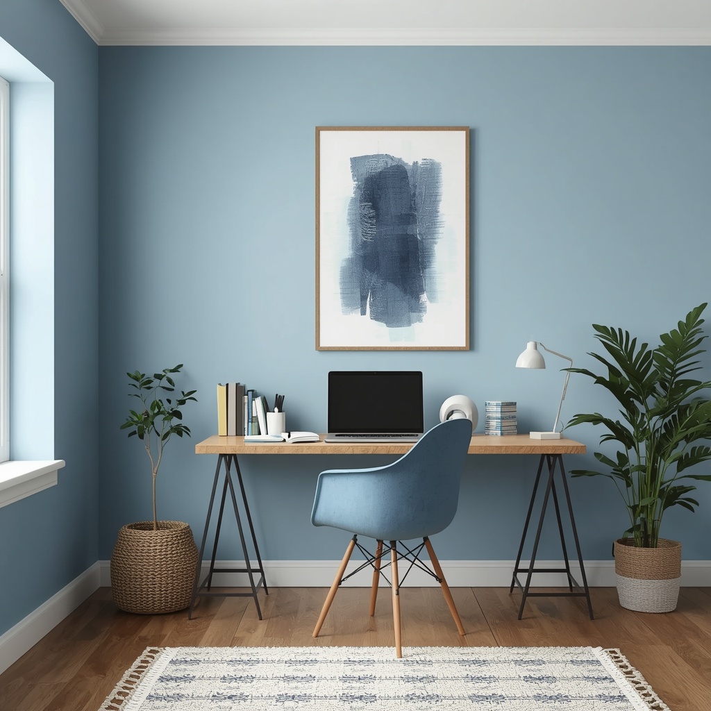
Soft, muted blues — think powder blue, slate, or dusty denim — tend to work better in home offices than bright, saturated blues, which can feel cold or sterile in smaller rooms. Pair a soft blue wall with warm wood tones, brass hardware, or a natural fiber rug to keep the space from feeling clinical.
Best for: Analysts, writers, customer service roles, and anyone who needs sustained, quiet concentration.
2. Energizing Yellow for Creative Work
Yellow is scientifically linked to optimism, energy, and creative thinking, making it a favorite for home offices used by designers, marketers, and entrepreneurs. It stimulates mental activity and can help combat the afternoon slump that hits many remote workers around 2 p.m.
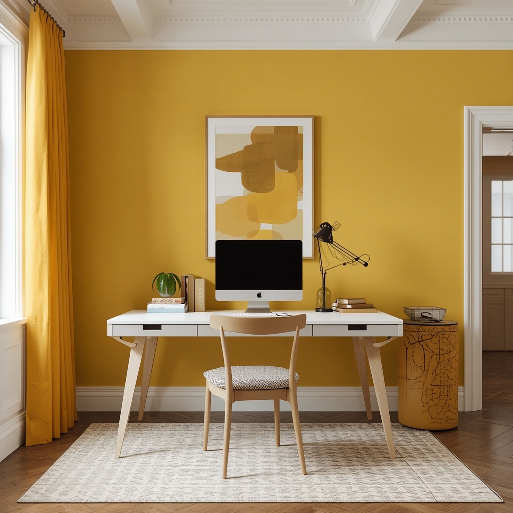
The key with yellow is restraint. A full room of bright yellow can quickly become overstimulating and even trigger irritability, according to color psychologists. Instead, use a soft buttery yellow, mustard, or ochre as an accent wall, or bring it in through curtains, artwork, or an accent chair.
Best for: Creative professionals, entrepreneurs, and anyone doing brainstorming-heavy work.
3. Grounding Green for Balance
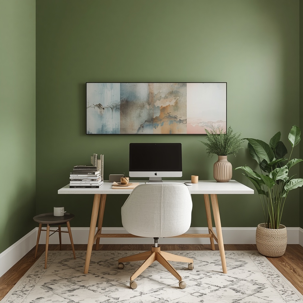
Green sits at the center of the color wheel for a reason — it’s the most balanced hue to the human eye, requiring no adjustment from the retina. This is why green is often called the most restful color for the eyes, which matters enormously when you’re staring at a screen for eight-plus hours a day.
Sage, olive, and forest green all bring a sense of nature indoors, which has been shown to reduce cortisol levels and mental fatigue. Biophilic design — the practice of connecting interior spaces to the natural world — relies heavily on greens for exactly this reason.
Best for: Long work sessions, video calls, and reducing eye strain.
4. Warm Terracotta and Clay for Comfort
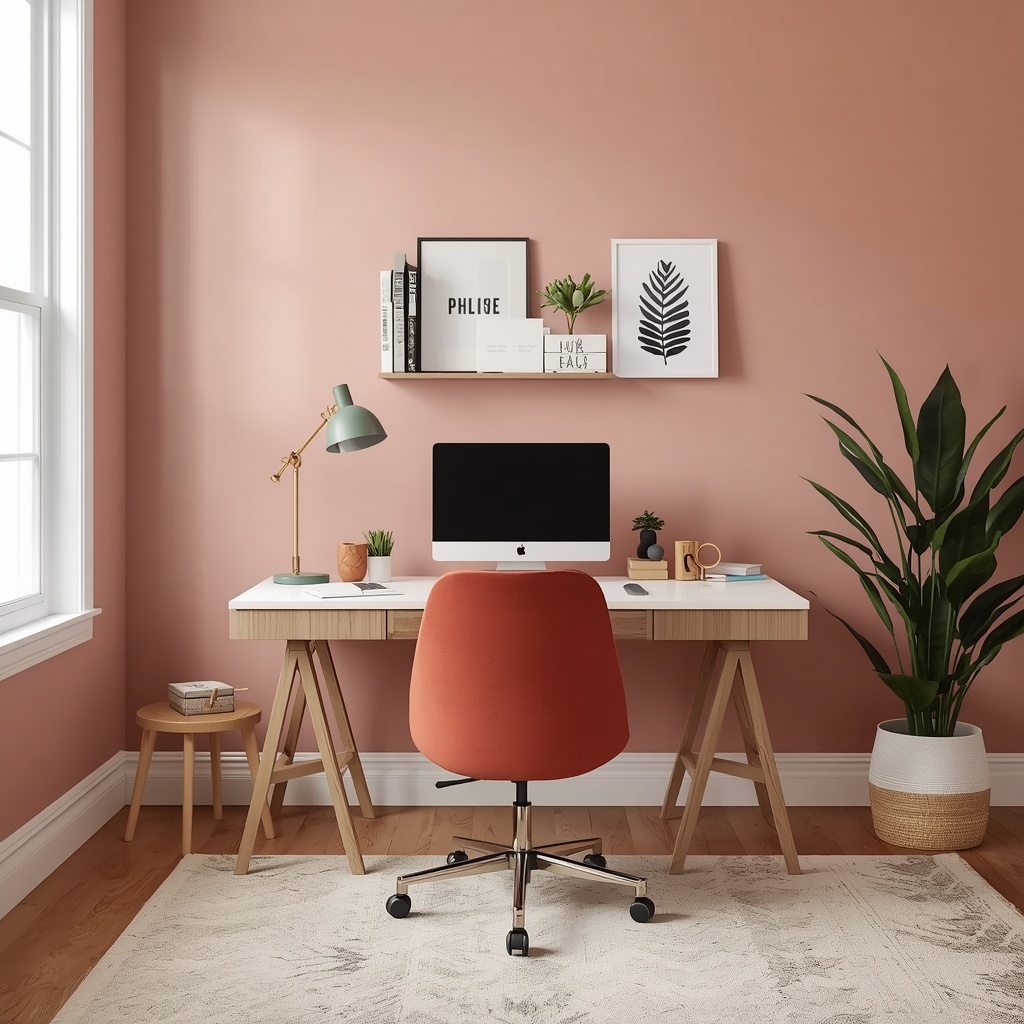
Earthy terracotta, clay, and warm rust tones have surged in popularity for home offices because they add warmth without the visual chaos of a bright, saturated color. These tones feel grounded and inviting, making a home office feel less like a corporate box and more like a comfortable extension of your home.
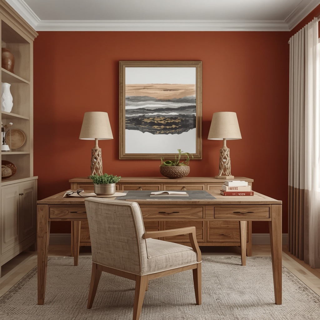
Terracotta pairs beautifully with natural materials — linen, rattan, unfinished wood — and works well in both small and large rooms because it doesn’t read as cold under any lighting condition.
Best for: Cozy, low-light offices and anyone wanting a workspace that doesn’t feel sterile.
5. Crisp White and Off-White for Clarity
White remains a top choice for small home offices because it maximizes light reflection and makes a space feel open and uncluttered. Clean, bright environments have been linked to clearer thinking and reduced visual distraction, which is why so many minimalist workspaces default to white or off-white walls.
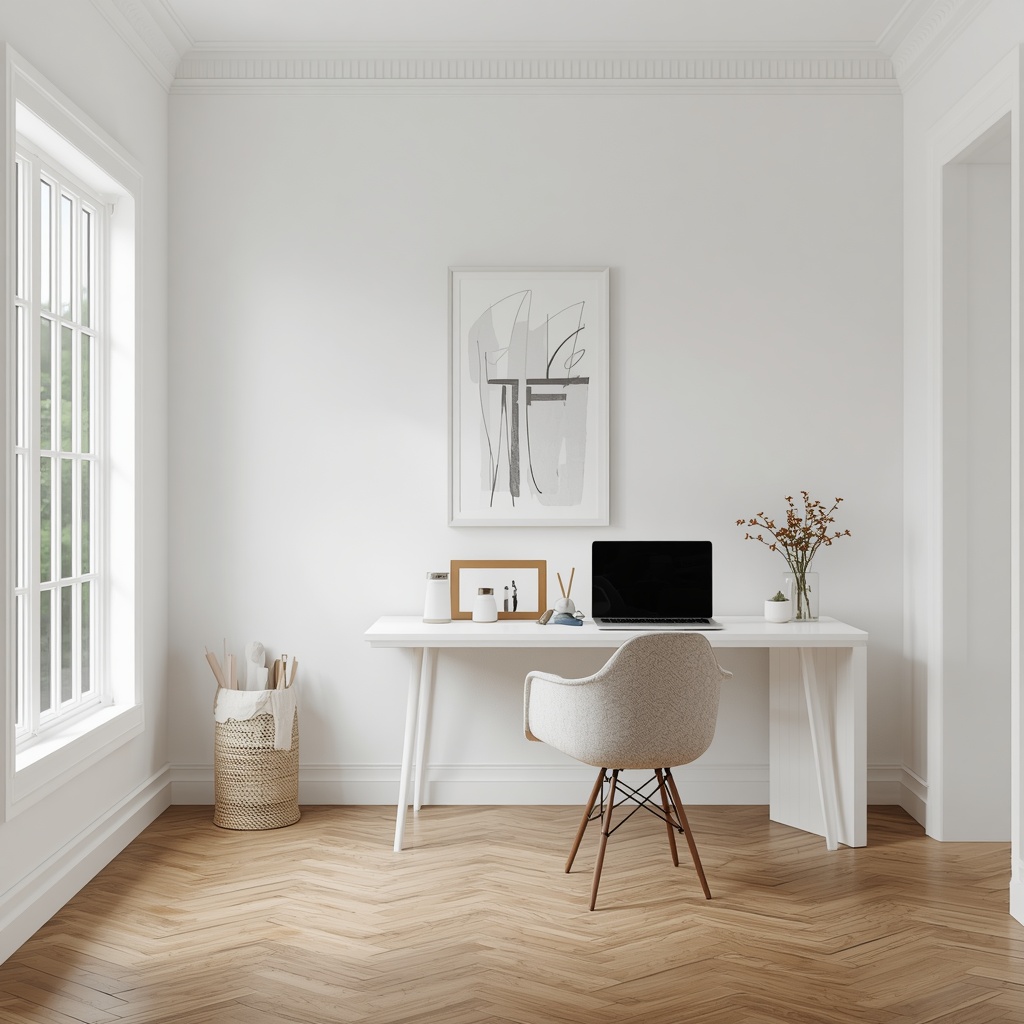
The caveat is that stark white can feel flat or clinical without warmth added elsewhere in the room. Balance a white wall with a warm rug, wood desk, or a single bold accent color to avoid a sterile, “waiting room” feel.
Best for: Small or windowless offices needing to feel larger and brighter.
Quick Comparison: Home Office Colors by Mood and Function
| Color | Mood Effect | Best Room Type | Pairs Well With |
|---|---|---|---|
| Soft Blue | Calm, focused | Small to medium offices | Warm wood, brass, linen |
| Buttery Yellow | Energized, creative | Bright, well-lit rooms | White trim, natural wood |
| Sage Green | Balanced, restful | Rooms with screens/monitors | Rattan, black accents |
| Terracotta | Warm, grounded | Low-light or north-facing rooms | Linen, wood, cream |
| Off-White | Clear, open | Small or windowless rooms | Bold accent pieces |
How to Choose the Right Shade for Your Space
Not every “calming blue” or “energizing yellow” will work in your specific room, because lighting changes everything. A color that looks soft and dusty in a north-facing room can look completely different under direct afternoon sun.

Here’s a simple checklist to guide your decision:
- Test before you commit. Paint large swatches (at least 2×2 feet) on multiple walls and observe them morning, afternoon, and evening.
- Consider your natural light direction. North-facing rooms benefit from warmer tones; south-facing rooms can handle cooler colors without feeling cold.
- Match the color to your work type. Choose calming tones for detail-oriented work and energizing tones for creative brainstorming.
- Balance saturation with trim and furniture. A bold wall color needs neutral furniture to avoid visual overload.
- Think about video call backgrounds. If you’re on camera often, muted greens, blues, and warm neutrals tend to look the most professional and flattering on screen.
Pro Tip
Pro Tip: If you’re unsure which color to commit to, paint the wall directly behind your desk chair rather than the wall you face. This becomes your video call background and gives you a flattering, professional backdrop, while the wall you actually look at during the day can stay a calmer, more neutral tone to reduce visual fatigue.
Common Mistakes to Avoid When Painting a Home Office
Even well-intentioned color choices can backfire without a bit of planning. Below are the most frequent mistakes homeowners make when tackling this project themselves.
- Choosing a color based on trends rather than natural light. A trending sage green might look muddy in a dim, north-facing room.
- Going too bold on all four walls. Saturated colors in a small, enclosed space can increase feelings of restlessness over long work hours.
- Ignoring the ceiling and trim. A stark white ceiling against a deep, moody wall color can make a small office feel more closed in.
- Skipping the sample stage. Undertones shift dramatically between paint chips and full walls; always test before buying gallons.
- Forgetting glare and screen reflection. Extremely glossy or bright finishes can create screen glare during video calls.
Finishing Touches That Reinforce the Mood
Paint color sets the tone, but it works best as part of a cohesive design system. Once your wall color is chosen, reinforce the intended mood through lighting, texture, and accessories.
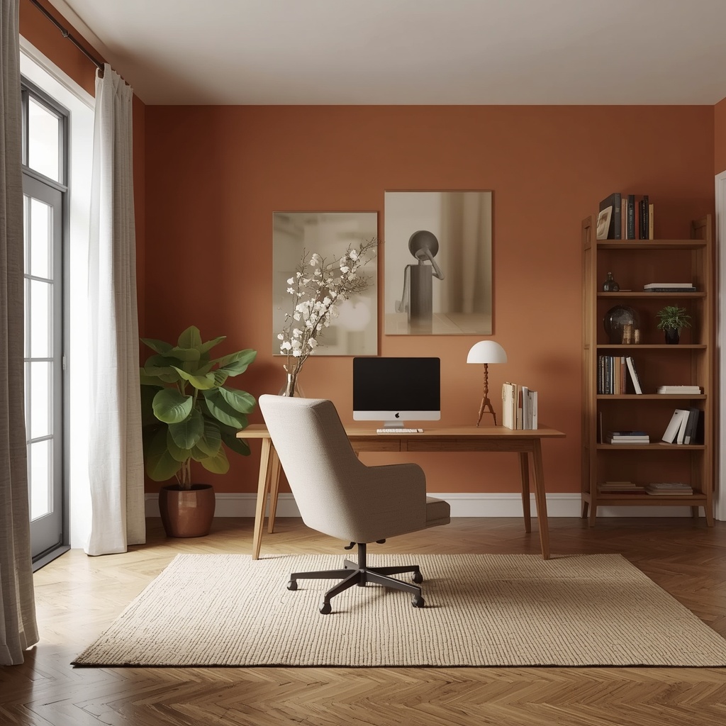
Warm dimmable lighting enhances the coziness of terracotta and clay tones, while daylight-balanced bulbs help sage green and blue rooms feel crisp and alert. Natural textures — jute rugs, linen curtains, wood shelving — soften any saturated wall color and prevent a home office from feeling like a paint swatch rather than a lived-in room. For further reading on how light temperature affects mood and productivity, the U.S. Department of Energy’s guide to lighting choices is a helpful resource: energy.gov lighting guide.
Final Thoughts
Choosing the best mood-boosting color for your home office isn’t about picking a trendy shade off Pinterest — it’s about understanding how you work, how much natural light your room receives, and what mental state you need to access most during your workday. Soft blues and greens support calm, focused work, while yellows and terracottas bring warmth and creative energy into rooms that might otherwise feel flat.
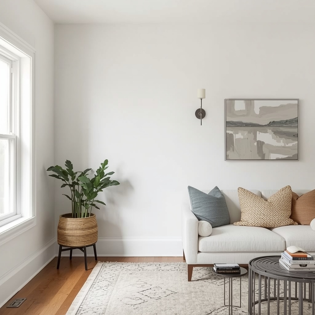
The best home offices balance color psychology with practical design choices like lighting, texture, and furniture. Take the time to sample colors in your actual space before committing, and don’t be afraid to use different tones on an accent wall versus your primary walls to get the best of both energizing and calming effects.
Your home office should work as hard as you do — and the right color on the wall is one of the simplest, most affordable ways to make that happen.