
If you’ve ever repainted a room and suddenly felt more relaxed in it — or more on edge — that wasn’t your imagination. As an interior designer who has walked into hundreds of client bedrooms, I can tell you that color is one of the most underestimated tools for better sleep. Most people spend weeks shopping for the “right” mattress but fifteen minutes picking a paint swatch. That’s backwards.
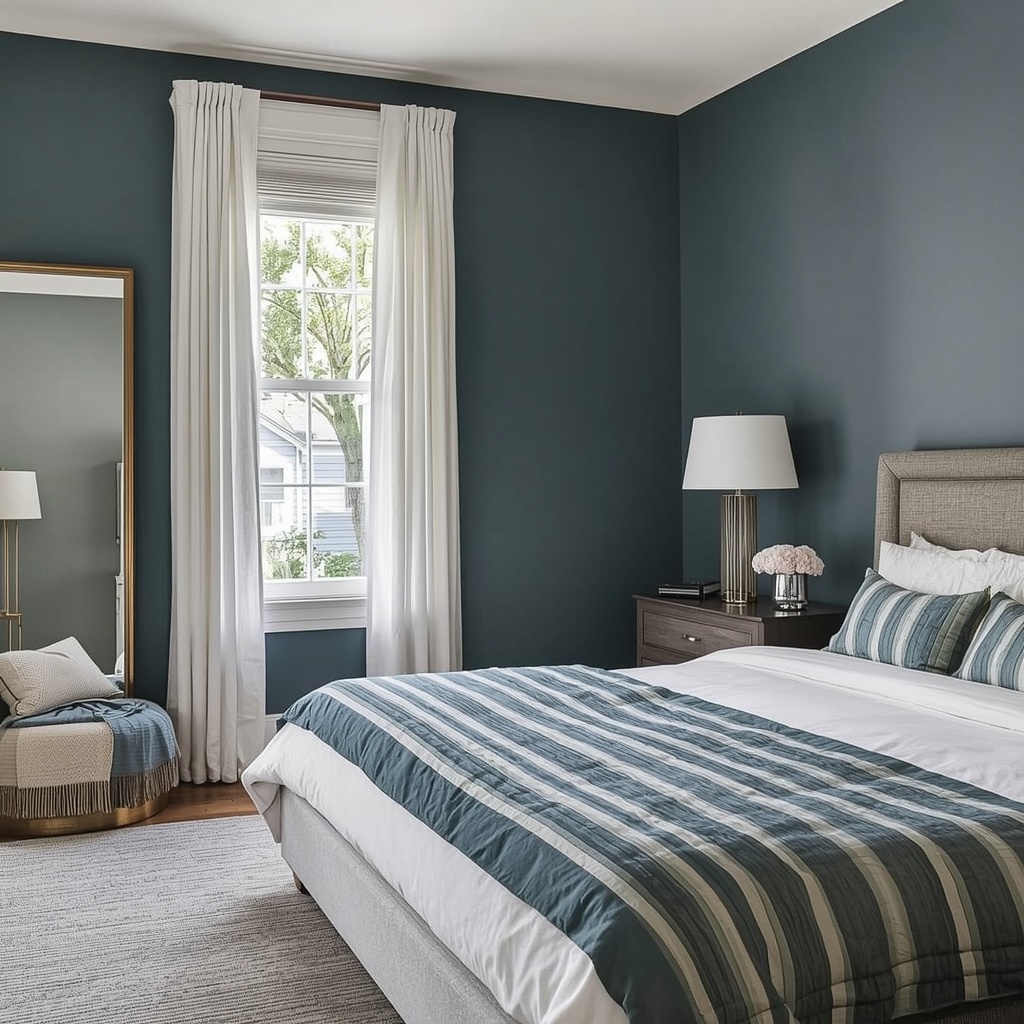
Your bedroom color talks to your nervous system before your brain even registers it consciously. The right shade can lower your heart rate, quiet racing thoughts, and cue your body that it’s time to wind down. The wrong one can keep you wired long after the lights go out. In this guide, we’ll break down the best calming bedroom colors, the science behind why they work, and exactly how to apply them — wall by wall, swatch by swatch.
Why Bedroom Color Matters More Than You Think
Color isn’t just decoration; it’s environmental input. Every time you walk into a room, your eyes send signals to your brain that influence mood, alertness, and even blood pressure. A bedroom painted in a stimulating hue can subtly work against your body’s natural wind-down process, no matter how good your sleep hygiene is otherwise.
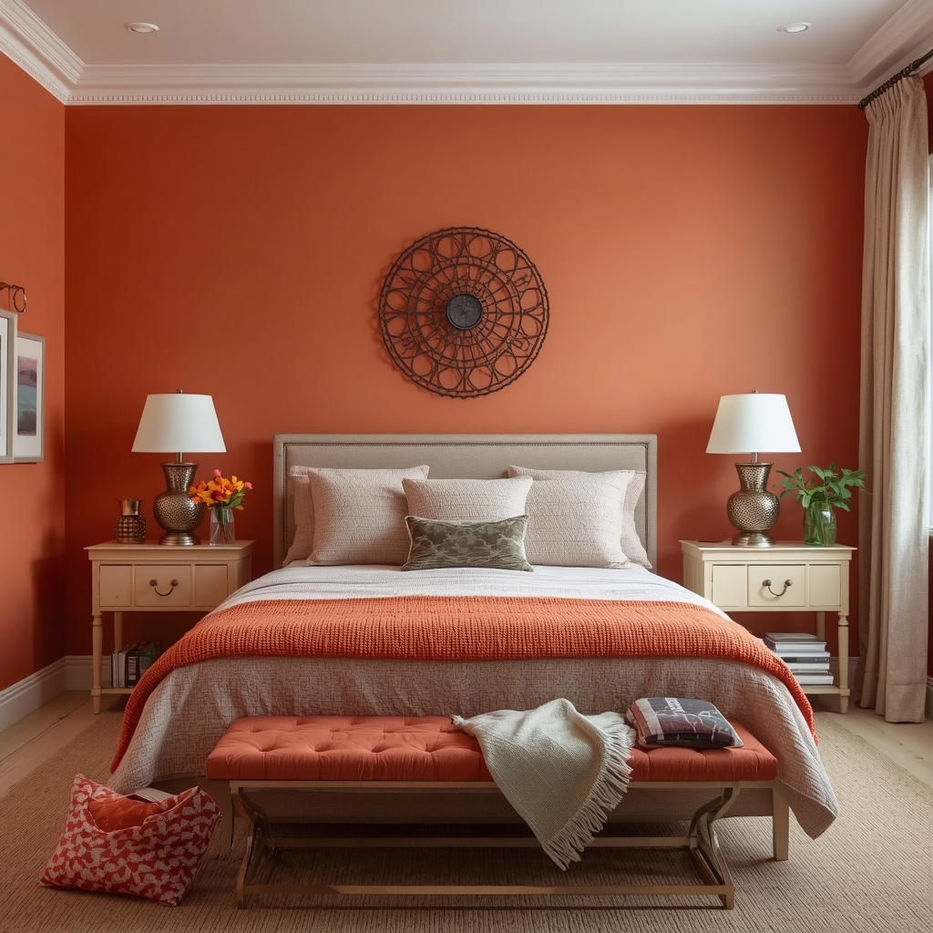
Designers call this the psychology of color, and it’s not pseudoscience — it’s rooted in how humans have responded to color in nature for millennia. Cool tones echo sky, water, and shade, which our bodies associate with rest. Warm, saturated tones echo fire, danger, and daylight, which our bodies associate with alertness. Your bedroom should lean firmly into the former.
The Sleep Science Behind Color Psychology
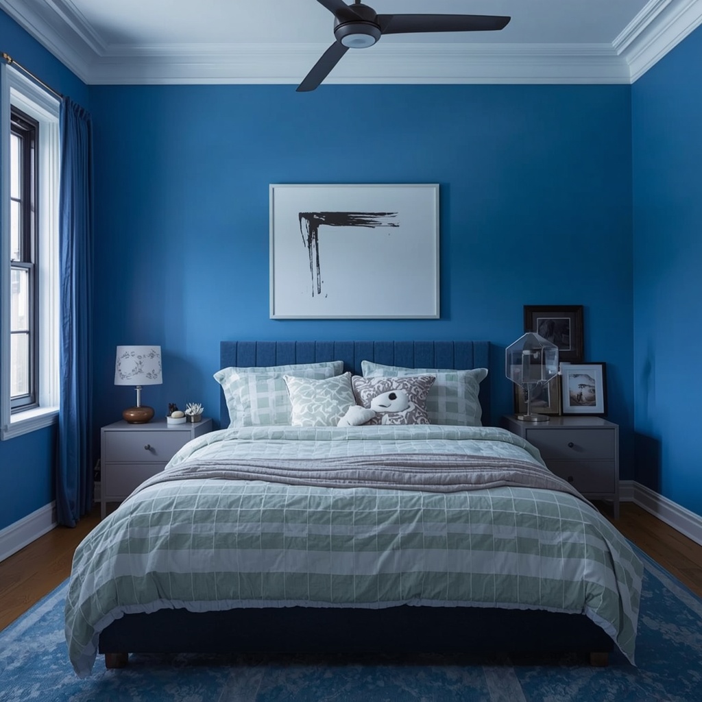
This isn’t just designer intuition — there’s real research behind it. A widely cited Travelodge sleep survey found that people sleeping in blue bedrooms logged the longest average sleep time of any color group, alongside higher rates of waking up in a good mood. Separate research out of the University of Sussex identified blue as one of the most consistently relaxing colors across cultures.
Green performed almost as well in the same studies, likely because of its strong association with nature and the outdoors. Soft yellows also scored surprisingly high — but only in muted, pale versions, since saturated yellow tips back into “stimulating” territory. The throughline across nearly every study: softness and desaturation matter more than the specific hue you choose.
“A bedroom should function like a visual exhale — nothing in the room should ask anything of your eyes.” This is the standard I hold every bedroom design to, and it’s the simplest litmus test for whether a color belongs in a sleep space.
The Best Calming Bedroom Colors, Ranked
Below is a practical breakdown of the most sleep-friendly bedroom colors, based on color psychology research and what consistently performs well in real client homes.
| Color | Mood It Creates | Best Paired With | Ideal For |
|---|---|---|---|
| Soft Blue | Calm, secure, slows heart rate | White, light oak, linen | Primary bedrooms, anyone with racing thoughts at night |
| Sage / Muted Green | Grounded, nature-connected, restorative | Warm wood, rattan, cream | Bedrooms with lots of plants or natural light |
| Warm Greige / Taupe | Cozy, neutral, easy to live with | Brass, ivory, soft pink accents | Resale-friendly homes, small bedrooms |
| Soft Lavender | Soothing, slightly romantic, low-stimulation | Grey, white, silver tones | Guest rooms, primary suites |
| Dusty Rose / Blush | Warm, comforting, gentle | Charcoal, terracotta, walnut | South-facing rooms that need warmth without intensity |
| Off-White / Soft White | Clean, spacious, restful | Almost anything | Small or low-light bedrooms |
Soft Blue: The Reigning Champion
Soft, muted blue consistently tops nearly every sleep-color study, and it’s the shade I recommend most often to clients who say they “can’t switch their brain off” at night. The key word is soft — a hazy, slightly grayed blue, not a bold nautical navy. Think the sky about thirty minutes after sunset, not a swimming pool.
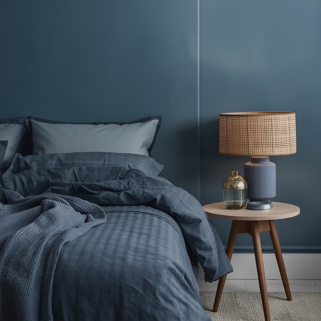
Avoid bright or saturated blues, which can feel cold and sterile rather than cozy. Balance the coolness with warm textures — a wool throw, a wood headboard, linen drapery — so the room still feels inviting rather than clinical.
Sage and Muted Greens
Green is blue’s closest competitor in nearly every sleep survey, and it makes sense biologically — we’re wired to feel safe surrounded by living, growing things. Sage, eucalyptus, and muted olive all read as restorative without tipping into the visual intensity of a forest green or emerald.
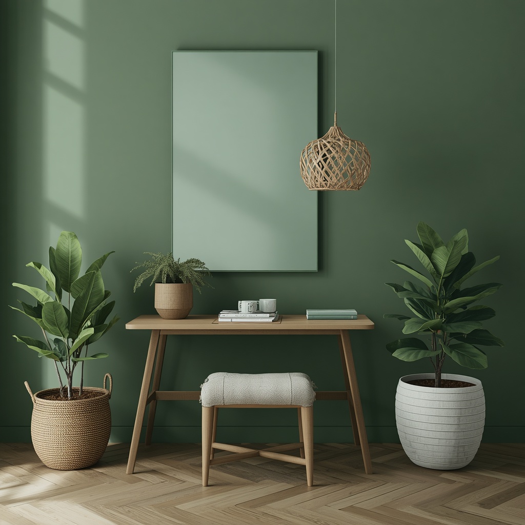
This palette pairs beautifully with rattan, linen, and warm wood tones, making it a favorite for bedrooms that lean organic or “quiet luxury” in style. It also tends to photograph and resell well, which matters if you’re staging a home.
Warm Neutrals: Greige, Taupe, and Soft Sand
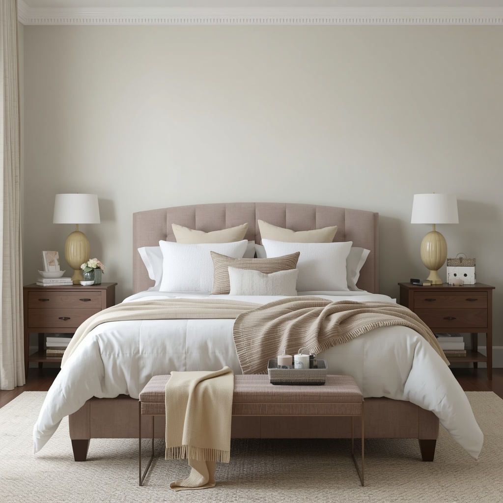
Neutrals get a reputation for being “boring,” but a well-chosen warm neutral is one of the most reliably calming bedroom color choices available. The trick is staying warm, not cool — a greige with too much blue undertone can feel flat and institutional under artificial light.
These shades work in almost any home and at almost any resale stage, which is why they remain a go-to for primary bedrooms in particular. Layer in texture — boucle, linen, woven baskets — so the neutral palette doesn’t read as flat or sterile.
Soft Lavender and Dusty Purples
Lavender has a uniquely soothing effect, but only in its softer, more blue-leaning forms. A vibrant or saturated purple skews energetic and can actually work against relaxation, so steer clear of anything that reads as “grape” rather than “dried flower.”
Pair pale lavender with warm grey or soft white to keep the room feeling sophisticated rather than overly sweet. It’s an especially good choice for guest bedrooms, where you want a space that feels gently special without being overstimulating.
Dusty Rose and Blush Tones
Muted pinks have quietly become one of the most popular calming bedroom colors of the last few years, and for good reason — they bring warmth without the intensity of red or coral. Dusty rose in particular reads as comforting rather than “girly,” especially when paired with deeper, grounding tones.

This color works exceptionally well in rooms that get a lot of natural light, where a cooler shade might otherwise feel chilly. Add charcoal, walnut, or black accents to keep the overall palette balanced and adult.
💡 Pro Tip: Before committing to a full wall of color, paint a sample swatch (at least 2×2 feet) on the wall you’ll see first from bed, and check it at three different times of day — morning, midday, and after dark with your lamps on. Paint reads dramatically differently under warm bulb light than it does in daylight, and the evening version is the one that actually matters for sleep.
Bedroom Colors to Avoid
Just as some colors help you wind down, others actively work against it. Based on color psychology research and what I see go wrong in real bedrooms, here’s what to limit or avoid as a dominant wall color:
- Bright red — raises heart rate and blood pressure; strongly linked to alertness and even aggression in studies
- Saturated orange — energizing and appetite-stimulating, better suited to kitchens than bedrooms
- Neon or highly saturated yellow — fine in small doses, overstimulating as a primary wall color
- Stark, cool grey — can read as flat, cold, or even depressing without enough warmth layered in
- Pure black on all walls — visually shrinks the room and can feel oppressive rather than cozy
None of these colors are “banned” — a deep charcoal headboard wall or a single red accent pillow won’t sabotage your sleep. The issue is using an overstimulating color as the dominant tone surrounding you for seven-plus hours a night.
How to Choose the Right Shade: LRV and Undertones
Picking “blue” or “green” is only step one. The actual shade you choose matters just as much as the color family, and two technical concepts make this easier: Light Reflectance Value (LRV) and undertone.
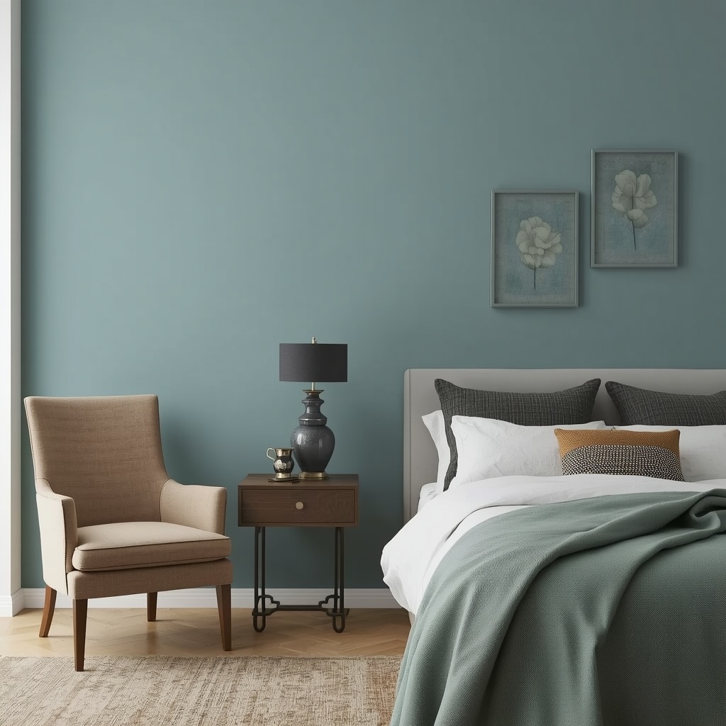
LRV measures how much light a paint color reflects, on a scale from 0 (absolute black) to 100 (pure white). For calming bedrooms, designers generally recommend staying in the 40–70 range — light enough to feel soft and airy, dark enough to feel cozy and enveloping rather than sterile.
Undertone is the secondary color hiding underneath the main one — a “greige” might lean pink, purple, or green depending on the brand. This is why two neutrals that look identical on a swatch card can feel completely different on your actual walls. Always test undertones against your room’s existing flooring and natural light before committing.
| Factor | What to Check | Why It Matters |
|---|---|---|
| LRV | Aim for 40–70 for most bedrooms | Too high feels stark; too low feels cave-like |
| Undertone | Test against flooring and trim | Prevents unexpected pink, green, or purple casts |
| Natural light direction | North-facing rooms run cool; south-facing run warm | Helps you compensate with warmer or cooler shade choices |
| Lighting at night | View swatch under your actual bedside lamp | Evening light is when you’ll experience the color most |
Pairing Colors: Calming Palette Combinations
A single wall color rarely tells the whole story — it’s the combination of wall, trim, bedding, and accents that creates a truly restful room. Here are five tested palette combinations that consistently photograph and feel calming in real bedrooms.
| Wall Color | Trim / Ceiling | Bedding | Accent Color |
|---|---|---|---|
| Soft Blue | Crisp White | Ivory Linen | Brushed Brass |
| Sage Green | Warm White | Natural Linen | Walnut Wood |
| Warm Greige | Soft White | Cream + Texture | Dusty Rose |
| Pale Lavender | Light Grey | White + Grey | Soft Silver |
| Off-White | Same as Wall | Layered Neutrals | Charcoal |
A useful rule of thumb I give clients: pick one calming “hero” color for the walls, one warm neutral for the largest textile (your bedding), and one deeper accent color used sparingly — a headboard, a rug, or a pair of nightstands — to keep the room grounded instead of flat.
Room-by-Room Considerations
Not every bedroom is a blank, perfectly lit box, so color choices should flex based on your specific space.
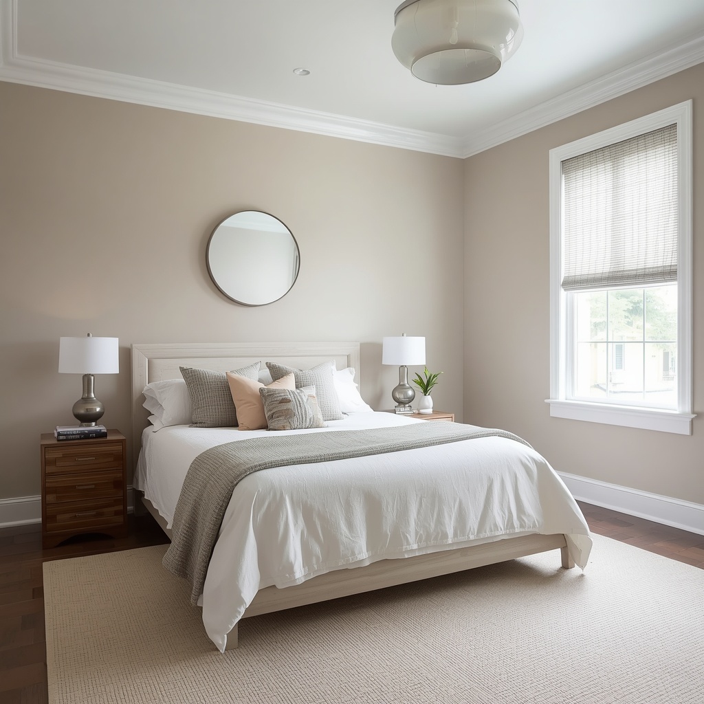
Small bedrooms generally benefit from sticking to a single soft color across walls, trim, and ceiling — this “color drench” technique removes visual breaks and makes a small room feel larger and calmer rather than choppy. Avoid high-contrast trim in a small room, since it can chop the space up visually.
North-facing bedrooms receive cooler, bluer natural light, so they often need a warmer paint color to avoid feeling cold or flat. South-facing bedrooms get warmer light and can comfortably handle cooler tones like blue or sage without feeling icy.
Kids’ bedrooms can use the same calming-color logic as adult rooms — soft blues, greens, and warm neutrals support better sleep for children too, even if their decor is more playful in pattern or accessories.
Beyond Paint: Color Through Textiles and Lighting
Paint is the biggest lever, but it isn’t the only one. Bedding, rugs, curtains, and even lampshades all contribute to the room’s overall color story — and they’re far easier to change than a wall.
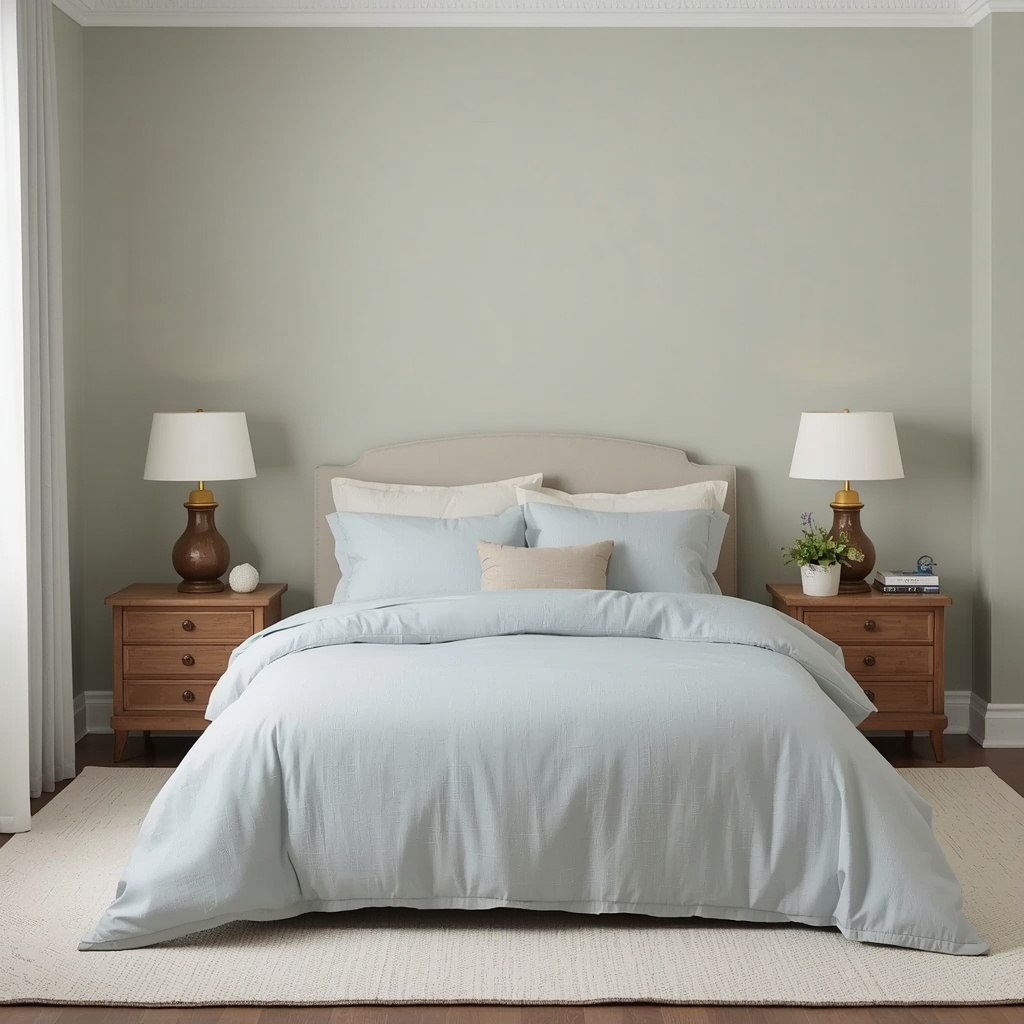
If you’re not ready to commit to paint, start with a calming color in your bedding and curtains first. A soft blue or sage duvet set against neutral walls delivers a meaningful chunk of the same psychological benefit, and it’s a reversible, renter-friendly way to test a color before painting.
Lighting also shifts how any color reads. Warm-toned bulbs (around 2700K) flatter almost every calming bedroom palette and support melatonin production in the evening, while cool, blue-toned bulbs (4000K+) can counteract even the most perfectly chosen wall color by keeping your brain alert.
Frequently Asked Questions
What is the single best color for a bedroom if I had to pick just one? Soft, muted blue is the most consistently research-backed choice for sleep, but the “best” color is ultimately the one that feels personally calming to you — comfort and sleep are deeply individual.
Should all four walls be the same color? For most calming bedrooms, yes — a single, soothing color across all walls (and often the ceiling) creates a more cohesive, restful feel than an accent wall, which can introduce visual contrast your brain has to process.
Are dark bedroom colors bad for sleep? Not necessarily. A soft, warm dark color like deep charcoal or muted navy can feel cozy and enveloping in the right room, especially with good ambient lighting. The colors to truly avoid are highly saturated, attention-grabbing ones like bright red or neon orange — not all dark colors.
Can I use color psychology if I rent and can’t paint? Absolutely. Lean on bedding, curtains, rugs, and an oversized art piece in your chosen calming color family — textiles deliver a real portion of the same psychological effect as paint.
Bringing It All Together
The best bedroom colors for a calming, sleep-inducing space all share the same DNA: they’re soft, desaturated, and rooted in tones the human nervous system already associates with rest. Soft blue, sage green, warm neutrals, gentle lavender, and dusty rose all check that box — while bright red, neon orange, and stark grey work against it.
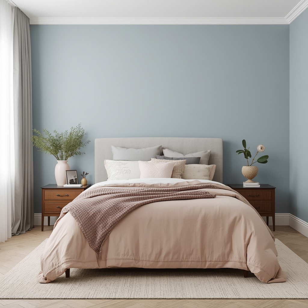
Start with one calming hero color, layer in warm texture, get your lighting temperature right, and test your swatch in the actual evening light you’ll be falling asleep under. Get those fundamentals right, and your bedroom stops being just a place you sleep — it becomes part of the reason you sleep well.