
Serene Bedrooms with Dreamy Color Palettes: Your Complete Design Guide

Your bedroom is more than just a place to sleep — it is your personal sanctuary, the one room in your home that should feel like a deep exhale the moment you walk through the door. And nothing shapes that feeling more powerfully than color. The right palette can lower your heart rate, quiet a racing mind, and transform an ordinary room into a retreat that rivals a luxury spa.
As an interior designer who has worked with hundreds of US homeowners, I have seen firsthand how dreamy bedroom color palettes can completely change how a space feels — and how people feel inside it. Whether you are starting from scratch or simply want to refresh your current bedroom aesthetic, this guide will walk you through everything you need to know to create a serene, beautiful bedroom that speaks to your soul.
Quick takeaway: Studies in environmental psychology consistently show that soft, cool, and muted hues promote relaxation and improve sleep quality — making thoughtful color selection one of the highest-ROI upgrades you can make to your bedroom.
Why Bedroom Color Psychology Matters More Than You Think
Color is not just decoration — it is communication. Every shade you introduce into your bedroom sends a signal to your nervous system, either inviting rest or triggering alertness. Warm, saturated hues like fire-engine red or electric orange are energizing by nature, which is why interior designers rarely recommend them for sleep spaces. Instead, the most calming bedroom colors tend to fall into the cool, neutral, or softly warm spectrum.

The science behind bedroom color therapy is well-established. Research from institutions like the Sleep Foundation and Color Matters suggests that blues, greens, and lavenders can actually reduce resting heart rate and promote the production of melatonin. Understanding bedroom color psychology gives you a functional edge when making design decisions — you are not just choosing what looks pretty, you are choosing how you want your body to feel.
“Color is the keyboard, the eyes are the harmonies, the soul is the piano with many strings. The artist is the hand that plays, touching one key or another, to cause vibrations in the soul.”— Wassily Kandinsky, artist and color theorist
The 6 Most Serene Bedroom Color Palettes for
Not all soft colors are created equal, and the best dreamy bedroom ideas come from understanding how hues interact with light, texture, and furnishings. Below are six of the most stunning and sleep-friendly bedroom color schemes trending across US homes right now, each with specific paint recommendations and styling tips.

Whether your bedroom style leans toward modern minimalist, cottagecore, coastal, or transitional, there is a soothing palette here that will feel right for your space. Remember: the goal is not perfection, but peace.
Coastal Mist
Dusty blue + white linen + warm sand
Sage Garden
Sage green + ivory + aged brass
Lavender Dream
Soft lavender + blush + warm white
Warm Greige
Greige + cream + honeyed oak
Terracotta Blush
Dusty terracotta + soft peach + linen
Slate & Snow
Soft charcoal + pure white + cool grey
Pro Tip
Always test paint swatches in your actual bedroom at three different times of day — morning, midday, and evening lamplight. A color that looks ethereal in the store can read lavender-grey at dawn and full violet by night. Paint a 12×12 inch swatch directly on your wall and live with it for 48 hours before committing.
Calming Bedroom Colors: A Room-by-Room Breakdown
Selecting the right bedroom wall colors is only half the equation. True serenity comes from a layered approach — walls, textiles, furniture, and accents working together like instruments in an orchestra. A dusty blue wall paired with harsh synthetic bedding will never feel as peaceful as the same blue wall dressed in soft Belgian linen and organic cotton pillows.
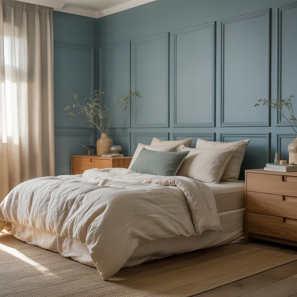
Here is how each element of your bedroom can reinforce your color story and create that dreamy, restful atmosphere you are chasing. Think of each layer as an opportunity to deepen the mood rather than simply fill the space with objects.
| Room Element | Best Color Strategy | What to Avoid |
|---|---|---|
| Walls | Muted, low-saturation tones — dusty blues, sage greens, warm whites, soft lavender | High-gloss finishes that reflect harsh light |
| Bedding | Tonal layers in linen, cotton, or velvet; stick to 2–3 shades within your palette | Bold graphic prints or high-contrast patterns |
| Curtains | Sheer white or linen panels; blackout liners in a matching hue for sleep | Synthetic fabrics that block out light unevenly |
| Furniture | Natural wood, washed oak, or painted pieces in soft whites and warm greys | Dark espresso wood that absorbs too much light |
| Lighting | Warm-white bulbs (2700K–3000K); layered with bedside lamps and dimmers | Cool daylight bulbs (5000K+) in the evening |
| Accent colors | One metallic (brass, bronze, or matte gold) + one natural material (jute, rattan) | Too many competing accent colors (3 or more) |
How to Layer Textures Within a Serene Color Palette
One of the biggest mistakes homeowners make when designing minimalist or tranquil bedrooms is keeping everything too flat. A serene space does not mean a boring one — it means visual richness achieved through texture, not color contrast. You can work entirely within a single tonal palette of soft blues and still create a bedroom that feels deeply layered, inviting, and alive.
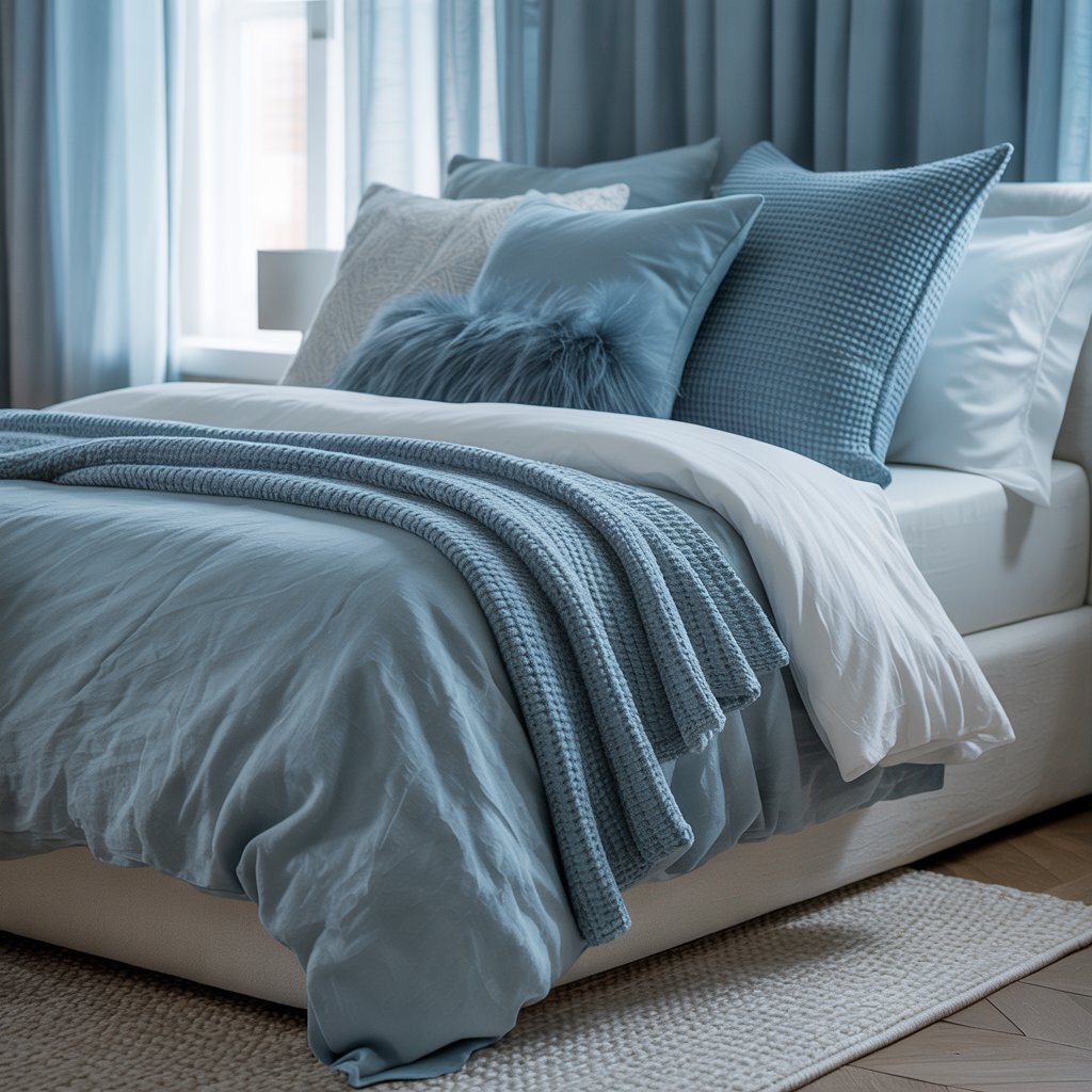
Think of a bed dressed in crisp cotton percale sheets, topped with a chunky-knit throw, two Euro shams in washed linen, and a velvet lumbar pillow in the same dusty blue family. Every piece is a different texture, but the eye reads cohesion because the colors flow together. This is the quiet luxury that high-end interior design is built on, and it is entirely achievable at any budget level.
- Layer 1 — The base: fitted sheet and pillowcases in a crisp, light-colored cotton or Tencel
- Layer 2 — The main quilt or duvet: a slightly warmer or cooler tone within your palette
- Layer 3 — Decorative pillows: vary the fabric — try linen, velvet, and boucle together
- Layer 4 — The throw: a loose weave, waffle knit, or faux fur in a grounding neutral
- Layer 5 — The rug: a low-pile or flatweave style in ivory, sand, or a tonal print
Pro Tip
When shopping for textiles, hold swatches together in natural light before purchasing. Slight tonal variations — a warm beige vs. a cool taupe — can make or break a layered look. The 60-30-10 color rule works well here: 60% dominant hue (walls + bedding), 30% secondary (furniture + curtains), 10% accent (pillows + hardware).
Bedroom Color Combinations That Promote Better Sleep
Not every soft color is equally restful. Pale yellow, for example, can read as cheerful rather than calming — and while it is a beautiful bedroom accent color, it is rarely the best choice for a primary wall hue in a sleep-first space. The most scientifically backed bedroom color combinations for better sleep quality tend to cluster around blue-adjacent and green-adjacent families.
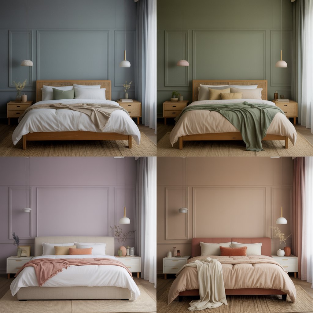
Here are four bedroom color pairings that designers and sleep experts consistently recommend for their soothing, restorative qualities — each one a masterclass in understated, livable elegance.
- Dusty blue + warm white + natural oak: the ultimate coastal-meets-Scandinavian combination that never feels cold thanks to the warmth of natural wood and linen accents.
- Sage green + ivory + aged brass: earthy, grounded, and deeply calming — especially beautiful in spaces with plenty of natural light.
- Warm lavender + blush pink + matte white: a dreamy, romantic palette that is gender-neutral when balanced with clean-lined furniture and minimal clutter.
- Warm greige + cream + terracotta: a sophisticated, timeless combination that works in everything from farmhouse to modern transitional interiors.
Small Bedroom Color Ideas: Making the Most of Limited Square Footage
If your bedroom is on the smaller side — as many American apartments and starter homes tend to be — your color strategy becomes even more important. The right small bedroom color ideas can make a room feel twice its actual size, while the wrong choices can make even a generous room feel cramped and claustrophobic. The general rule is that lighter, cooler colors recede visually, making walls appear farther away than they actually are.
That said, do not be afraid to use a single deep, enveloping shade in a small bedroom — an all-over dusty teal or soft moody blue, applied to walls, trim, and even ceiling, creates a cocooning effect that many people find intensely restful. This technique, sometimes called “color drenching,” is one of the most powerful tools in a modern interior designer’s toolkit for creating intimacy and depth in compact spaces.
72%
of homeowners say bedroom color affects their sleep quality
3K
average cost of a full bedroom color refresh (paint + textiles)
2–3
ideal number of colors in a serene bedroom palette
Accent Wall Ideas for a Serene Bedroom
An accent wall is one of the most cost-effective ways to introduce a dreamy new color into your bedroom without committing to a full repaint. The headboard wall is the natural choice — it frames the bed as the focal point of the room and creates a sense of intentional design without overwhelming the space. Choose a shade that is 1–2 tones deeper than your main wall color for a tonal, sophisticated look rather than a stark contrast.
Wallpaper is having a genuine renaissance in American interior design, and for good reason — a subtly textured grasscloth, a soft watercolor botanical print, or a quiet geometric in complementary tones can add dimension that paint alone simply cannot achieve. Brands like Schumacher, Anthropologie Home, and Serena & Lily offer stunning bedroom wallpaper options in the serene, muted palette range.
01
Use eggshell finish on bedroom walls — it is forgiving, washable, and reflects just enough light to feel luminous without glare.
02
Paint your ceiling 10–20% lighter than your walls to make the room feel taller and airier, especially in rooms under 9 feet.
03
If using wallpaper on one wall, pull a color from its pattern for your opposite wall’s paint — this ties the room together seamlessly.
04
Don’t forget the trim. Painting baseboards and window frames in a crisp white or warm cream elevates even the simplest color scheme dramatically.
Top Paint Brands and Colors to Try Right Now
Knowing your palette is one thing — knowing where to find the exact shades is another. Here is a quick reference guide to the most beloved serene bedroom paint colors from top US paint brands, all available at major retailers like Sherwin-Williams and Benjamin Moore.
| Color | Brand & Name | Palette Family | Best For |
|---|---|---|---|
| Dusty Blue | SW Interesting Aqua 6220 | Coastal Mist | Main walls, north-facing rooms |
| Sage Green | BM Saybrook Sage HC-114 | Sage Garden | All walls, south-facing rooms |
| Soft Lavender | SW Inkling 6549 | Lavender Dream | Accent wall, small rooms |
| Warm Greige | BM Revere Pewter HC-172 | Warm Greige | Versatile — suits any room size |
| Dusty Terracotta | SW Cavern Clay SW 7701 | Terracotta Blush | Accent walls, warm-light rooms |
Bringing It All Together: Your Serene Bedroom Checklist
Great interior design is not about following rules perfectly — it is about creating a space that feels uniquely and deeply yours. A serene bedroom should reflect your personality even as it quiets your mind, blending the best of beauty and function into a room you genuinely cannot wait to come home to at the end of a long day.
Use this final checklist to make sure every element of your bedroom is working together toward that dreamy, restful goal. Take your time, invest in quality textiles, and do not underestimate the transformative power of good lighting. Your perfect sanctuary is closer than you think.
- Choose a primary wall color in a muted, low-saturation hue from the cool or warm-neutral spectrum
- Apply the 60-30-10 rule across walls, furniture, and accents
- Layer at least four different textures within your bedding alone
- Switch all bedroom bulbs to warm-white (2700K–3000K) with dimmer capability
- Limit your accent color count to one metallic and one natural material
- Test paint swatches on the wall for 48 hours before committing
- Consider color-drenching if working with a small or awkwardly shaped bedroom
- Use sheer curtains during the day and blackout liners at night for optimal light control
Pro Tip — Final Thought
The single most underrated element in a serene bedroom? Decluttering before you repaint. No color palette — no matter how perfectly chosen — can create calm in a cluttered space. A minimalist approach to what you keep in your bedroom amplifies every design decision you make, from wall color to bedding to furniture placement. Less truly is more when it comes to sleep sanctuary design.
Jamie Holloway is a certified interior designer with over 12 years of experience helping US homeowners create beautiful, livable spaces. She specializes in residential bedroom design, color consulting, and sustainable home decor. For more design insp