
There’s a reason earthy tones have become the go-to living room color palette for homeowners across the United States. Warm terracotta, soft clay, deep olive, and muted sand don’t just look good on a paint chip — they create a living space that feels grounded, calm, and effortlessly inviting. As an interior designer who works with clients on home decor projects nationwide, I’ve watched earthy color schemes move from a passing trend into a genuine design staple.
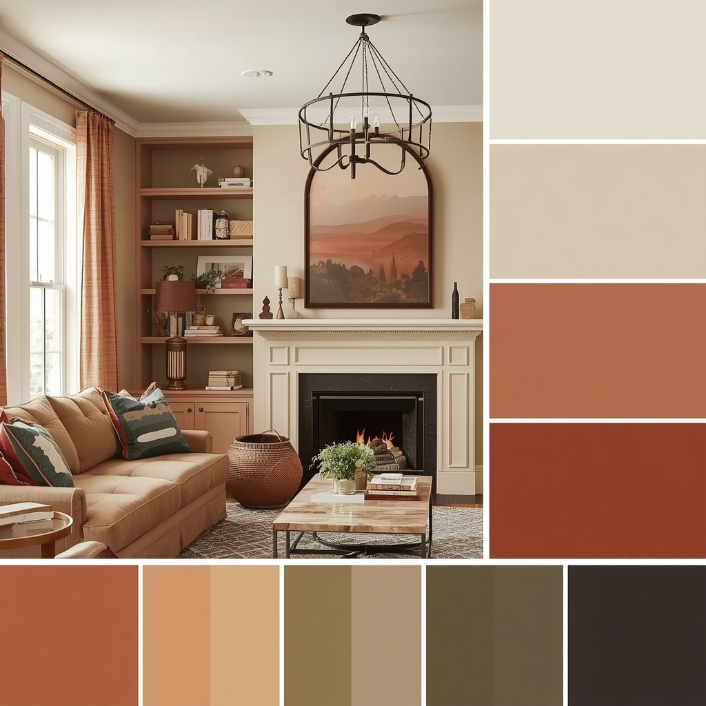
In this guide, I’ll walk you through everything you need to know about using earth tone palettes in your living room: which colors pair well, how to layer them across furniture and textiles, and the small styling mistakes that can make a warm neutral palette feel flat instead of rich. Whether you’re repainting your walls or simply swapping out throw pillows and area rugs, these ideas will help you build a cohesive, nature-inspired living room.
Why Earthy Tones Work So Well in Living Rooms
Earthy tones — think terracotta, rust, olive green, mustard, camel, and warm taupe — are drawn directly from nature: clay soil, tree bark, dried grasses, and stone. Because these hues already exist in balanced harmony outdoors, they tend to coexist beautifully indoors without much effort. This is part of why earth tone interiors feel so easy to live with day to day.
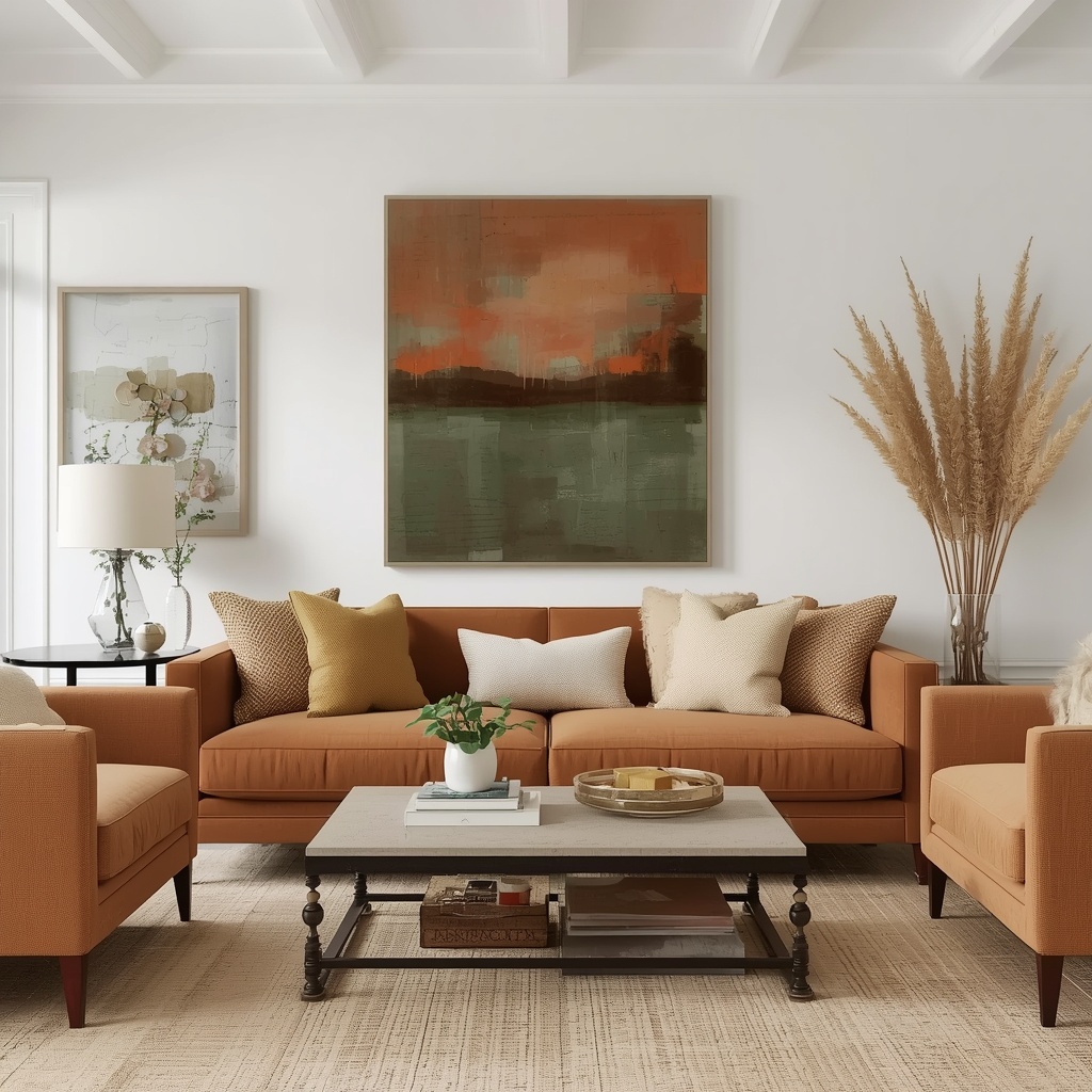
There’s also a psychological component that’s worth mentioning. Warm neutrals and muted earth colors are associated with comfort, stability, and biophilic design — the idea that surrounding ourselves with natural elements and colors improves mood and reduces stress. A living room painted in warm sand or soft terracotta simply reads as more relaxed than one in stark white or cool gray.
“Color is a language everyone understands on some level, even if they can’t articulate why. Earthy palettes speak the language of comfort — they remind us of soil, sun, and shelter, which is exactly what we want a living room to feel like.” — a sentiment echoed by many designers in the biophilic design movement
Understanding the Earthy Color Palette
Before you start pulling paint swatches, it helps to understand the different “families” within the earth tone spectrum. Earthy colors generally fall into four categories, and most well-designed rooms pull from at least two or three of them for balance and depth.
| Color Family | Example Shades | Best Used For | Mood Created |
|---|---|---|---|
| Terracotta & Rust | Burnt orange, brick, clay red | Accent walls, throw pillows, ceramics | Warm, energetic, cozy |
| Olive & Sage Greens | Olive, moss, sage, forest | Sofas, curtains, accent chairs | Calm, natural, grounding |
| Warm Neutrals | Camel, tan, sand, taupe | Walls, large upholstery, rugs | Soft, airy, versatile |
| Deep Browns & Umbers | Chocolate, walnut, chestnut | Wood furniture, leather, trim | Rich, stable, sophisticated |
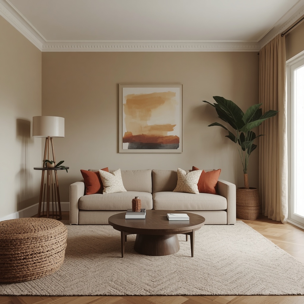
A well-balanced earthy living room usually anchors one large surface — walls, a sectional sofa, or an area rug — in a warm neutral, then layers in terracotta or olive as secondary accents, with deep brown wood tones tying everything together through furniture and trim.
Popular Earthy Tone Color Combinations
If you’re not sure where to start, pairing colors by contrast and undertone is the easiest way to avoid a muddy or flat-looking room. Here are combinations that consistently work well in real living rooms:
- Terracotta + Cream + Walnut — a warm, Mediterranean-inspired combination that feels sunny year-round
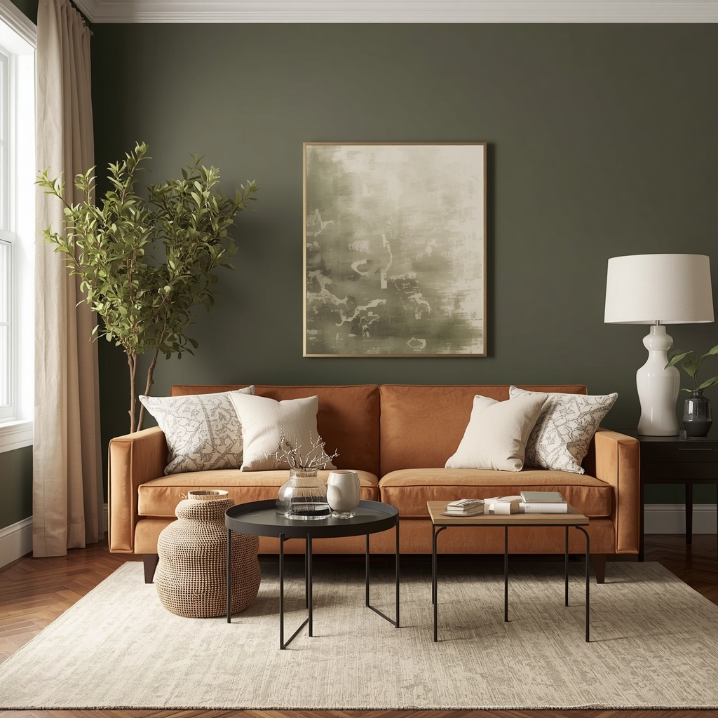
- Olive Green + Camel + Black Accents — a modern, slightly moody take on earthy design
- Sage + Rust + Natural Linen — soft and cottage-inspired, great for smaller spaces
- Chocolate Brown + Mustard + Off-White — a retro-leaning palette with strong contrast
- Sand + Terracotta + Sage — a triadic earth palette that works in open-concept homes
Pro Tip: When combining three or more earth tones, use the 60-30-10 rule: 60% of the room in your dominant neutral (walls, large furniture), 30% in a secondary tone (a sofa or rug), and 10% in an accent color (pillows, art, ceramics). This ratio keeps the palette from feeling chaotic while still layering enough color to feel intentional.
How to Bring Earthy Tones Into Every Element of the Room
Earthy color schemes work best when they’re distributed throughout the room rather than concentrated in one spot, like a single accent wall. Below is a breakdown of how to apply earth tones across the major elements of a living room.
Walls and Paint
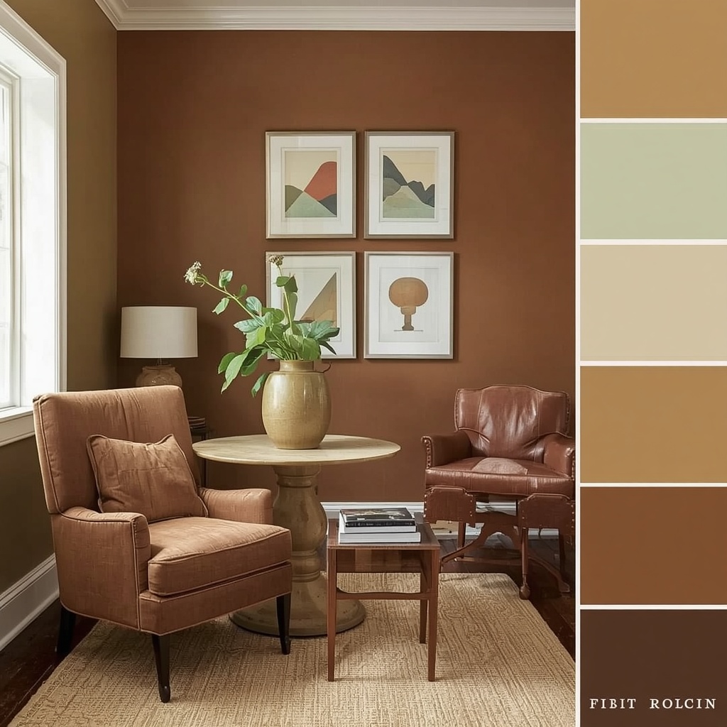
Walls set the tone — literally — for everything else in the room. A warm greige, soft terracotta, or muted clay on the walls creates an enveloping backdrop that makes furniture and art pop without competing for attention. If a full room in a bold earth tone feels risky, start with one accent wall behind the sofa or fireplace.
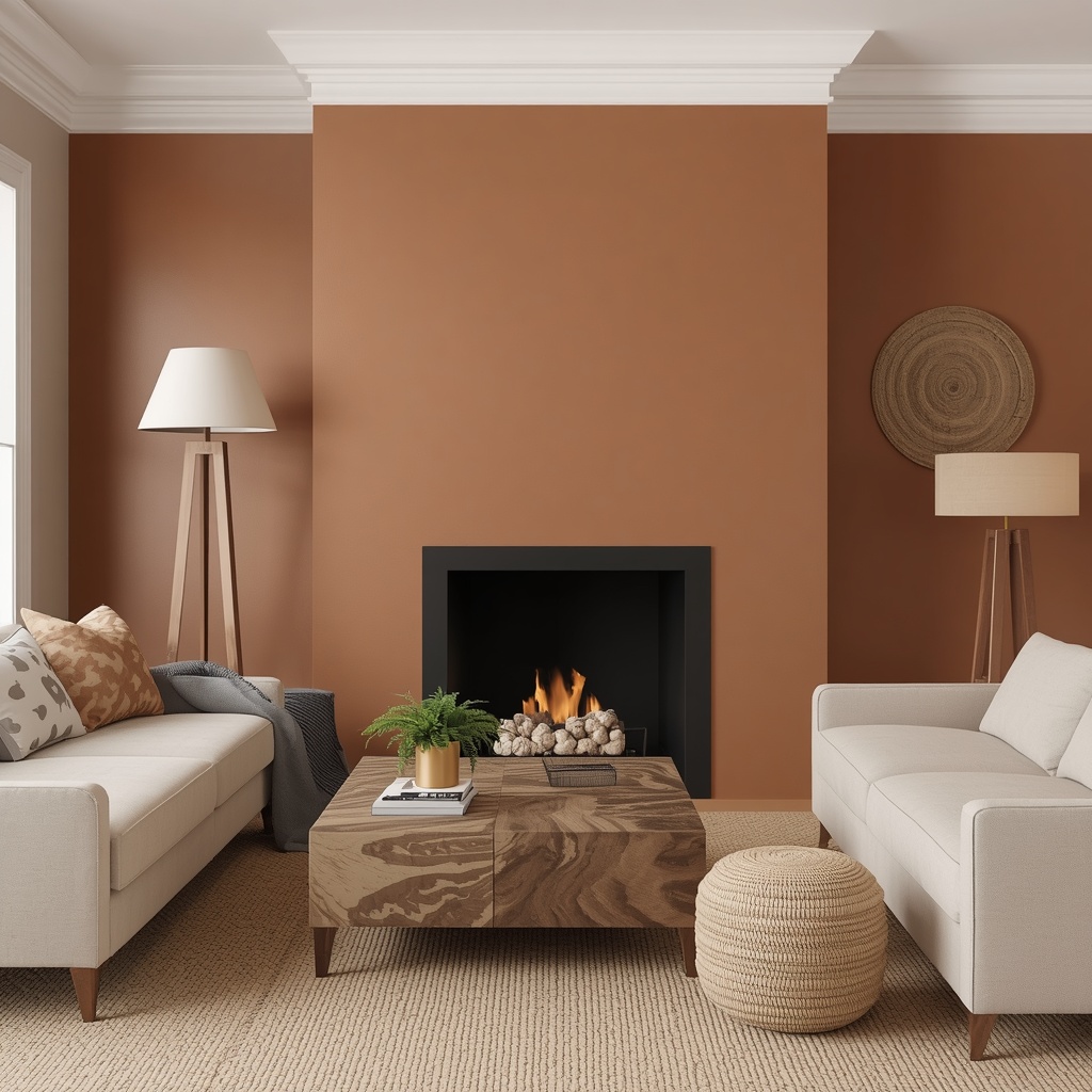
Popular national paint brands like Sherwin-Williams and Benjamin Moore both release earth-toned colors of the year almost annually, which is a good sign of how mainstream this palette has become. Testing large swatches on your actual wall before committing is still the best way to judge how a color shifts with your home’s natural light.
Furniture and Upholstery
A neutral-toned sofa in camel, sand, or warm gray gives you flexibility to rotate accent colors seasonally. If you want to commit further, a boucle or velvet sofa in olive or rust becomes a statement piece on its own. Wood furniture with visible grain — walnut, oak, or teak — naturally complements earth tones because wood is, quite literally, an earthy material.
Textiles: Rugs, Curtains, and Pillows
Textiles are the easiest and most affordable way to experiment with earthy tones without committing to a full repaint. A jute or wool area rug in a natural fiber tone instantly grounds a room, while patterned throw pillows in rust, ochre, or forest green add texture and visual interest.
Accents, Art, and Greenery
Ceramic vases, woven baskets, and natural wood bowls reinforce the earthy theme without adding more color. Layer in artwork with warm, abstract tones or botanical prints, and don’t skip live plants — nothing complements an earth tone palette quite like real greenery.
Earthy Tones and Natural Light: What to Consider
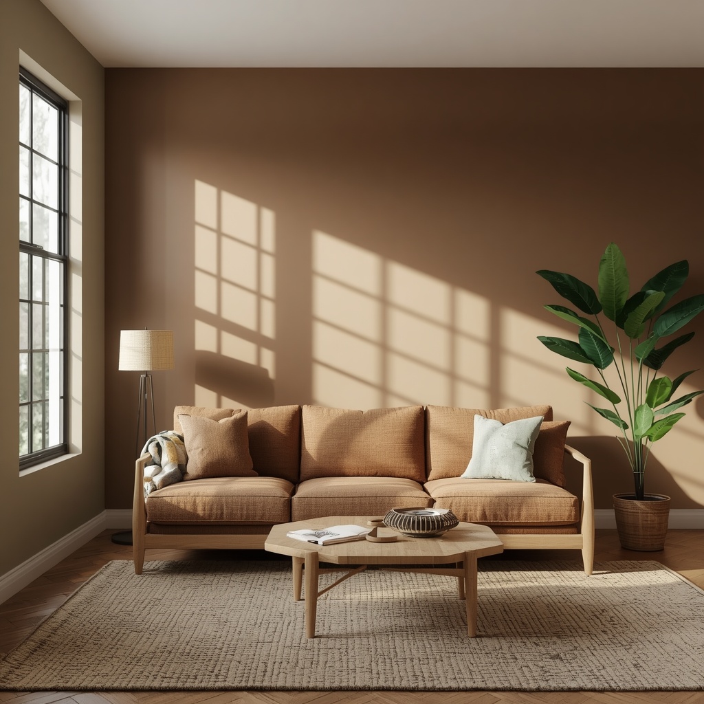
The direction your living room faces has a real impact on how earth tones read on your walls. This is one of the most overlooked factors in home decor planning, and it can make or break a color choice.
| Room Orientation | Light Quality | Recommended Earth Tones |
|---|---|---|
| North-facing | Cool, flat light | Warm terracotta, rust, camel (to counteract coolness) |
| South-facing | Bright, warm light | Deeper olive, chocolate, umber (won’t wash out) |
| East-facing | Bright morning, dim evening | Mid-tone taupe, sand (versatile across light shifts) |
| West-facing | Dim morning, warm evening | Sage, muted clay (balances strong afternoon glow) |
If your living room doesn’t get much natural light, lean toward warmer, lighter earth tones like terracotta or camel rather than deep browns or olive, which can feel heavier and darker in low-light spaces.
Mixing Earthy Tones With Popular Design Styles
One of the best things about an earth tone palette is its versatility — it doesn’t lock you into one design aesthetic. Here’s how earthy colors show up across a few popular interior styles:
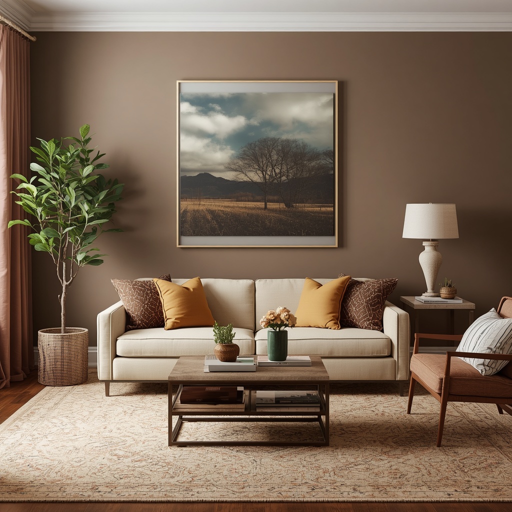
- Modern Boho — layers rust, sage, and cream with natural fiber textures like rattan, jute, and macrame
- Japandi — pairs muted earth tones with clean lines, minimal clutter, and warm wood furniture
- Modern Farmhouse — combines warm neutrals and deep browns with shiplap, black metal accents, and cozy textiles
- Mid-Century Modern — uses mustard, olive, and walnut wood tones with retro-inspired furniture silhouettes
- Coastal Grandmother — softens earth tones with linen whites and sandy taupes for a relaxed, breezy feel
Whatever your existing style, earthy tones tend to slot in as an evolution rather than a full overhaul — which is part of why this palette has such staying power compared to more trend-driven color schemes.
Common Mistakes to Avoid With Earthy Color Palettes
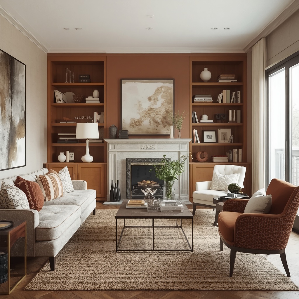
Even a beautiful color palette can fall flat if it’s applied without enough contrast or texture. Here are the mistakes I see most often with clients attempting an earthy living room on their own.
- Using only one earth tone throughout — this reads as monotonous rather than cohesive; aim for at least two or three shades
- Skipping contrast entirely — a small amount of black, cream, or white keeps warm palettes from feeling muddy
- Ignoring texture — flat, smooth surfaces in earth tones can look dull; add boucle, jute, linen, or textured ceramics
- Choosing colors under artificial light only — always check swatches in natural daylight before finalizing
- Overlooking undertones — some “earthy” paints lean more pink or yellow than expected; test large swatches, not tiny chips
Pro Tip: If you’re nervous about committing to a bold earth tone on a large surface, start with a piece of furniture you can return or resell if needed — like an accent chair — before investing in a full room repaint or a custom sofa.
Frequently Asked Questions
Do earthy tones work in small living rooms? Yes, though it’s best to keep the dominant tone lighter (like sand or warm greige) and use deeper colors like rust or chocolate as accents rather than covering large surfaces, which can make a small space feel closed in.
Are earthy tones a passing trend? Earth tones have appeared in interior design for decades, cycling in popularity but never fully disappearing. Because they’re drawn from nature rather than a specific design era, they tend to age better than more saturated, trend-driven palettes.
What flooring works best with earthy color schemes? Natural wood flooring, especially in warm oak or walnut tones, pairs seamlessly with earth tone walls and furniture. Light or bleached wood floors also work well if you want to keep the overall room feeling airy.
Can I mix earthy tones with cool colors like navy or gray? Absolutely. A small amount of navy or charcoal can add welcome contrast to an earth tone palette, as long as the warm tones still dominate the room’s overall balance.
Final Thoughts
Earthy tones remain one of the most reliable, livable color palettes for a modern American living room — versatile enough to suit minimalist, bohemian, or traditional spaces, and warm enough to make a house feel like home. The key is balance: pair a dominant neutral with one or two supporting earth tones, add texture through natural materials, and let the room breathe with a touch of contrast.
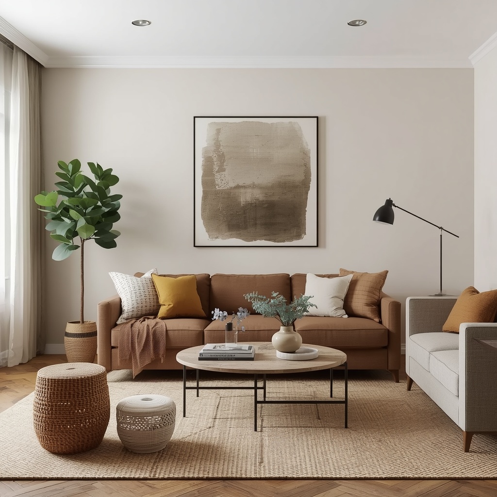
Start small if you need to — a few new throw pillows, a jute rug, or a single accent wall can tell you a lot about how you’ll feel living with a fuller earthy palette. From there, layering in furniture, art, and greenery will bring the whole room together into a space that feels both current and timeless.