
Few design challenges come up as often as the small room. A 600-square-foot apartment in Chicago, a narrow bungalow bedroom in Austin, a compact powder room in Boston: they all raise the same question. How do you make a tight space feel open, airy, and comfortable without knocking down a wall?
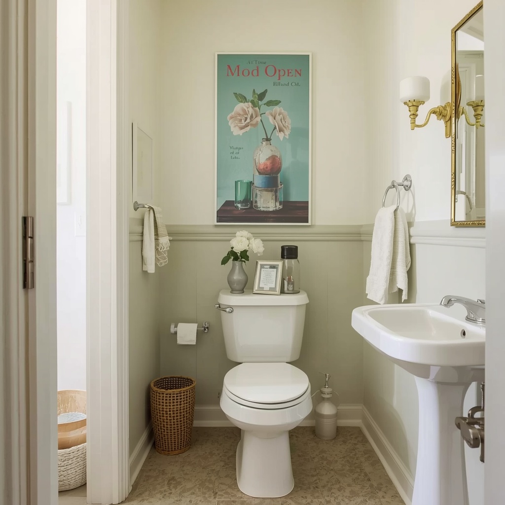
The answer starts with color. The right small space color palette can add perceived depth, lift low ceilings, and make a cramped corner feel intentional. After years of styling compact homes, I’ve learned that paint is the fastest and most affordable way to change how a room feels. This guide covers the palettes, undertones, and finishes that work, plus the mistakes to avoid.
Why Color Changes the Way We Perceive Space
Our eyes read color as distance. Light, cool, and desaturated shades tend to recede, which makes walls feel farther away. Dark, warm, and highly saturated shades tend to advance, which makes walls feel closer. Interior designers use this principle every day to shape how a room feels.
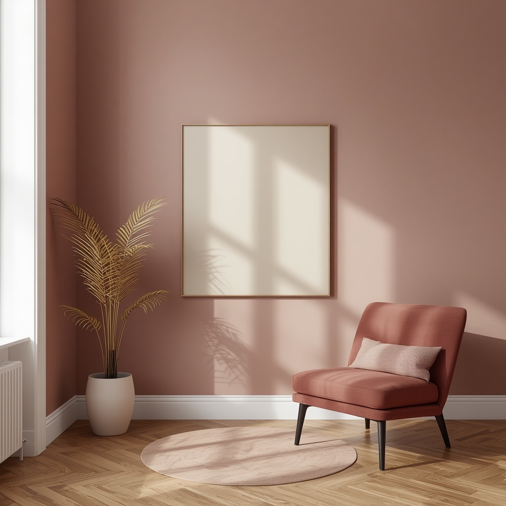
Light also matters. A pale wall bounces light back into the room, spreading brightness across the ceiling and floor. A dark wall absorbs light, so the room feels smaller unless the design is handled with care. For a room with limited square footage, the goal is usually to maximize reflected light and reduce visual clutter.
“In a small room, color should work like an exhale. Every shade should give the eye somewhere to rest.”
Pro Tip: Before choosing any color, stand in the room at three times of day: morning, midday, and evening. Natural light shifts a paint color dramatically, and a shade that looks crisp at noon can turn muddy by dusk.
Understanding LRV and Undertones Before You Buy Paint
Two technical ideas will help you shop for paint with confidence. The first is Light Reflectance Value (LRV), a scale from 0 (pure black) to 100 (pure white) that tells you how much light a paint color reflects. For small rooms, I usually look for LRV numbers of 60 or higher on the walls.
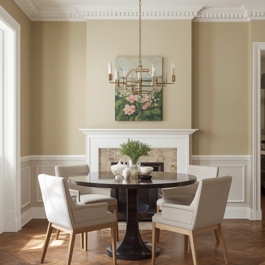
The second is undertone. Every white, gray, and beige leans slightly warm (yellow, red, peach), cool (blue, green, violet), or neutral. Undertones determine whether a color feels fresh or off once it meets your flooring, cabinetry, and lighting. Major brands such as Sherwin-Williams, Benjamin Moore, and Behr list LRV values on their color pages, which makes comparison easy.
| LRV Range | Visual Effect | Best Use in Small Spaces |
|---|---|---|
| 80–95 | Bright, highly reflective | Ceilings, trim, windowless rooms |
| 60–79 | Light, airy | Main walls in most small rooms |
| 40–59 | Mid-tone, cozy | Accent walls, bedrooms, nooks |
| Below 40 | Deep, light-absorbing | Intentional drama, small powder rooms |
The Best Light Paint Colors for Small Rooms
When clients ask for the best paint colors for small rooms, I start with a short list of dependable light shades. Each one reflects plenty of light and keeps sightlines clean. The right pick depends on your room’s exposure and your existing finishes.

Here are the families I reach for most often:
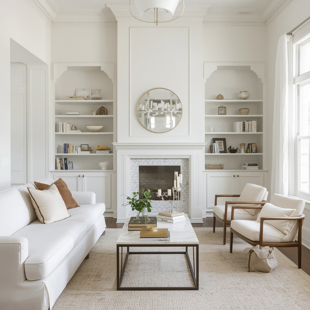
- Soft warm white: a creamy white with a gentle yellow or beige undertone that feels inviting in north-facing rooms
- Crisp neutral white: a clean, balanced white that works with nearly any decor style
- Pale greige: a blend of gray and beige that adds a hint of depth without darkening the room
- Light dove gray: a soft, slightly cool gray for modern and Scandinavian-inspired interiors
- Misty sage: a pale green-gray that feels calm and connects to the outdoors
- Powder blue: a sky-inspired tint that suggests height and openness
Choosing a white deserves more care than most people give it. A stark, bluish white can feel cold and clinical in a small room, while a creamy white with a hint of warmth feels welcoming and still bright.
Pro Tip: Always test paint with large swatches, at least two feet square, on two different walls. Judge them for several days before committing.
Monochromatic Color Schemes: The Designer’s Secret Weapon
If I could recommend only one strategy for a small living room or studio apartment, it would be a monochromatic color scheme. Using one hue in varied tints and shades removes the visual breaks that make rooms feel chopped up. The eye travels smoothly from wall to trim to furniture, and the room feels larger as a result.
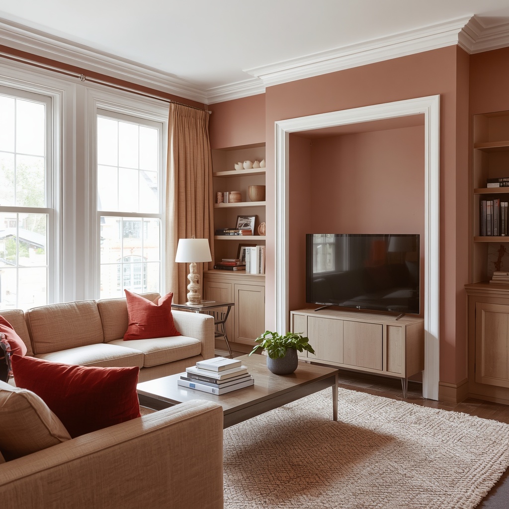
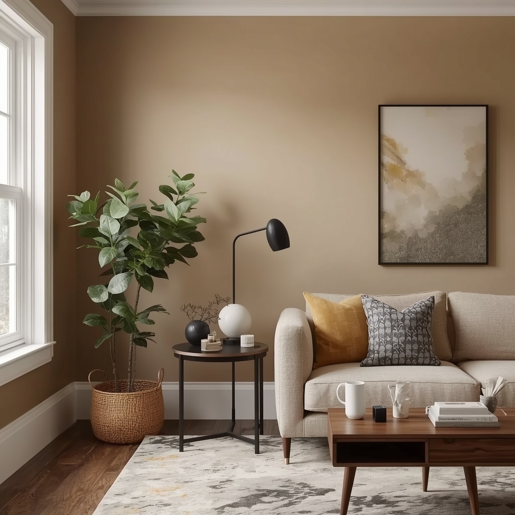
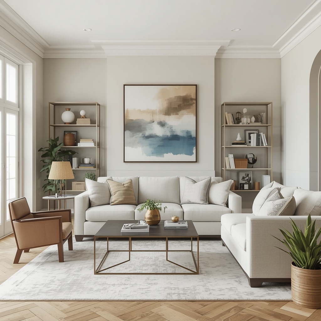
A monochromatic palette doesn’t have to be boring. Layer texture such as linen, boucle, woven baskets, and matte ceramics to add richness without adding color. A pale oatmeal sofa against a slightly deeper oatmeal wall, topped with cream throw pillows, feels cohesive and calm.
| Base Hue | Wall Shade | Furniture and Textiles | Accent Layer |
|---|---|---|---|
| Warm beige | Soft sand | Oatmeal linen, natural jute | Brushed brass |
| Cool gray | Pale dove | Charcoal wool, light concrete | Matte black |
| Sage green | Misty sage | Olive velvet, pale eucalyptus | Warm wood |
| Soft blue | Powder blue | Navy cotton, white linen | Chrome or nickel |
Warm Neutrals vs. Cool Tones: Which One Expands Space Best?
This is one of the most common questions I get, and the honest answer is that both work. Cool tones such as blues, soft grays, and pale greens recede and make walls feel farther away. They suit sunny, south-facing rooms where the light is already warm. Warm neutrals such as cream, sand, and soft taupe add comfort and balance rooms that get little natural light.
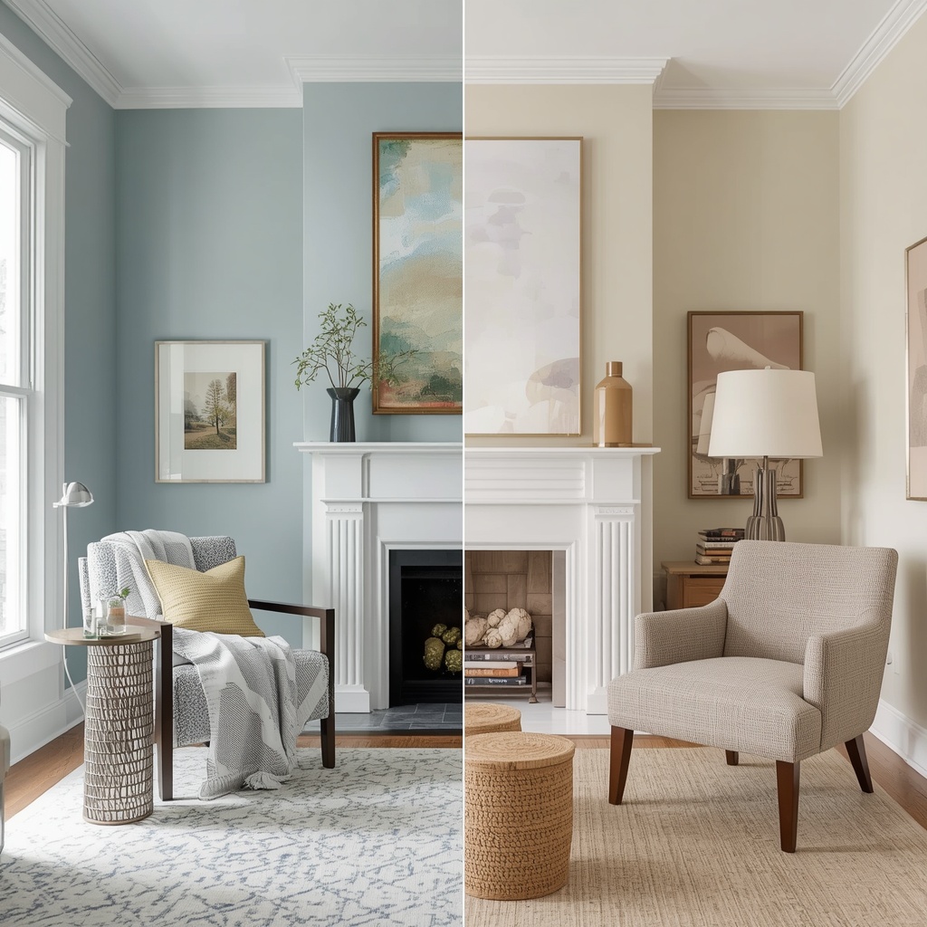
The mistake is choosing based on trend rather than light. A north-facing room with gray walls can feel dreary and shrunken, since north light is naturally cool and flat. In that room I would pick a warm white or a greige with a hint of yellow, which brings the glow back in.
“Match your undertone to your light, not to your Pinterest board.”
Soothing Blues and Greens That Open Up a Room
Nature-inspired shades have a long record of making small spaces feel larger. Pale blues evoke sky and water, and both suggest open distance. Soft greens, particularly gray-greens, bring a restful, airy quality that feels especially good in bedrooms and home offices.
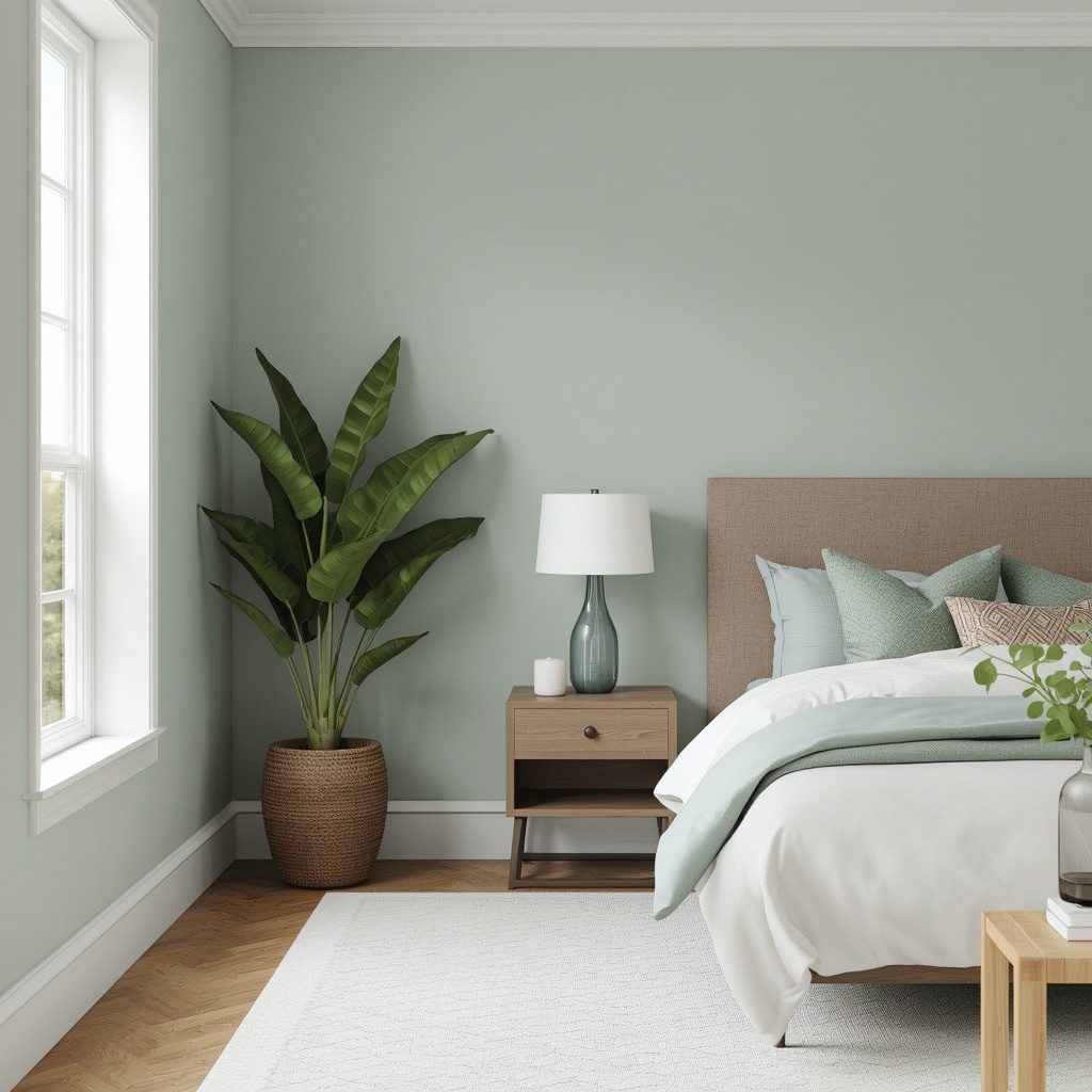
Keep these shades light and slightly muted. A saturated teal or kelly green can overwhelm a compact room, but a whisper of sage or seafoam reads as a neutral with personality. Pair them with white trim and natural wood for a fresh, spa-like look that sells well in today’s real estate market too.
Pro Tip: If you love color but fear a small room will feel boxed in, paint the walls a pale tint of your favorite hue. Choose the version that’s 50 to 75 percent lighter than the paint chip you love.
Can You Use Dark Colors in a Small Space?
Conventional wisdom says never, but I’d call that advice too rigid. Dark colors can work in a small room, though they won’t make it look bigger. What they do is blur the room’s corners and boundaries, so it feels enveloping and intentional rather than cramped. In a powder room, small den, or reading nook, deep navy, forest green, or charcoal can look striking.
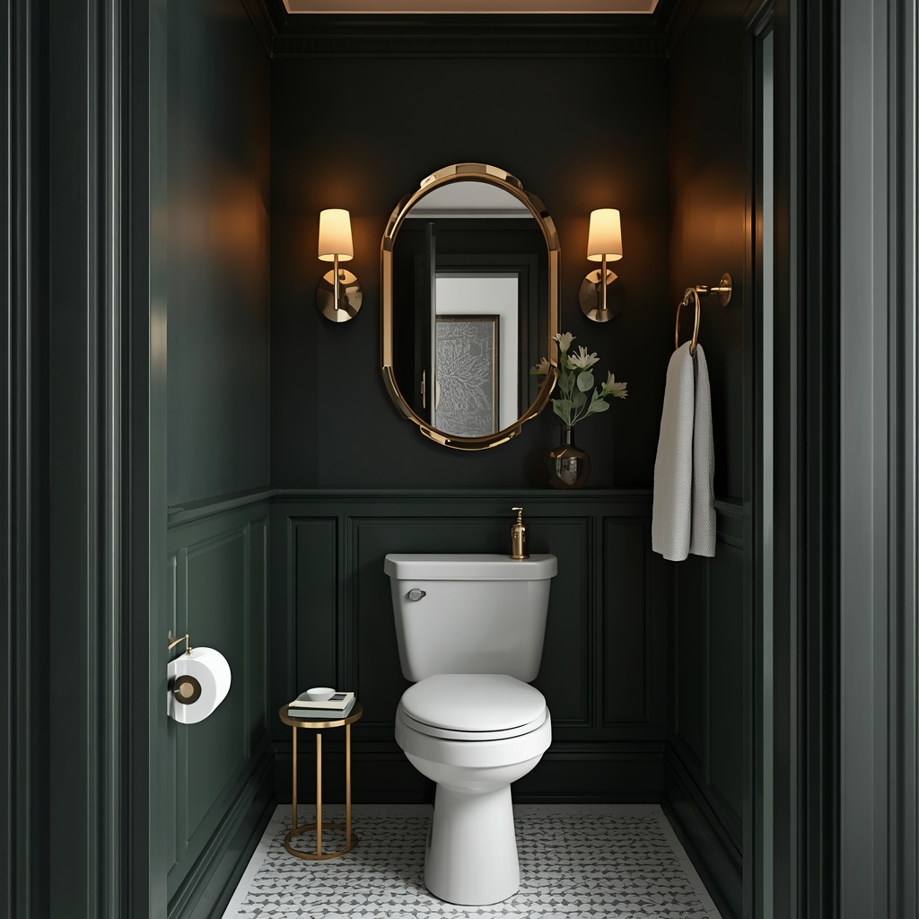
The key is commitment. Paint the walls, trim, and even the ceiling the same dark shade so the edges disappear. Then add warm lighting, a statement mirror, and metallic accents for contrast. This approach, sometimes called color drenching, works best in rooms you use mostly in the evening.
Using Color Drenching and Tone-on-Tone Techniques
Color drenching means painting every surface in one color, including walls, baseboards, doors, and sometimes the ceiling. In a small light-colored room, the effect is seamless and quietly luxurious. Without contrast lines, the eye can’t tell where the room stops, so it feels more expansive.
A gentler version is tone-on-tone painting, where trim is just one or two shades lighter or deeper than the walls. This approach suits smaller homes where stark white trim might make the room feel boxy. It also hides scuffs and shadows, which keeps the space looking cleaner for longer.
Don’t Forget the Ceiling, Trim, and Floor
Walls get the attention, but the ceiling is the fifth wall and has a major effect on perceived height. Painting the ceiling a bright white, or a very pale tint of the wall color, draws the eye upward. For rooms with low ceilings, I like a ceiling color that’s 25 percent lighter than the walls.
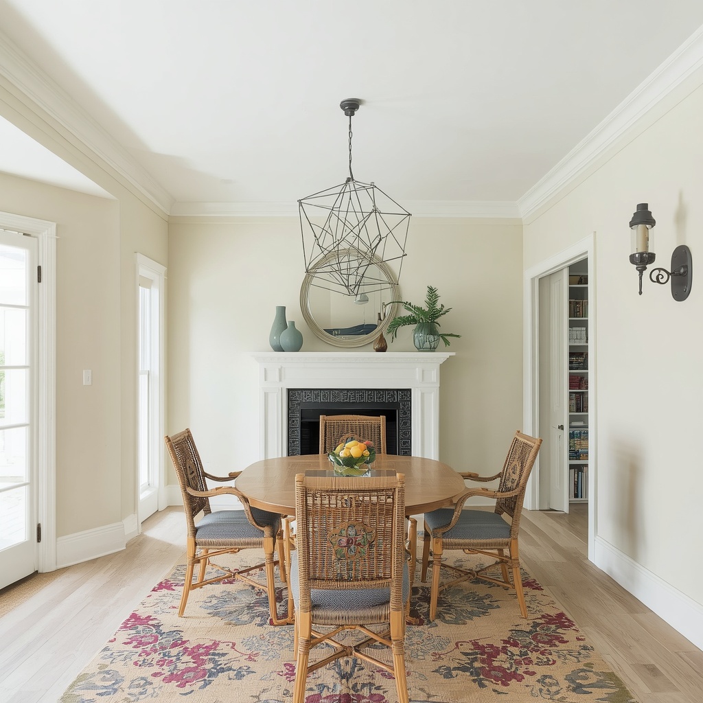
Flooring counts too. Light wood floors, pale oak, or light porcelain tile extend the visual field and bounce light around the room. If you have dark floors you can’t replace, a large light-colored area rug can break up the expanse and lift the whole space. For more on how floors and walls work together, browse the Houzz photo galleries to see small room ideas in real homes.
Pro Tip: Run the same flooring through connected rooms and paint adjoining walls in related shades. Continuous visual flow is one of the best open-concept tricks for a small floor plan.
Room-by-Room Color Palette Recommendations
Every room serves a different purpose, so the ideal palette shifts. Here is a quick reference I share with my clients:
| Room | Recommended Palette | Why It Works |
|---|---|---|
| Small living room | Warm white, pale greige, soft taupe | Creates a bright, welcoming base for layered decor |
| Bedroom | Misty blue, sage, soft lavender-gray | Promotes calm and a sense of space |
| Kitchen | Crisp white, pale gray, light butter yellow | Reflects light and keeps counters feeling clear |
| Bathroom | Seafoam, light aqua, soft white | Evokes freshness and visual openness |
| Home office | Light gray-green, cool white | Supports focus without feeling confining |
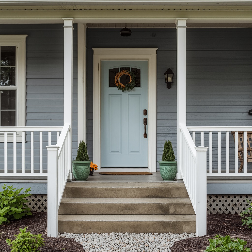
| Entryway | Pale warm neutral with a bold door | Makes a small foyer feel gracious |
| Studio apartment | One cohesive neutral family throughout | Unifies zones into one large-feeling space |
How Lighting and Paint Finish Affect Perceived Size
Even the perfect color falls flat under poor lighting. Layer your lighting with ambient, task, and accent sources so no corner falls into shadow. Bulbs matter as well. For most small rooms, a warm white bulb around 2700K to 3000K flatters warm neutrals, while 3500K to 4000K suits cooler palettes and workspaces.
Finish changes the story too. Flat and matte paints hide wall imperfections but absorb more light. Eggshell and satin finishes have a soft sheen that reflects a touch more glow, which is why they’re a popular choice for small living spaces. Semi-gloss on trim and doors adds subtle definition. Avoid high-gloss on walls, since it highlights every flaw.
- Matte or flat: best for ceilings and low-traffic walls
- Eggshell: a good all-around choice for living rooms and bedrooms
- Satin: durable and light-reflecting, ideal for kitchens, baths, and hallways
- Semi-gloss: best for trim, cabinets, and doors
Smart Accents That Help a Small Room Feel Larger
Once the base palette is set, accents bring personality without crowding the space. Mirrors are the classic trick for good reason, since a large mirror placed opposite a window doubles natural light and implies extra depth. Glass, acrylic, and metallic finishes work in the same way by reflecting light instead of blocking it.
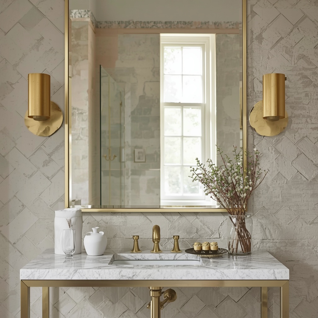
Keep your accent colors limited to one or two, and repeat them in small doses across the room. A single deep-toned throw, a pair of artwork pieces in a coordinating hue, or a few green plants add life without visual noise. Sheer curtains in white or ivory, hung high and wide, soften the window and make ceilings look taller.
Pro Tip: Follow the 60-30-10 rule. Use 60 percent main color (walls and large furniture), 30 percent secondary color (upholstery, rugs, curtains), and 10 percent accent color (pillows, art, accessories).
Common Color Mistakes That Make Small Spaces Feel Smaller
Even experienced homeowners fall into a few predictable traps. Avoiding them is often just as important as choosing the right shade.
- Using too many colors: busy palettes chop up sightlines and make rooms feel cluttered
- Choosing stark, cold white: it can feel sterile and make the room look flat
- Ignoring undertones: a pink-leaning beige clashing with green-leaning flooring creates visual tension
- Painting only one wall dark: this can make the room feel lopsided unless it’s done intentionally
- Skipping samples: colors on a screen or small chip rarely match real-world results
- Forgetting about contrast: high-contrast trim lines can emphasize the edges of a tight room
Frequently Asked Questions About Small Room Paint Colors
Is white always the best color for a small room? Not always. White and off-white reflect the most light, but rooms with poor natural light can feel flat in pure white. Warm creams or light greiges often feel more inviting while still reading as bright.
Should I paint the ceiling the same color as the walls? It depends on your goal. Matching creates a seamless, enveloping look, while a lighter ceiling lifts the eye upward. For low ceilings, a slightly lighter shade works best.
What is the best paint color for a small, dark room? Choose a warm, light neutral with a high LRV, such as a soft cream or pale greige. Pair it with layered lighting and reflective surfaces to compensate for the lack of daylight.
Do accent walls make a room look smaller? A dark accent wall on the short end of a narrow room can make it feel more balanced. A dark accent on a long wall may bring it visually closer and make the room feel narrower.
Final Thoughts: Let Color Do the Heavy Lifting
You don’t need a bigger floor plan to enjoy a more spacious home. With thoughtful color selection, you can expand a small space visually using light hues, consistent undertones, and smart finishes. Start with high-LRV neutrals or soft blues and greens, keep your palette cohesive, and let texture and lighting add depth.
Remember that every home is different. Test your samples, trust the light in your own room, and don’t be afraid to break a rule if it suits your lifestyle. When color is chosen with intention, even the smallest room can feel open, calm, and beautifully designed.