
Most homeowners paint their walls, style their furniture, and layer in decor — then stop and slap the same flat white on the ceiling without a second thought. That’s a missed opportunity. As an interior designer, I can tell you that the ceiling, often called the “fifth wall,” is one of the most underused surfaces in the American home.
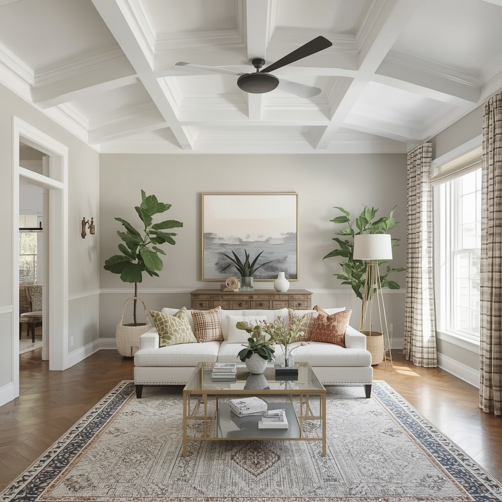
A well-chosen ceiling paint color or finish can make a room feel taller, cozier, more dramatic, or more architecturally rich — often for the cost of a single gallon of paint. In this guide, I’ll walk you through the color strategies, finishes, and techniques professional designers use to turn a blank ceiling into a genuine design feature.
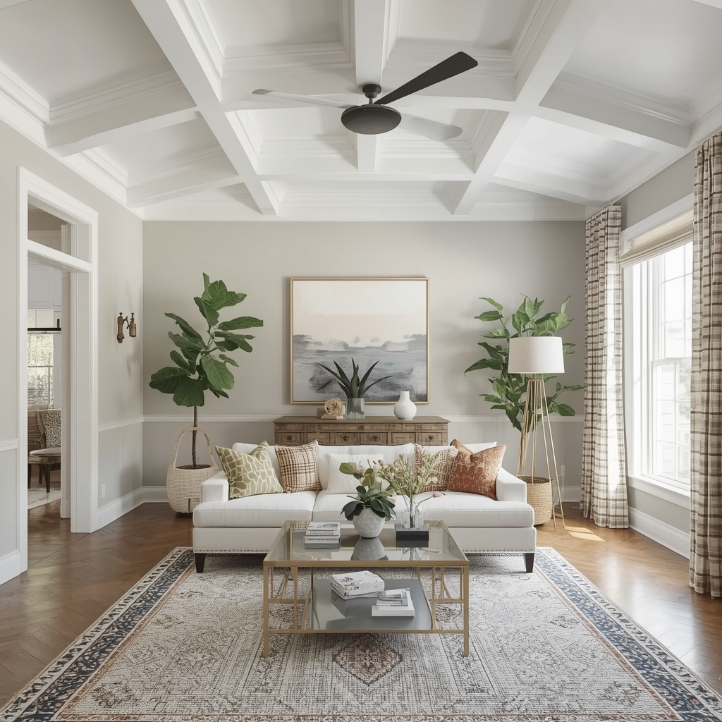
Why the Ceiling Is the Fifth Wall of Design
For decades, “ceiling white” was treated as a default rather than a decision. But design-savvy homeowners and professional decorators now approach the ceiling the same way they approach any wall: as a canvas for color, contrast, and texture. Thinking of your ceiling as the fifth wall shifts your entire approach to a room’s architecture.
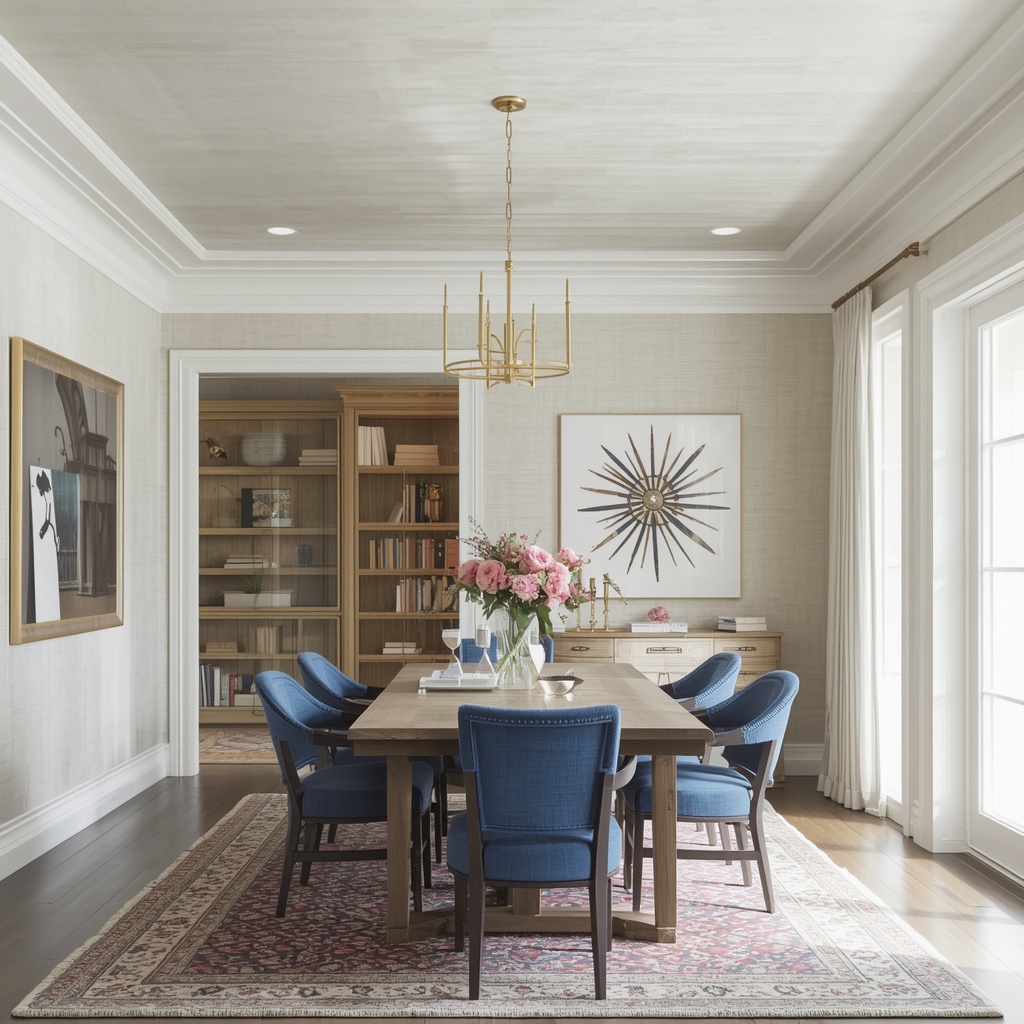
This mindset shift matters because ceilings interact directly with light, proportion, and mood. A glossy black ceiling in a small powder room can feel jewel-box dramatic, while a soft sky blue on a porch ceiling has been a Southern tradition for generations. The point is that ceiling paint isn’t an afterthought — it’s a legitimate architectural tool.
“The ceiling sets the emotional tone of a room before you even notice the walls. Get it right, and everything below it feels intentional.” — a common refrain among residential designers
Choosing the Right Sheen for Your Ceiling
Before you even touch color, sheen matters enormously. The finish you choose affects how light bounces around the room, how forgiving the surface is of imperfections, and how durable the paint job will be over time.
| Sheen | Best For | Pros | Cons |
|---|---|---|---|
| Flat/Matte | Traditional ceilings, uneven drywall | Hides imperfections, minimizes glare | Harder to clean, shows scuffs |
| Eggshell | Bedrooms, living rooms | Slight sheen, easy touch-ups | Can highlight minor flaws |
| Satin | Kitchens, bathrooms, hallways | Moisture-resistant, wipeable | More visible imperfections |
| Semi-Gloss | Trim-matched ceilings, moldings | Durable, reflective, crisp | Emphasizes every flaw |
| High-Gloss | Statement or “lacquered” ceilings | Maximum drama and light reflection | Requires flawless drywall prep |
Pro Tip: If your ceiling has visible seams, popcorn texture, or patch marks, stick with flat or matte sheens. Glossy finishes are stunning in magazine photos, but they magnify every imperfection under direct light — so they’re best reserved for freshly skim-coated or very smooth ceilings.
Color Strategies That Add Architectural Interest
Once you’ve settled on sheen, color is where the real transformation happens. Below are the strategies professional designers reach for most often when a ceiling needs personality.
Bold Contrast Ceilings
Painting the ceiling in a color noticeably darker or more saturated than the walls creates an intentional, almost architectural “cap” on the room. Deep navy, forest green, or charcoal ceilings paired with lighter walls read as confident and curated rather than accidental.
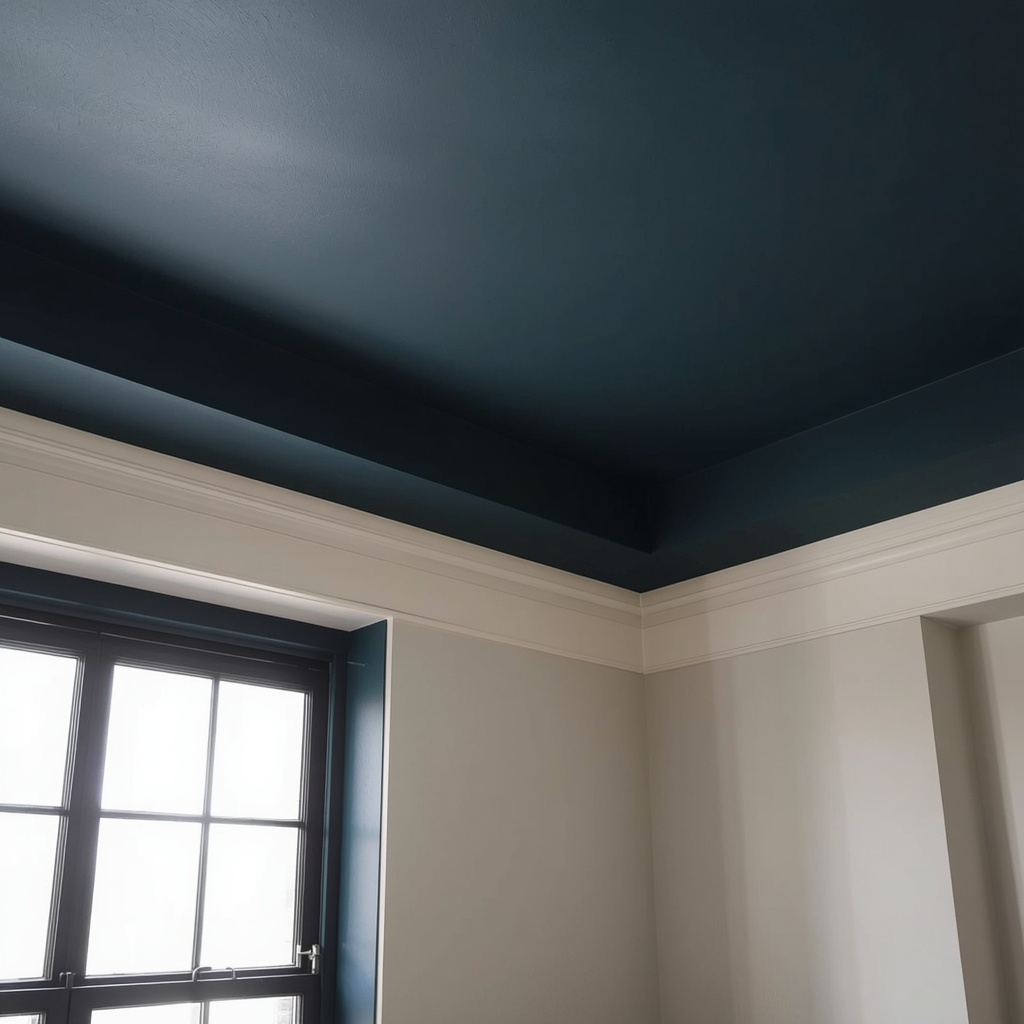
This approach works especially well in dining rooms and libraries, where a moodier atmosphere is welcome. It also visually lowers a ceiling that feels too tall and disconnected from the room’s furniture scale, making large or oddly proportioned spaces feel more intimate.
Tone-on-Tone (Monochromatic) Ceilings
Rather than a stark contrast, tone-on-tone ceilings use a slightly lighter or darker shade of the same wall color. This is a subtler nod to a colored ceiling that still reads as sophisticated and cohesive rather than jarring.
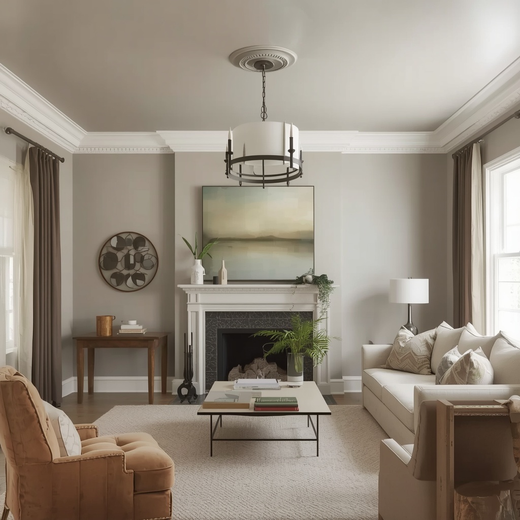
Designers often use this technique in bedrooms and primary suites, where the goal is a cocooning, enveloping feel without the visual punch of a full color shift. It’s an easy entry point if you’re new to ceiling color and want something low-risk but still elevated.
Color Drenching
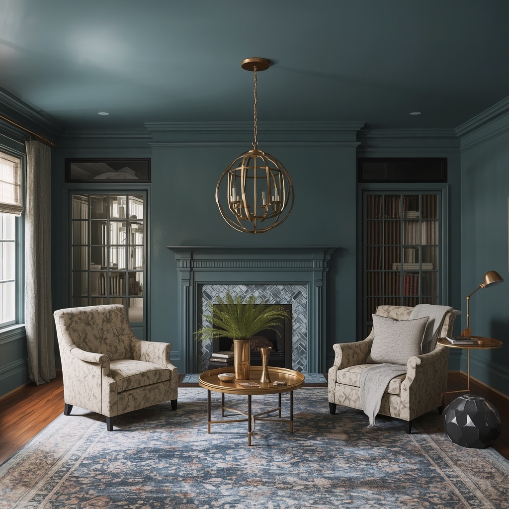
Color drenching — painting the walls, trim, and ceiling all in the same hue — has become one of the most talked-about trends in American interior design. It eliminates the visual “stop” where wall meets ceiling, making the entire room feel like a single, immersive volume.
This technique is particularly effective in smaller rooms, powder baths, and reading nooks, where breaking up the surfaces with contrasting colors can make the space feel choppy or busy. Fully drenched rooms often photograph beautifully and create a strong sense of intentional design.
Two-Tone Trim Contrast
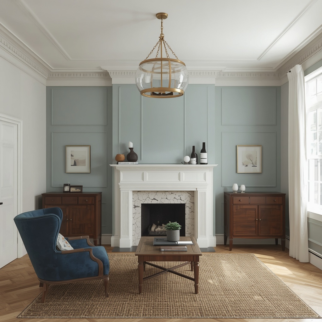
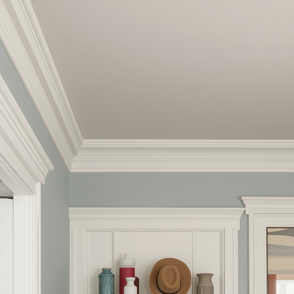
For homes with existing crown molding or ceiling trim, painting the trim a crisp white while the ceiling field takes on a soft color creates architectural definition without a full commitment to a dramatic hue. This approach highlights existing millwork and adds depth to flat, builder-grade ceilings.
Pro Tip: When in doubt about committing to a saturated ceiling color, test it first. Buy sample-size pots, paint large poster-board swatches, and tape them to the ceiling at different times of day. Ceiling paint reads very differently under morning light versus evening lamp light, and a shade that looks perfect on the wall can look completely different overhead.
Ceiling Paint Ideas by Room
Different rooms call for different ceiling strategies. Here’s a quick-reference breakdown to help you match color psychology and function to each space.
| Room | Suggested Ceiling Approach | Why It Works |
|---|---|---|
| Living Room | Soft greige or warm white, or a bold contrast in deep green | Balances everyday use with visual warmth |
| Dining Room | Rich navy, black, or aubergine | Creates drama for evening entertaining |
| Primary Bedroom | Tone-on-tone dusty blue or clay | Enveloping, restful atmosphere |
| Kids’ Room | Playful pastel or soft sky blue | Adds whimsy without overwhelming |
| Kitchen | Bright white or pale warm neutral | Reflects light over work surfaces |
| Home Office | Deep teal or charcoal | Reduces glare, supports focus |
| Powder Room | High-gloss black or jewel tone | Small space, maximum drama |
| Covered Porch | “Haint blue” | Traditional, reflects sky and light |
| Entryway/Foyer | Warm terracotta or soft gold | Welcoming first impression |
Trending Ceiling Colors for 2026
Designers are seeing a clear shift away from stark, cold white ceilings toward warmer, more atmospheric choices. Here are the shades generating the most requests from homeowners this year:
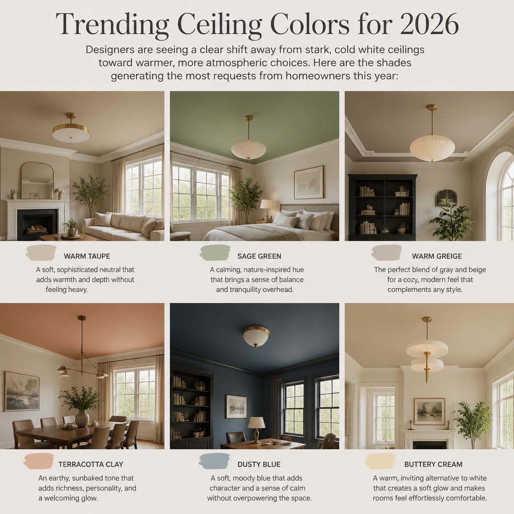
- Warm White – A softer alternative to bright white that avoids a clinical, sterile look
- Sage and Muted Green – Continues its multi-year run as a calming, nature-inspired neutral
- Deep Charcoal – A modern, moody alternative to black that still reads sophisticated
- Dusty Terracotta – Brings warmth and an earthy, organic feel to ceilings
- Classic Haint Blue – A historic Southern porch tradition now migrating indoors
- Soft Clay and Mushroom Tones – Part of the broader “quiet luxury” neutral palette trend
Techniques Beyond Solid Color
Color isn’t the only way to add architectural interest overhead. A few additional techniques can elevate a ceiling even further:
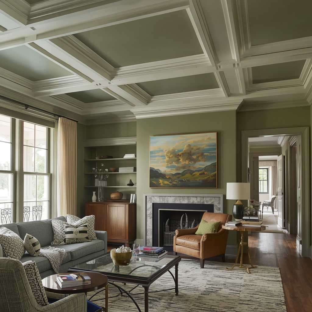
- Painted Stripes or Geometric Patterns – Create visual rhythm in a nursery, hallway, or reading nook
- Ombre Ceilings – A gradual color fade from wall to ceiling center for a soft, cloud-like effect
- Stenciled Motifs – Adds a subtle pattern reminiscent of plaster medallions or tin ceiling tiles
- Faux Tin Ceiling Paint Techniques – Mimics the look of pressed metal ceilings popular in historic homes
- Wallpaper-Ceiling Pairing – Painted trim borders framing a wallpapered ceiling panel for a layered, custom look
Pro Tip: If you love the idea of pattern but aren’t ready to commit to a full stenciled or striped ceiling, start small. Apply the technique to a closet, mudroom, or powder room ceiling first. It’s a low-risk way to test your comfort level with a bold architectural statement before scaling it to a primary living space.
Common Ceiling Paint Mistakes to Avoid
Even a great color choice can fall flat if execution missteps get in the way. Keep these common pitfalls in mind:
- Skipping proper primer, especially over stains, smoke damage, or patched drywall
- Choosing too glossy a sheen on an uneven or textured ceiling
- Ignoring undertones — a “warm white” ceiling can clash with cool-toned walls
- Cutting corners on edges, leaving visible roller lines near crown molding
- Not testing under both natural and artificial light before committing to a full room
- Forgetting ventilation in bathrooms and kitchens, where moisture-resistant paint matters most
How to Prep and Paint Your Ceiling Like a Pro
A beautiful ceiling color is only as good as the prep work behind it. Follow this general sequence for a professional-quality result:
- Clear the room and cover flooring and furniture with drop cloths
- Dust and spot-clean the ceiling to remove cobwebs, grease, and residue
- Patch any cracks, nail pops, or water stains, and let them fully dry
- Apply a stain-blocking primer if you’re covering water damage, smoke, or a dramatic color shift
- Cut in the edges along crown molding or wall lines with an angled brush
- Roll the field using a thick nap roller for even texture and full coverage
- Apply a second coat once the first is fully dry for depth and durability
- Inspect under both daylight and lamp light before calling the job finished
If you’re working with high ceilings, vaulted ceilings, or intricate trim, this is one project where hiring a professional painter can be worth the investment — both for safety and for a flawless finish on a highly visible surface.
Frequently Asked Questions
Does a dark ceiling make a room feel smaller? Not necessarily. A dark ceiling can make a tall room feel cozier and more proportional, though it may make an already low ceiling feel more compressed. Room height and lighting play a bigger role than color alone.
What’s the best white for a ceiling if I want to keep it simple? Look for a warm white with a hint of cream or gray undertone rather than a stark, blue-based white, which can feel cold and clinical under artificial lighting.
Should ceiling paint match the walls exactly? It doesn’t have to. Many designers recommend a lighter or darker version of the wall color, or a complementary tone, rather than an exact match, to add subtle depth.
Is it more expensive to paint a ceiling than a wall? Material costs are similar, but labor can run higher due to the physical difficulty of overhead painting, the need for careful edge work near trim, and potential ceiling texture.
Final Thoughts
Your ceiling has more design potential than most homeowners realize. Whether you go bold with a deep, moody hue, subtle with a tone-on-tone approach, or immersive with full color drenching, the fifth wall deserves the same thoughtful attention as the walls below it. Start small if you’re unsure, test your colors under real lighting conditions, and don’t be afraid to look up — literally — the next time you’re planning a room refresh.
Looking for more color inspiration? Reputable paint manufacturers like Sherwin-Williams and Benjamin Moore offer free digital tools to preview ceiling and wall color combinations before you buy.