
If you’ve ever painted a wall “simple white” only to watch it turn ghostly blue at night or sickly yellow by afternoon, you already know the truth: there is no such thing as a neutral white. Every white paint carries a hidden undertone, and that undertone is exactly why the perfect white in your friend’s kitchen can look completely wrong in yours.

As an interior designer who’s spent years helping US homeowners navigate paint aisles full of names like “Swiss Coffee,” “Chantilly Lace,” and “Alabaster,” I can tell you this is the single most common decorating mistake I see. White paint looks deceptively simple in a can, but it is one of the most nuanced colors in the entire palette. This guide will walk you through everything you need to know about white paint undertones so you can choose with confidence — not guesswork.
Why White Paint Is Never Just White
White paint is made by combining a white base with tiny amounts of other pigments. Those trace pigments are what create an undertone — a subtle hint of color that only becomes visible under certain lighting or next to certain materials. Manufacturers add these pigments intentionally, because a pure, unaltered white often looks stark, clinical, and even a little unsettling in a home.
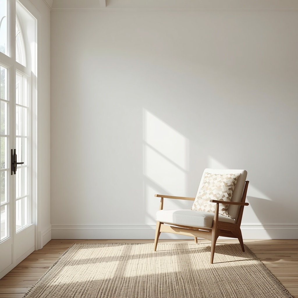
Think of undertones like a whisper rather than a shout. You may not notice them in isolation, but the moment you place a swatch next to your countertop, your trim, or your afternoon sunlight, that whisper becomes impossible to ignore. This is why designers rarely trust a paint chip at the store — it’s telling only part of the story.
The Three Main Categories of White Undertones
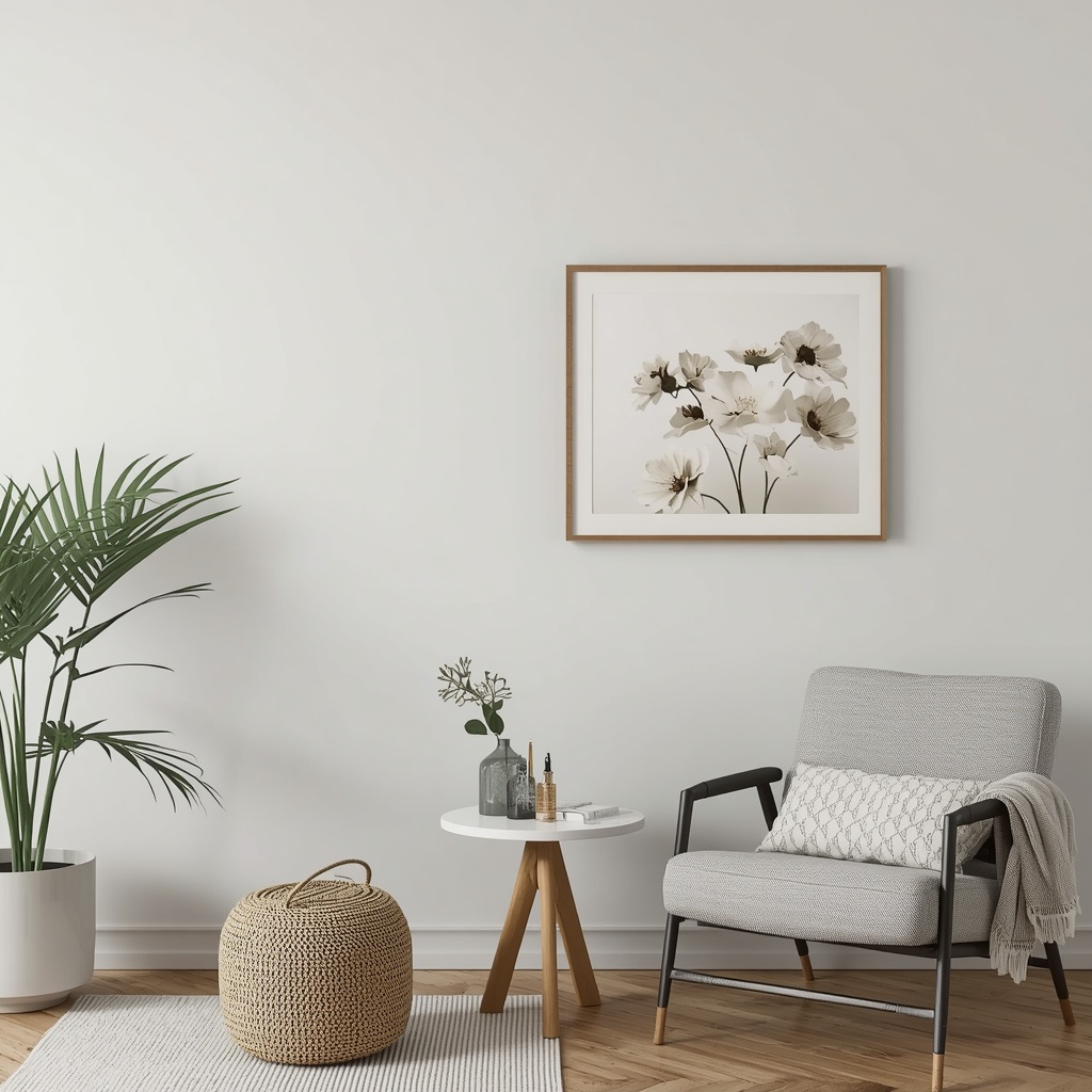
Every white paint falls somewhere on a spectrum between warm, cool, and neutral. Understanding these categories is the foundation of choosing the right shade for your space.
| Undertone Category | Common Underlying Pigments | Visual Effect | Best Paired With |
|---|---|---|---|
| Warm Whites | Yellow, red, beige | Cozy, soft, inviting | Wood tones, brass, terracotta, earthy textiles |
| Cool Whites | Blue, green, gray | Crisp, clean, modern | Chrome, marble, black accents, minimalist decor |
| Neutral (Greige) Whites | Balanced gray-beige | Versatile, adaptable | Almost any palette, transitional or coastal styles |
Warm whites tend to glow beautifully in north-facing rooms that get cooler, bluer natural light, since the warmth in the paint balances out the coolness in the air. Cool whites shine in south-facing rooms flooded with warm afternoon sun, because they counteract that golden cast. Neutral whites are the chameleons of the paint world — they shift subtly depending on what’s around them, which makes them a safe (if slightly less dramatic) choice for many homes.
How Natural and Artificial Light Change Everything
Lighting is the single biggest variable in how a white paint reads on your walls, and it’s the reason so many people feel betrayed by their paint choice after the fact.
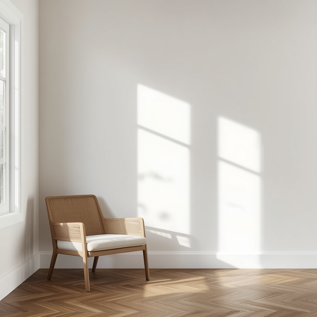
- North-facing rooms receive indirect, cooler light, which can make whites look flatter and slightly blue or gray.
- South-facing rooms get strong, warm light for most of the day, which can wash out cool whites and make warm whites glow.
- East-facing rooms are warm in the morning and cooler by afternoon, so undertones can shift throughout the day.
- West-facing rooms stay cool most of the day before turning warm and golden in the evening.
- Artificial lighting matters too: LED bulbs often cast a cooler, bluish light, while incandescent and warm LED bulbs cast a yellow glow that can amplify warm undertones.
“Paint color is not a fixed decision — it’s a conversation between the pigment and the light in the room.” This is something worth remembering before you commit to a full gallon.
Popular White Paint Shades and Their Undertones
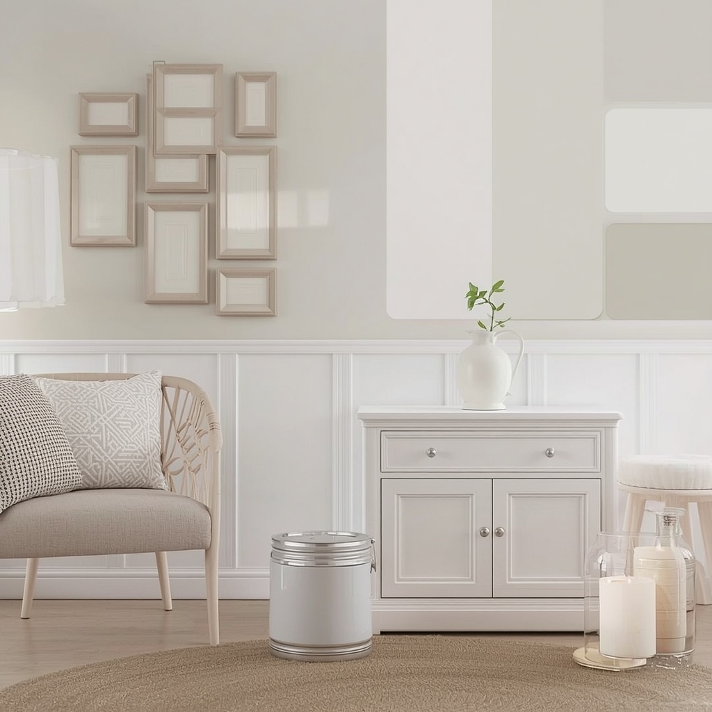
To make this practical, here’s a breakdown of some of the most popular whites on the US market and where they typically land on the undertone spectrum.
| Paint Name | Brand | Undertone | Best For |
|---|---|---|---|
| Alabaster | Sherwin-Williams | Warm, soft greige | Living rooms, whole-house neutral |
| Chantilly Lace | Benjamin Moore | Clean, slightly cool | Trim, cabinetry, modern kitchens |
| Swiss Coffee | Behr | Warm cream | Cozy bedrooms, farmhouse style |
| White Dove | Benjamin Moore | Warm, soft | Trim and walls, classic homes |
| Simply White | Benjamin Moore | Warm with a hint of yellow | Traditional and coastal interiors |
| Pure White | Sherwin-Williams | Balanced, slightly cool | Scandinavian and minimalist spaces |
| Snowbound | Sherwin-Williams | Cool gray-white | Modern and contemporary interiors |
Keep in mind that paint formulations can be updated by manufacturers over time, so it’s always worth ordering a physical sample before buying in bulk.
How to Test Undertones Before You Commit
The paint chip in the store is lit by fluorescent lighting designed to make every color look good — which is exactly why it can’t be trusted on its own. Here’s the process I walk my own clients through.
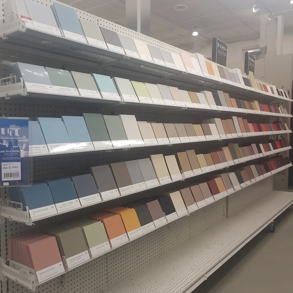
- Order large sample swatches or peel-and-stick samples, not just tiny chips.
- Place them on multiple walls, including the darkest corner and the brightest window wall.
- Observe at three times of day — morning, midday, and evening — since undertones shift with the sun.
- Check under your actual light bulbs, not the store’s lighting.
- Hold the swatch next to fixed elements like flooring, countertops, and trim to see how it interacts.
- Compare two or three whites side by side rather than judging one in isolation — undertones are almost invisible until you have something to compare them to.
- Live with it for at least 48 hours before making a final decision.
Pro Tip
Pro Tip: Squint at your paint swatch next to a piece of plain printer paper. Printer paper is about as close to a true, pigment-free white as you’ll find in most homes, and squinting blurs out detail so your eye focuses purely on color temperature. If the swatch looks yellow, pink, or blue compared to the paper, that’s your true undertone revealing itself.
Choosing White Paint Room by Room
Different rooms have different lighting conditions, functions, and emotional goals, so the “best” white genuinely changes from space to space.
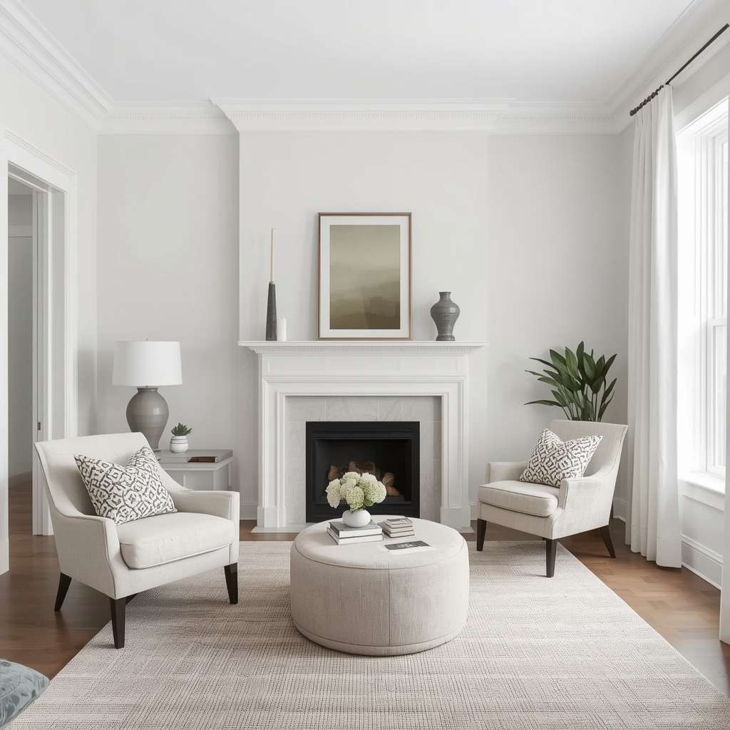
- Kitchens: Cool or neutral whites tend to pair best with stainless steel, marble, and quartz countertops, keeping the space feeling fresh and clean.
- Bedrooms: Warm whites create a cozier, more restful atmosphere, especially in rooms used mostly in the evening.
- Bathrooms: Cool whites complement chrome fixtures and tile, while warm whites soften a space with a lot of hard, reflective surfaces.
- Living rooms: Neutral, greige-based whites offer the most flexibility for mixing wood tones, textiles, and artwork.
- Home offices: Cooler whites can support focus and alertness, especially when paired with natural light.
- Trim and molding: A slightly cooler or brighter white than your wall color helps trim pop without looking mismatched.
Common Mistakes Homeowners Make With White Paint
Even well-intentioned homeowners run into the same handful of pitfalls again and again.
- Choosing based on a single tiny chip instead of a large sample viewed in the actual room.
- Ignoring fixed finishes like flooring, countertops, and existing trim, which all have undertones of their own.
- Painting an entire home the same white without accounting for how each room’s light differs.
- Skipping the primer step, which can cause old wall colors to bleed through and distort the new white’s undertone.
- Forgetting sheen level, since glossier finishes reflect more light and can intensify undertones, while matte finishes soften them.
- Rushing the decision instead of living with samples for a few days.
Matching White Paint to Your Home’s Existing Color Scheme
White rarely exists in isolation — it’s almost always working alongside flooring, cabinetry, furniture, and metal finishes. As a general rule of thumb:
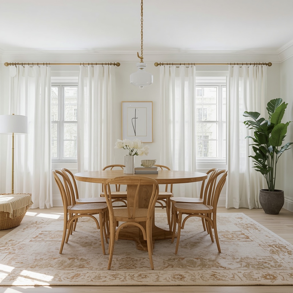
- Warm wood floors and brass fixtures call for warm whites to avoid a jarring, mismatched contrast.
- Gray or cool-toned flooring pairs naturally with cool or neutral whites.
- Black or matte metal accents tend to look sharpest against cool or true whites.
- Natural, earthy materials like rattan, linen, and terracotta lean beautifully into warm whites.
If you’re building a full palette, it can help to start with your largest fixed element — usually flooring or a countertop — and let its undertone guide your white paint choice, rather than the other way around.
Frequently Asked Questions
What is the most popular white paint color in the US right now? Warm neutrals like Alabaster and White Dove remain consistently popular for whole-home use because they read as soft rather than stark, while still feeling fresh.
Is warm or cool white better for resale value? Neutral, slightly warm whites tend to appeal to the widest range of buyers, since they feel welcoming without leaning too far into a specific trend.
Do I need a different white for every room? Not necessarily, but many designers use one main “whole-house white” and adjust the sheen or bring in a slightly warmer or cooler variant in rooms with unusual lighting.
How many samples should I test before deciding? Two to three is usually enough. Testing too many at once can make it harder to see subtle differences, since your eye needs a baseline for comparison.
Final Thoughts
Choosing the perfect white paint isn’t about finding a single “best” shade — it’s about understanding how a specific white behaves in your specific space. Once you start reading undertones the way a designer does, you’ll never look at a paint chip the same way again. Take the time to sample, observe, and compare, and you’ll land on a white that feels intentional, cohesive, and unmistakably right for your home.
If you want a second opinion on your shortlist, a local paint retailer or interior designer can often walk through your space in person and help you make the final call with confidence.