
Walk into any room that instantly feels “designed” instead of just “decorated,” and you’ll notice something before you can even name it: texture. It’s the tactile layer that separates a flat, showroom-style space from one that feels collected, warm, and lived-in.
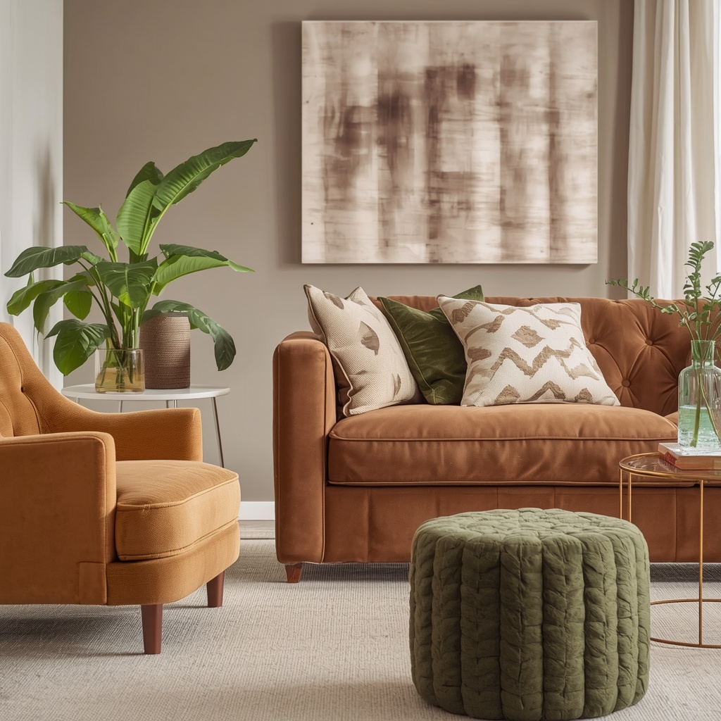
As an interior designer, the question I hear most often isn’t about color palettes—it’s about texture pairing. Specifically: how do you mix velvet, linen, and leather without the room looking like a furniture catalog exploded? The answer lies in understanding contrast, balance, and intentional placement.
This guide breaks down exactly how to layer these three foundational materials—one soft and light-catching, one breathable and matte, one structured and rich—into a cohesive, magazine-worthy interior.
Why Texture Matters More Than Color in Interior Design
Most homeowners default to color when planning a room, but seasoned designers know texture does the heavier lifting. Texture creates depth, dimension, and visual interest even in a monochromatic or neutral color scheme.
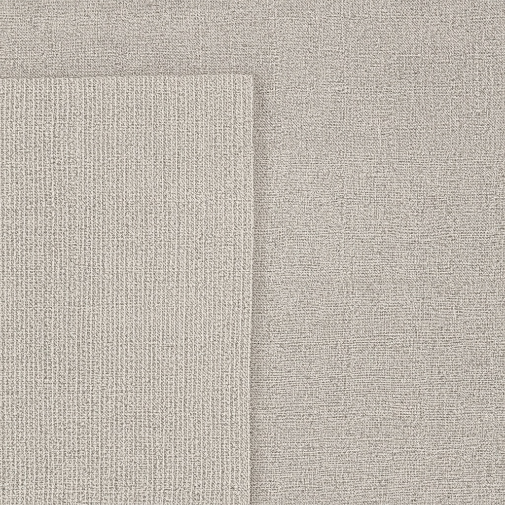
Think of an all-white living room with only smooth surfaces—it can feel sterile and cold. Now add a chunky linen throw, a tufted velvet ottoman, and a worn leather armchair. Suddenly that same white room feels curated and inviting, without a single new color introduced. This is the power of tactile layering, a principle every home decor specialist relies on to build rooms that feel dynamic rather than staged.
“Color gets attention, but texture is what makes people want to touch a room, sit in it, and stay a while.” — a principle every seasoned designer eventually internalizes.
Texture also affects how light behaves in a space. Velvet absorbs and reflects light unpredictably, creating shifting shadows. Linen diffuses light softly. Leather bounces light in a more controlled, glossy way. Combining all three gives a room visual movement throughout the day.
Understanding the Three Textures: Velvet, Linen, and Leather
Before blending textures, it helps to understand what each material contributes to a room’s personality.
Velvet: The Luxe Statement Maker
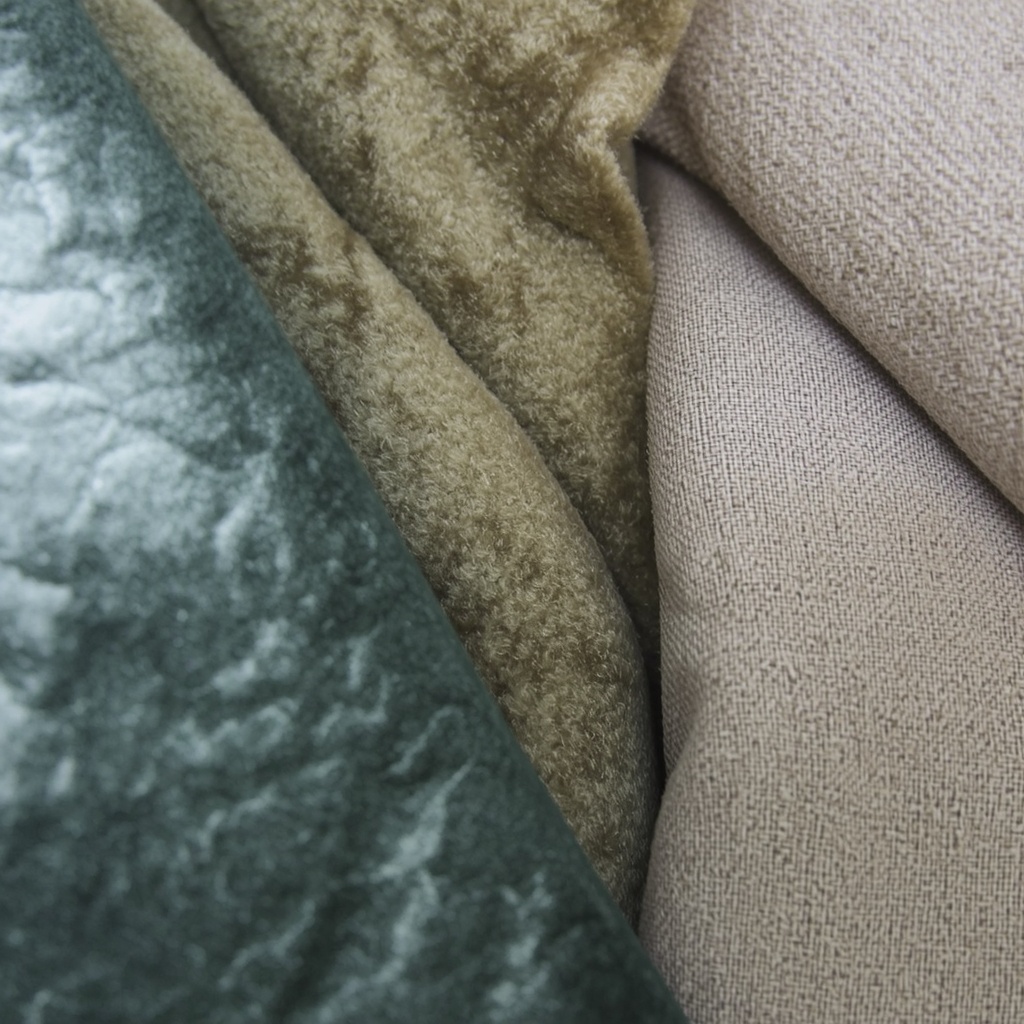
Velvet is a pile fabric with a soft, dense nap that catches and reflects light differently depending on the viewing angle. This creates a shimmering, color-shifting effect that instantly reads as luxurious.
- Best used on: accent chairs, throw pillows, drapery, headboards
- Emotional tone: opulent, cozy, dramatic
- Common colors: jewel tones (emerald, sapphire, mustard), deep neutrals
Linen: The Effortless Neutralizer
Linen is a breathable, matte natural fiber woven from flax. It has a slightly nubby, relaxed texture that reads as casual elegance—think coastal cottages and Scandinavian interiors.
- Best used on: sofas, slipcovers, curtains, bedding
- Emotional tone: relaxed, airy, understated
- Common colors: oatmeal, ivory, sage, soft grey
Leather: The Grounding Anchor
Leather brings structure and a slightly rugged, masculine-leaning warmth to a space. It ages beautifully, developing a patina that adds character over time.
- Best used on: sofas, armchairs, poufs, accent tables (with leather wrapping)
- Emotional tone: sophisticated, timeless, grounded
- Common colors: cognac, chocolate brown, black, saddle tan
The 60-30-10 Rule for Texture Balance
Designers often use the 60-30-10 rule for color distribution, and the same ratio works beautifully for texture planning. Applying this framework prevents any single texture from overwhelming the room.

| Proportion | Texture Role | Example Application |
|---|---|---|
| 60% | Dominant/base texture | Linen sofa, linen drapery, woven rug |
| 30% | Secondary texture | Leather armchair, leather ottoman |
| 10% | Accent texture | Velvet throw pillows, velvet bench |
Using this ratio, a linen-heavy living room (the calm base) gets structure from a leather accent chair, then a jolt of richness from a couple of velvet pillows or a small velvet stool. No single texture fights for dominance, and the eye moves comfortably around the space.
Room-by-Room: How to Blend Velvet, Linen, and Leather
Living Room
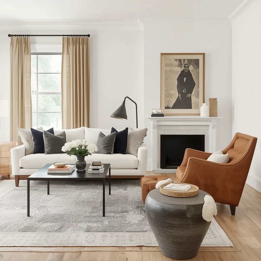
The living room is where texture blending shines most because it typically has the largest furniture footprint. Start with a linen sofa as your neutral canvas, then introduce a leather club chair as a secondary seating option. Layer in velvet through throw pillows, a lumbar cushion, or a small accent bench at the end of a console.
Add a jute or wool rug underneath to introduce a fourth textural note without overcomplicating the palette. This layering approach—soft, structured, plush, woven—creates a room that feels complete rather than matchy.
Bedroom
Bedrooms benefit from texture blending because it directly impacts comfort and coziness. A linen duvet cover paired with a velvet headboard is a classic, hotel-inspired combination. Add leather accents through a bench at the foot of the bed or a leather-strapped mirror.
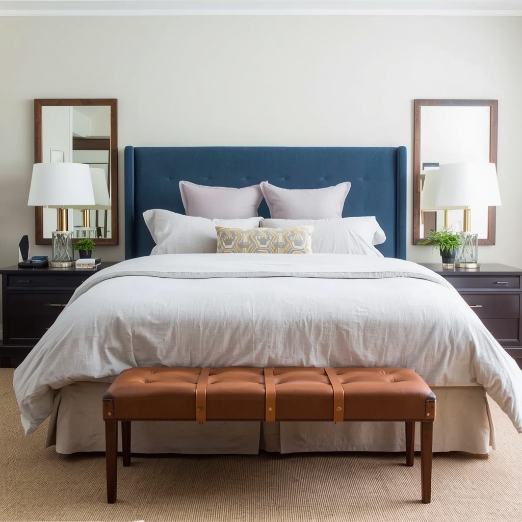
Pro Tip: Keep leather pieces in the bedroom smaller and further from the bed itself. Leather can read visually “cool” or formal, and you want the sleeping zone to feel soft and enveloping. Reserve leather for a reading chair in the corner or a decorative bench rather than anything touching the pillows.
Dining Room
Dining rooms are an underrated opportunity for texture play. Consider linen napkins and a linen-blend tablecloth, leather-upholstered dining chairs, and a velvet bench seat on one side of the table for visual asymmetry.
- Linen: table runner, napkins, window treatments
- Leather: dining chair upholstery, chair cushions
- Velvet: bench seating, chair back accents
Home Office
A home office can feel surprisingly polished with the right texture mix. A leather desk chair signals professionalism, a linen roman shade softens the window, and a velvet reading chair in the corner adds a relaxed nook for non-desk work.
Common Texture-Blending Mistakes to Avoid
Even experienced decorators can misstep when combining multiple textures. Here are the pitfalls to watch for:
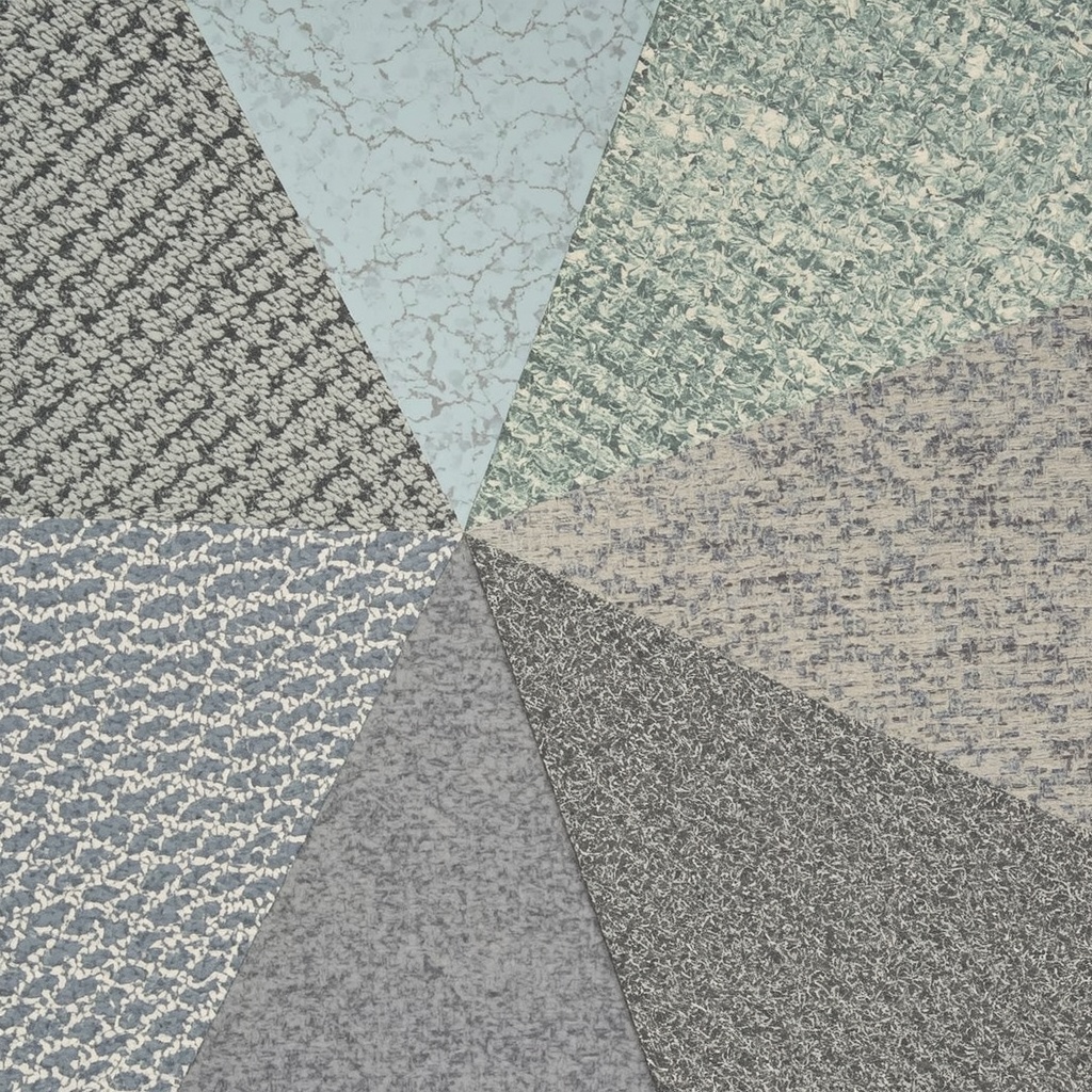
- Matching too many textures in the same tone. All-brown leather, tan linen, and camel velvet in one room reads flat rather than layered.
- Overloading one zone. Putting velvet, linen, and leather all within arm’s reach of each other (like on a single sofa) creates visual clutter.
- Ignoring scale. A massive leather sectional paired with delicate velvet throw pillows can look mismatched in proportion.
- Forgetting maintenance needs. Velvet shows watermarks easily, linen wrinkles, and leather scratches—plan placement around household traffic and pets.
- Skipping a neutral “resting” surface. Without a plain painted wall, simple rug, or unadorned surface, the eye never gets a break from texture.
“A well-designed room needs negative space just as much as it needs texture—somewhere for the eye to rest before it takes in the next layer.”
Color Coordination Tips for Multi-Texture Rooms
Texture blending works best when color stays relatively restrained. Here’s a simple framework for choosing a palette that supports rather than competes with your textures:
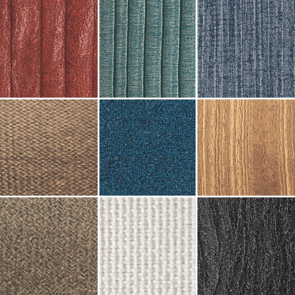
| Base Color Family | Velvet Accent | Linen Base | Leather Anchor |
|---|---|---|---|
| Warm Neutral | Rust or terracotta | Oatmeal or cream | Cognac or tan |
| Cool Neutral | Emerald or navy | Dove grey or ivory | Chocolate or black |
| Earthy/Organic | Olive or mustard | Sage or stone | Saddle brown |
Sticking within one color family—even while mixing warm and cool textures—keeps a multi-textural room from feeling chaotic.
How Lighting Enhances Texture Contrast
Natural and artificial lighting both play a huge role in how textures read in a finished space. Velvet needs directional light (like a table lamp or wall sconce) to really show off its sheen and depth. Linen looks best in soft, diffused daylight, which is why sheer curtains paired with linen furniture work so well together.
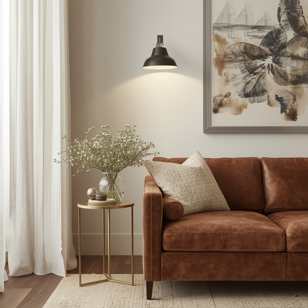
Leather, meanwhile, benefits from warmer bulb temperatures (around 2700K–3000K) that bring out its natural richness rather than making it look flat or plasticky under cool white light. When planning a multi-texture room, consider layered lighting—overhead, task, and accent—so each material gets its moment to shine.
Seasonal Texture Rotation
One advantage of decorating with velvet, linen, and leather is how easily you can rotate emphasis by season without buying new furniture.
- Spring/Summer: Lean into linen—swap velvet pillows for linen or cotton ones, keep leather pieces as-is for grounding.
- Fall/Winter: Bring velvet forward with heavier throws, deep-toned pillow covers, and a velvet blanket over the leather sofa.
This rotation keeps a home feeling fresh throughout the year while relying on the same core furniture investments—a budget-friendly strategy many interior designers recommend to clients.
Where to Shop for Each Texture
For anyone ready to start sourcing pieces, here are general categories to search for:
- Velvet: accent chairs, channel-tufted sofas, decorative pillow covers, velvet drapery panels
- Linen: slipcovered sofas, linen bedding sets, linen blend curtains, natural fiber area rugs
- Leather: top-grain leather sofas, leather sling chairs, leather ottomans, leather-wrapped decor objects
If you want design inspiration before purchasing, platforms like Houzz and Pinterest offer searchable mood boards specifically for texture-driven interiors.
Final Thoughts: Building a Room That Feels as Good as It Looks
Blending velvet, linen, and leather isn’t about following a rigid formula—it’s about understanding how each material contributes emotionally and visually to a space, then balancing them with intention. Velvet brings drama and light-play, linen brings calm and breathability, and leather brings structure and timeless warmth.
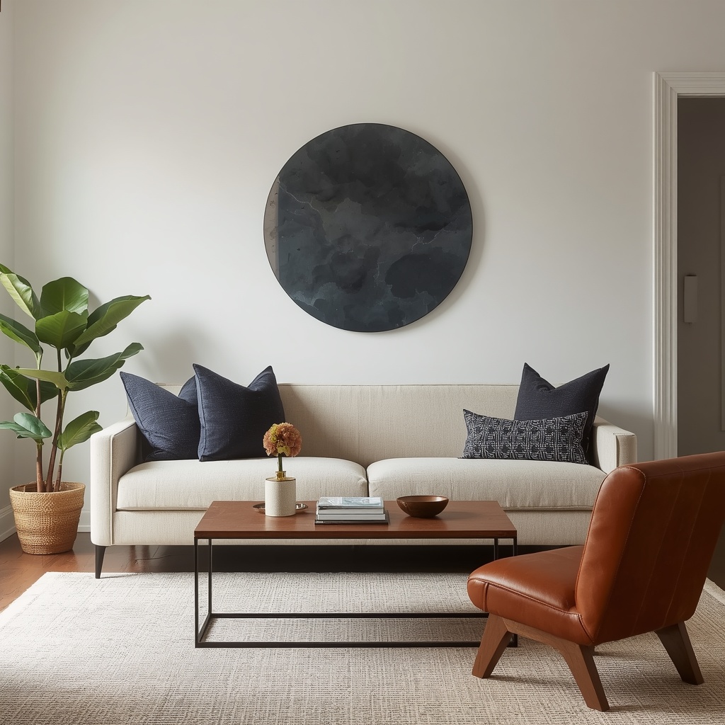
Start with one dominant texture as your base, layer a secondary texture for contrast, and use the third as an accent that appears in smaller, deliberate doses. Pay attention to color families, scale, lighting, and even seasonal rotation to keep the room feeling alive year-round.
Done well, texture blending transforms a house into a home—one that doesn’t just look beautiful in photos, but genuinely feels good to sit in, touch, and live inside every single day.