
Walk into any well-designed home and you’ll notice something before you even register the art itself: the frames feel right. They don’t fight with the walls, the furniture, or the piece inside them. That’s not an accident — it’s intentional interior design at work.

As an interior designer who focuses on home decor for American homeowners, I get asked constantly: “How do I pick a frame that actually matches my space?” The truth is, frame selection is one of the most underrated design decisions you’ll make. The right frame style can elevate a five-dollar print into a gallery-worthy focal point, while the wrong one can make an expensive original painting look like an afterthought.
This guide breaks down everything you need to know about choosing frame styles, matching them to your art and decor, and avoiding the common mistakes that quietly undermine an otherwise beautiful room.
Why Frame Styles Matter More Than You Think
A frame isn’t just a border — it’s a transition zone between your artwork and your wall. Think of it as punctuation in a sentence. It tells the eye where the art begins and ends, and it sets the tone before anyone even processes the image inside.
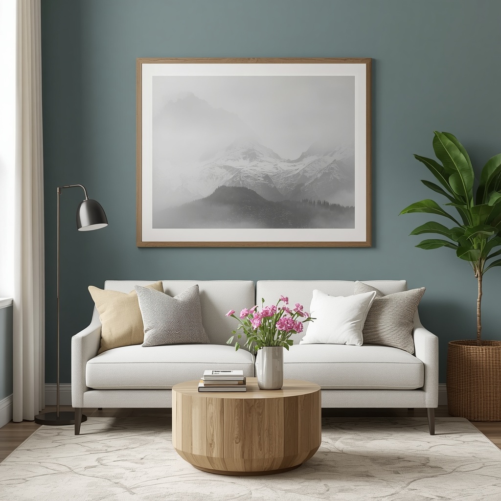
Interior design isn’t only about furniture and paint color; it’s about the cumulative effect of every detail in a room, including framing. A mismatched frame style can create visual noise, while a well-chosen one creates harmony between your wall art, home decor, and overall interior style.
“Framing is the last 10% of the creative process, but it accounts for 90% of how a piece is perceived in a room.” — a sentiment echoed by gallery curators and interior designers alike.
Pro Tip: Before buying any frame, hold a swatch of the frame material or a printed color sample next to your art in the actual room lighting. Colors and finishes shift dramatically under warm versus cool light.
Understanding the Main Frame Style Categories
Before you can match a frame to your decor, you need to understand the vocabulary. Frame styles generally fall into a handful of broad families, each with its own personality and best-use scenarios.
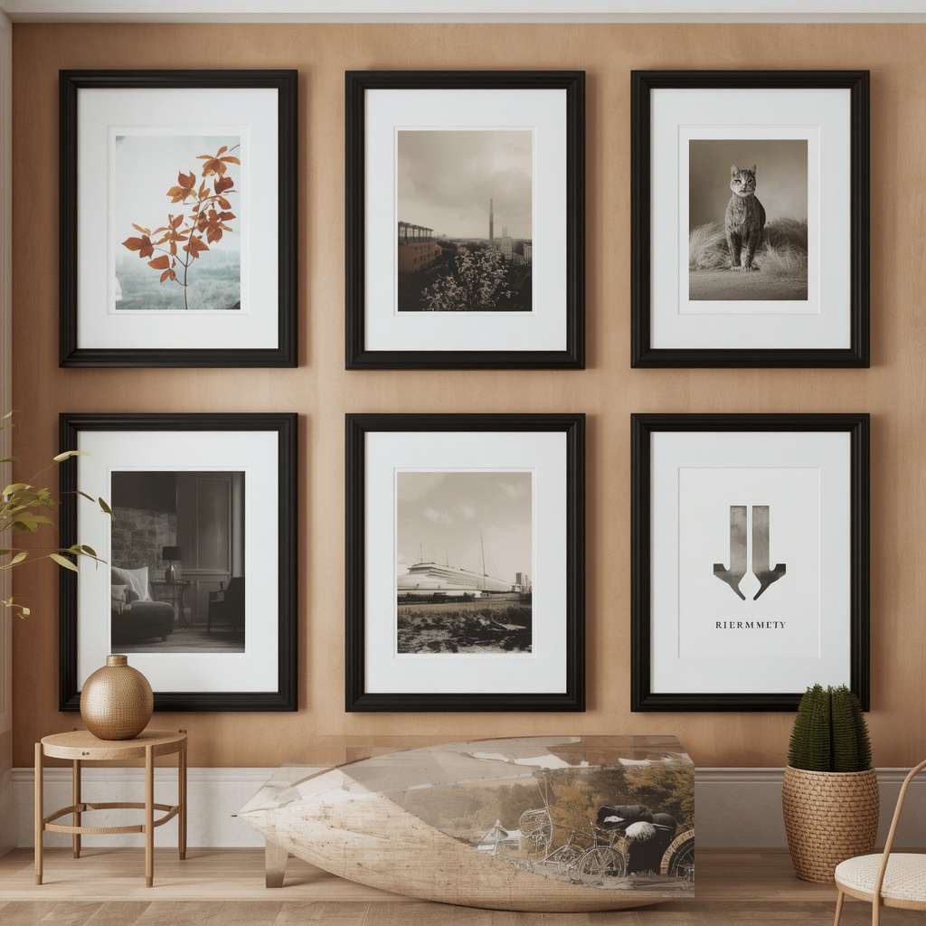
1. Modern and Minimalist Frames
Clean lines, thin profiles, and neutral finishes define this category. Think matte black, brushed aluminum, or simple white frames with little to no ornamentation.
- Best for: contemporary art, black-and-white photography, minimalist interiors
- Common materials: aluminum, powder-coated metal, matte wood
- Pairs well with: Scandinavian, industrial, and mid-century modern decor
2. Traditional and Ornate Frames
These frames feature carved details, gold or silver leafing, and heavier profiles. They’re reminiscent of classic European art galleries.
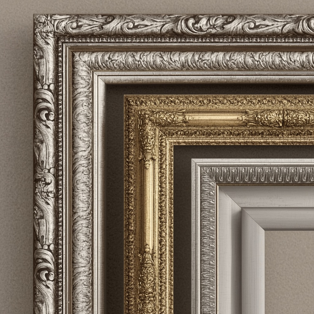
- Best for: oil paintings, heirloom portraits, vintage prints
- Common materials: carved wood, gilded finishes, resin composites
- Pairs well with: classic, French country, and traditional interiors
3. Rustic and Farmhouse Frames
Distressed wood, reclaimed materials, and warm, earthy tones characterize this style. These frames bring texture and a lived-in warmth to a space.
- Best for: landscape photography, botanical prints, family photos
- Common materials: reclaimed barnwood, whitewashed pine, weathered oak
- Pairs well with: farmhouse, cottagecore, and coastal interiors
4. Eclectic and Bohemian Frames
Mixed materials, unexpected shapes, and layered textures define eclectic framing. Think rattan, bamboo, or mixed-metal frames grouped in an intentional “gallery wall” arrangement.
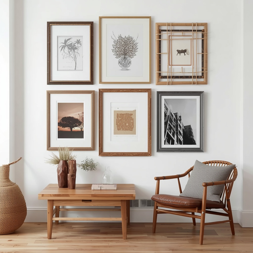
- Best for: mixed media art, travel photography, textile art
- Common materials: rattan, woven fiber, mixed metals
- Pairs well with: boho, eclectic maximalist, and global-inspired interiors
Matching Frame Style to Your Existing Decor
The single biggest mistake homeowners make is choosing a frame that matches the art perfectly but clashes with the room. Your frame needs to speak two languages at once: it must honor the artwork and integrate with your existing home decor palette.
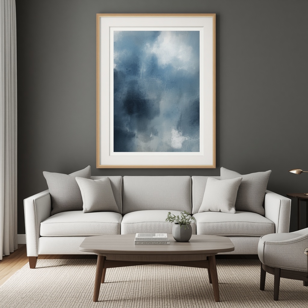
Here’s a simple compatibility table to guide your decision-making process when shopping for frame styles.
| Interior Style | Recommended Frame Finish | Frame Shape | Avoid |
|---|---|---|---|
| Modern / Contemporary | Matte black, brushed metal | Thin, geometric | Ornate gold, heavy carving |
| Traditional | Gold leaf, dark wood, silver | Curved, decorative | Raw or unfinished wood |
| Farmhouse | Whitewashed or weathered wood | Wide, rustic | High-gloss lacquer |
| Coastal | Light wood, whitewash, rope accents | Simple, relaxed | Dark, heavy ornamentation |
| Industrial | Blackened metal, exposed hardware | Boxy, minimal | Delicate gilded trim |
| Bohemian | Rattan, mixed wood tones | Irregular, layered | Uniform, corporate metal |
| Mid-Century Modern | Warm walnut, teak | Slim, angled | Distressed or shabby-chic |
Pro Tip: When in doubt, pull one material or finish already present in your room — a brass lamp, a walnut side table, matte black hardware — and echo it in your frame. This “repeat one element” trick instantly makes framed art feel like it belongs.
How to Choose Frames Based on Art Type
Different art mediums have different framing needs, both aesthetically and practically. Choosing correctly protects your art and enhances how it reads visually.
Photography
Photographs, especially black-and-white or high-contrast color images, tend to look best in simple, thin frames that don’t distract from the composition. A white mat with a black or wood frame is a timeless, versatile choice for photography-heavy walls.
Oil and Acrylic Paintings
Paintings can typically handle — and often benefit from — heavier, more textured frames. Ornate or float frames (which create a shadow-box effect around canvas edges) give paintings a gallery feel.
Watercolors and Works on Paper
These delicate mediums usually require glass or acrylic glazing and a mat to prevent direct contact with the glass. Thin wood or metal frames tend to complement the light, airy quality of watercolor work.
Prints and Posters
Mass-produced prints and posters are the most forgiving category. A simple, affordable frame in a finish that matches your decor works well here, and this is where budget-friendly framing options really shine.
The Role of Matting in Frame Selection
Matting (the border between the art and the frame) is often overlooked, but it plays a huge role in how a piece reads on the wall.
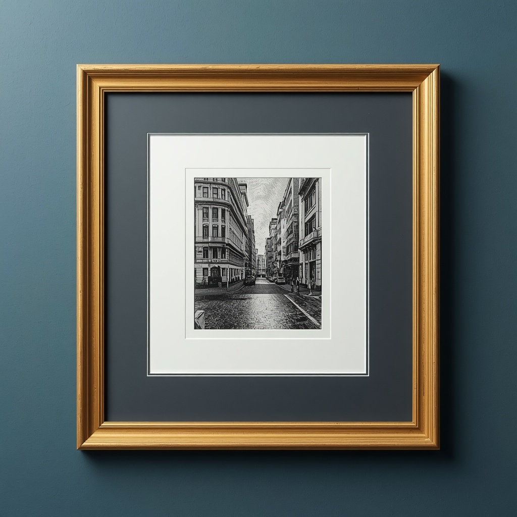
- Standard white or off-white mats work with almost any art style and create breathing room around the image.
- Colored mats can pull out a specific hue from the artwork, but use them sparingly to avoid dating the piece.
- Double mats (two layers of matting) add depth and a more curated, gallery-like appearance.
- No mat (full-bleed framing) works best for bold, graphic prints or photography that benefits from an edge-to-edge presentation.
Pro Tip: As a general rule, mats should be at least 2 to 3 inches wide for smaller pieces and up to 4 inches for larger statement art. Undersized mats are one of the most common framing mistakes homeowners make.
Gallery Walls: Mixing Frame Styles Intentionally
Gallery walls are one of the most popular home decor trends, and they’re also where frame style decisions get the trickiest. The good news is that mixing frame styles is not only acceptable — it’s often more visually interesting than uniformity, as long as you follow a few grounding rules.
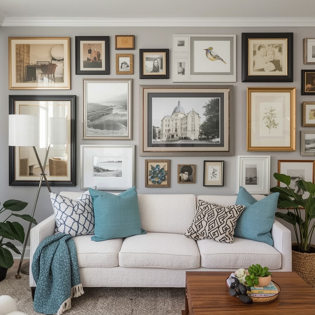
Choose one unifying element to tie mismatched frames together, whether that’s a shared color family, similar finish tones, or consistent spacing between pieces. Without this connective thread, a gallery wall of completely random frames can feel chaotic rather than curated.
A helpful approach is to select two or three frame finishes maximum (for example, black, natural wood, and brass) and repeat them throughout the arrangement. This creates cohesion while still allowing for variety in size, shape, and art style.
Common Frame Style Mistakes to Avoid
Even design-savvy homeowners fall into these traps. Here’s a quick list of what to watch for:
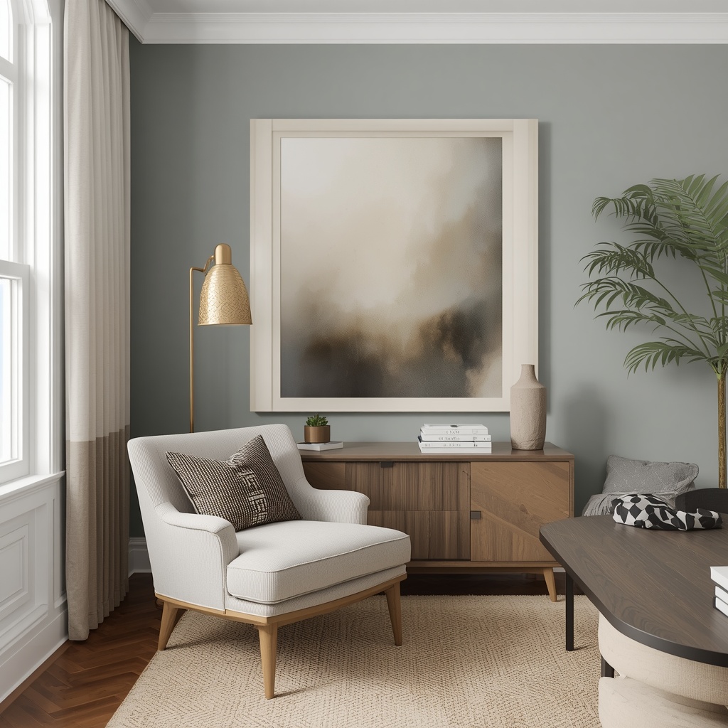
- Frame too small for the wall: A frame that looks proportionate on a table can disappear on a large wall.
- Ignoring the room’s undertones: Warm-toned frames can clash with cool-toned rooms, and vice versa.
- Overlooking glare: Standard glass in a sunny room can create distracting reflections; consider anti-glare or museum glass.
- Mismatched hardware finishes: A gold frame next to matte black light fixtures can feel disjointed unless it’s clearly intentional.
- Skipping the mat: Framing art directly against glass without a mat can look unfinished, especially for works on paper.
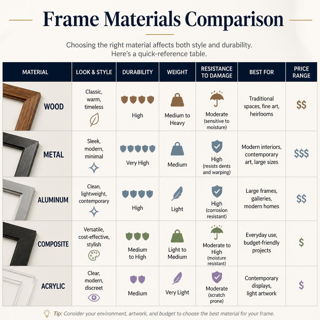
Frame Materials Comparison
Choosing the right material affects both style and durability. Here’s a quick-reference table.
| Material | Look & Feel | Durability | Best For |
|---|---|---|---|
| Solid Wood | Warm, classic, versatile | High | Most art types, long-term investment pieces |
| Metal (Aluminum/Steel) | Sleek, modern, lightweight | High | Contemporary art, photography |
| Composite/Resin | Budget-friendly, mimics wood or gilding | Medium | Traditional or ornate styles on a budget |
| Reclaimed Wood | Rustic, textured, unique | Medium-High | Farmhouse and rustic interiors |
| Bamboo/Rattan | Natural, textured, lightweight | Medium | Boho and coastal interiors |
Where to Shop for Quality Frames
For custom framing tailored to specific artwork, a local frame shop remains the gold standard, since they can advise on UV-protective glazing and archival matting in person. For ready-made options that still offer strong style variety, retailers like West Elm, CB2, and Framebridge are popular choices among interior designers for their consistent quality and on-trend finishes.
Final Thoughts: Let the Room Guide the Frame
Choosing frame styles isn’t about picking whatever looks nice in isolation — it’s about creating a dialogue between your art, your frame, and the room around it. When those three elements are in sync, even a modest print can feel like it was made for your space.
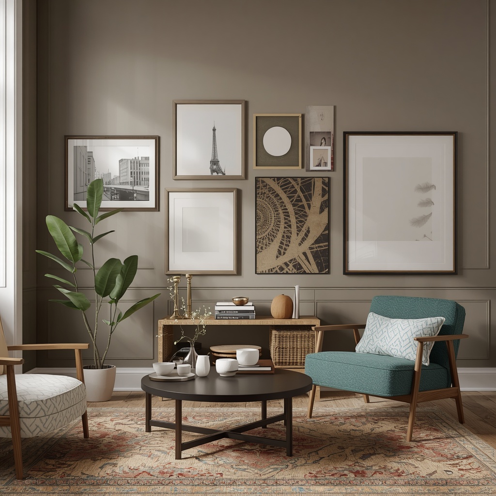
Start by identifying your dominant interior style, then work backward to select frame finishes and shapes that reinforce it. Use the tables and tips above as a starting reference, but trust your eye once you start holding options up against your actual wall. Great home decor is built one intentional decision at a time, and frame selection is a decision worth slowing down for.