
Walk into most “neutral” living rooms and you’ll see the same story repeated: beige walls, a beige sofa, and a beige rug that all blend into one flat, forgettable scene. It’s no wonder so many homeowners assume neutral decor means safe, sterile, and a little bit dull.
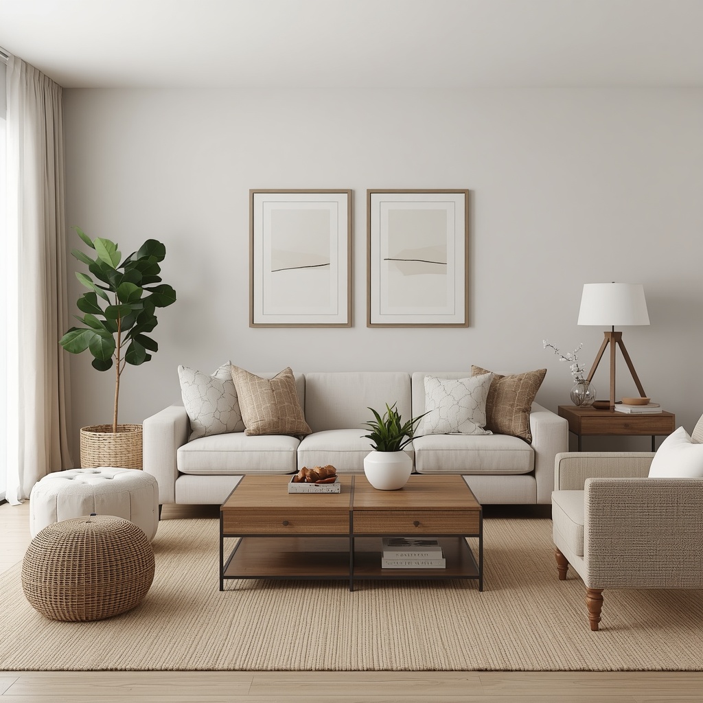
As an interior designer who works almost exclusively in neutral palettes, I can tell you that’s a myth. Neutral living rooms can be layered, textured, and full of personality when you know which design principles to lean on. This guide walks you through exactly how to build a neutral living room that feels warm, intentional, and anything but boring.
Why Neutral Doesn’t Mean Boring
The confusion around neutral color schemes usually comes down to a single mistake: treating “neutral” as one flat color instead of a full spectrum. True neutral decor spans warm whites, greige, taupe, oatmeal, mushroom, charcoal, and deep espresso brown. Each of these tones behaves differently depending on the light in your room and the materials around it.
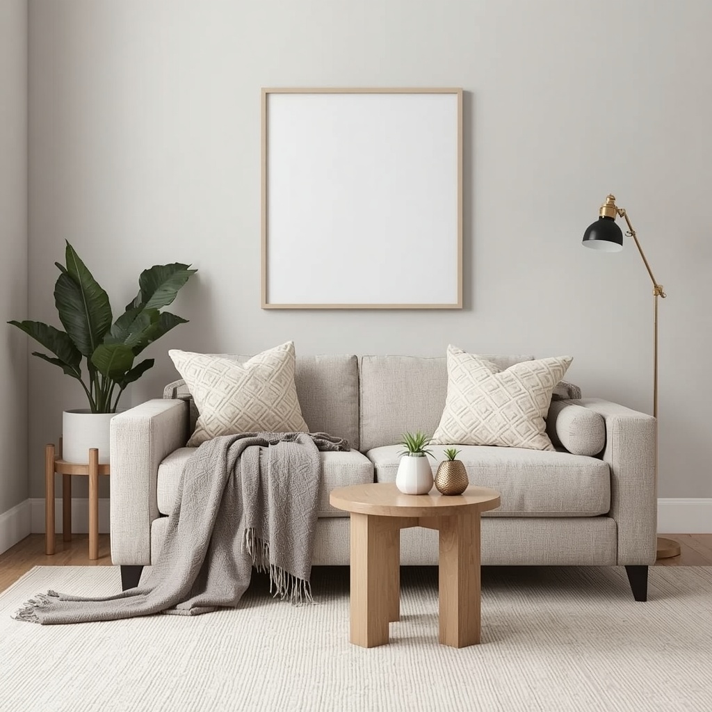
The most sophisticated neutral living rooms actually use several shades of neutral at once, layered like a monochromatic outfit. Interior designers call this “tonal layering,” and it’s the single biggest difference between a flat beige room and a rich, dimensional neutral living room. When you stop thinking of neutral as an absence of color and start thinking of it as a palette in its own right, everything changes.
“Neutral doesn’t mean nothing. It means everything gets to breathe — the texture, the shape, the light — because color isn’t fighting for attention.” — a philosophy shared by many veteran residential designers
Choosing Your Neutral Base: Warm vs. Cool Tones
Before you buy a single throw pillow, decide whether your living room will lean warm (creamy whites, tan, camel, terracotta-adjacent browns) or cool (greige, dove gray, cool white, charcoal). This decision affects your paint color, your flooring, and even the metals you choose for hardware and lighting.
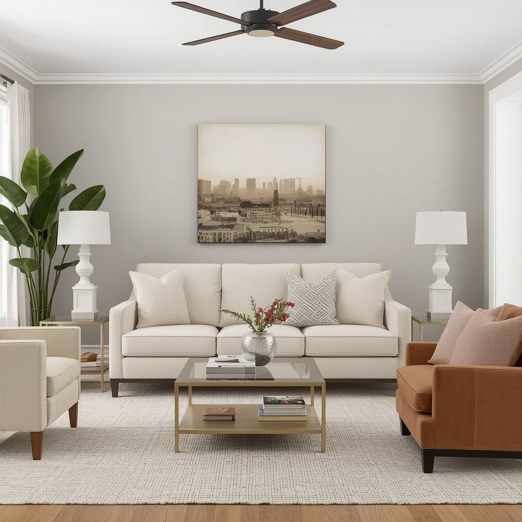
Warm neutrals tend to feel cozier and pair beautifully with natural wood, rattan, and linen. Cool neutrals feel more modern and sleek, and they photograph especially well in rooms with lots of natural light. Mixing warm and cool without a plan is the fastest way to make a room feel muddy instead of curated.
| Neutral Tone | Undertone | Best Paired With | Mood Created |
|---|---|---|---|
| Warm White (e.g., Sherwin-Williams Alabaster) | Yellow/cream | Light wood, brass, linen | Soft, airy, welcoming |
| Greige (e.g., Benjamin Moore Revere Pewter) | Gray-beige | Black metal, walnut wood | Balanced, versatile |
| Taupe | Gray-brown | Olive green accents, jute | Earthy, grounded |
| Oatmeal / Mushroom | Warm gray | Cream boucle, rattan | Cozy, organic |
| Charcoal | Cool gray-black | White trim, chrome | Moody, sophisticated |
| Espresso Brown | Deep warm brown | Cream, brass, marble | Rich, dramatic |
Pro Tip: Always test paint swatches on your actual wall and view them at 9 a.m., 1 p.m., and 7 p.m. Neutral paint colors shift dramatically depending on natural and artificial light, and a shade that looks perfect in the store can turn pink, green, or muddy once it’s on your wall.
Layer Textures to Add Depth
If color isn’t doing the heavy lifting in a neutral living room, texture has to. This is the single most important design principle for avoiding a flat, boring space. Think of texture as the “seasoning” of your room — it’s what makes a monochromatic space feel rich instead of empty.
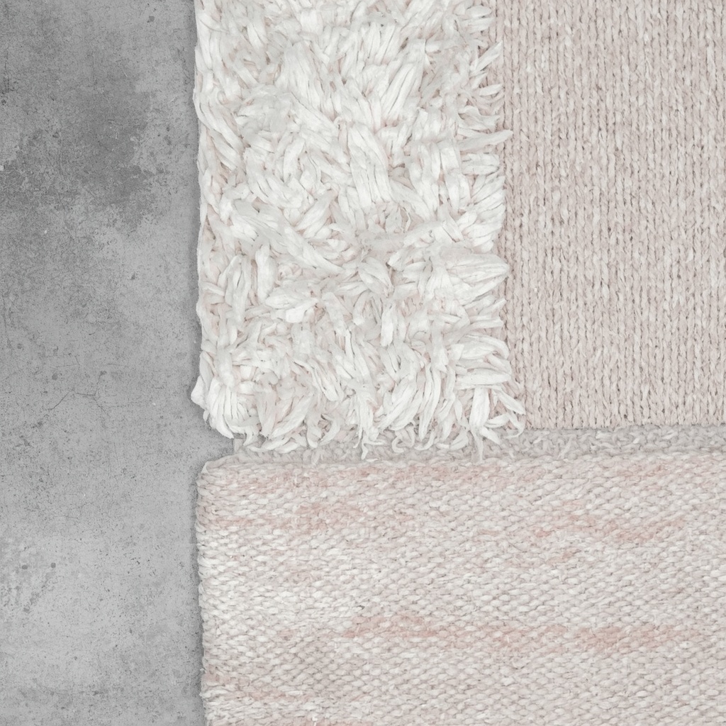
The goal is to combine at least four to six different textures in every neutral living room. Smooth and rough, matte and glossy, soft and structured — the contrast between these finishes creates visual interest even when the color palette barely changes from one surface to the next.
Textures worth layering into a neutral living room:
- Boucle or chenille upholstery for a tactile, cozy sofa or accent chair
- Chunky knit throws draped over furniture for softness and movement
- Natural fiber rugs like jute or sisal layered under a plush wool rug
- Rattan or cane furniture for organic warmth
- Linen curtains that add movement and soft drape to windows
- Woven baskets for storage that doubles as texture
- Reclaimed or textured wood in coffee tables and shelving
- Stone or marble accents in side tables or decorative objects
Add Visual Interest with Pattern
A common misconception is that neutral rooms can’t include pattern. In reality, tone-on-tone pattern is one of the best-kept secrets of high-end neutral interiors. Think cream-on-cream Moroccan trellis pillows, subtle herringbone upholstery, or a jacquard-weave throw blanket.
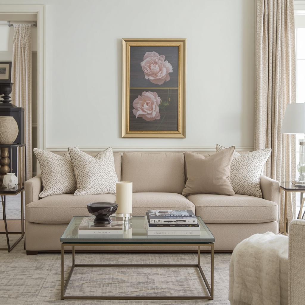
The key is keeping the pattern within the same tonal family as your base palette so it reads as texture from across the room, but reveals detail up close. This creates a layered, “quiet luxury” look that photographs beautifully and never competes with the rest of your decor.
The Power of Contrast in Neutral Rooms
Even the most beautifully layered neutral living room needs contrast to keep it from washing out. Without contrast, a room full of similar tones can feel flat and undefined, no matter how much texture you’ve added. The solution is to introduce a few deliberately darker or lighter anchor points.
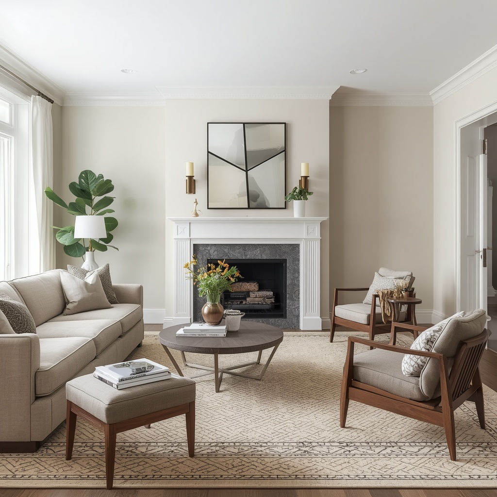
A black metal floor lamp, a dark walnut coffee table, or a charcoal picture frame gallery wall can instantly ground a room full of light neutrals. Similarly, a cream sofa against a warm taupe wall creates just enough separation for each element to be appreciated individually rather than blurring together.
Statement Furniture Pieces
Neutral doesn’t mean plain, and this is especially true when it comes to furniture shape. Since color variation is intentionally limited, silhouette becomes one of your best tools for adding personality. A curved boucle sofa, a sculptural coffee table, or an oversized arched mirror can all serve as the “statement piece” that a bolder room might get from a colorful accent wall.
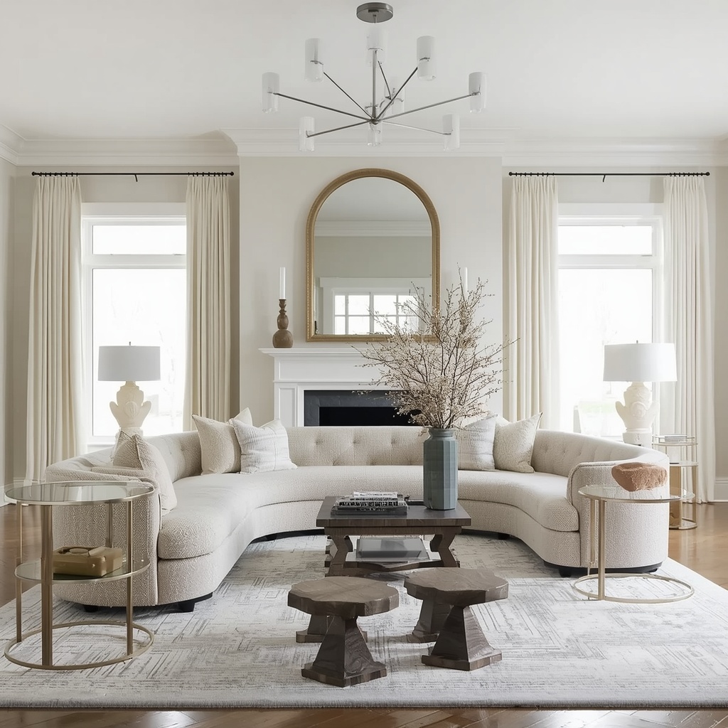
Look for furniture with interesting lines, unexpected proportions, or unique materials — think a fluted wood console, a pedestal-based side table, or a chair with an architectural frame. These pieces do the visual storytelling that color would otherwise provide, keeping the room from feeling like a blank canvas.
Accent Colors That Complement Neutrals
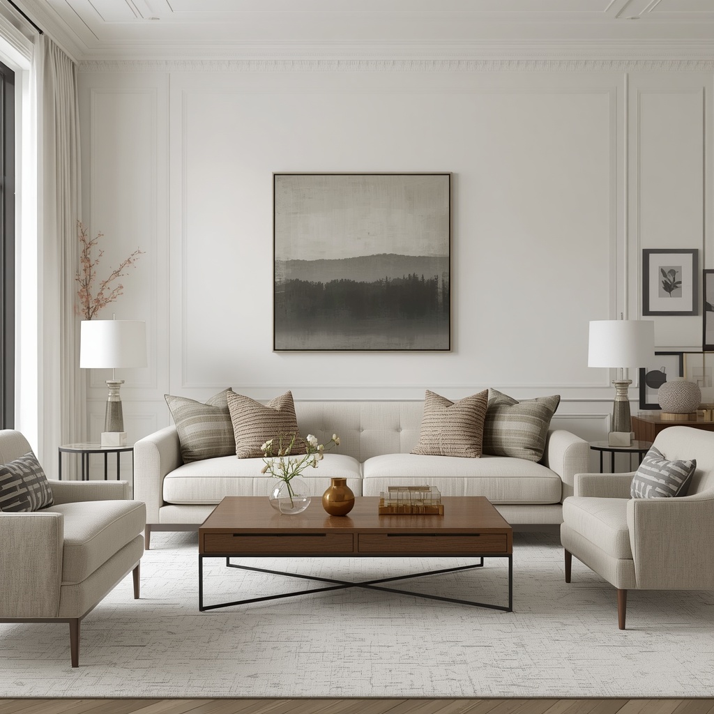
You don’t need to abandon neutrals to add a pop of personality. Small, intentional doses of color can make a neutral living room feel curated rather than clinical, as long as they’re used sparingly and repeated at least twice in the room for balance.
| Accent Color | Why It Works | Where to Use It |
|---|---|---|
| Sage or olive green | Echoes natural, earthy tones | Throw pillows, ceramics, houseplants |
| Terracotta | Warms up cool neutrals | Vases, art, a single accent chair |
| Navy or deep blue | Adds sophistication without clashing | Books, one accent pillow, artwork |
| Mustard or ochre | Complements warm neutral undertones | A single lamp shade or throw |
| Black | Grounds and defines edges | Frames, hardware, lamp bases |
Pro Tip: Follow the “rule of three” when adding accent color — repeat your chosen accent shade at least three times around the room (for example, in a pillow, a vase, and a piece of art) so it reads as an intentional choice rather than a random accident.
Lighting as a Design Element
Lighting can make or break a neutral living room. Because there’s less color to create drama, the quality and warmth of your light fixtures matter more than in a bolder space. Cool, harsh overhead lighting can make neutral tones look washed out and flat, while warm, layered lighting brings out the richness of every texture in the room.
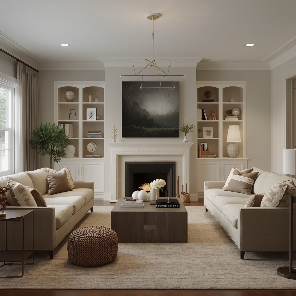
Aim for at least three light sources at different heights: an overhead fixture, a floor lamp, and a table lamp. Choose bulbs in the 2700K–3000K range for a warm, inviting glow, and consider a statement fixture — a sculptural pendant or an oversized floor lamp — as another opportunity to add shape and personality without adding color.
Bringing in Nature (Biophilic Touches)
Houseplants and natural materials are some of the easiest ways to bring life into a neutral living room. Greenery adds an organic pop of color that never clashes with your palette, while also softening hard furniture lines and improving the overall feel of the space.
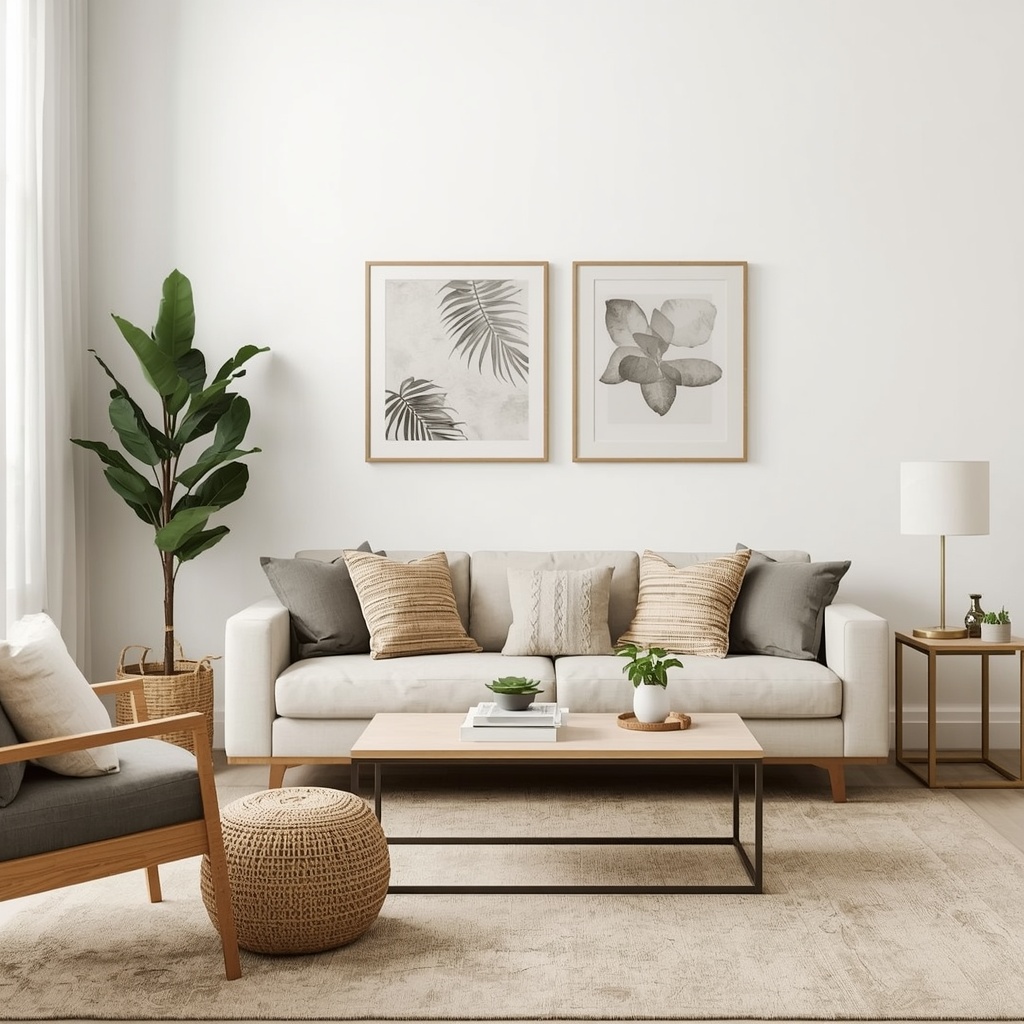
Large leafy plants like a fiddle leaf fig or a rubber plant work well as living sculptures in a corner, while smaller potted plants on shelves or side tables add subtle color throughout the room. According to the University of Vermont Extension, houseplants can also improve indoor air quality, making this an upgrade that’s both aesthetic and practical.
Mixing Metals and Finishes
Just as you layer neutral colors and textures, mixing metal finishes adds another subtle layer of visual interest. Brass, matte black, brushed nickel, and aged bronze can all coexist in the same room as long as one finish is used as the dominant tone and the others appear in smaller doses.
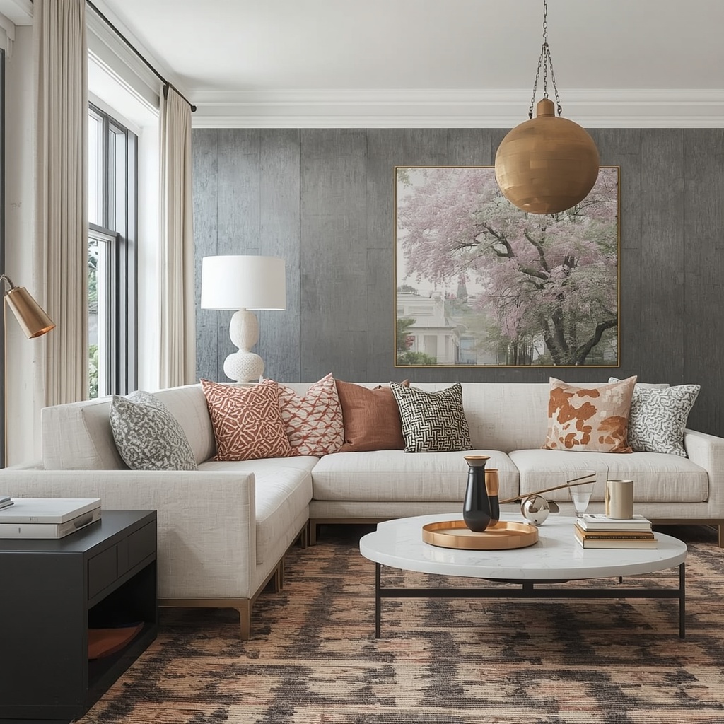
A common formula is 60% of one metal, 30% of a second, and 10% of a third accent finish. For example, brass hardware and lamp bases could dominate, matte black could appear in window frames or a floor lamp, and a touch of aged bronze could show up in a single decorative object.
Common Mistakes to Avoid in Neutral Living Rooms
Even well-intentioned neutral decor can fall flat if a few key principles are ignored. Here are the mistakes I see most often when homeowners try to design a neutral space on their own.
- Using only one shade of neutral throughout the entire room, which flattens the space instead of layering it
- Skipping texture entirely, resulting in a room that looks unfinished despite having furniture and decor
- Choosing furniture with no contrast, so nothing stands out or anchors the eye
- Relying only on overhead lighting, which can make neutral tones look cold and clinical
- Forgetting greenery, missing an easy source of natural, non-clashing color
- Matching everything too perfectly, which can make a room feel like a furniture showroom instead of a lived-in home
Frequently Asked Questions
Is a neutral living room outdated in 2026? Not at all — neutral palettes remain one of the most popular and timeless choices in residential design, largely because they’re easy to update with accent colors and accessories as trends shift.
What’s the easiest way to make a neutral living room feel warmer? Focus on warm-toned lighting, natural wood tones, and soft textiles like boucle and wool. These three elements alone can transform a cold, flat neutral room into a cozy retreat.
How many neutral shades should I use in one room? Most designers recommend three to five different neutral tones layered throughout a single room — enough to create depth without looking chaotic or overplanned.
Final Thoughts
A neutral living room is never really about the absence of color — it’s about the presence of texture, contrast, and thoughtful design choices that let every element shine. When you layer tones, mix textures, add a few accent colors, and pay attention to lighting, neutral becomes one of the most versatile and elegant design directions available.
The next time someone tells you neutral decor is boring, invite them into a room built with these principles in mind. Chances are, they won’t be able to point to a single “beige” moment in the entire space — just a home that feels calm, collected, and quietly full of personality.