
There’s a reason luxury hotel lobbies and five-star restaurants keep coming back to emerald greens, sapphire blues, and amethyst purples. Jewel tones don’t whisper — they announce. They tell a room’s story before a guest even sits down.

As an interior designer who’s spent years helping American homeowners transform beige, builder-grade living rooms into spaces that feel collected and intentional, I can tell you this: jewel tones are the single fastest way to make a room feel expensive. You don’t need a full renovation or a five-figure budget. You need the right colors, in the right places, balanced the right way.
This guide walks you through exactly how to bring jewel-toned interior design into your home — from choosing your palette to picking fabrics, furniture, and finishing touches — so your living space feels like it belongs in a design magazine, not a rental listing.
What Are Jewel Tones, Exactly?
Jewel tones are deep, saturated colors named after precious gemstones: emerald green, sapphire blue, ruby red, amethyst purple, topaz gold, and garnet. Unlike pastels or neutrals, jewel tones have high color saturation combined with a darker value, which gives them richness and depth rather than brightness.
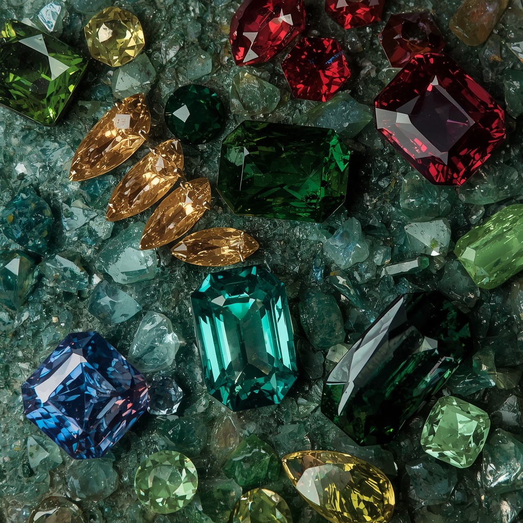
Think of the difference between a pale sage green and a deep emerald. Both are green, but only one reads as “luxury.” That’s the power of saturation and depth working together. Jewel tones catch and reflect light differently than flat, muted colors, which is exactly why they photograph so beautifully and feel so expensive in person.
Common jewel tones used in home decor include:
- Emerald green
- Sapphire blue
- Ruby red
- Amethyst / royal purple
- Topaz / amber gold
- Garnet
- Peacock teal
Why Jewel Tones Read as “Luxurious”
Color psychology plays a bigger role in perceived luxury than most homeowners realize. Deep, saturated hues have historically been associated with wealth and status — largely because natural pigments capable of producing rich, true jewel tones were once rare and expensive to produce, reserved for royalty and the elite.
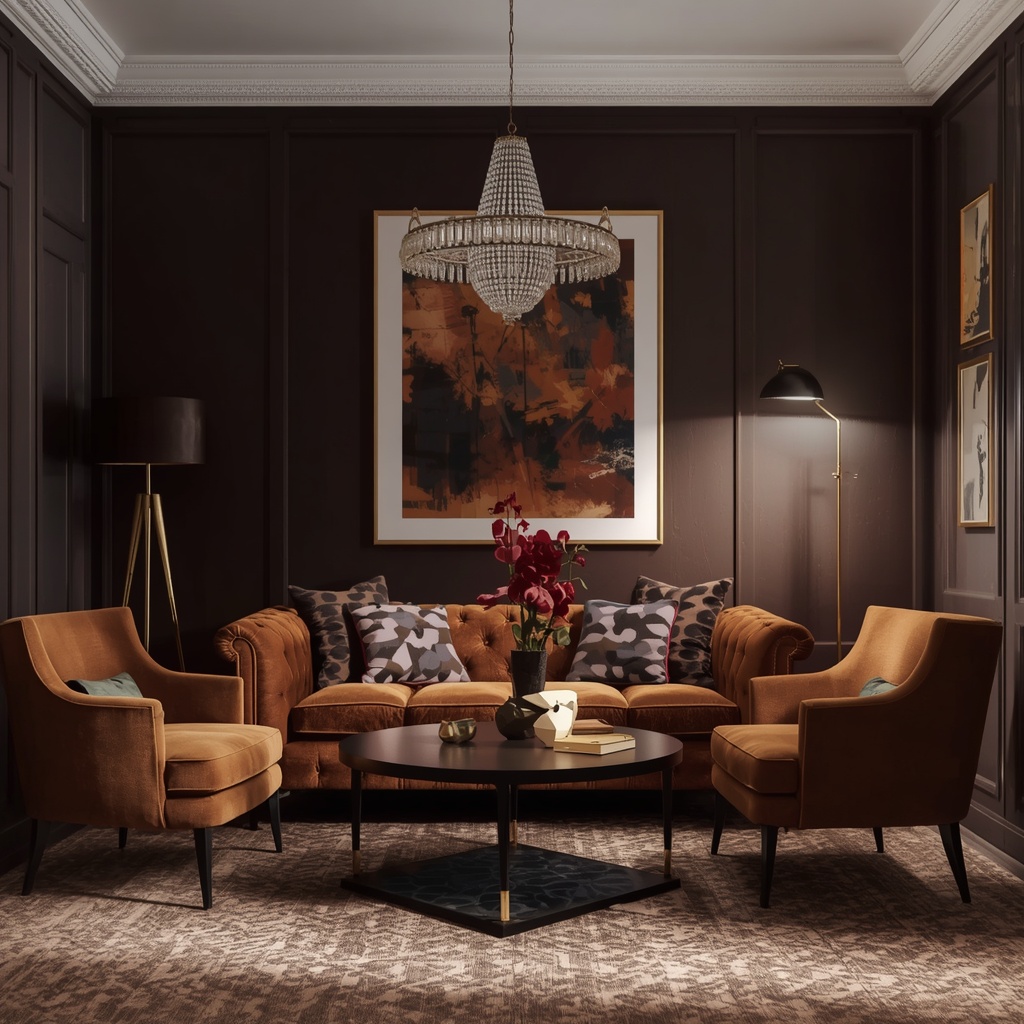
That historical association hasn’t faded. Today, jewel tones still signal richness, drama, and confidence. A room painted in soft greige can feel safe and pleasant, but it rarely feels remarkable. A room anchored by a deep emerald sofa or a sapphire accent wall feels curated — like someone made a deliberate design decision rather than defaulting to what’s “safe.”
“Color is a power which directly influences the soul.” — Wassily Kandinsky
That idea holds true in interior design. Jewel tones don’t just decorate a room; they shape how it feels to be in it — cozy, dramatic, grounded, alive.
Choosing the Right Jewel Tone for Your Space
Not every jewel tone works in every room, and not every jewel tone works with every existing color scheme. Before you commit to a paint color or a velvet sofa, think about the mood you want and the natural light your room receives.
Match Undertones to Existing Elements
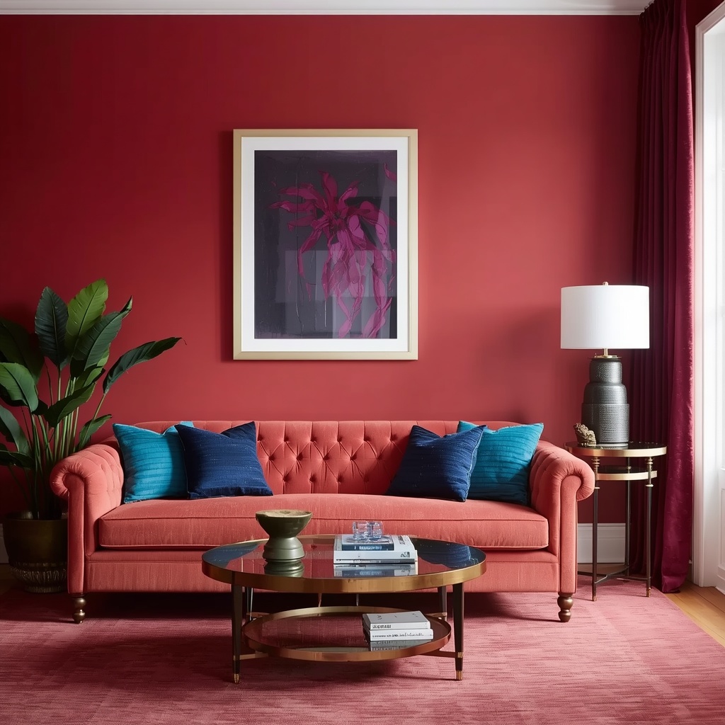
If your home has warm wood floors, brass fixtures, or a warm-toned neutral wall color, lean toward jewel tones with warm undertones like ruby, garnet, and amber gold. If your space leans cool — gray flooring, chrome or nickel fixtures, cool white walls — sapphire, amethyst, and emerald will feel more cohesive.
Consider Room Function and Natural Light
North-facing rooms with cooler, indirect light can handle bold jewel tones beautifully because the color won’t feel overwhelming. South-facing rooms flooded with warm sunlight may need slightly muted jewel tones so the space doesn’t feel visually loud by midday.
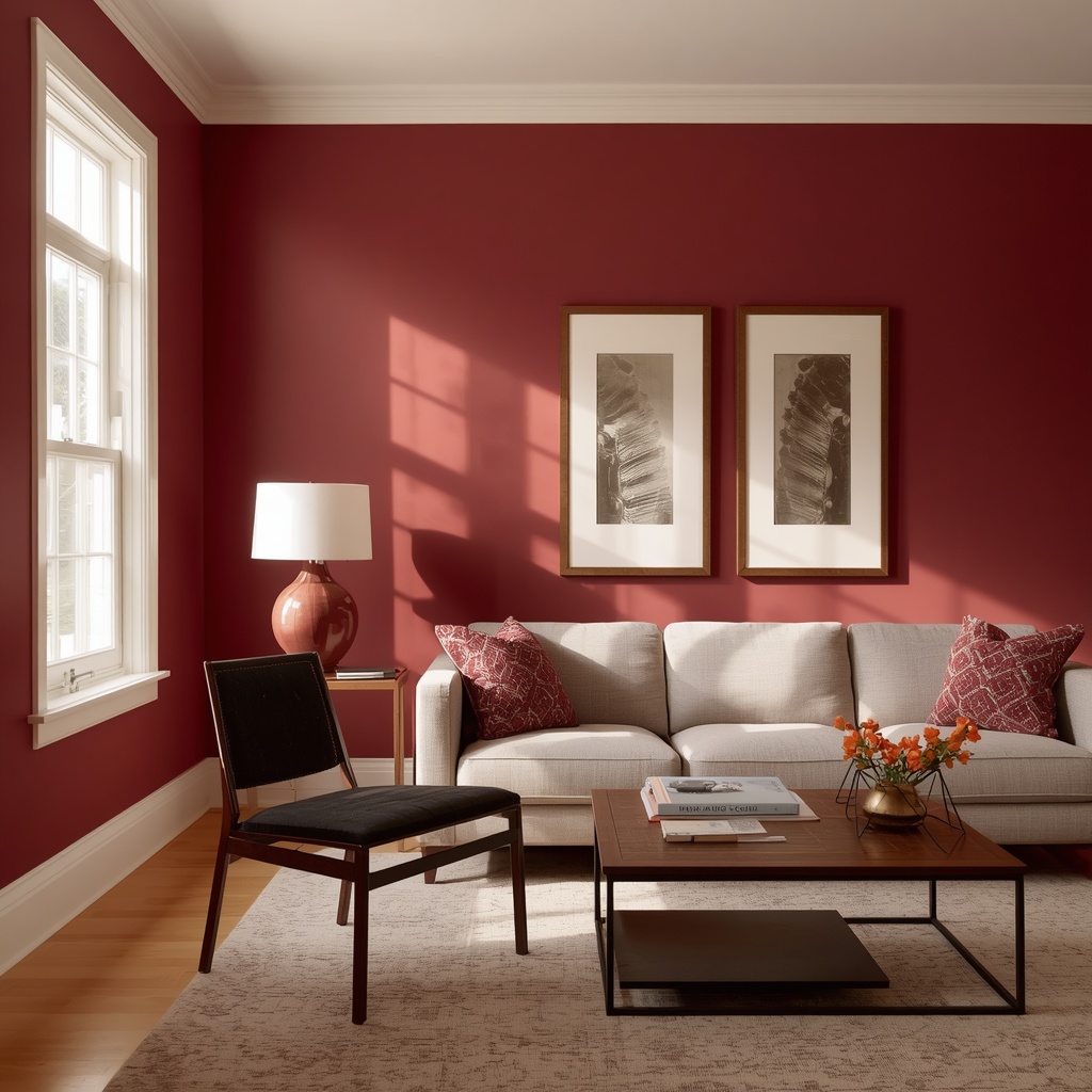
Pro Tip: Before committing to a full wall or a large upholstered piece, buy a quart of your chosen paint color and test it on a large poster board. Move that board around the room across a full day — morning, midday, and evening light change jewel tones dramatically, especially blues and greens.
Jewel Tone Meanings and Best Room Pairings
Different jewel tones create different emotional atmospheres. Here’s a quick reference for matching color to purpose.
| Jewel Tone | Mood It Creates | Best Rooms | Pairs Well With |
|---|---|---|---|
| Emerald Green | Grounded, refreshing, natural | Living room, home office, dining room | Gold, brass, cream, black |
| Sapphire Blue | Calm, sophisticated, cool | Bedroom, bathroom, study | Silver, white, blush pink |
| Ruby Red | Bold, energetic, warm | Dining room, entryway, powder room | Gold, ivory, dark wood |
| Amethyst Purple | Regal, dramatic, moody | Bedroom, reading nook, powder room | Rose gold, gray, blush |
| Topaz / Amber Gold | Warm, inviting, rich | Living room, kitchen accents | Navy, chocolate brown, cream |
| Peacock Teal | Vibrant, eclectic, confident | Living room, home office | Coral, brass, white |
Where to Introduce Jewel Tones in a Living Room
You don’t need to paint every wall emerald green to get the jewel-tone effect. In fact, restraint is often what separates a luxurious room from an overwhelming one. Here’s how designers typically layer jewel tones from largest to smallest investment.
Large Furniture Pieces
A velvet sofa in sapphire or emerald is the single most impactful jewel-tone investment you can make in a living room. Velvet specifically matters here — the way velvet catches light adds dimension that a flat cotton or linen upholstery simply can’t replicate, which is a big part of why jewel-toned velvet furniture reads as high-end.
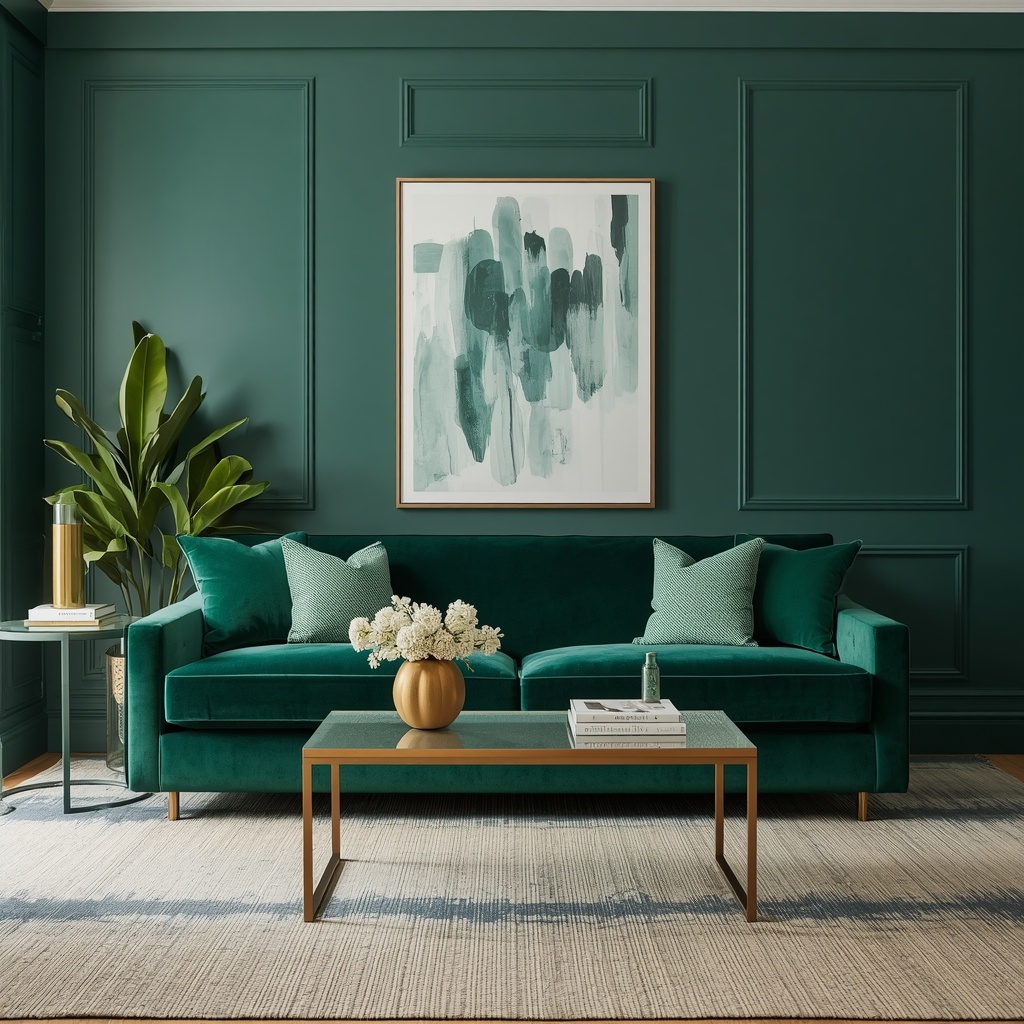
If a full sofa feels too committed, start with a single accent chair. It gives you the same rich color impact in a smaller, lower-risk footprint, and it’s easy to swap out later if your taste evolves.
Accent Walls and Paint
A single accent wall in a deep jewel tone — behind a bed, a sofa, or a dining table — creates a focal point without visually shrinking the whole room the way four saturated walls can. Pair it with lighter walls elsewhere to keep the space balanced and airy.
Textiles and Soft Furnishings
Throw pillows, curtains, area rugs, and throw blankets are the easiest, lowest-commitment way to experiment with jewel tones. This is where I recommend most homeowners start before investing in furniture or paint.
Easy jewel-tone textile swaps:
- Velvet or silk throw pillows in emerald or ruby
- A patterned area rug with jewel-toned accents
- Floor-length curtains in sapphire or amethyst
- A cashmere or velvet throw blanket draped over a neutral sofa
- Table runners or napkins in topaz gold for the dining area
Decor and Accessories
Vases, candles, ceramics, and art frames in jewel tones let you test the palette with almost no risk. These small doses of color are also the easiest to rotate seasonally if you want your space to evolve throughout the year.
Balancing Jewel Tones So the Room Doesn’t Feel Overwhelming
This is where most DIY attempts go wrong. Jewel tones are powerful, and powerful colors need balance, or the room tips from “luxurious” into “chaotic.”
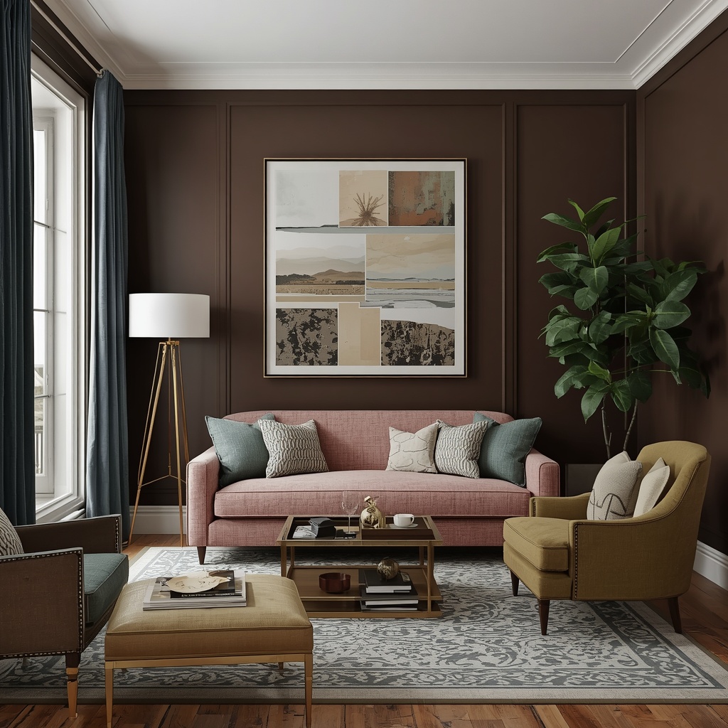
The most reliable formula I use with clients is the 60-30-10 rule, adapted specifically for jewel-tone rooms:
- 60% Neutral Base — walls, large rugs, or major architectural elements in white, cream, warm gray, or greige
- 30% Jewel Tone — your chosen gemstone color on major furniture, an accent wall, or drapery
- 10% Metallic or Contrast Accent — gold, brass, or black details that sharpen the whole palette
Metallics deserve special mention here. Gold and brass hardware, light fixtures, and picture frames don’t compete with jewel tones — they complete them. The reflective quality of metal against a deep, matte-adjacent jewel tone is what pushes a room from “colorful” into “luxurious.”
Pro Tip: If you’re nervous about committing to a full jewel-toned room, start with a monochromatic approach — pick one jewel tone and use it in two or three different shades and textures (matte, velvet, glossy ceramic) throughout the space. This creates depth without visual competition between multiple bold colors.
Materials and Textures That Elevate Jewel Tones
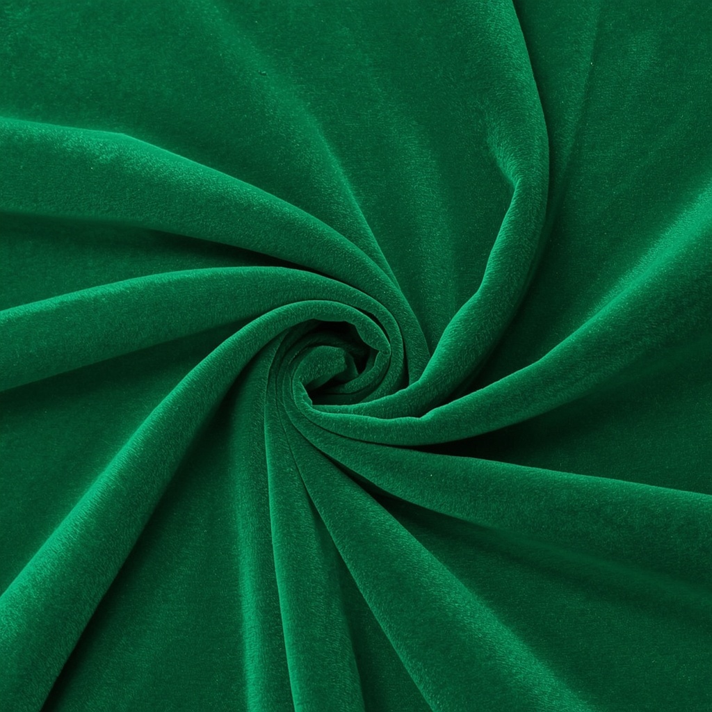
Color alone isn’t what makes jewel tones feel luxurious — texture does a lot of the heavy lifting. The same emerald green looks completely different in matte cotton versus lustrous velvet.
| Material | Effect With Jewel Tones | Best Used For |
|---|---|---|
| Velvet | Deepens color, adds light-catching sheen | Sofas, chairs, throw pillows |
| Silk / Satin | Adds subtle shine, softens saturation | Curtains, decorative pillows |
| Brass / Gold Metal | Warms and brightens the palette | Light fixtures, hardware, frames |
| Marble | Cools and formalizes the look | Countertops, side tables, coasters |
| Matte Ceramic | Grounds the palette, adds contrast | Vases, lamp bases |
| Dark Wood | Adds warmth and richness | Furniture frames, flooring |
Layering two or three of these materials in one room — say, a velvet sofa, a brass floor lamp, and a marble coffee table — is what creates that “designed by a professional” feeling homeowners are usually chasing.
Jewel-Toned Living Room Design: A Sample Layout
If you’re not sure where to start, here’s a simple, tested formula for a jewel-toned living room that feels cohesive rather than random:
- Walls: Warm white or soft greige
- Sofa: Emerald green velvet
- Accent chair: Solid neutral with a jewel-toned throw pillow
- Coffee table: Dark wood or marble top with brass legs
- Rug: Neutral base with subtle jewel-toned pattern
- Lighting: Brass or gold floor and table lamps
- Curtains: Floor-length, soft neutral or a lighter tonal match
- Accessories: Ceramic vases, candles, and books in ruby or amethyst tones
This structure keeps the eye moving without overwhelming it, and it’s flexible enough to adapt whether your personal style leans traditional, transitional, or modern eclectic.
Common Mistakes to Avoid
Even a great color story can fall flat with a few avoidable missteps. Here’s what to watch for:
- Using too many jewel tones at once. Stick to one or two dominant jewel tones per room, plus neutrals and metallics.
- Skipping the lighting test. Jewel tones shift dramatically under warm versus cool lighting — always test swatches under your actual bulbs.
- Forgetting texture variation. Flat, matte jewel tones everywhere can feel heavy rather than luxurious.
- Ignoring undertones. Mixing a warm ruby with cool-toned silver accents can create visual tension instead of harmony.
- Going too dark without contrast. A room entirely in deep jewel tones without light neutrals or metallics can feel cramped rather than cozy.
Frequently Asked Questions
Do jewel tones work in small living rooms? Yes, as long as you balance them with lighter neutrals on the largest surfaces (walls, ceiling, main rug) and use jewel tones as accents rather than covering every surface. A single emerald accent wall or a jewel-toned chair can add richness without shrinking the room visually.
What’s the easiest jewel tone to start with? Emerald green and sapphire blue are the most versatile and beginner-friendly, since they pair well with both warm and cool metals and most existing neutral color schemes.
Are jewel tones a passing trend? Jewel tones have cycled through interior design for decades because they’re rooted in classic color theory and historic design movements — from Art Deco to Victorian interiors — rather than a single fleeting trend cycle. That staying power is part of why they remain a reliable choice for a timeless, elevated home.
Final Thoughts
Jewel tones offer something a lot of trend-driven color palettes don’t: staying power paired with instant visual impact. Whether you commit to a full emerald velvet sofa or simply add a few sapphire and gold accents to an existing neutral living room, these rich, saturated hues do the work of making a space feel considered, warm, and genuinely luxurious.
Start small if you need to. A few throw pillows, a well-chosen accent wall, or a single statement chair can tell you a lot about how a jewel tone will live in your space before you commit further. But once you experience how much depth and warmth these colors bring to a room, don’t be surprised if beige starts to feel a little boring.