
Walk into any beautifully designed home in America, and chances are the walls aren’t stark white or bold red — they’re wearing a quiet, confident neutral. Neutrals have become the backbone of modern interior design, and for good reason.
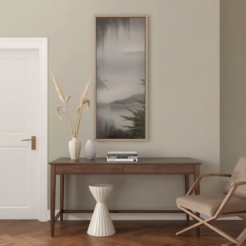
They’re timeless, versatile, and they let your furniture, art, and personality take center stage. But not all neutrals are created equal. As an interior designer who has painted (and repainted) more rooms than I can count, I can tell you that choosing the “right” neutral is equal parts science and art.
In this guide, I’m sharing the exact neutral paint colors that professional designers reach for again and again, along with the undertones, room pairings, and insider tricks that separate a flat, lifeless wall from one that feels warm, layered, and intentional.
Why Neutral Paint Colors Never Go Out of Style
Neutral colors — think whites, grays, greiges, beiges, and soft taupes — form the foundation of what designers call a “quiet palette.” They don’t compete for attention; instead, they create a calm backdrop that makes everything else in the room look better.

This is exactly why neutrals dominate real estate listings, interior design magazines, and Pinterest boards alike. They photograph well, they appeal to a wide range of buyers, and they age gracefully instead of dating a room the way trendy colors often do.
“A great neutral isn’t boring — it’s a blank canvas with personality. The best ones shift subtly throughout the day, catching warm morning light and cooler evening tones without ever feeling flat.” — a philosophy I share with nearly every client during a color consultation.
Understanding Undertones: The Secret Designers Actually Use
Before you fall in love with a paint chip, you need to understand undertones — the subtle background hue hiding within every “neutral” color. This is the single biggest reason DIY paint jobs go wrong.
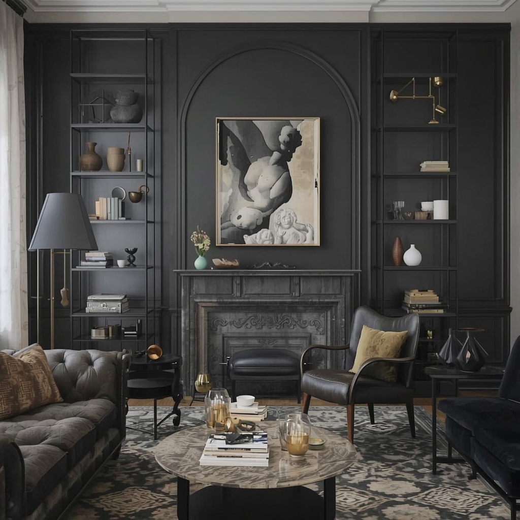
A gray with a purple undertone can look muddy in north-facing rooms. A white with a yellow undertone can read cream in bright sunlight. Designers always test swatches at different times of day before committing, because lighting changes everything.
Common undertones to watch for:
- Warm undertones — yellow, pink, or red base (cozy, inviting)
- Cool undertones — blue, green, or violet base (crisp, modern)
- Green undertones — often hidden in “greige” shades (earthy, calming)
- True neutrals — minimal undertone shift (rare and highly prized)
<div style=”border-left: 4px solid #999; padding-left: 12px; margin: 16px 0;”> <strong>Pro Tip:</strong> Always paint a large sample swatch — at least 2×2 feet — directly on your wall, and observe it at 9 AM, 1 PM, and 7 PM. Undertones that look invisible at noon can turn shockingly pink or green under lamplight. </div>
The Best Neutral Paint Colors Interior Designers Recommend
Here’s where the fun begins. Below are the neutral shades that consistently show up in designer portfolios, model homes, and client favorites across the US.
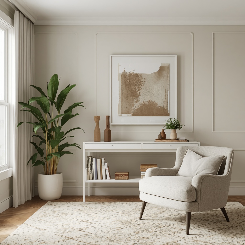
1. Warm Whites for a Soft, Inviting Look
Warm whites are the go-to for designers who want brightness without the clinical feel of a stark white. They pair beautifully with wood tones, brass hardware, and natural textures like linen and rattan.
These shades work especially well in farmhouse, coastal, and transitional interiors. They reflect light generously, making smaller rooms feel more open and airy.
2. Greige — The Designer’s Ultimate Compromise
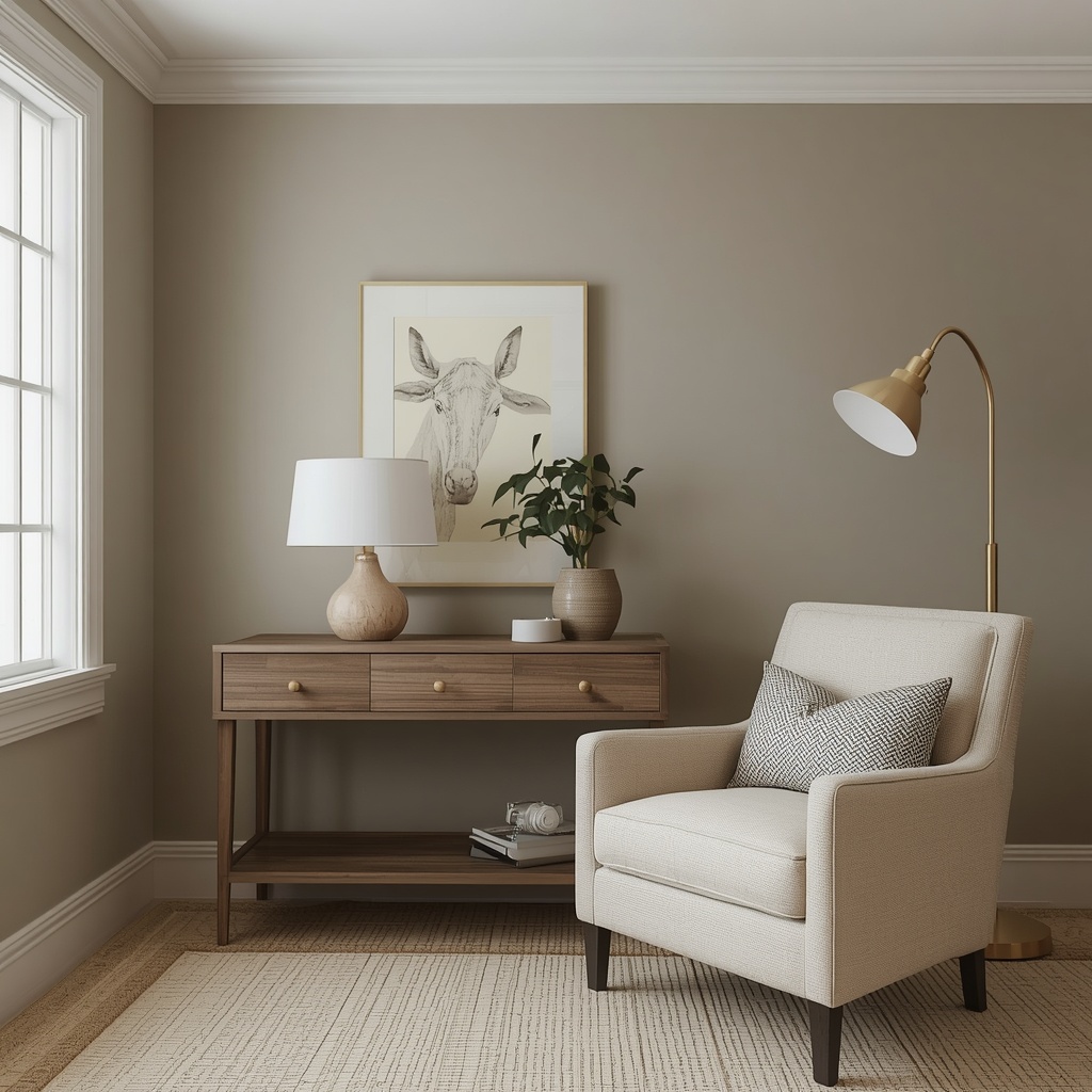
Greige (gray + beige) has dominated designer palettes for over a decade, and it’s not slowing down. It solves the eternal debate between warm and cool by doing a little of both.
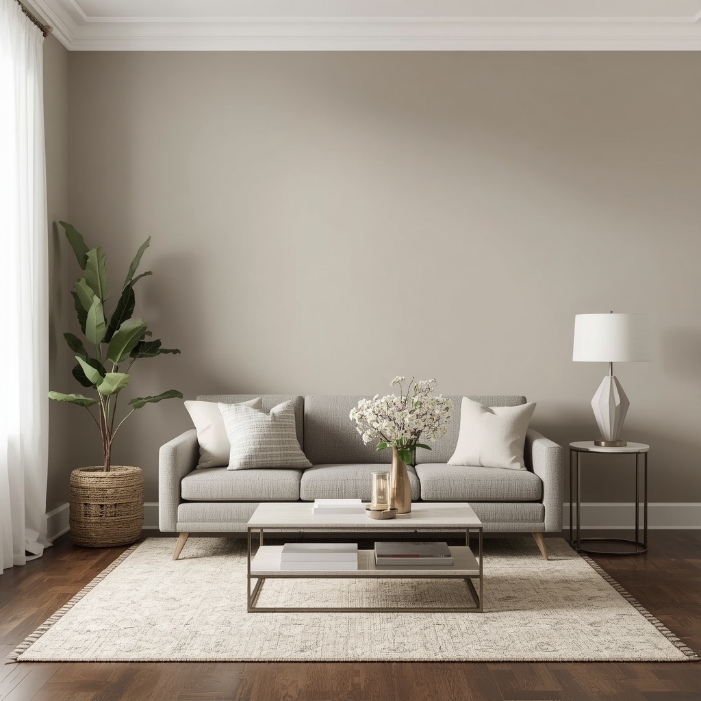
Greige works in nearly any room, any lighting condition, and any design style — from modern farmhouse to minimalist. It’s often called the “no-fail neutral” because it rarely clashes with existing furniture or flooring.
3. Soft Taupe for Cozy, Grounded Spaces
Taupe brings warmth and depth without veering into “brown room” territory. It’s a favorite for living rooms, dens, and bedrooms where you want a cocooning, restful atmosphere.
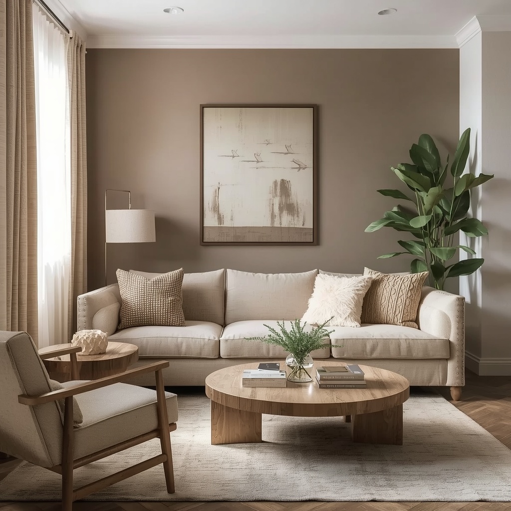
Designers often use taupe as a transition color between bold accent walls and neutral trim, creating a layered, cohesive look throughout an open floor plan.
4. Cool Grays for Modern, Minimalist Homes
Cool grays are the backbone of contemporary and Scandinavian-inspired interiors. They create a crisp, gallery-like backdrop that makes black, white, and metallic accents pop.
Be cautious with cool grays in rooms with limited natural light — without enough warmth from lighting or décor, they can occasionally feel a bit cold or sterile.
Popular Neutral Paint Colors at a Glance
| Paint Color | Undertone | Best For | Designer Vibe |
|---|---|---|---|
| Alabaster (Sherwin-Williams) | Warm, soft | Living rooms, trim | Airy & timeless |
| Simply White (Benjamin Moore) | Slightly warm | Kitchens, ceilings | Clean & bright |
| Agreeable Gray (Sherwin-Williams) | Warm greige | Whole-home color | Cozy & versatile |
| Revere Pewter (Benjamin Moore) | Warm greige | Bedrooms, living rooms | Classic & elegant |
| Balboa Mist (Benjamin Moore) | Cool-neutral gray | Open floor plans | Soft & sophisticated |
| Edgecomb Gray (Benjamin Moore) | Warm gray-beige | North-facing rooms | Inviting & subtle |
| Repose Gray (Sherwin-Williams) | Balanced greige | Any room, any light | Designer favorite |
| Swiss Coffee (Behr) | Warm cream-white | Trim, cabinetry | Soft & traditional |
Note: Always test physical swatches before purchasing full cans — screen colors and printed chips rarely match the final wall color exactly.
How to Choose the Right Neutral for Your Space
Selecting a neutral isn’t just about picking a pretty color from Pinterest. It’s about reading your space — its light, its purpose, and the furniture and finishes already living inside it.
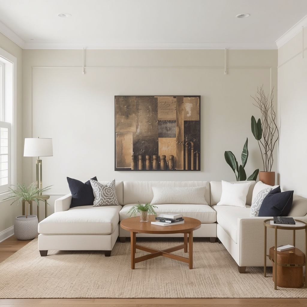
Here’s the process designers actually follow when narrowing down options for a client’s home.
Step-by-step approach:
- Assess your natural light — North-facing rooms need warmer neutrals; south-facing rooms can handle cooler tones.
- Pull colors from your flooring and fixed finishes — Wood tones, tile, and countertops should guide your undertone choice.
- Consider the room’s function — Bedrooms benefit from cozy, warm neutrals; home offices often suit crisper, cooler tones.
- Test in the actual room — Sample swatches under your real lighting, not the paint store’s fluorescents.
- Check adjoining rooms — Neutrals should flow logically from one space to the next for a cohesive, high-end feel.
<div style=”border-left: 4px solid #999; padding-left: 12px; margin: 16px 0;”> <strong>Pro Tip:</strong> If you’re painting an open-concept home, choose one versatile greige or warm white and use it throughout the main living areas. Reserve slightly deeper or lighter variations of the same color family for hallways, ceilings, and trim to create subtle dimension without visual chaos. </div>
Neutral Paint Colors by Room: A Quick Reference
Different rooms call for different neutral strategies. Here’s how designers typically approach color by space.
- Living Room: Warm greige or soft taupe for an inviting, layered feel
- Kitchen: Warm white or off-white to keep the space bright and timeless
- Bedroom: Muted taupe or warm gray for a calming, restful retreat
- Bathroom: Cool-neutral gray or crisp white for a clean, spa-like atmosphere
- Home Office: Balanced greige or soft gray for focus without feeling cold
- Entryway/Hallway: A slightly deeper neutral to anchor the space and hide daily wear
Common Mistakes to Avoid When Choosing Neutrals
Even seasoned homeowners fall into a few predictable traps when selecting neutral paint. Avoiding these will save you time, money, and repainting headaches.

Skipping the swatch test is the most common mistake — a color that looks perfect on a 2×3 inch chip can shift dramatically once it covers four walls. Lighting, room size, and surrounding colors all distort how a neutral actually reads in real life.
Another frequent error is choosing a neutral in isolation, without considering flooring, cabinetry, or existing furniture. A designer always works backward from what’s already fixed in the room — flooring and countertops rarely change, so the paint should complement them, not fight them.
Neutral Doesn’t Mean Boring: Styling Tips From a Designer
A neutral wall is only the beginning. The real magic happens when you layer texture, contrast, and warmth on top of that quiet backdrop.

Designers rely on a mix of matte and glossy finishes, natural materials like wood and stone, and varied fabric textures — linen, boucle, wool — to keep neutral rooms from feeling flat. Contrast is your best friend: pair a soft white wall with black window frames, or a warm greige with brass lighting fixtures.
Quick styling checklist for neutral rooms:
- Add at least one bold or dark accent (furniture, art, or a rug)
- Mix textures generously — smooth, woven, matte, and glossy
- Use metallics (brass, matte black, or aged bronze) for contrast
- Introduce greenery or fresh flowers for a natural pop of color
- Layer varying shades of the same neutral family for depth
Frequently Asked Questions About Neutral Paint Colors
What is the most popular neutral paint color right now? Warm greiges like Agreeable Gray and Revere Pewter remain top choices among designers because they balance warmth and sophistication in nearly any lighting condition.
Are neutral paint colors good for resale value? Yes. Real estate professionals consistently recommend neutral palettes because they appeal to a broader range of buyers and photograph beautifully for online listings.
Should I use the same neutral throughout my whole house? Many designers recommend a consistent neutral for main living areas to create visual flow, while allowing bedrooms and bathrooms to introduce subtle variations.
How do I know if a paint color will look too gray or too beige? Always test large swatches in your actual room and observe them throughout the day — undertones become far more obvious under natural light shifts than under store lighting.
Final Thoughts: Building a Timeless Neutral Palette
Choosing the right neutral paint color is one of the most impactful — and most overlooked — decisions in interior design. It’s not about playing it safe; it’s about creating a sophisticated foundation that lets your home’s character shine.
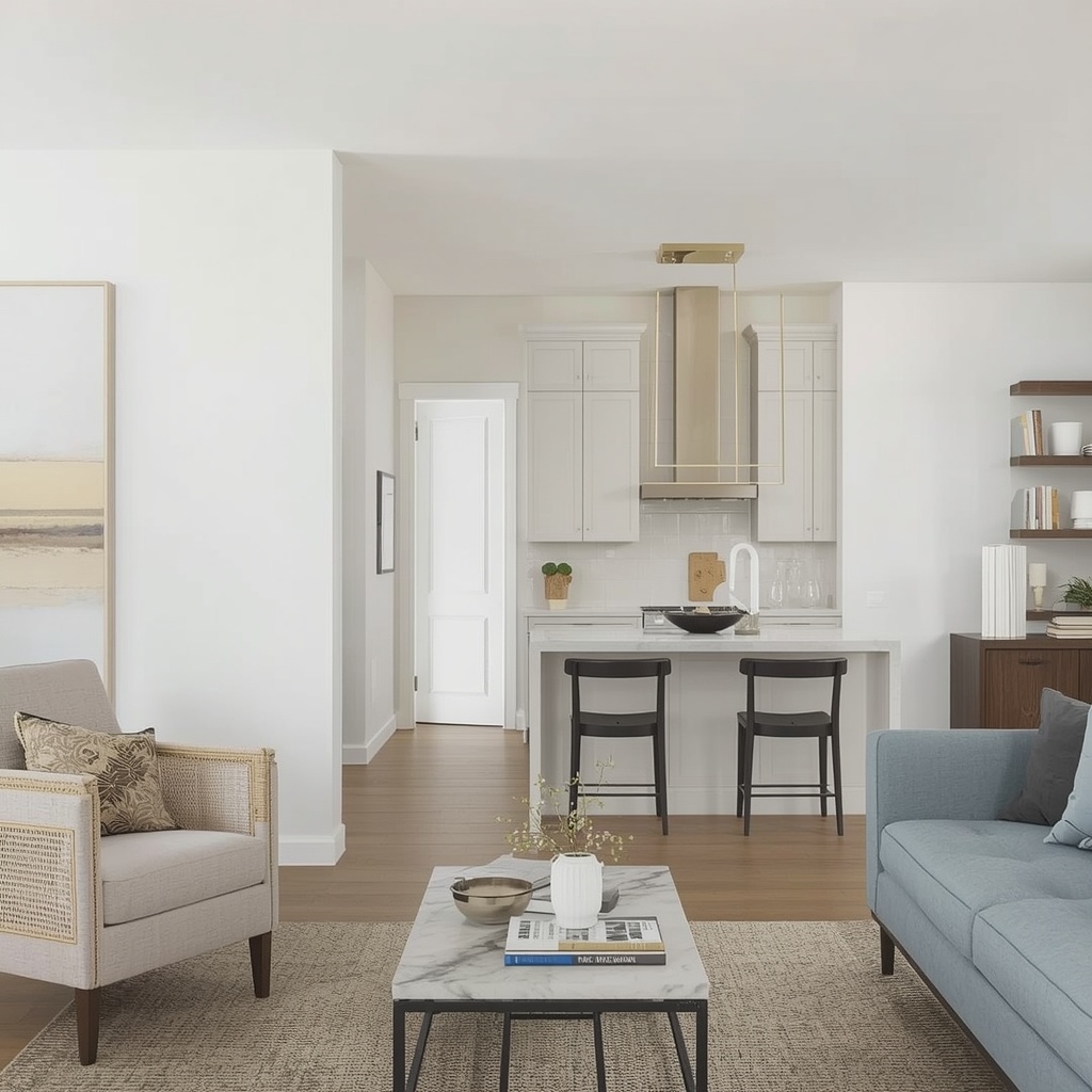
Whether you gravitate toward a warm white, a cozy taupe, or a crisp modern gray, the key is testing thoroughly, considering your lighting, and thinking about how each room connects to the next. Get the neutral right, and everything else in your home — furniture, art, textiles — instantly looks more intentional and pulled together.
For more color inspiration, explore resources from paint brands directly, such as Sherwin-Williams’ color visualizer and Benjamin Moore’s color gallery, where you can preview shades in different room settings before committing to a can.