
Walk into any room and, before you notice the furniture or the artwork, your body has already reacted to the color temperature around you. That’s not a coincidence — it’s design psychology at work. As an interior designer who has spent years helping homeowners across the US turn beige boxes into spaces that actually feel like them, I can tell you that the warm vs. cool tone debate is one of the most common — and most misunderstood — questions I get.
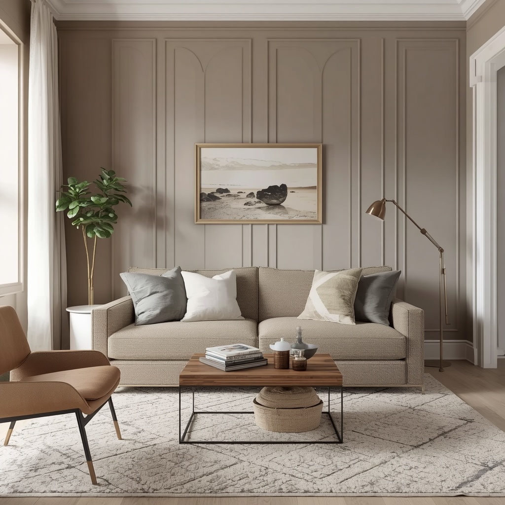
Some clients walk in convinced they’re “warm people” who love cozy earth tones. Others swear by crisp, cool minimalism. The truth? Almost every beautiful home uses both. The real skill isn’t picking a side — it’s learning how to balance warm and cool tones so your space feels layered, intentional, and alive.
What Are Warm and Cool Tones, Exactly?
Before we talk balance, let’s get the fundamentals straight. In color theory, every hue falls somewhere on a spectrum from warm to cool, and understanding this is the foundation of good color palette selection.

Warm tones include reds, oranges, yellows, and warm neutrals like terracotta, camel, and cream. They’re associated with sunlight, fire, and desert landscapes.
Cool tones include blues, greens, purples, and cool neutrals like slate gray, icy white, and dove gray. They evoke water, sky, and shade.
“Color is a power which directly influences the soul.” — Wassily Kandinsky
That quote might be about fine art, but it applies just as much to your living room walls. Interior designers use this same emotional logic when choosing a color scheme, because the temperature of a room shapes how people feel in it — not just how it looks in photos.
The Psychology Behind Warm and Cool Color Palettes
Color temperature isn’t just an aesthetic choice; it’s a mood-setting tool backed by real psychological research. This is why paint brands and home decor retailers spend so much time marketing “calming blues” or “energizing terracottas.”
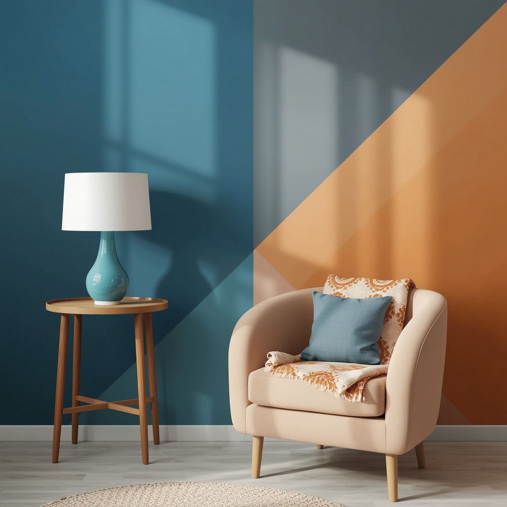
Warm tones tend to feel inviting, energetic, and grounded, which is why they dominate in kitchens, dining rooms, and family spaces where connection matters. Cool tones tend to feel serene, spacious, and restful, which explains their popularity in bedrooms, bathrooms, and home offices where focus or relaxation is the goal.
Pro Tip
Before committing to a full room, tape large paint swatches (at least 2×2 feet) on multiple walls and observe them at different times of day. Natural morning light, harsh midday sun, and warm evening lamplight can make the same “greige” look completely different — sometimes shifting from warm to cool within a single afternoon.
Warm Tones: Creating Cozy, Inviting Spaces
Warm color palettes are having a major resurgence in American interior design right now, moving away from the all-gray-everything era of the 2010s. Think rich terracotta, burnt sienna, mustard yellow, and deep rust — colors pulled straight from nature.
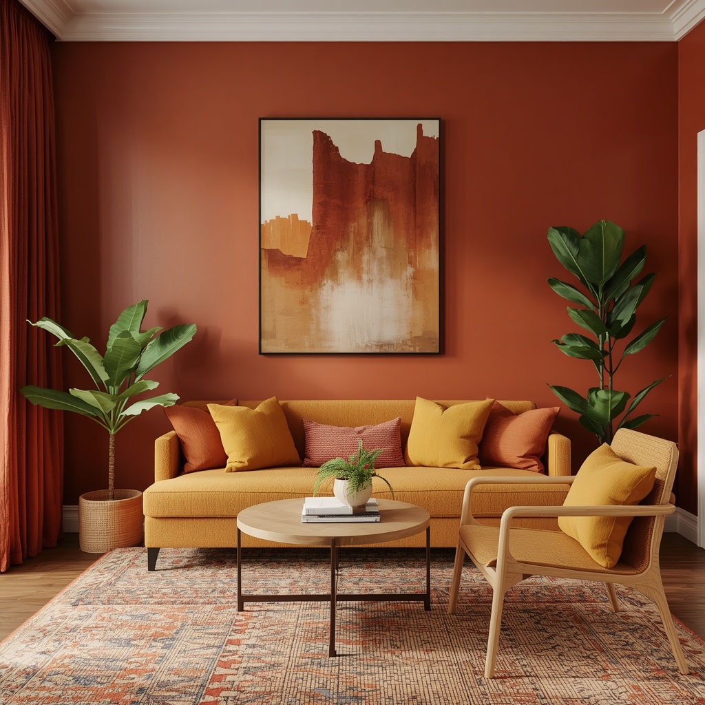
These hues work beautifully in homes that want to feel lived-in rather than staged. They pair effortlessly with natural materials like walnut wood, rattan, linen, and unlacquered brass, creating what many designers now call “warm minimalism” or “earthy modern” style.
Popular warm tone applications:
- Terracotta accent walls in dining rooms and entryways
- Camel or cognac leather furniture in living rooms
- Warm wood tones (oak, walnut, cherry) for flooring and cabinetry
- Brass or gold hardware and lighting fixtures
- Rust, mustard, or clay-colored textiles and throw pillows
If your home gets limited natural light or faces north, warm tones can counteract that cool, flat quality and inject visual warmth even on gray days.
Cool Tones: Building Calm, Spacious Interiors
Cool tones remain a staple for a reason — they’re incredibly versatile and tend to make small spaces feel larger and more open. Blues, sage greens, and soft grays are especially popular in coastal, Scandinavian, and modern farmhouse aesthetics, three of the most searched home design styles in the US.
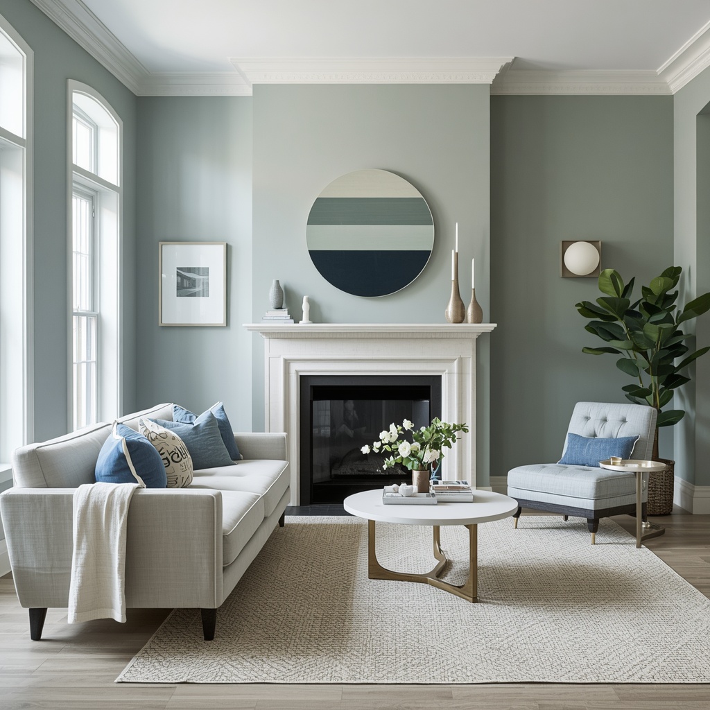
Cool palettes photograph beautifully because they reflect light cleanly, which is part of why they dominate real estate listings and rental staging. They also tend to age gracefully, avoiding the “trendy” trap that can date a home within a few years.
Popular cool tone applications:
- Soft sage or eucalyptus green kitchen cabinetry
- Dove gray or greige walls as a neutral backdrop
- Navy or slate blue accent furniture
- Chrome, nickel, or matte black hardware
- Cool-toned marble or quartz countertops
Warm vs. Cool: A Side-by-Side Comparison
| Feature | Warm Tones | Cool Tones |
|---|---|---|
| Common colors | Terracotta, mustard, rust, cream, camel | Navy, sage, slate, dove gray, icy white |
| Emotional effect | Cozy, energetic, grounded | Calm, spacious, restful |
| Best rooms | Living rooms, kitchens, dining rooms | Bedrooms, bathrooms, home offices |
| Complements | Wood tones, brass, leather | Marble, chrome, glass |
| Natural light needed | Works well in low-light rooms | Best in bright, sunlit rooms |
| Design styles | Boho, warm minimalism, Mediterranean | Coastal, Scandinavian, modern farmhouse |
| Risk if overdone | Can feel heavy or dark | Can feel sterile or cold |
How to Balance Warm and Cool Tones in the Same Room
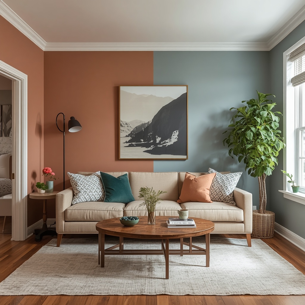
Here’s where the real design magic happens. The most sophisticated, high-end interiors rarely commit fully to one temperature. Instead, they use a dominant tone with intentional contrast — a technique professional interior designers rely on constantly.
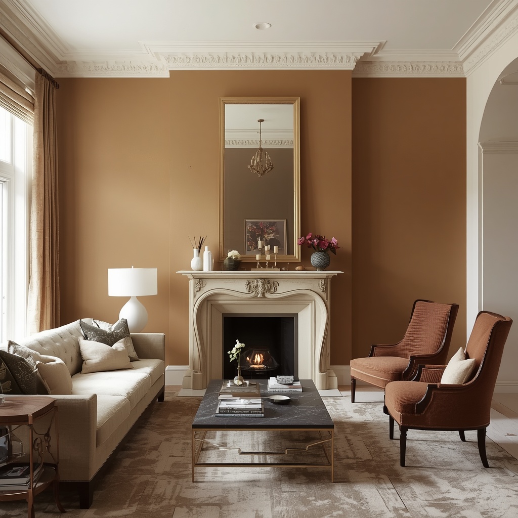
Think of it like seasoning a dish. Too much of one flavor overwhelms the palate, but the right contrast — salty and sweet, warm and cool — creates depth. A living room with warm wood floors and a camel sofa feels instantly more dynamic with a cool blue-gray accent chair or a slate coffee table.
Three Proven Balancing Techniques
- The 70/30 Rule – Choose one dominant temperature (70% of the room) and use the opposite temperature as an accent (30%). This keeps the space cohesive without feeling one-note.
- Neutral Bridging – Use warm-neutral or cool-neutral “bridge” colors like greige, taupe, or oatmeal to soften the transition between warm and cool elements.
- Material Mixing – Pair warm materials (wood, brass, leather) with cool materials (marble, glass, chrome) rather than relying on paint color alone to create temperature contrast.
Ad Pro Tip
Struggling to visualize the balance? Many paint brands, including Sherwin-Williams and Behr, offer free digital color visualizer tools where you can upload a photo of your actual room and test warm and cool palettes side by side before buying a single can of paint.
Room-by-Room Guide to Warm and Cool Balance
Different rooms in your home serve different emotional purposes, so the ideal warm-to-cool ratio should shift depending on the space and how you use it.
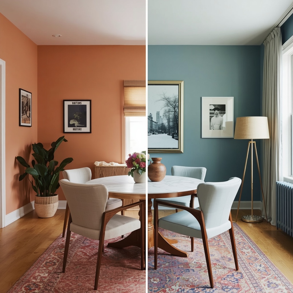
Your kitchen, for example, benefits from a slightly warmer lean since it’s a gathering space centered around food and connection, while a home office often performs better with a cooler, more focused palette that supports concentration. Matching color temperature to function — not just personal preference — is one of the most overlooked strategies in DIY home decorating.
Suggested room-by-room approach:
- Living Room: Warm-dominant with cool accent pillows or artwork
- Kitchen: Warm wood tones balanced by cool stone countertops
- Bedroom: Cool-dominant for restfulness, warm lighting for coziness at night
- Bathroom: Cool tones with warm brass or wood accents to avoid a clinical feel
- Home Office: Cool-dominant for focus, with a warm accent chair or rug
- Dining Room: Warm-dominant to encourage lingering conversation
Common Mistakes to Avoid
Even experienced homeowners fall into a few predictable traps when navigating color temperature. Recognizing these early can save you an expensive repaint or a full furniture return.
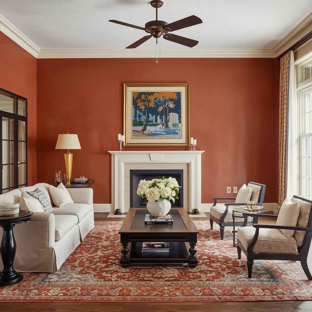
The most frequent mistake is choosing paint color in isolation from lighting — a warm terracotta that looks perfect in the store can turn muddy under cool LED bulbs at home. The second most common mistake is over-committing to one temperature across an entire open-concept floor plan, which can make a large space feel flat and monotonous rather than expansive.
Mistakes to watch for:
- Ignoring your home’s existing light temperature (measured in Kelvin) when selecting paint
- Matching all metals to one finish instead of mixing warm brass with cool chrome
- Choosing trend-driven colors without considering your home’s architectural style
- Overlooking flooring undertones when selecting wall colors
- Forgetting that fabric and textile colors shift dramatically under different lighting
Lighting: The Secret Variable Most People Forget
You can have the perfect warm-cool color balance on paper and still have it fall flat if your lighting works against you. Light bulb temperature, measured in Kelvin (K), dramatically affects how warm or cool your colors appear.
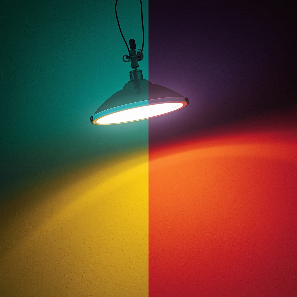
Bulbs in the 2700K–3000K range cast a warm, amber glow that flatters warm color palettes and adds coziness to cool ones. Bulbs in the 4000K–5000K range produce a crisp, cool-white light that enhances blues and grays but can make warm tones look washed out or slightly orange. For most residential spaces, designers recommend staying in the 2700K-3000K “soft white” range, then layering in accent lighting to create warmth even in cool-toned rooms.
Frequently Asked Questions
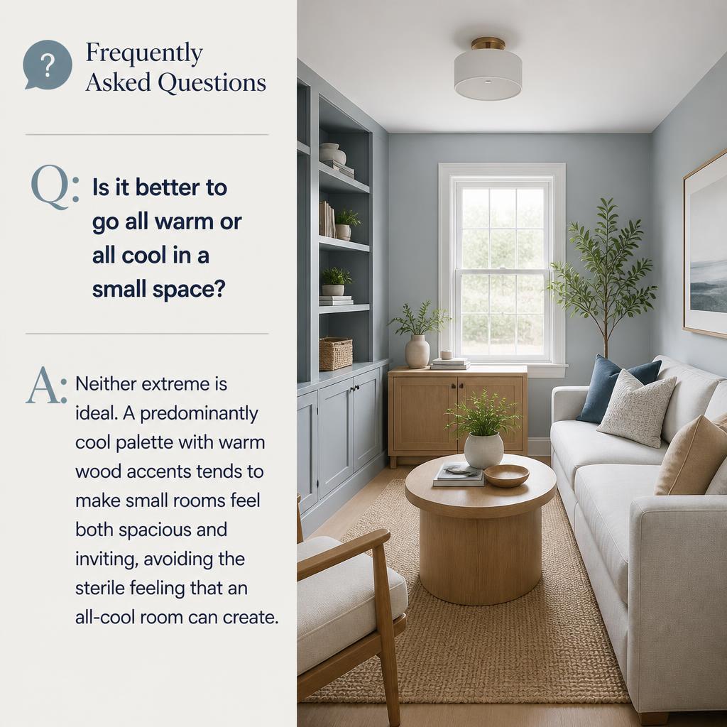
Is it better to go all warm or all cool in a small space? Neither extreme is ideal. A predominantly cool palette with warm wood accents tends to make small rooms feel both spacious and inviting, avoiding the sterile feeling that an all-cool room can create.
What’s the most popular warm-cool combination in 2026? Sage green paired with warm walnut wood and brass fixtures remains one of the most requested combinations, blending the calm of cool tones with the coziness of warm materials.
Can I mix warm and cool metals in the same room? Yes — intentional metal mixing (like matte black and brass, or chrome and gold) is a hallmark of current interior design trends and adds visual interest when done with restraint.
Final Thoughts: Trust the Balance, Not the Trend
At the end of the day, warm vs. cool isn’t a competition — it’s a conversation. The most memorable, magazine-worthy homes I’ve worked on all share one thing in common: they don’t force a single temperature onto every surface. They let warmth and coolness talk to each other through color, material, and light.
Start small. Pick one room, apply the 70/30 rule, and pay attention to how the space feels — not just how it photographs. Your home should reflect the way you actually want to feel when you walk through the door, and that almost always means a thoughtful blend of both warm and cool.
For more guidance on building a cohesive color palette, the Sherwin-Williams Color Visualizer and the Benjamin Moore Color Trends resources are excellent starting points for testing warm and cool combinations in your own space before making a final decision.