
There’s a moment every homeowner hits when they’re standing in the paint aisle, holding a swatch of deep charcoal or forest green, feeling that little flutter of “what if I hate it?” That hesitation is normal. Dark, moody paint colors ask for more commitment than a safe greige, and that’s exactly why they deliver so much more personality once you take the leap.

Moody interiors have moved from niche design-blog trend to mainstream must-have, showing up in everything from cozy reading nooks to full dining rooms wrapped in ink-black walls. If you’ve been eyeing a deeper palette but worry about making your space feel small, dark, or dated, this guide will walk you through exactly how to do it right — room by room, undertone by undertone, mistake by mistake.
What Are Moody Paint Colors, and Why Are They Having a Moment?
Moody paint colors are deep, saturated shades — think charcoal, espresso brown, hunter green, navy, aubergine, and near-black — that create drama, depth, and warmth rather than the airy openness of white or pastel palettes. They’re not about making a room feel dark for darkness’ sake; they’re about creating atmosphere, contrast, and a sense of intimacy.
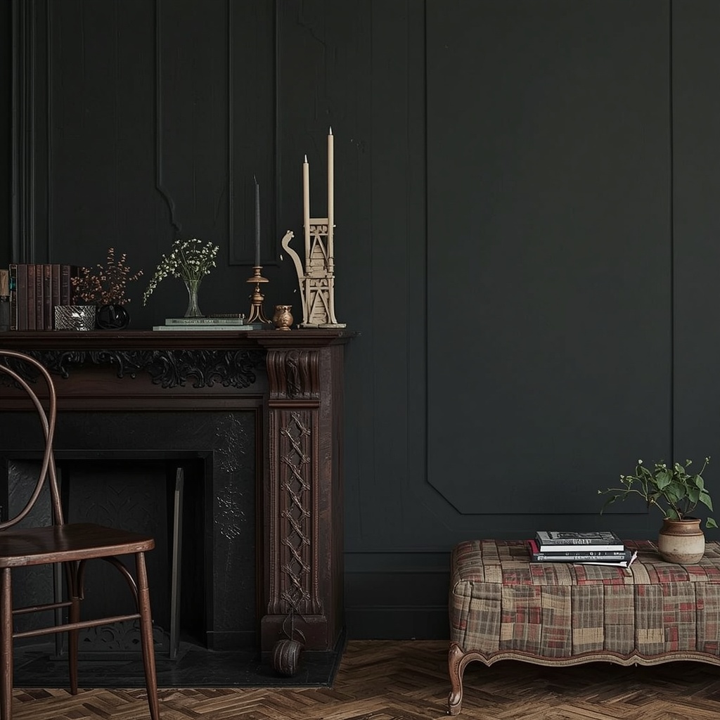
This shift toward richer color stories reflects a broader move away from the all-white, resale-ready interiors that dominated the last decade. Homeowners are prioritizing spaces that feel personal, layered, and a little unexpected. Dark walls do something flat white paint simply can’t: they recede visually in the right light, wrap a room in coziness, and make architectural details, art, and furniture pop with far more contrast than a neutral backdrop ever could.
Common Fears About Dark Paint (Debunked)
Almost every client who considers a moody palette raises the same handful of concerns. Let’s address them head-on before you pick up a brush.
- “It’ll make my room feel smaller.” Dark walls actually blur the corners of a room, making boundaries less distinct — in low-light spaces this can make a room feel more enveloping, not cramped.
- “It’ll make the room feel dark and gloomy.” Undertone and sheen matter more than the depth of the color itself. A warm charcoal with a soft sheen reflects light differently than a flat, cool black.
- “I’ll never be able to change it.” Modern primers and paints make repainting far easier than it used to be; two coats of a quality stain-blocking primer will get you back to white in a weekend.
- “It’s too trendy and will date quickly.” Deep, earthy tones like espresso brown and hunter green have been used in interiors for centuries — they’re arguably more timeless than the greige that’s now starting to feel tired.
“The rooms people remember are never the ones that played it safe on the walls.” — a sentiment echoed by design-forward homeowners embracing color again after years of neutral fatigue.
Choosing the Right Moody Shade for Your Space
Not all dark colors behave the same way, and undertone is the single biggest factor in whether a moody shade reads as sophisticated or simply murky. Warm undertones (brown, red, or yellow-based) tend to feel cozy and inviting, while cool undertones (blue or green-based) feel crisp, formal, and a touch more dramatic.
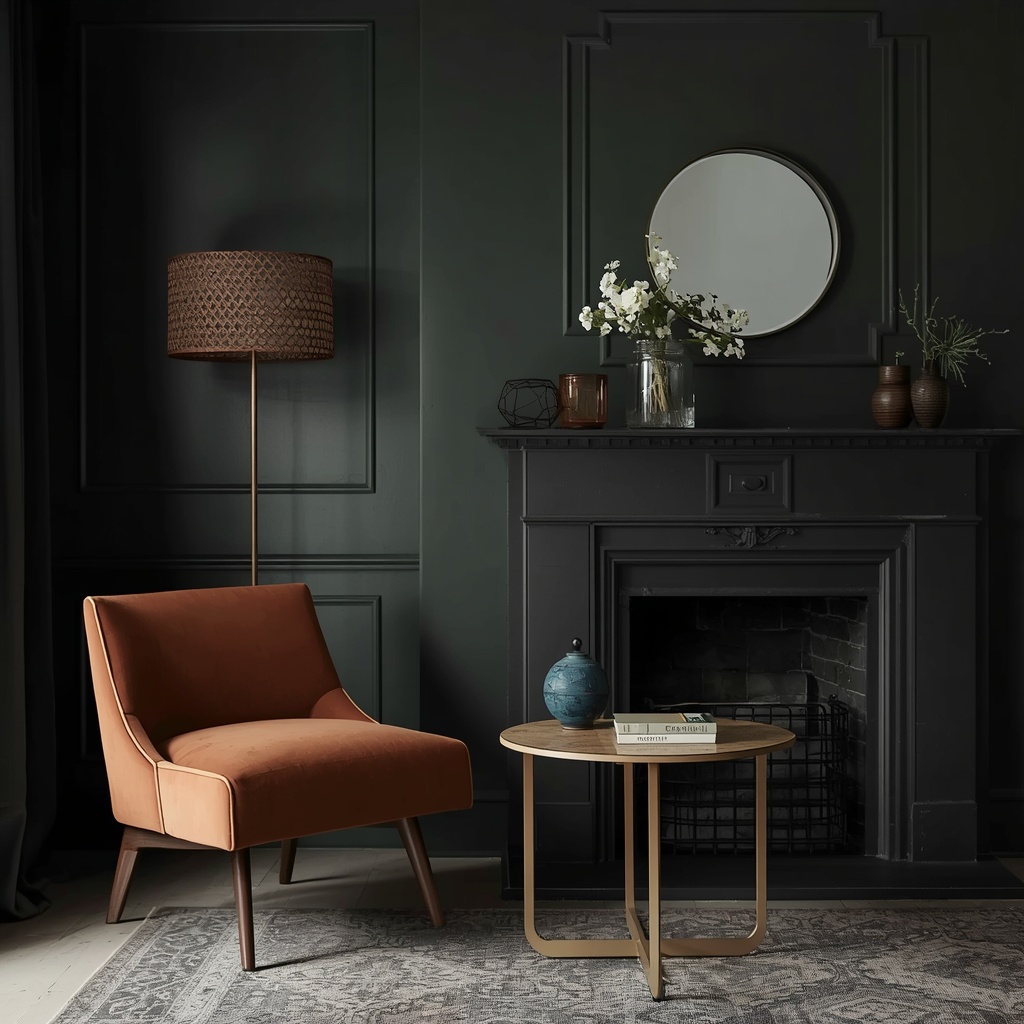
Before committing to a full room, always test a large swatch — at least a 2×2 foot painted poster board — and observe it at different times of day. Northern light stays cool and consistent; southern light is warm and bright; eastern light is warm in the morning and cool by afternoon; western light does the reverse. A color that looks perfect at 10 a.m. can shift dramatically by sunset.
Popular Moody Paint Colors and Their Undertones
| Color Name | Family | Undertone | Best Used In |
|---|---|---|---|
| Hale Navy | Navy Blue | Cool, slightly gray | Dining rooms, home offices |
| Kendall Charcoal | Charcoal Gray | Neutral-warm | Living rooms, kitchen cabinetry |
| Tarrytown Green | Hunter Green | Warm, earthy | Libraries, powder rooms |
| Bear Trap | Espresso Brown | Warm, red-based | Bedrooms, entryways |
| Aubergine | Deep Purple/Plum | Cool, muted | Accent walls, primary bedrooms |
| Iron Ore | Warm Black | Warm-neutral | Exteriors, kitchen islands |
| Van Deusen Blue | Deep Blue | Cool, classic | Studies, powder rooms |
Pro tip: If you’re nervous about undertone clashes, choose a moody color from the same paint family as your existing trim or flooring’s undertone — warm wood floors pair beautifully with warm charcoals and browns, while cooler gray floors lean better with navy or true black.
Room-by-Room Guide to Going Dark
Different rooms call for different levels of boldness. Here’s how to match the moody trend to the way each space is actually used.
- Powder rooms and small bathrooms — The lowest-risk, highest-impact place to start. Small spaces used briefly can handle bolder, darker colors because you’re never in them long enough to feel overwhelmed.
- Dining rooms — Typically used in the evening under artificial light, making them ideal for saturated, dramatic shades like navy or deep green that glow beautifully under warm bulbs and candlelight.
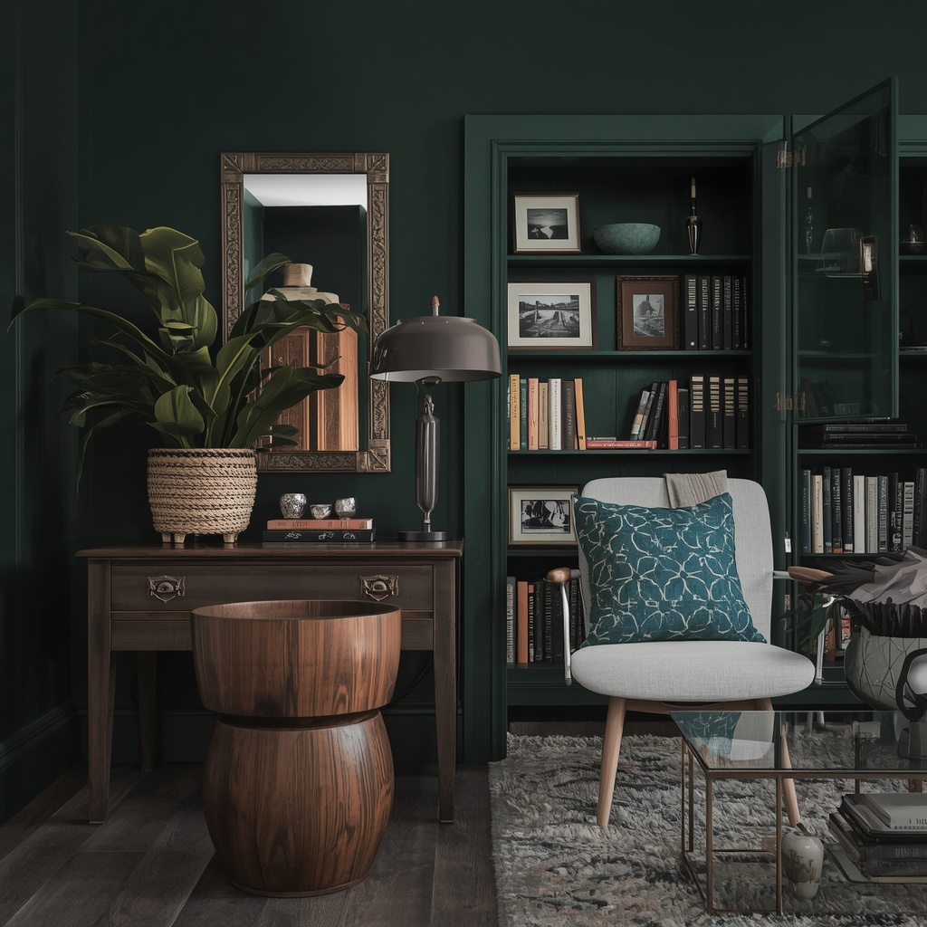
- Home offices and libraries — Deep, focused colors like espresso or hunter green support concentration and give built-in shelving a rich, gallery-like backdrop for books and art.
- Primary bedrooms — Moody tones create a cocoon-like, restful atmosphere; pair with warm lighting and soft textiles to avoid a cold or cavernous feel.
- Kitchens — Consider dark lower cabinets or a single moody wall rather than committing every surface, which keeps the room functional and bright while still delivering drama.
- Living rooms — Best for larger, light-filled rooms; if natural light is limited, use dark paint on one accent wall rather than all four to preserve brightness.
Lighting Tricks That Make Dark Rooms Glow
Paint color and lighting are inseparable decisions. A moody room lit poorly will feel flat and heavy; the same room lit well will feel rich and enveloping.
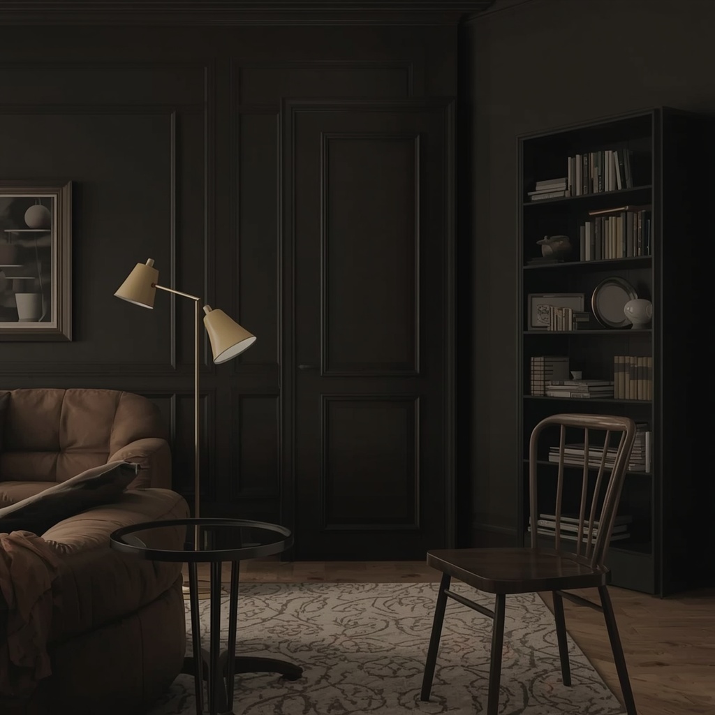
Layer at least three light sources in any dark-painted room: ambient (overhead), task (reading lamps, under-cabinet lighting), and accent (picture lights, sconces, or LED strip lighting). Warm-white bulbs, in the 2700K–3000K range, flatter dark walls far better than cool daylight bulbs, which can make deep colors look muddy or gray. Dimmer switches are almost non-negotiable in moody rooms — they let you shift the mood from bright and functional during the day to soft and atmospheric at night.
Metallic and reflective finishes also do heavy lifting in dark spaces. Brass or gold hardware, mirrored trays, glass light fixtures, and glossy ceramics all bounce light around a room and prevent deep walls from absorbing every bit of brightness.
Balancing Dark Walls with the Right Accents
A moody wall color needs contrast to breathe. Without lighter elements to balance it, even a beautifully chosen dark shade can start to feel heavy or claustrophobic over time.
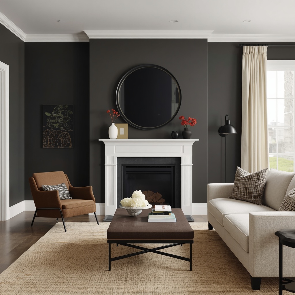
Bring in contrast through trim, ceilings, textiles, and furniture rather than relying on the wall color alone to do all the work. A crisp white or soft cream trim against a charcoal wall creates a defined, architectural edge that keeps the room from feeling like a single dark box. Light rugs, linen curtains, and pale wood furniture add breathing room, while a few darker accent pieces — a black metal light fixture, a dark wood side table — tie the whole palette together without repeating the exact wall color.
Quick Accent-Pairing Checklist
- Keep ceilings white or a soft off-white to maintain a sense of height
- Use natural materials — rattan, linen, light oak — to soften the drama
- Add at least one large mirror to bounce light and expand the visual space
- Introduce warm metallics (brass, gold, bronze) over cool chrome or silver
- Layer in one or two bold patterns rather than solid dark-on-dark everywhere
Mistakes to Avoid When Painting Dark
Even experienced homeowners run into a few predictable pitfalls when working with moody colors for the first time.
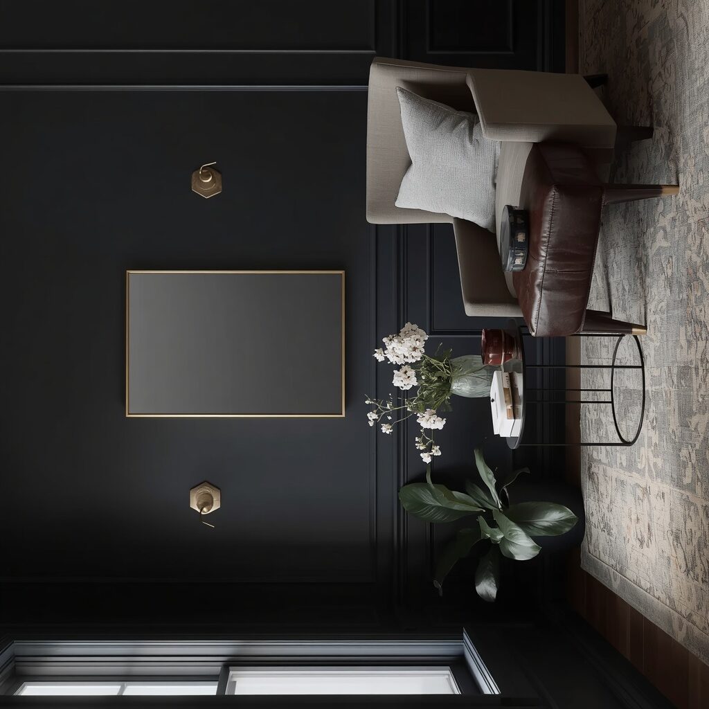
Skipping the sample-and-observe step is the most common one — committing to a full room based on a tiny paint chip almost always leads to disappointment, since color intensifies dramatically when scaled up across large wall surfaces. Another frequent mistake is ignoring sheen: a flat finish in high-traffic rooms shows scuffs quickly, while an eggshell or matte-with-scrubbable finish holds up far better and still reads as sophisticated rather than glossy.
Finally, many people underestimate how much undertone shifts under artificial light versus daylight, painting a whole room only to find their “black” reads distinctly green or blue at night. Testing swatches under your actual evening lighting, not just daytime sun, prevents this costly surprise.
Frequently Asked Questions
Will dark paint make my small room feel smaller? Not necessarily — in fact, dark walls can make a small room feel more intentional and cozy by blurring corner edges, especially when paired with matching or lighter ceiling color and good lighting.
What’s the easiest moody color to start with? A warm charcoal or soft navy is generally the most forgiving choice, since both pair well with a wide range of existing wood tones, metals, and furniture without heavy re-decorating.
Do I need a special primer for dark paint? Yes — a tinted or gray-toned primer helps achieve full, even color coverage in fewer coats and makes future repainting significantly easier if you ever want to go lighter again.
Is matte or eggshell better for moody walls? Eggshell or matte-washable finishes are generally recommended for living spaces, since they resist scuffs better than flat finishes while still keeping the soft, non-reflective look moody colors rely on.
Final Thoughts: Trust the Depth
Going moody isn’t about making a room dark for shock value — it’s about giving a space depth, warmth, and a sense of intention that white walls rarely achieve. Start small if you need to, whether that’s a powder room, an accent wall, or a piece of furniture, and let yourself get comfortable with how color transforms a space before committing to something larger.
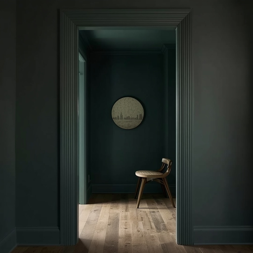
The homeowners who end up loving their moody rooms the most are almost always the ones who trusted the process through that uncertain, half-painted middle stage. Dark, saturated color rewards patience — and once the trim, lighting, and accents come together, it rarely reads as “risky.” It just reads as designed.