
Walk into any beautifully designed home and you’ll notice something: the rooms that feel the most collected, layered, and lived-in almost always mix patterns. A striped rug under a floral sofa. A geometric throw pillow against a botanical wallpaper. It looks effortless, but it isn’t accidental — it’s a skill.
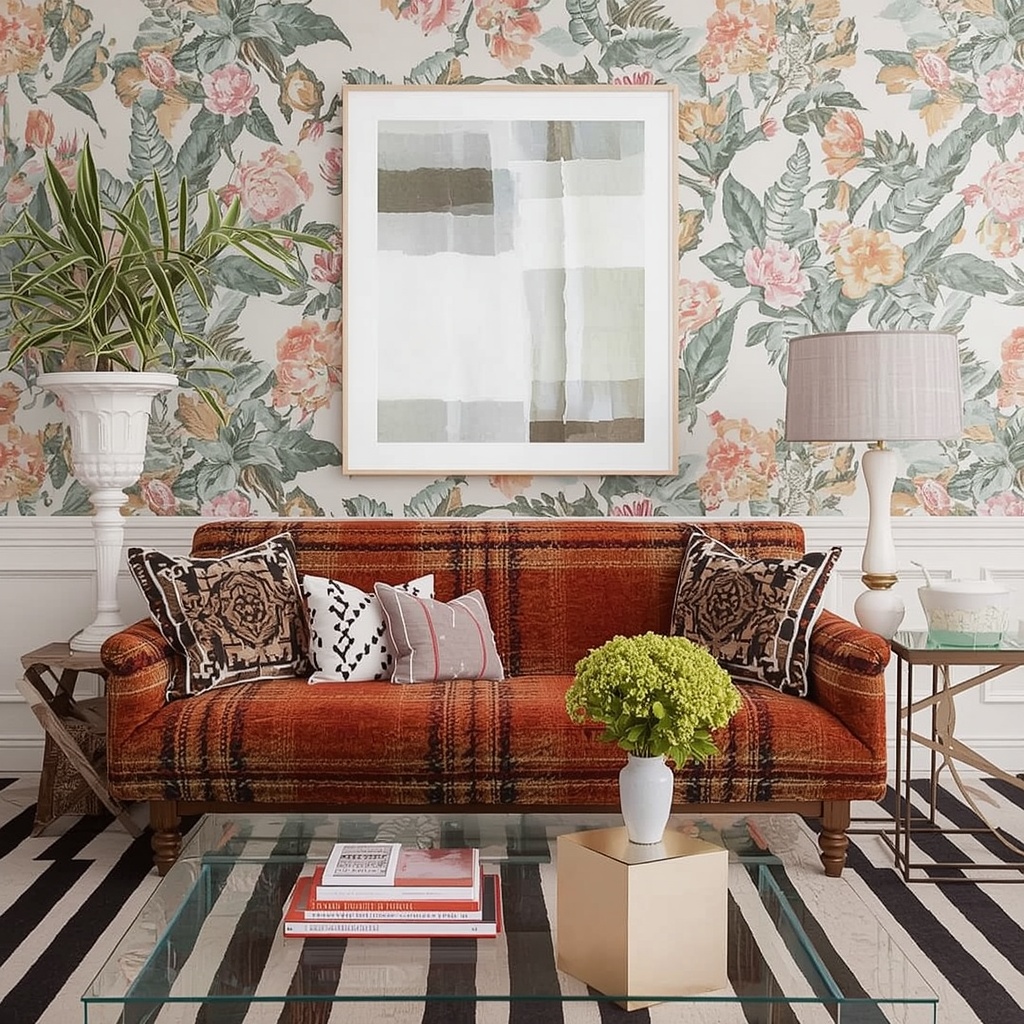
As an interior designer who’s spent years helping homeowners across the US bring personality into their spaces, I can tell you that pattern mixing is one of the most requested — and most feared — design moves. People worry about “getting it wrong,” so they default to solid neutrals and safe, matchy-matchy sets. The result? A room that looks like a furniture showroom instead of a home. This guide will walk you through everything you need to know about mixing patterns in interior decor, from color theory and scale to room-by-room application, so you can decorate with confidence.
Why Mixing Patterns Works (And Why It’s Not as Risky as You Think)
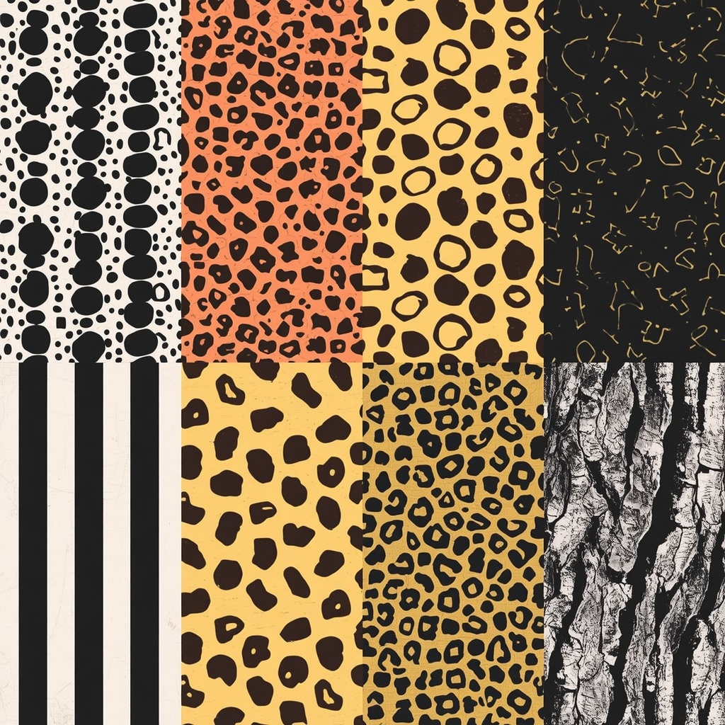
Pattern mixing works because it mimics how the eye naturally processes a rich, textured environment. Nature itself is full of clashing patterns — think of a garden with striped tulips, dotted ladybugs, and mottled tree bark all coexisting. Our brains are wired to find harmony in variety, not just in uniformity.
The fear of “clashing” usually comes from mixing patterns without a unifying thread — whether that’s color, scale, or style. Once you understand the underlying structure, pattern mixing stops being a gamble and becomes a formula you can repeat again and again. Designers rely on repeatable principles: color anchoring, scale variation, and pattern-type balance. Master these three, and any combination of prints becomes intentional rather than chaotic.
“Good pattern mixing isn’t about matching — it’s about creating a conversation between prints. Every pattern in the room should feel like it belongs to the same story, even if it’s telling a different chapter.”
The Golden Rules of Mixing Patterns
Before diving into specific pattern types, it helps to internalize a few non-negotiable rules. These are the guardrails that keep eclectic decor from tipping into visual chaos.
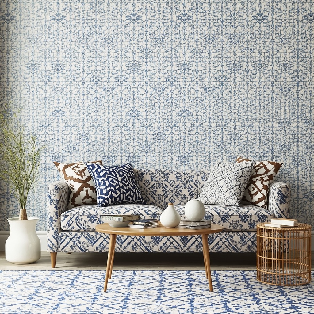
- Anchor with a common color. Every pattern in the room should share at least one recurring color, even if the rest of the palette differs.
- Vary the scale. Pair large-scale prints with small-scale ones so no two patterns compete for the same visual “volume.”
- Balance busy with calm. For every bold pattern, include a solid or near-solid surface to give the eye a place to rest.
- Mix pattern families, not just prints. Combine a stripe, a floral, and a geometric rather than three florals of different sizes.
- Repeat, don’t isolate. Echo a pattern or color at least twice in the room (pillow + throw, or rug + drapery) so it feels intentional.
Understanding Scale: The Secret Ingredient Most People Skip
Scale is arguably the single most important — and most overlooked — factor in successful pattern mixing. When patterns of similar size are placed together, they compete and create visual static. When you vary the scale, each pattern gets its own “lane,” and the room reads as curated rather than cluttered.

Here’s a simple breakdown of how to think about scale distribution in a single room:
| Scale Type | Example Pattern | Best Used On | Visual Effect |
|---|---|---|---|
| Large-scale | Oversized floral, big damask, wide stripes | Area rugs, drapery, an accent wall | Sets the tone; acts as a focal point |
| Medium-scale | Ikat, plaid, medium check | Upholstered chairs, ottomans | Bridges large and small patterns |
| Small-scale | Pinstripe, mini dot, small trellis | Throw pillows, lampshades, trim | Adds texture without overwhelming |
| Micro/textural | Herringbone, houndstooth, tonal weave | Table linens, chair backs | Reads almost as a solid from a distance |
A simple formula: pick one large-scale “hero” pattern, one medium-scale supporting pattern, and one or two small-scale accents. This 1-1-2 ratio almost always produces a balanced, magazine-worthy result.
Pro Tip: If you’re nervous about committing to bold pattern mixing on big-ticket items like a sofa or sectional, start small. Introduce pattern through pillows, a throw blanket, and a rug first. These are low-cost, low-commitment ways to test combinations before investing in upholstery or wallpaper. You can always swap pillow covers if a pairing doesn’t work, but you can’t easily return a custom sofa.
Color: The Thread That Ties It All Together
If scale controls the rhythm of a room, color controls the harmony. The fastest way to make disparate patterns feel cohesive is to build them all around a shared color palette — typically two to three main colors plus one neutral.
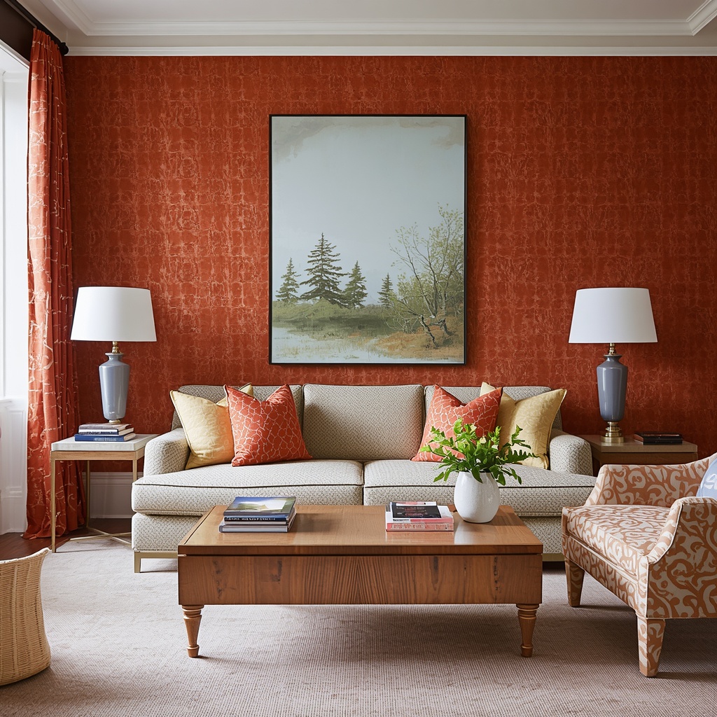
A helpful approach is the 60-30-10 rule, borrowed from classic color theory: 60% of the room in a dominant color (often a neutral or wall color), 30% in a secondary color (often your patterned upholstery), and 10% in an accent color (throw pillows, art, accessories). When each pattern you introduce pulls from this same three-color story, they’ll feel related no matter how different the prints themselves are.
Consider these popular color-anchored pattern palettes that work well in American homes:
- Coastal Calm: Navy stripe + soft botanical + white ground, anchored by natural linen texture.
- Warm Bohemian: Rust ikat + mustard geometric + cream trellis, anchored by jute or rattan.
- Modern Traditional: Charcoal windowpane + blue-and-white chinoiserie + subtle herringbone.
- Soft Farmhouse: Sage gingham + faded floral + oatmeal ticking stripe.
Pattern Types and How They Play Together
Not all patterns behave the same way, and knowing their “personality” helps you predict how they’ll interact. Below is a quick reference for the most common pattern families and their best pairings.
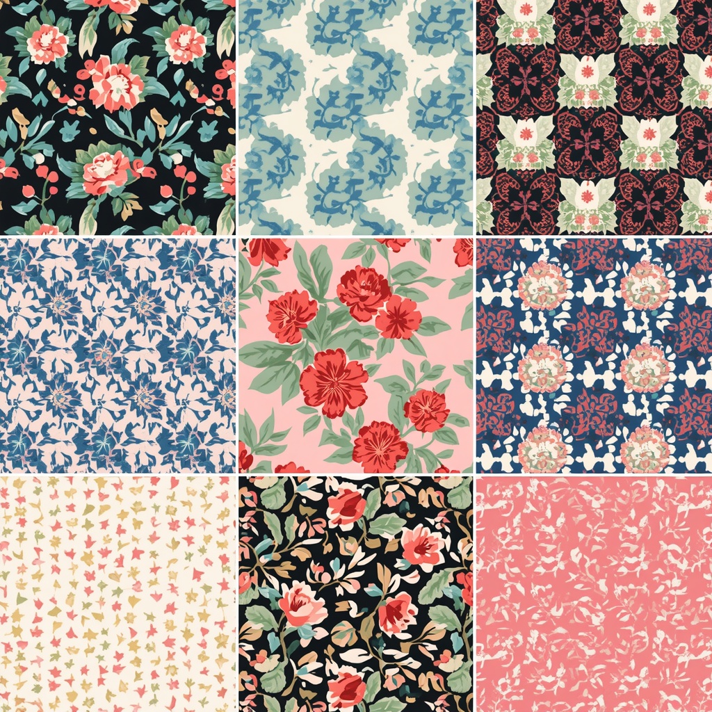
| Pattern Type | Personality | Pairs Best With |
|---|---|---|
| Stripes | Structured, versatile, calming | Florals, animal print, geometric |
| Florals | Organic, romantic, soft | Stripes, plaids, solid textures |
| Geometric | Bold, modern, energetic | Florals, stripes, organic prints |
| Plaid/Check | Cozy, traditional, grounding | Florals, solids, small geometrics |
| Animal Print | Neutral (surprisingly!), grounding | Almost anything — treat it like a solid |
| Ikat/Global Prints | Textural, artisanal, warm | Stripes, solids, other global patterns |
A tip many designers swear by: treat animal print as a neutral. Because leopard, zebra, and tiger prints are typically tonal (brown/black/cream), they behave more like a solid than a pattern and can be layered into almost any pattern mix without disrupting balance.
Room-by-Room: Applying Pattern Mixing in Real Spaces
Theory is helpful, but application is where confidence really builds. Let’s break down how pattern mixing shifts slightly depending on the room.

Living Room
The living room is usually the most forgiving space for bold pattern mixing because it has the most surface area to distribute prints across — sofa, chairs, rug, pillows, drapery, and art. Start with your rug or sofa as the anchor pattern, then layer in two to three supporting patterns through pillows and a throw.
Bedroom
Bedrooms benefit from a slightly softer approach since the goal is restfulness. A layered bed — patterned duvet, solid euro shams, patterned lumbar pillow, textured throw — is the easiest formula. Keep the wall color and larger furniture neutral so the bedding can carry the pattern story.
Dining Room
Dining rooms are a great place to experiment because they’re used intermittently, not lived in all day. A patterned wallpaper paired with solid upholstered chairs (or vice versa — patterned chair seats against a solid wall) is a classic, low-risk combination that reads as intentional and elegant.
Common Mistakes to Avoid
Even experienced decorators can stumble when mixing patterns. Here are the most frequent missteps I see in client homes:
- Using too many colors at once. Stick to your 2-3 color anchor palette; more than that and the room loses cohesion.
- Ignoring scale entirely. Three medium-scale patterns together will almost always compete rather than complement.
- Skipping the “resting spot.” A room needs solid surfaces (walls, a sofa, flooring) to let the eye recover between patterns.
- Matching instead of coordinating. Identical patterns in different colorways (like the same floral in three colors) often looks more matchy than mixed.
- Forgetting texture. Pattern isn’t only visual — woven textures like boucle, linen, and velvet add dimension that flat prints can’t achieve alone.
A Simple 4-Step Framework for Any Room
If you want a repeatable system rather than a one-off formula, follow these four steps whenever you’re building out a new pattern-mixed space:
- Choose your color story first (2-3 colors + 1 neutral).
- Select a large-scale “hero” pattern for your biggest surface (rug, drapery, or upholstery).
- Add a medium-scale supporting pattern on a secondary piece (accent chair, ottoman).
- Finish with 1-2 small-scale patterns in accessories (pillows, lampshades, table linens).
This four-step approach removes the guesswork and gives you permission to experiment within a safe structure — which is really what confident pattern mixing comes down to.
Frequently Asked Questions
Can I mix more than three patterns in one room? Yes, but it requires more discipline with color and scale. Most successful “maximalist” rooms actually follow the same color-anchoring and scale-variation rules — they just apply them across more surfaces.
Do patterns need to match the wallpaper? Not exactly match, but they should share your anchor color palette. If you have a busy floral wallpaper, keep upholstery patterns smaller in scale and calmer in color intensity.
What’s the easiest way to start if I’ve never mixed patterns before? Begin with pillows on a solid sofa. Choose three pillow patterns in varying scales that share one or two colors, and build your confidence from there before tackling larger pieces like rugs or drapery.
Are stripes considered a “safe” pattern? Yes — stripes are one of the most versatile patterns because their linear structure pairs well with almost any other print, making them a great starting point for beginners.
Final Thoughts
Mixing patterns is less about following a rigid rulebook and more about understanding a few core principles: anchor your palette, vary your scale, and always leave room for the eye to rest. Once those fundamentals click, you’ll find that pattern mixing becomes one of the most enjoyable and expressive parts of decorating a home. It’s how a house stops looking like a catalog page and starts looking like yours.
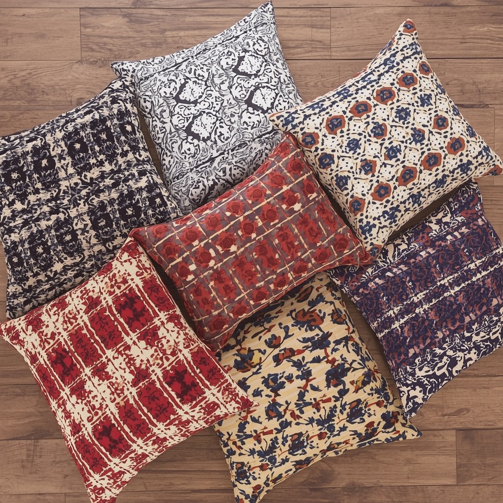
Start small, trust your color palette, and don’t be afraid to experiment with a few throw pillows before committing to bigger investments. The rooms we remember — the ones that feel warm, personal, and full of character — are almost never the ones that played it safe.
For further inspiration on color theory as it relates to home decor, resources like Pantone and Sherwin-Williams’ color tools can be great starting points when building your palette before you start layering patterns.