If you’ve been scrolling through Pinterest or walking the aisles of any home goods store lately, you’ve probably noticed a shift. The crisp, minimalist whites and corporate grays that dominated interior design for over a decade are quietly being retired. In their place? A warm, textured world of terracottas, mossy greens, warm taupes, and honey golds — a palette that feels less like a showroom and more like a sanctuary.
Earth tone interior design isn’t just a fleeting trend. It’s a response to how we want to feel inside our homes: calm, rooted, and connected to something natural. Whether you’re doing a full living room remodel or simply shopping for new throw pillows, understanding which earth tones work — and why — will help you make smarter, more satisfying design decisions.
Why Earth Tones Are Dominating Home Decor
Color psychology plays a bigger role in interior design than most homeowners realize. Earth tones — shades derived from soil, clay, stone, sand, bark, and foliage — trigger a primal sense of safety and comfort. When you walk into a room dressed in warm amber and soft clay, your nervous system literally relaxes. That’s not marketing speak; it’s backed by environmental psychology research.
The cultural momentum behind biophilic design (the practice of connecting interior spaces to the natural world) has made organic, nature-inspired palettes the go-to choice for designers and homeowners alike. Coupled with a post-pandemic desire for homes that feel genuinely restorative, the demand for warm, earthy hues has skyrocketed. Interior trend forecasters at major design firms like Benjamin Moore and Sherwin-Williams have confirmed that muted, nature-derived tones are among the top-performing color families this year.
“Earth tones aren’t just aesthetically pleasing — they speak to something deeply human. They remind us that we belong to the land, and that our homes should reflect that belonging.”— Sarah Barnard, LEED-Certified Interior Designer & Founder of Sarah Barnard Design
The Core Earth Tone Palette: 8 Colors to Know This Year
Not all earth tones are created equal. Some are warm and enveloping; others are cool and grounding. The best living spaces in 2026 are built on a curated selection of two to four tones that work together harmoniously. Below are the eight standout shades dominating the design world right now.
Terracotta
#C4875A
Warm Sand
#D4A574
Tobacco Brown
#8B6E4E
Sage Green
#7C9A7E
Warm Taupe
#B5A38A
Honey Gold
#E8C17A
Raw Umber
#6B5344
Linen Cream
#D9C5A8
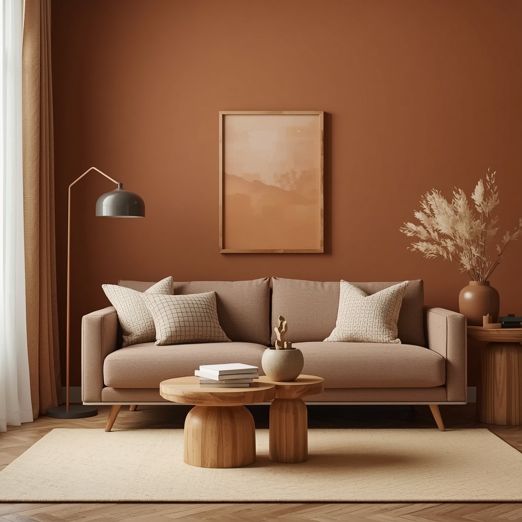
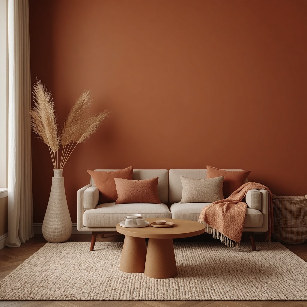
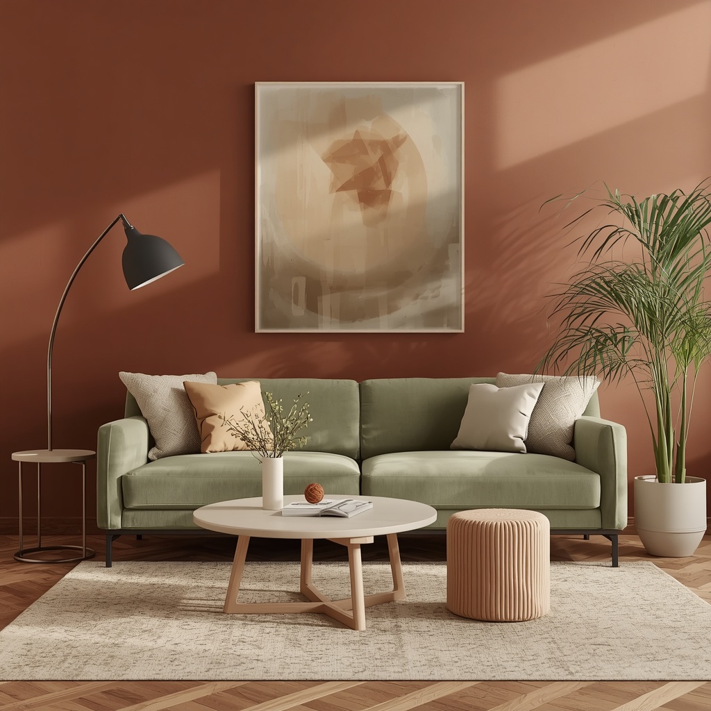
Terracotta: The Undisputed Star of the Season Trending
If there’s one color that defines the earth tone movement, it’s terracotta. Named after the Italian for “baked earth,” this rich red-orange hue has ancient roots — it’s the color of Roman pottery, Southwestern adobe walls, and Moroccan tile. Today, it shows up in everything from wall paint to ceramic vases to linen throw pillows, and it works beautifully in living rooms, dining spaces, and bedrooms alike.
The key to using terracotta without overwhelming a room is to treat it as an accent rather than a base. Paint one statement wall in a deep terracotta like Sherwin-Williams’ “Cavern Clay” (SW 7701) or Benjamin Moore’s “Pueblo” (2175-30), then layer in neutral linens and natural wood tones. The result is a room that feels warm and sculptural without tipping into orange-overload. Pair it with warm whites, dusty sage, and raw brass hardware for a palette that feels both earthy and elevated.
Pro Tip
Don’t limit terracotta to walls. A single large terracotta ceramic vessel or a handwoven terracotta-toned area rug can anchor the entire color story of a room. Shop artisan ceramics on Etsy for one-of-a-kind pieces that add authenticity and warmth without the commitment of paint.
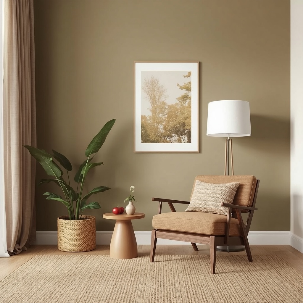
Sage Green: The Earthy Neutral That Goes With Everything
Sage green occupies a unique position in the earth tone family — it’s simultaneously calming and alive. Unlike the minty or jewel-toned greens of seasons past, sage is dusty, muted, and organic. It reads like dried herbs in afternoon light and pairs effortlessly with terracotta, warm sand, and raw linen. Designers love it because it functions like a neutral while still adding depth and personality.
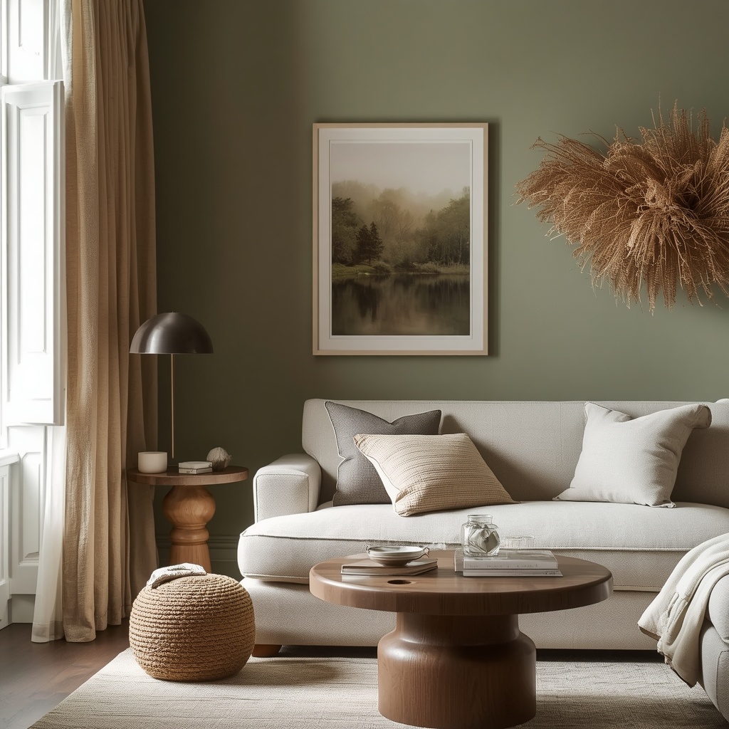
In living rooms, sage green works brilliantly as a sofa fabric, an accent wall color, or in textiles like velvet throw blankets and linen curtains. It’s one of the few colors that genuinely bridges modern and traditional aesthetics — equally at home in a sleek, minimalist apartment and a cozy farmhouse-style retreat. Benjamin Moore’s “Salisbury Green” (HC-139) and Farrow & Ball’s “Mizzle” (No. 266) are two designer favorites worth testing in your space.
Pro Tip
When choosing sage paint, always test it in both natural daylight and warm evening lamp light before committing. Sage can shift from cool and gray-green in daylight to a more golden, olive-toned green under incandescent bulbs — both beautiful, but quite different moods. Order sample pots from Benjamin Moore’s sample program and live with them for 48 hours before deciding.
Room-by-Room: Which Earth Tones Work Where
Earth tones aren’t one-size-fits-all. Different rooms have different lighting conditions, purposes, and emotional needs. Here’s a practical guide to matching the right earthy hue to each space in your home.
| Room | Best Earth Tone | Why It Works | Designer Pick |
|---|---|---|---|
| Living Room | Terracotta | Creates warmth for social gathering | SW Cavern Clay |
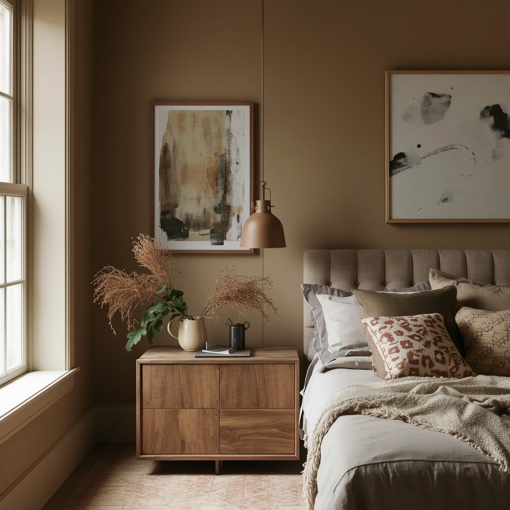
| Bedroom | Sage Green | Calming, restful, biophilic feel | BM Salisbury Green |
| Kitchen | Honey Gold | Warm, inviting, appetite-stimulating | PPG Harvest Wheat |
| Dining Room | Tobacco Brown | Rich, intimate, moody for evening meals | BM Saddle Soap |
| Home Office | Warm Taupe | Focused, grounding, distraction-free | SW Accessible Beige |
| Bathroom | Linen Cream | Spa-like, soft, pairs with stone tile | BM White Dove |
The Best Earth Tone Color Combinations
The most impactful earth tone interiors aren’t built on a single color — they’re layered combinations that create depth and movement. A monochromatic terracotta room can feel flat; add a sage green accent and natural jute, and it suddenly breathes. Here are four foolproof pairings that designers are using right now.
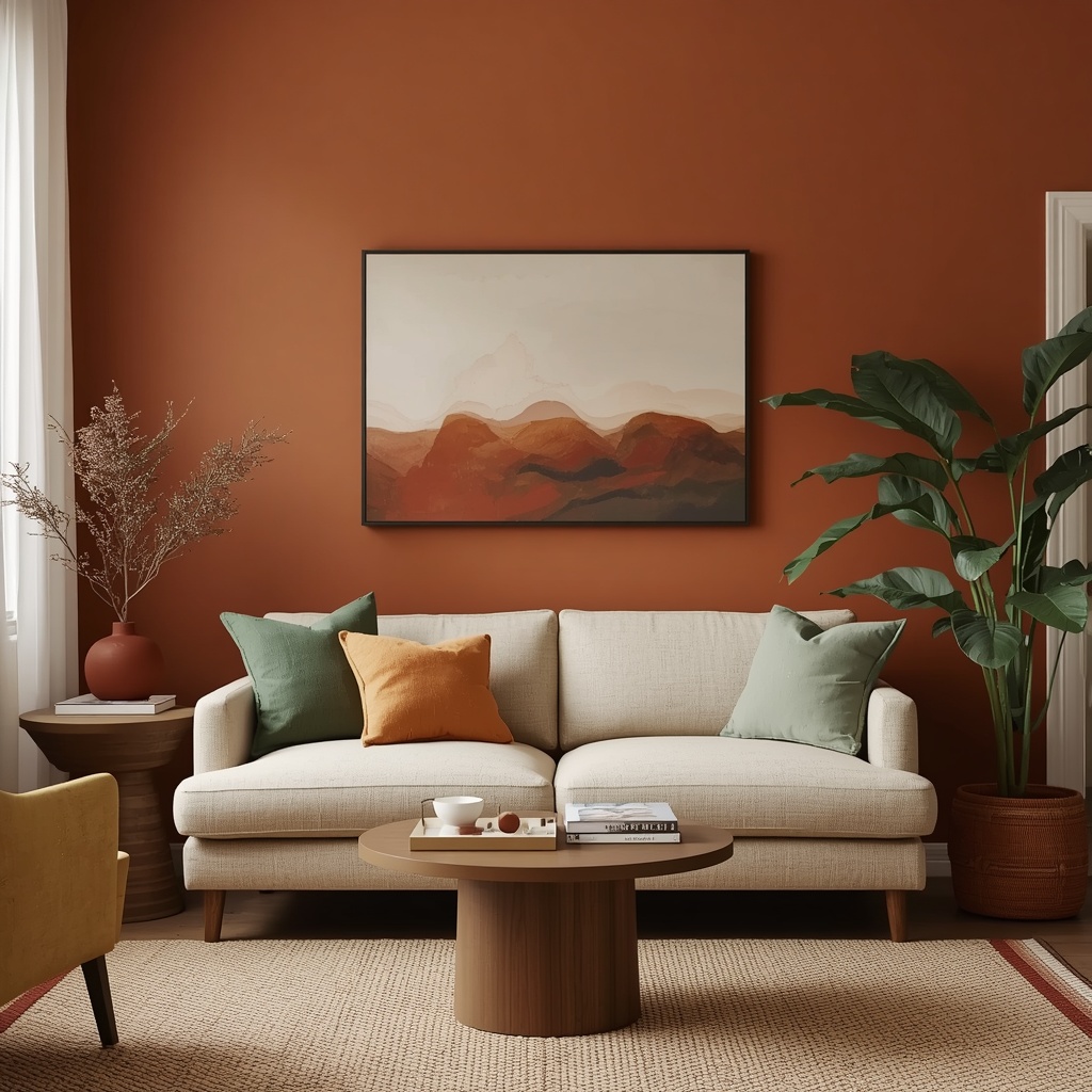
Desert Bloom
Terracotta + Sage + Linen. The most popular trio of the year — warm, organic, and balanced.
Golden Hour
Honey Gold + Tobacco Brown + Cream. Warm and enveloping — perfect for dining and living rooms.
Canyon Dusk
Raw Umber + Warm Taupe + Sand. Moody and sophisticated — great for bedrooms and offices.
Garden Afternoon
Sage + Linen + Honey Gold. Fresh yet earthy — ideal for kitchens and breakfast nooks.
Textures and Materials That Amplify Earth Tone Palettes
Color alone doesn’t make a room feel warm — texture does the heavy lifting. Earth tones sing when they’re paired with raw, natural materials that add tactile depth. The goal is to layer different surface qualities so the eye has something to explore at every level of the room, from floor to ceiling.
- Jute and sisal rugs — The ultimate grounding layer. Their raw, fibrous texture locks an earth tone palette in place and adds warmth underfoot without competing with wall colors.
- Reclaimed wood and walnut furniture — Warm-toned wood grains echo earthy hues naturally. Look for live-edge tables, wooden bookshelves, and raw oak frames from sustainable furniture makers.
- Linen and cotton textiles — Chunky knit throws, undyed linen curtains, and cotton slipcovers add softness and breathability. They photograph beautifully and feel luxurious without looking fussy.
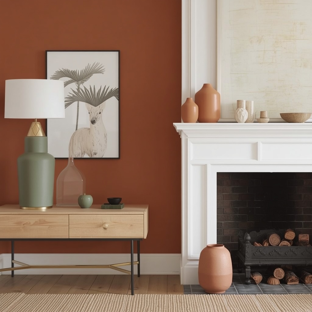
- Ceramic and clay vessels — Handmade pottery in terracotta, ochre, or matte cream anchors earth tone rooms with artisanal authenticity. One well-chosen ceramic piece can elevate an entire shelf or side table.
- Natural stone and travertine — For countertops, fireplace surrounds, or decorative trays, travertine’s warm beige veining is a natural fit with any earth tone palette.
- Rattan and wicker — A rattan pendant light or wicker side chair layers organic texture and a honey-wheat tone that bridges every earth hue on this list.
The “rule of three” is your best friend in earth tone decorating: choose one dominant tone (e.g., warm sand for your walls and sofa), one supporting tone (e.g., sage in your rug and curtains), and one accent tone (e.g., terracotta in your throw pillows and ceramics). Three tones feel intentional; more than four can start to feel chaotic. For inspiration, browse Houzz’s earth tone living room gallery to see how professionals implement this rule.
Shopping Guide: Where to Find Earth Tone Decor
The good news: earth tone home decor is everywhere this year, from budget-friendly big-box stores to high-end artisan boutiques. Here are some of the best places to shop by budget tier, so you can build your earth tone palette without blowing your renovation budget.
| Budget Tier | Retailer | Best For |
|---|---|---|
| Budget ($) | IKEA, Target, H&M Home | Textiles, candles, small ceramics |
| Mid-Range ($$) | West Elm, Crate & Barrel, CB2 | Rugs, pillows, accent furniture |
| Premium ($$$) | Pottery Barn, Article, RH | Sofas, lighting, statement pieces |
| Artisan ($$–$$$) | Etsy, local makers markets | Handmade ceramics, woven textiles |
Final Thoughts: Building a Home That Feels Like the Earth
The best interiors aren’t just visually beautiful — they feel like somewhere you genuinely want to be. Earth tones achieve that effortlessly because they tap into something pre-verbal and instinctive. When you surround yourself with the colors of soil, stone, bark, and leaf, your body recognizes them as safe, warm, and real. In a world that can feel increasingly digital and disconnected, that’s not a small thing.
Whether you commit to a full terracotta statement wall, invest in a sage velvet sofa, or simply swap your gray throw pillows for warm linen ones, you’re making a choice to bring the outside in. And that — more than any specific trend or color forecast — is the enduring heart of great interior design. Start small, trust your instincts, and let the colors of the earth do the rest.