
If you’ve ever scrolled past a beautifully styled corner shelf packed with trailing pothos, layered succulents, and a fiddle leaf fig standing tall in the back, you already understand the appeal of a tiered plant stand. It’s one of the fastest ways to turn a handful of houseplants into an intentional, gallery-worthy display.
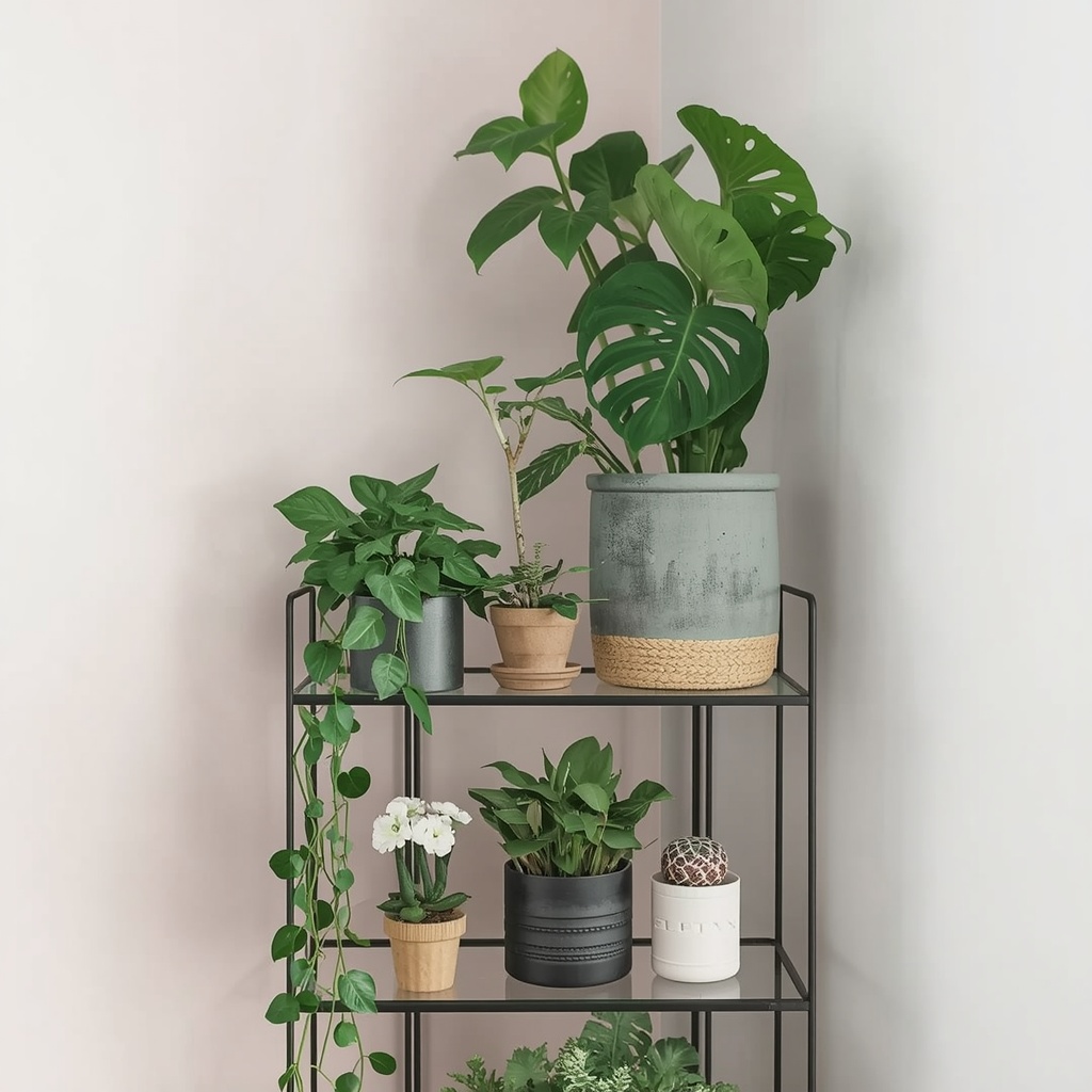
A tiered plant stand isn’t just storage. It’s a design tool. Used well, it creates height, rhythm, and depth in a room that flat surfaces simply can’t match. Used poorly, it turns into a cluttered plant graveyard nobody wants near their window.
This guide walks through everything you need to style a tiered plant stand like a professional — from choosing the right stand and understanding plant light needs, to layering by height, color, and texture for a display that actually looks curated.
Why Tiered Plant Stands Work So Well in Home Decor
Tiered stands solve a problem most plant lovers face eventually: too many plants, not enough floor space. But the real magic is visual, not practical.
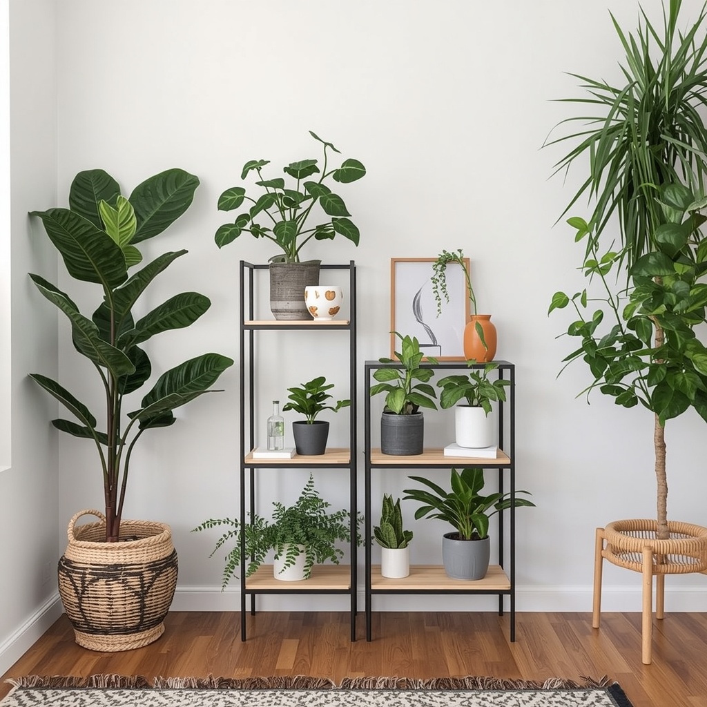
Interior design relies heavily on the rule of varied height and visual triangles. A single row of plants at the same level reads as flat and static. A tiered arrangement automatically creates that staggered, eye-catching silhouette designers chase in every vignette, whether it’s a bookshelf, a mantel, or a plant corner.
“Height variation is one of the cheapest, most effective styling tricks in interior design. A tiered plant stand does the height work for you — you just have to fill it thoughtfully.”
Tiered stands also support biophilic design, the practice of bringing natural elements into interior spaces to boost mood and air quality. Grouping plants together, rather than scattering them, tends to make the greenery feel more deliberate and less accidental.
Choosing the Right Tiered Plant Stand
Before you place a single leaf, the stand itself needs to fit your space, your plant collection, and your room’s existing style. Not all tiered stands are created equal, and the wrong shape can undercut even the best plant styling.
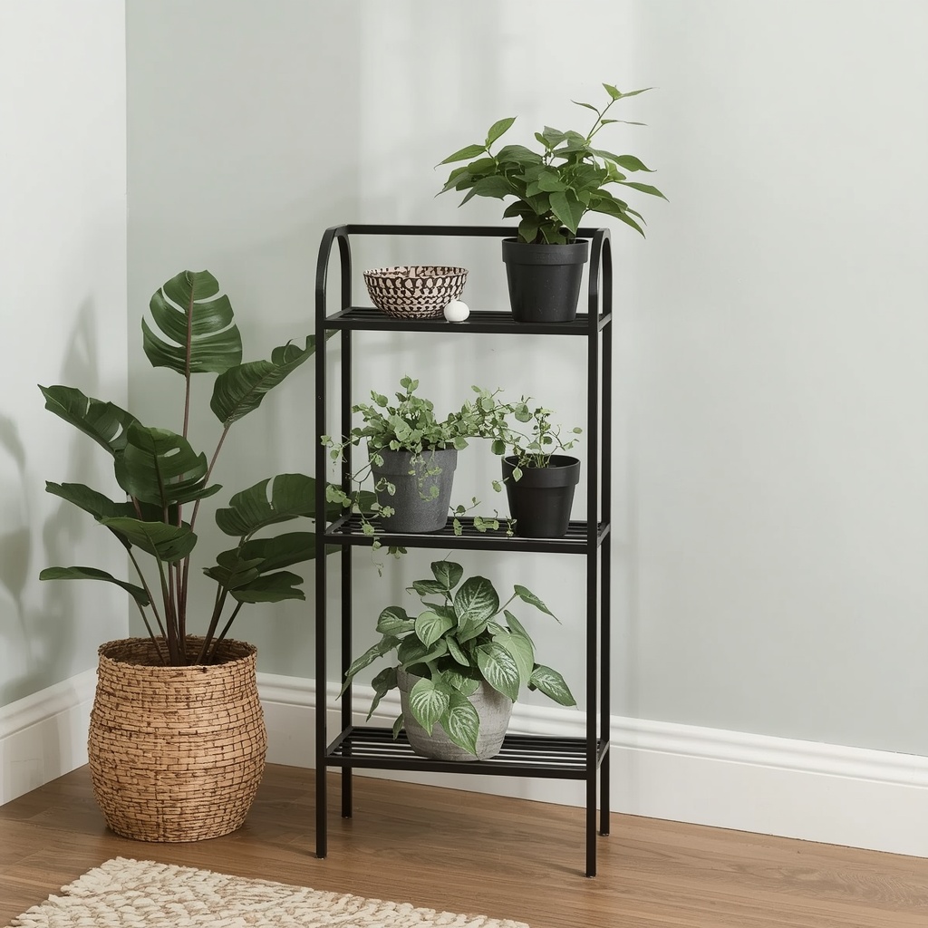
Consider four things: the number of tiers, the material and finish, the footprint, and the weight capacity per shelf. A stand with three or more tiers offers more flexibility for layering, but only works if you have enough plants — and enough light — to fill it without looking sparse.
| Stand Type | Best For | Style Pairing |
|---|---|---|
| Ladder stand (leaning) | Small apartments, corners | Modern, minimalist, Scandinavian |
| Round tiered stand | Statement pieces near windows | Boho, eclectic |
| Rectangular multi-shelf stand | Large plant collections | Farmhouse, industrial |
| Metal wire stand | Airy, light-filled rooms | Mid-century modern, contemporary |
| Wood tiered stand | Warm, natural interiors | Japandi, cottagecore |
Pro Tip
Measure your available vertical space before buying. Leave at least 8–10 inches of clearance above your tallest plant’s mature height so nothing brushes the ceiling or blocks natural light from reaching lower tiers.
Understanding Light Before You Style
This is the step most people skip, and it’s the reason plant stands often fail within a few months. Styling is only half the job — placement dictates plant health, and dead or leggy plants ruin the look fast.
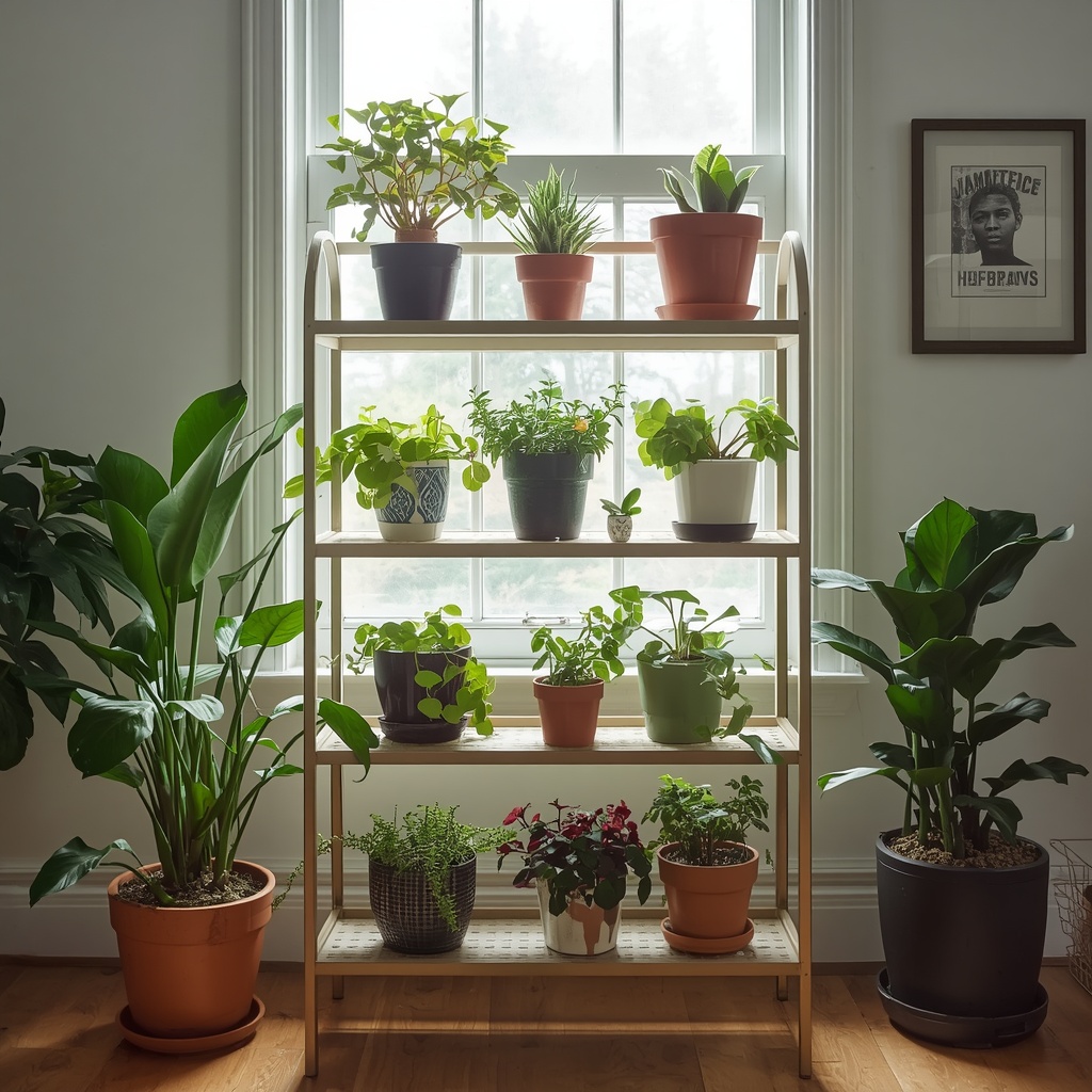
Every tier on your stand receives a different amount of light depending on its height and distance from the window. Top tiers closer to the light source suit sun-loving plants, while the lowest tiers, often shaded by the plants above, need genuinely low-light species.
| Tier Position | Light Exposure | Suitable Plants |
|---|---|---|
| Top tier | Brightest, most direct | Succulents, pothos, string of pearls |
| Middle tier | Bright, indirect | Peperomia, pilea, philodendron |
| Bottom tier | Lowest light | Snake plant, ZZ plant, cast iron plant |
Placing a sun-hungry plant on a shaded bottom shelf is one of the most common mistakes in plant styling. It doesn’t just harm the plant — it disrupts the entire visual balance once that plant starts stretching, yellowing, or dropping leaves.
The Core Principles of Plant Styling on a Tiered Stand
Once you know your stand and your light conditions, styling comes down to five repeatable principles that professional stylists use again and again.
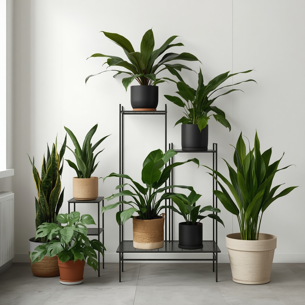
- Vary the height within each tier, not just between tiers, using plant stands, risers, or upturned pots.
- Mix growth habits — upright, bushy, and trailing — so the eye moves naturally across the display.
- Group in odd numbers. Groupings of three or five feel more organic than even pairs.
- Repeat a color or texture at least twice to tie the arrangement together.
- Leave breathing room. Negative space between plants prevents visual clutter.
These principles apply whether you’re working with a two-tier stand or a five-shelf display, and they’re the same ones used in furniture layouts, gallery walls, and tablescapes.
Pro Tip
Odd-numbered plant groupings feel more natural because the eye can’t split them into equal, predictable pairs. This is the same rule stylists use for arranging candles, books, and vases — apply it to your plant stand and the whole display instantly feels less staged.
Layering by Tier: A Step-by-Step Approach
Think of your tiered stand in three zones — top, middle, and bottom — each with its own styling job to do.
Top Tier: The Anchor
The top tier sets the tone for the whole display. This is where you place your most architectural or upright plant — something with strong vertical lines, like a snake plant, dracaena, or a small palm. It should be tall enough to be visible from across the room but not so large it overwhelms the stand.
Because the top tier gets the most light and the most visual attention, it’s also the place for statement foliage — variegated leaves, unusual shapes, or a plant with striking color contrast. This is your “hero” plant.
Middle Tier: The Transition
The middle tier bridges the height of the top plant and the sprawl of the bottom. Bushy, rounded plants work well here — pileas, peperomias, or a compact pothos trained upward on a small trellis.
This tier is also where texture contrast does the most work. Pair a glossy-leafed plant with a fuzzy or matte one, and the difference in surface texture reads as intentional layering rather than randomness.
Bottom Tier: The Cascade
The bottom tier is where trailing and low-growing plants shine. String of hearts, pothos, ivy, or ferns spilling over the edge soften the hard lines of the stand and visually anchor the whole piece to the floor.
Trailing plants on the bottom tier also disguise the stand’s legs and base, which can otherwise look bare or overly structural once everything above is filled in.
Color, Texture, and Pot Selection
Plant styling isn’t only about the plants — the pots matter just as much. A tiered stand filled with mismatched plastic nursery pots will never look finished, no matter how well the plants are arranged.
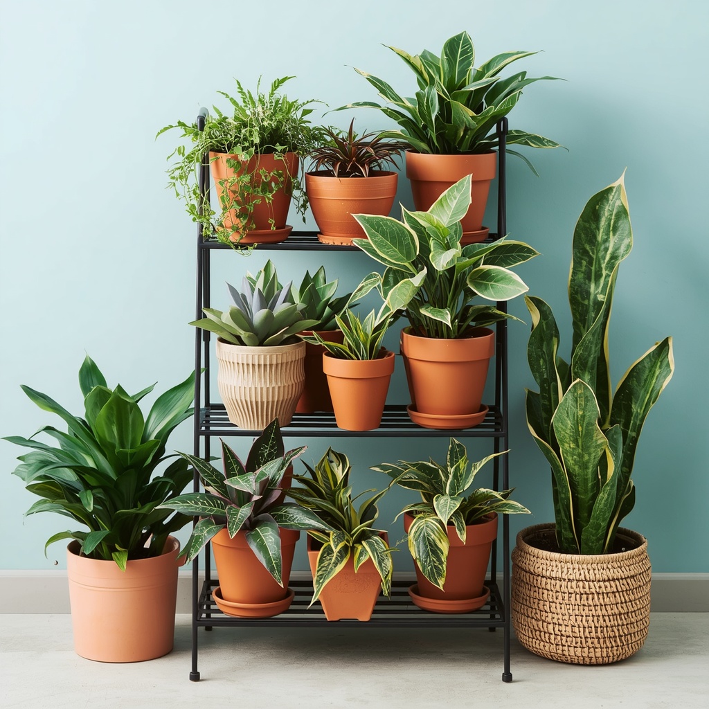
Stick to a limited palette. Choose two or three pot colors or materials — terracotta, matte ceramic, woven rattan — and repeat them across the tiers. This creates cohesion even when the plant species themselves vary widely.
- Terracotta pots suit boho, Mediterranean, and desert-inspired rooms
- Matte white or black ceramic pots suit modern and minimalist interiors
- Woven or rattan planters suit coastal and cottagecore styles
- Concrete or stone planters suit industrial and Scandinavian interiors
Avoid pairing more than three pot colors on one stand. Beyond that, the eye stops reading it as curated and starts reading it as cluttered.
Common Plant Styling Mistakes to Avoid
Even experienced plant owners fall into predictable traps when styling a tiered stand. Here are the ones worth watching for.
| Mistake | Why It Fails | Quick Fix |
|---|---|---|
| Same plant size on every tier | Creates a flat, boxy silhouette | Vary heights within each tier |
| Overcrowding every shelf | Looks chaotic, blocks light and airflow | Leave gaps; edit ruthlessly |
| Ignoring plant care needs | Plants decline, ruining the display | Match plant to tier light level |
| Mismatched, clashing pots | Undermines an otherwise good layout | Limit to 2–3 pot colors/materials |
| No trailing element | Feels stiff and unfinished | Add at least one cascading plant |
Styling Tips by Room and Aesthetic
A tiered plant stand should feel like part of the room, not an accessory dropped in as an afterthought. Adjust your approach depending on where it lives.
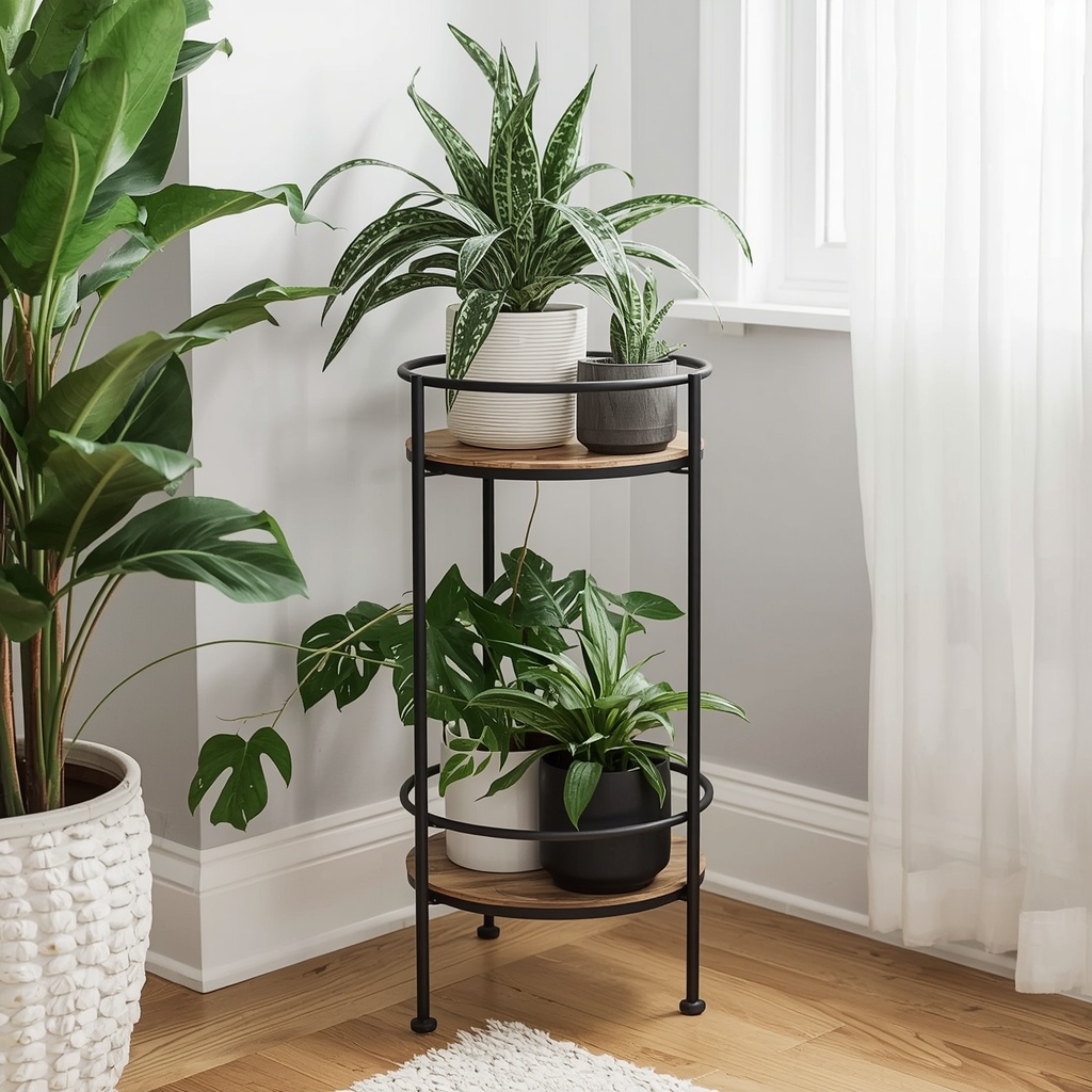
Living rooms benefit from a larger, statement stand near a window, styled with a mix of tall architectural plants and trailing greenery to soften furniture lines. Bedrooms call for a smaller, quieter arrangement — often just low-light, air-purifying plants like snake plants or pothos for a calming, restful feel. Home offices do well with compact stands on a desk corner, using smaller succulents or air plants that need minimal upkeep during busy weeks. Bathrooms with adequate humidity are ideal for ferns and moisture-loving plants layered on a smaller two-tier stand near (but not directly under) a window.
Pro Tip
If your stand sits in a low-light room, don’t force real plants to survive there just for the look. High-quality faux plants on the lower tiers, mixed with one or two real, low-light plants up top, can achieve the same visual effect without the constant plant replacement cycle.
Maintaining Your Display Over Time
Styling isn’t a one-time task. Plants grow, seasons change light levels, and what looked balanced in spring may look lopsided by winter.
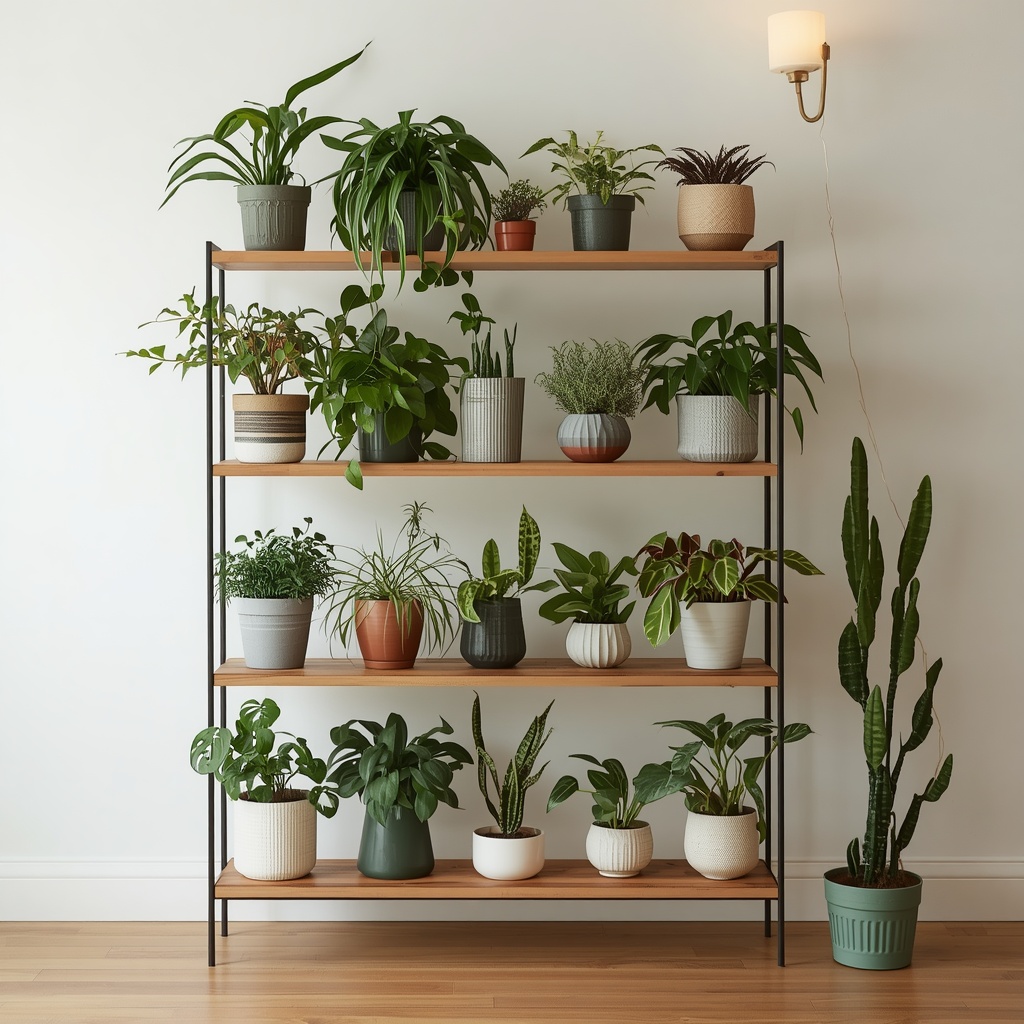
Rotate plants a quarter turn every week or two so growth stays even on all sides, especially for plants near a single light source. Every few months, step back and reassess the display the way you would edit a bookshelf — some plants may have outgrown their tier, and others may need to move up or down as light conditions shift with the seasons.
- Rotate pots weekly for even growth
- Repot root-bound plants before they stress the display’s proportions
- Swap seasonal bloomers in and out to keep the arrangement fresh
- Wipe leaves regularly — dusty foliage dulls the whole display
Final Thoughts
A tiered plant stand is one of the most effective, budget-friendly ways to bring depth, texture, and life into a room. The difference between a stand that looks like an afterthought and one that looks professionally styled almost always comes down to the same fundamentals: matching light to placement, varying height and texture, grouping in odd numbers, and choosing a cohesive pot palette.
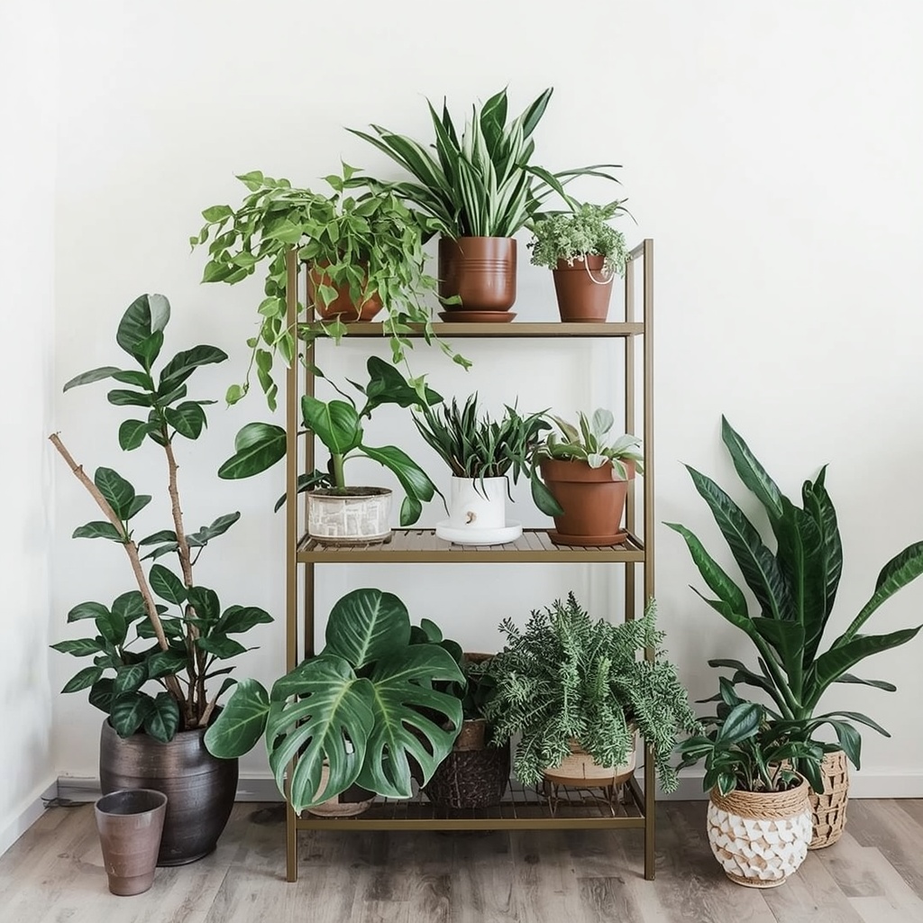
Start with the bones — the right stand, the right light — and the styling almost arranges itself from there. Once you’ve got a display you love, the real reward is watching it evolve as the plants themselves fill in and grow into their spots.