
If you’ve ever felt like your bedroom is closing in on you or your home office feels more like a closet, you’re not alone. Millions of homeowners across the US live in compact apartments, starter homes, or cozy older houses where square footage is a luxury. The good news? You don’t need to knock down walls or hire a contractor to fix this problem.
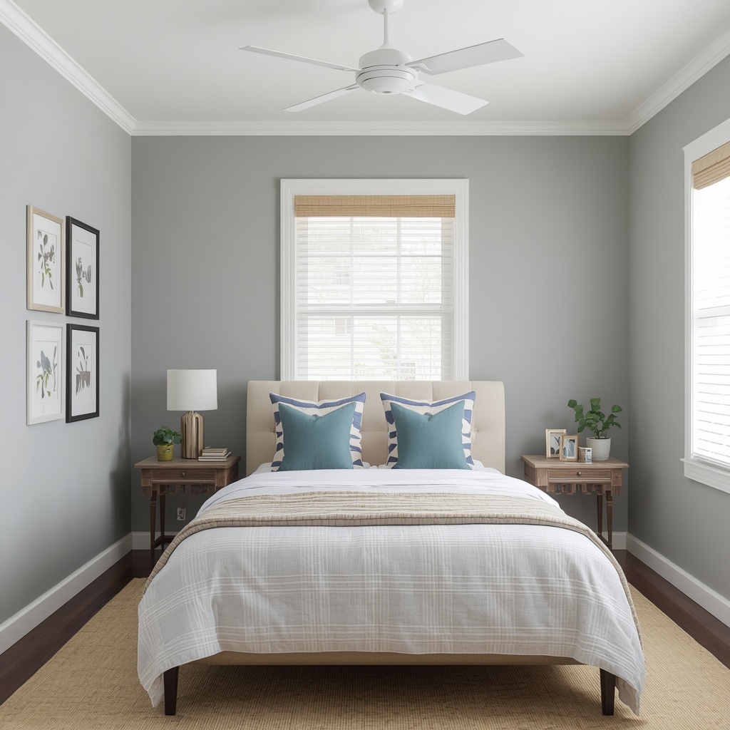
As an interior designer who has transformed hundreds of small spaces, I can tell you that paint is the single most powerful (and affordable) tool for visually expanding a room. The right color, sheen, and application technique can trick the eye into seeing far more space than actually exists.
In this guide, I’ll walk you through exactly how professional designers use color psychology, light reflectance, and strategic contrast to make tiny rooms feel airy, open, and spacious.
Why Paint Color Affects the Perception of Space
Our brains interpret space based on light, contrast, and depth cues — not just physical measurements. Dark, saturated colors absorb light and visually “shrink” walls by pulling them inward. Light, cool-toned colors reflect ambient light and bounce it around the room, pushing walls outward in our perception.
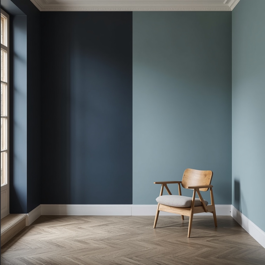
This is rooted in a paint science concept called Light Reflectance Value (LRV), which measures how much light a color reflects versus absorbs on a scale of 0 (absolute black) to 100 (pure white). Colors with a high LRV (typically 60 and above) reflect more natural and artificial light, making a small room feel brighter and larger. Designers rely on LRV charts constantly when selecting paint for compact spaces, and most major paint brands like Benjamin Moore and Sherwin-Williams list LRV values right on their color swatches.
“Color doesn’t just decorate a room — it architecturally reshapes how we experience it.” — a principle every trained interior designer learns early in their career.
Best Paint Colors to Make a Small Room Look Bigger
Not every light color works equally well. The best small-room paint colors combine high LRV with a cool or neutral undertone, since warm, saturated hues tend to visually advance toward the viewer.
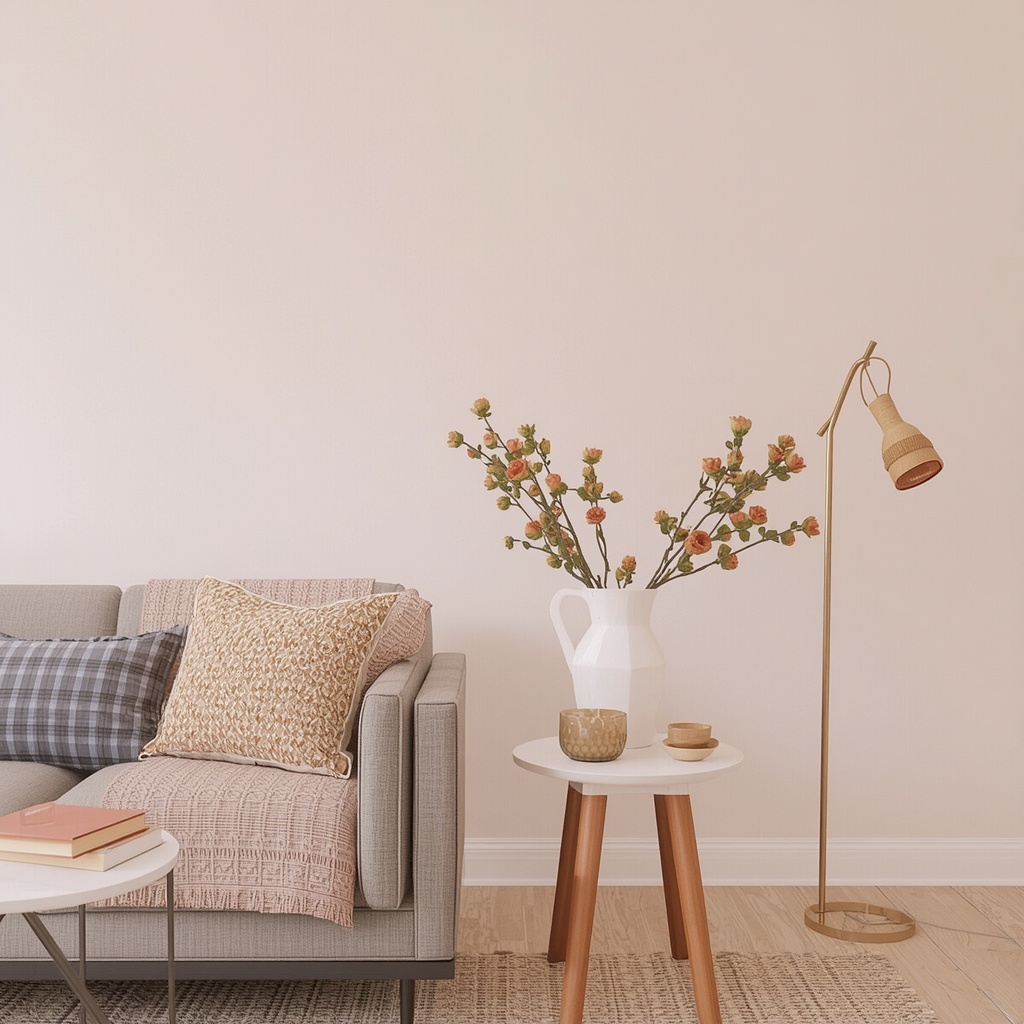
Here are the most reliable color families for expanding a small space:
| Color Family | Popular Shades | Why It Works |
|---|---|---|
| Soft Whites | Swiss Coffee, White Dove, Simply White | Maximizes light bounce, near-seamless blend with trim |
| Pale Blues | Sea Salt, Rainwashed, Windy Blue | Cool undertones create a sense of airiness and distance |
| Light Greys | Repose Gray, Gray Owl, Agreeable Gray | Neutral, versatile, and softens harsh light |
| Muted Greens | Sage, Silver Sage, Comfort Gray | Earthy but reflective; pairs well with natural light |
| Warm Neutrals | Alabaster, Natural Cream, Shoji White | Cozy without feeling closed-in; great for low-light rooms |
Pro Tip: Always test paint on your actual wall before committing. Colors shift dramatically depending on your room’s natural light exposure, flooring, and time of day. Paint a 2×2-foot swatch and observe it in morning, afternoon, and evening light for at least 24 hours before making a final decision.
The Power of Monochromatic Color Schemes
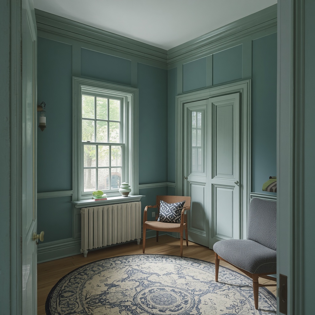
One of the most effective (and often overlooked) tricks for expanding a small room is painting the walls, trim, and ceiling in the same color family, or even the exact same shade. When there’s no visual break between surfaces, the eye doesn’t register where one plane ends and another begins.
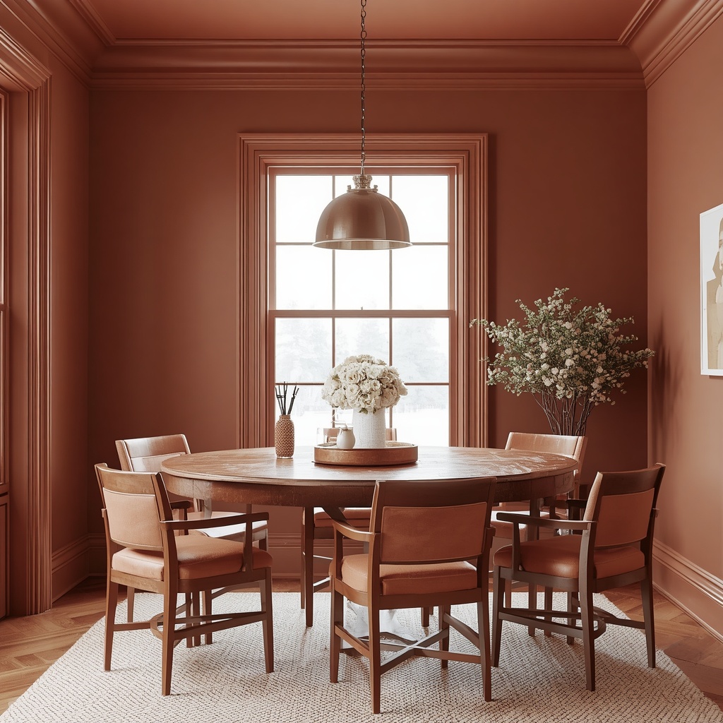
This technique, often called a “color drench” or monochromatic wash, eliminates the boxy feeling that high-contrast trim can create in tight quarters. It’s become one of the most requested treatments among my clients living in NYC studios and small condos.
Key benefits of a monochromatic scheme:
- Removes visual “stop points” that make ceilings feel low
- Creates a seamless, cocoon-like flow from floor to ceiling
- Works especially well in awkward, angular, or oddly shaped rooms
- Photographs beautifully for real estate listings and social media
Trim, Ceiling, and Door Tricks That Add Visual Height
Beyond wall color, how you treat trim, ceilings, and doors dramatically affects perceived room size. Many homeowners default to bright white trim without realizing it can actually make walls feel shorter and more segmented.
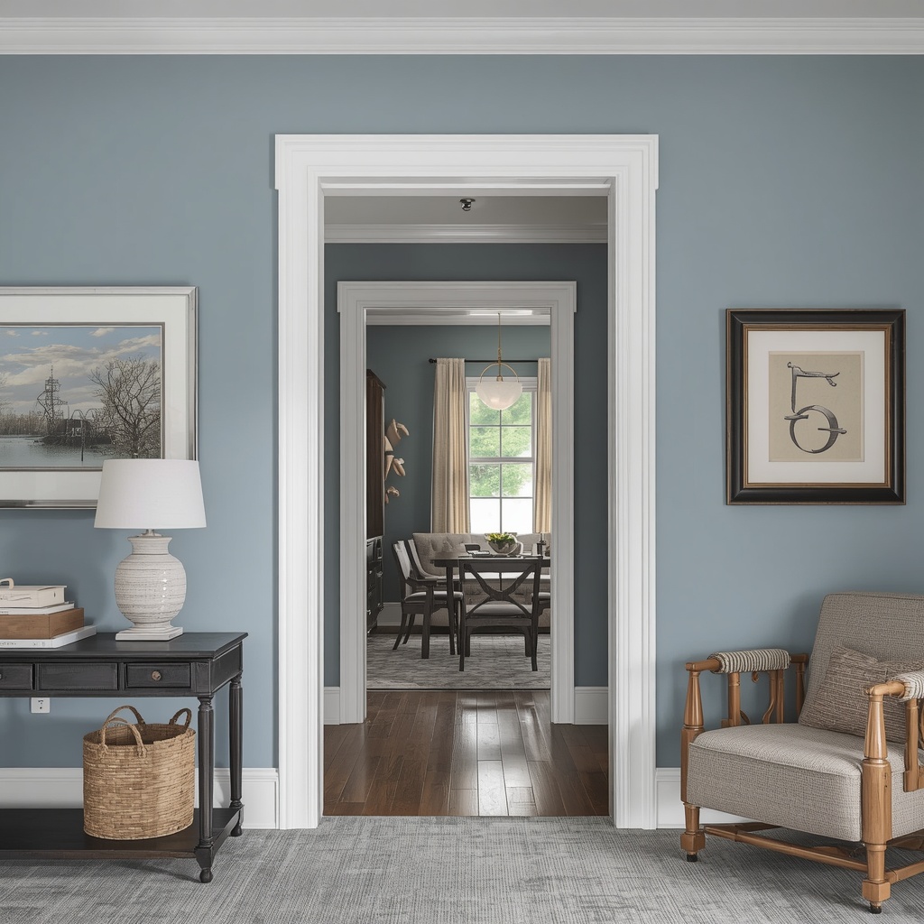
Painting your ceiling a shade lighter than your walls — or the exact same color — draws the eye upward and removes the “lid” effect low ceilings often create. Similarly, painting doors the same color as the surrounding walls (rather than stark white) helps them disappear visually instead of interrupting the flow of the room.
Try these designer-approved tricks:
- Paint the ceiling in “Ceiling White” mixed with 50% of your wall color for subtle continuity
- Extend wall color slightly onto the ceiling (2–4 inches) to blur the corner line
- Match door and trim color to walls in low-ceiling rooms
- Use vertical stripes or a single accent wall sparingly — horizontal breaks shrink rooms
- Skip heavy crown molding in bold contrasting colors
Sheen and Finish Matter More Than You Think
Color isn’t the only variable — the finish or sheen of your paint significantly impacts how light behaves in the room. Glossier finishes reflect more light but also highlight wall imperfections, while flat finishes absorb light and can make a room feel duller.
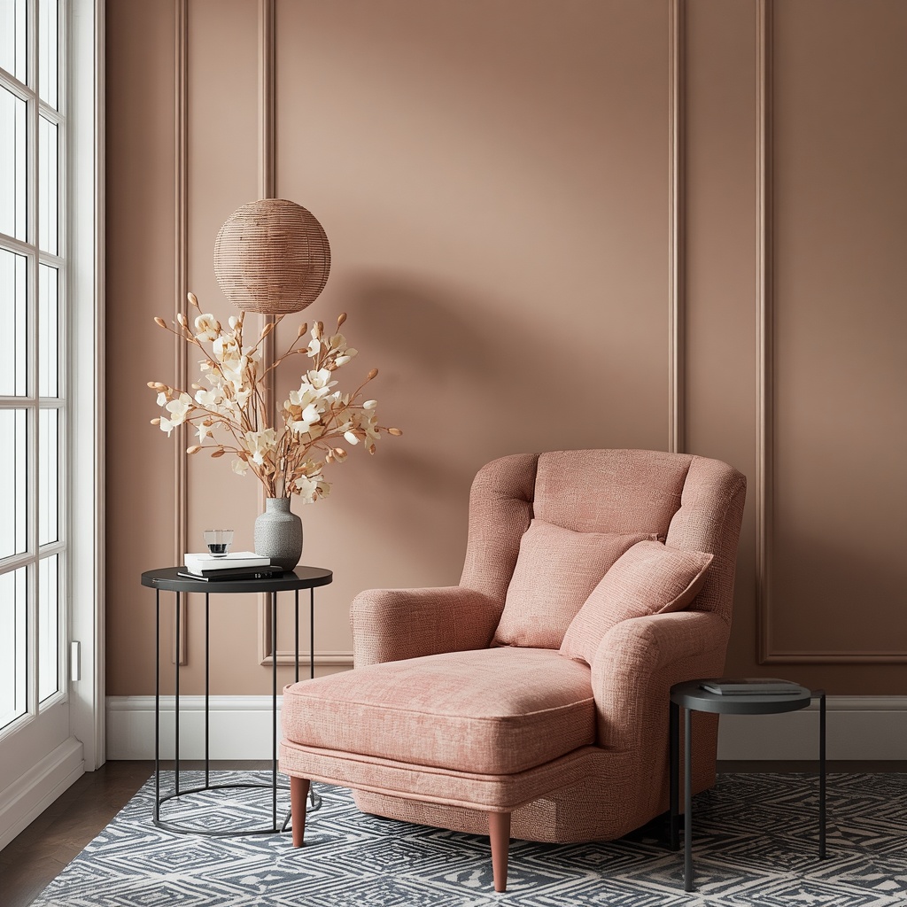
For small rooms, designers typically recommend an eggshell or satin finish on walls, which offers a soft, subtle glow without harsh glare. Trim and doors can go slightly glossier (semi-gloss) to add a crisp, light-catching contrast that still feels cohesive.
| Sheen Type | Best Use in Small Rooms | Light Reflection |
|---|---|---|
| Flat/Matte | Ceilings, low-traffic areas | Low |
| Eggshell | Main walls (most versatile) | Medium |
| Satin | Hallways, kids’ rooms, kitchens | Medium-High |
| Semi-Gloss | Trim, doors, cabinetry | High |
| High-Gloss | Accent moments only | Very High |
Common Small-Space Paint Mistakes to Avoid
Even well-intentioned homeowners fall into a few predictable traps when painting a small room. Avoiding these mistakes is just as important as choosing the right color.
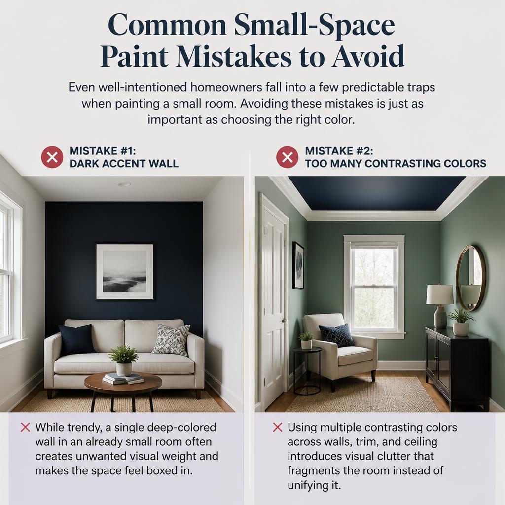
Dark accent walls are the most common culprit — while trendy, a single deep-colored wall in an already small room often creates unwanted visual weight and makes the space feel boxed in. Similarly, using multiple contrasting colors across walls, trim, and ceiling introduces visual clutter that fragments the room instead of unifying it.
Mistakes to steer clear of:
- Choosing a trendy dark accent wall in a room under 120 sq ft
- Using high-contrast trim in rooms with low ceilings
- Painting a large-scale pattern or mural on a feature wall
- Ignoring natural light direction when selecting undertones
- Skipping a primer, which can cause uneven, patchy color that emphasizes flaws
Quick Reference: Best Paint Strategy by Room Type
Different rooms have different lighting conditions and functions, so the ideal paint strategy isn’t one-size-fits-all.
| Room Type | Recommended Approach | Suggested Sheen |
|---|---|---|
| Small Bedroom | Monochromatic soft blue or greige | Eggshell |
| Small Bathroom | Bright white or pale aqua, semi-gloss trim | Satin/Semi-Gloss |
| Home Office | Light warm neutral with matching trim | Eggshell |
| Studio Apartment | Full color-drench in soft white or sage | Eggshell/Satin |
| Small Kitchen | Off-white or soft yellow, glossy cabinetry | Satin |
| Hallway/Entry | Same tone as adjoining rooms for flow | Satin |
Pro Tip: If your small room lacks natural light, avoid stark cool whites, which can look flat or gray under artificial lighting. Instead, opt for warm whites with a hint of cream or beige undertone — they stay bright without feeling clinical.
Additional Designer Techniques to Enhance the Effect
Paint works even better when paired with complementary design choices. Reflective surfaces, like a large mirror positioned opposite a window, amplify the light-bouncing effect of your wall color. Sheer window treatments in a matching or lighter tone also help maintain the illusion of continuous, uninterrupted space.
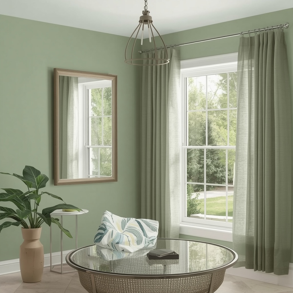
Furniture placement matters too — pushing large pieces against walls painted in the same light tone helps them visually “blend” rather than compete for attention. When furniture and walls share tonal harmony, the eye reads the room as one continuous space rather than a cluttered box.
Other space-enhancing pairings:
- Light-colored or glass furniture to reduce visual bulk
- Matching curtain color to wall color for uninterrupted sightlines
- Strategic mirror placement to double natural light
- Low-profile furniture to keep sightlines open across the room
Frequently Asked Questions
Does white always make a room look bigger?
Not necessarily. While white generally has high LRV, undertones matter. A stark, cool white under poor lighting can feel sterile rather than spacious. Warm whites or soft neutrals often perform better in real-world lighting conditions.
Can dark colors ever work in a small room?
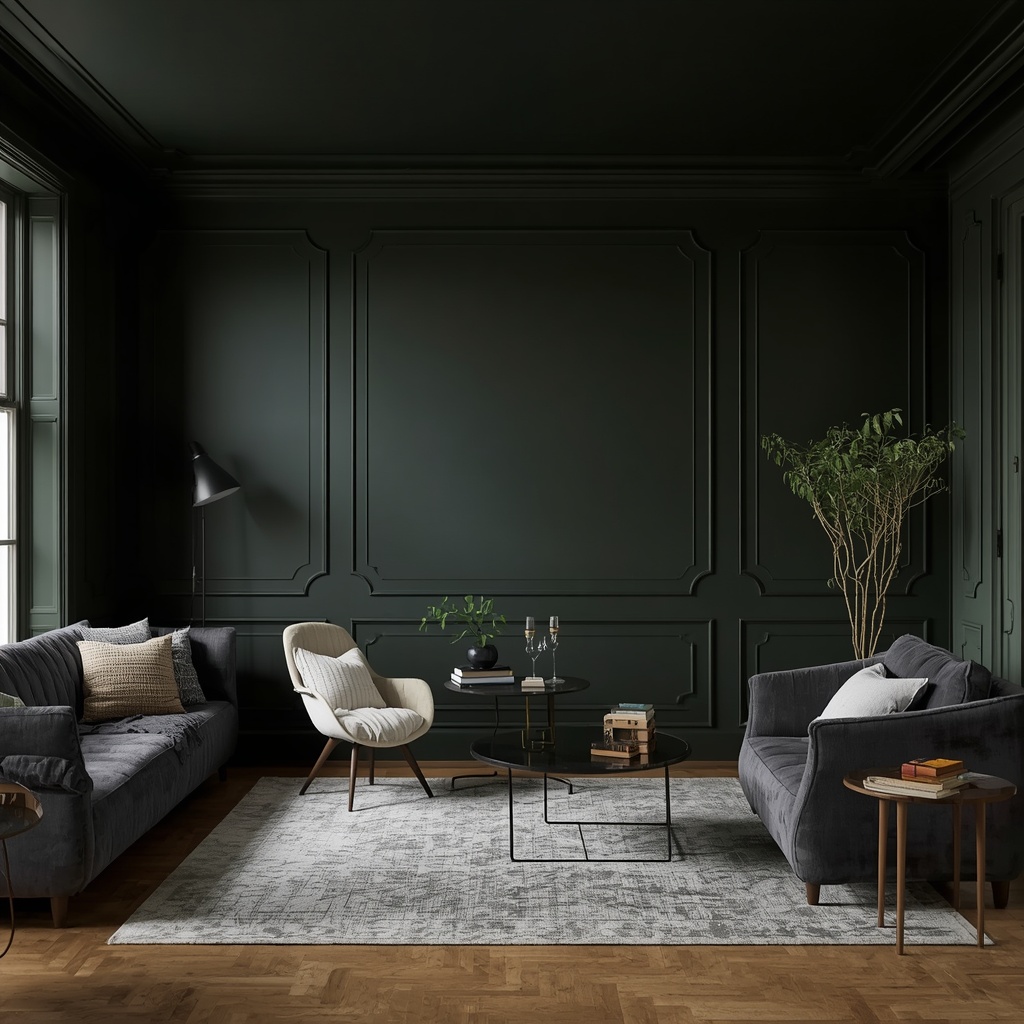
Yes, in specific cases. A fully “color-drenched” dark room (walls, trim, and ceiling all the same deep tone) can create a cozy, intentional feel rather than a shrinking effect, since there’s no jarring contrast to emphasize boundaries. This works best in rooms with strong natural light or ample lamp lighting.
How many paint colors should I use in a small room?
Generally, one to two colors maximum. Sticking to a tight, cohesive palette prevents visual fragmentation and keeps the eye moving smoothly through the space.
Is a glossy or matte finish better for small rooms?
Eggshell or satin finishes strike the best balance — they reflect enough light to brighten the room without highlighting every wall imperfection the way high-gloss finishes can.
Final Thoughts
Making a small room feel larger doesn’t require a renovation budget — it requires strategic color choices, the right sheen, and a few smart techniques borrowed straight from professional design playbooks. Start with a high-LRV, cool-or-neutral paint color, consider a monochromatic approach for ceilings and trim, and don’t underestimate the power of sheen and light placement.
Small spaces have incredible potential when treated thoughtfully. With the right can of paint and a bit of design intention, your compact room can feel every bit as open and inviting as a much larger one.