
Walk into any beautifully styled home and you’ll notice something the owner probably didn’t even think twice about: the plant pots. Not the plants themselves — the pots. That humble ceramic, terracotta, or concrete vessel is doing more visual work than almost any other accessory in the room, quietly tying together your color palette, texture story, and overall design language.
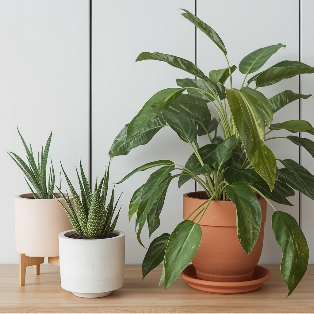
As an interior designer who specializes in home decor, I can tell you that clients obsess over sofas, rugs, and paint colors, then grab whatever plastic nursery pot the plant came in and call it done. That’s a missed opportunity. The right planter can elevate a $12 pothos into a design statement, while the wrong one can make an expensive fiddle leaf fig look like an afterthought. This guide will walk you through everything you need to know about choosing plant pots that actually complement your interior style, room by room, material by material.
Why Your Plant Pot Choice Matters More Than You Think
A plant pot isn’t just a container — it’s a design element with its own shape, color, texture, and finish, all of which interact with your existing decor. Interior stylists often refer to pots as “grounding objects” because they visually anchor a plant to the floor or surface it sits on, much like a rug anchors a seating area.
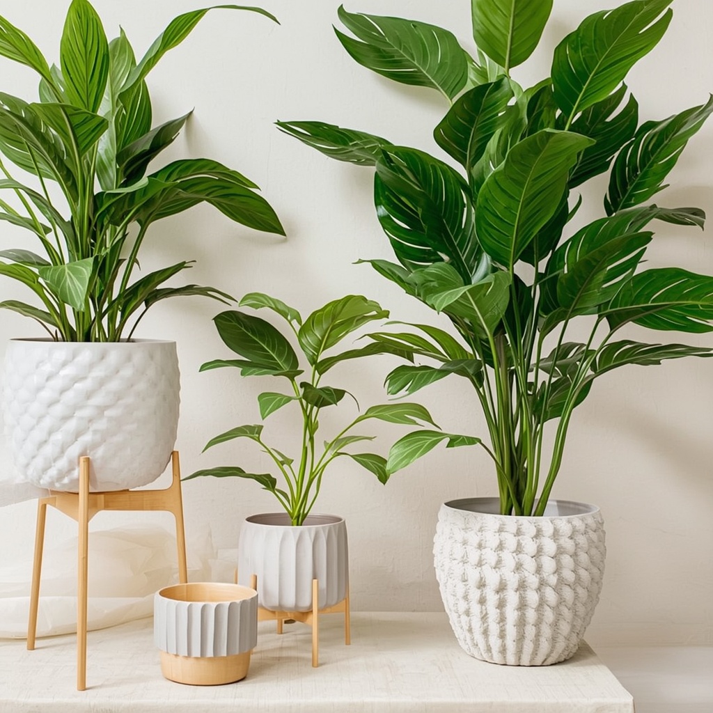
Think about it this way: two identical monstera plants can look completely different depending on their pots. One in a sleek white ceramic cylinder reads as modern and minimal. The same plant in a woven rattan basket feels warm, organic, and bohemian. The plant hasn’t changed — the story around it has.
“Plants are living sculpture, but the pot is the pedestal. Get the pedestal wrong, and even the most beautiful plant will feel out of place.” — a principle every trained decorator learns early in their career.
Start With Your Interior Style
Before you buy a single pot, identify the design language already at work in your space. Most homes lean toward one of a handful of recognizable aesthetics, and each one calls for a distinct pot personality.
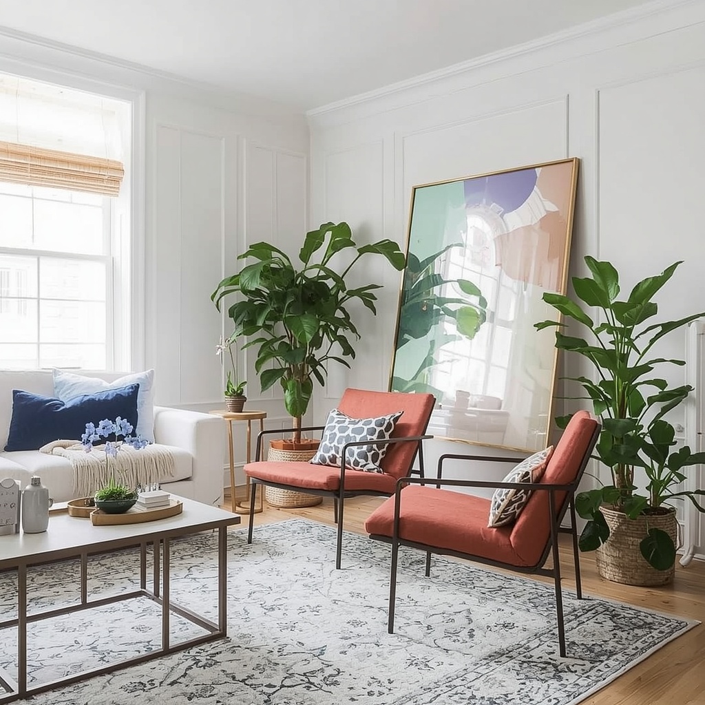
Pro Tip: Take a photo of the room where the plant will live, then hold up (or digitally overlay) a picture of the pot you’re considering. Seeing them together — rather than picturing it in your head — prevents costly mismatches, especially with bold colors or patterns.
Matching Pots to Popular Interior Styles
| Interior Style | Best Pot Materials | Shapes & Finishes | Color Palette |
|---|---|---|---|
| Modern / Minimalist | Ceramic, concrete, matte metal | Clean cylinders, geometric cubes | White, black, greige, matte neutrals |
| Bohemian | Woven rattan, terracotta, macramé-wrapped | Textured, irregular, handmade look | Warm terracotta, sand, rust |
| Scandinavian | Light wood, pale ceramic, concrete | Simple, rounded, functional | White, soft gray, natural wood tone |
| Industrial | Raw metal, cast iron, aged concrete | Bucket shapes, riveted, distressed | Black, gunmetal, rust patina |
| Coastal | Glazed ceramic, light rattan, glass | Rounded, breezy silhouettes | Seafoam, sandy beige, crisp white |
| Traditional | Glazed porcelain, brass, urn-style ceramic | Ornate, footed, classic urns | Navy, hunter green, gold accents |
| Mid-Century Modern | Tapered wood-leg planters, ceramic | Angular, retro curves | Mustard, burnt orange, walnut brown |
Once you know your style family, you have a filter for every future plant purchase — no more impulse-buying a pot that clashes with everything else you own.
Material Matters: What Each Pot Type Says About Your Space
The material of a plant pot affects both its visual weight and its practical performance, so it’s worth understanding your options before you shop.
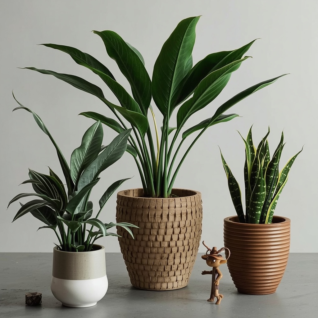
Terracotta pots bring an earthy, timeless warmth that works beautifully in bohemian, Mediterranean, and farmhouse-inspired interiors, and their porous clay body helps wick away excess moisture, which is genuinely good for plant roots. Ceramic and porcelain pots, on the other hand, come in a glazed or matte finish and offer far more versatility in color and shape, making them the go-to choice for modern, traditional, and transitional spaces alike.
Concrete and cement planters have become a favorite among designers chasing an industrial or minimalist look, thanks to their raw, sculptural quality and substantial visual weight that grounds a room. Woven natural fiber pots — rattan, seagrass, jute — introduce texture and softness that pairs naturally with boho, coastal, and Scandinavian interiors, though they typically need a plastic liner to protect against water damage.
Quick Material Comparison
- Terracotta — breathable, affordable, rustic charm, but heavy and prone to cracking in freezing temps
- Ceramic/Porcelain — glossy or matte finishes, wide color range, best for a polished look
- Concrete — heavy, sculptural, industrial-modern, holds moisture longer
- Metal — sleek and contemporary, but can rust or heat up in direct sun
- Wood — warm, natural, ideal for mid-century and Scandinavian spaces, needs a liner
- Woven fiber/rattan — textural, boho-friendly, lightweight, needs a liner too
- Fiberglass/resin — lightweight alternative that mimics stone or metal at a fraction of the weight
Pro Tip: If you love the look of concrete or stone but worry about weight, look for fiberglass or resin pots designed to mimic those finishes. They deliver the same visual heft for a fraction of the weight — perfect for upper-floor apartments or plants you’ll want to rearrange seasonally.
Shape and Proportion: The Design Rule Most People Skip
Color gets all the attention, but shape and proportion are what make a pot feel “right” in a space. A general styling rule: the pot should be roughly one-third the height of the plant (including the pot) for a balanced visual proportion. Too small, and the arrangement looks top-heavy; too large, and the plant gets visually swallowed.
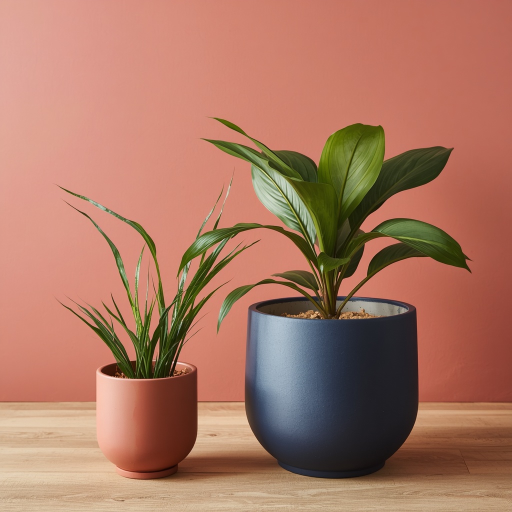
Shape also communicates mood. Tall, tapered cylinders feel modern and architectural, especially paired with structural plants like snake plants or ZZ plants. Wide, low bowls suit trailing or spreading plants like pothos or string of pearls, and rounded, bulbous forms soften a room’s hard lines, which is why they show up so often in cozy, traditional interiors.
Color Psychology and Coordination
Choosing a pot color isn’t just about matching your walls — it’s about deciding how much visual attention you want the plant arrangement to command.
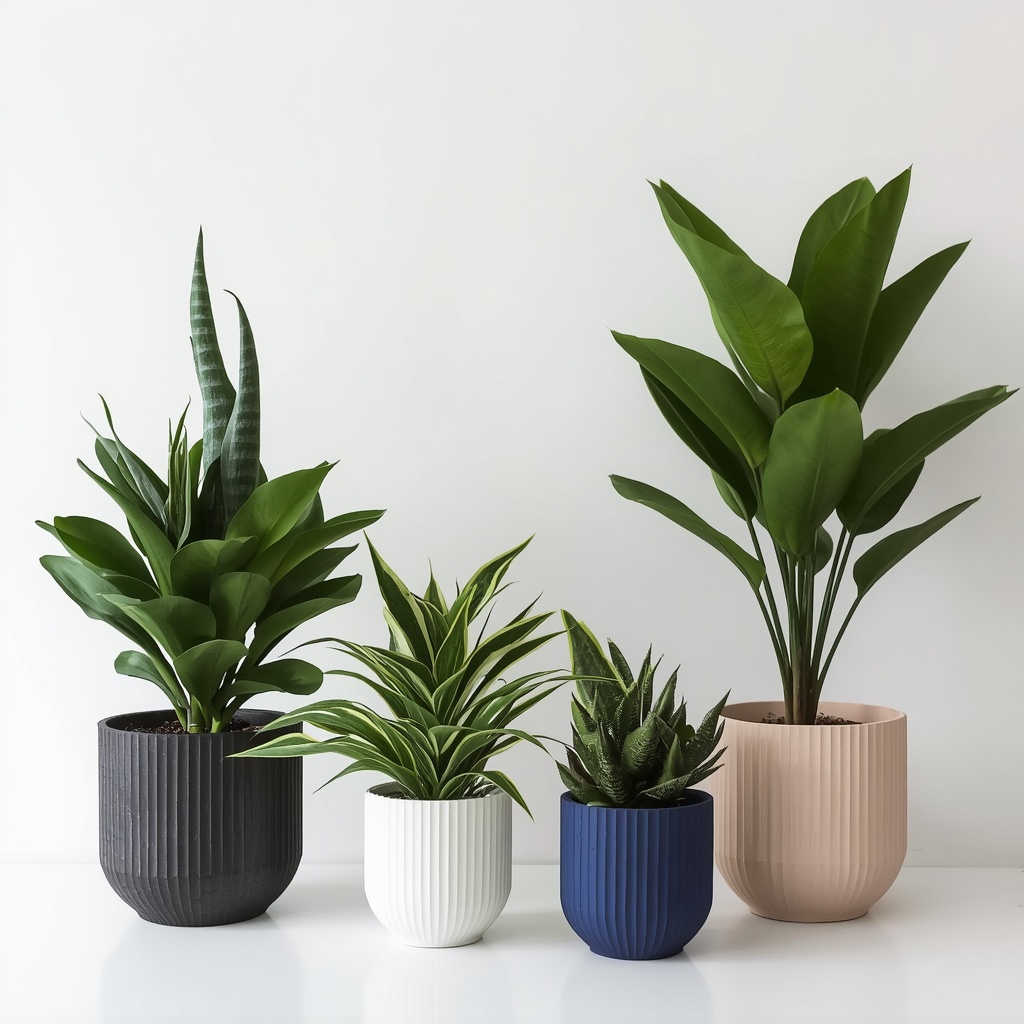
Neutral pots (white, gray, terracotta, black) let the plant’s foliage do the talking and blend seamlessly into almost any room, which is why designers default to them in spaces with already-busy patterns or artwork. Bold or colorful pots — think emerald green, cobalt blue, or blush pink — work best as intentional accent pieces in otherwise neutral rooms, where they can echo an accent color used elsewhere, such as in throw pillows or artwork.
A simple rule of thumb: repeat any statement pot color at least twice elsewhere in the room, whether in a cushion, a piece of art, or a ceramic vase. This “rule of three” repetition is a classic interior design technique that keeps a bold choice from feeling random.
Room-by-Room Pot Selection Guide
Different rooms have different functional demands, lighting conditions, and style expectations, so it helps to think through your pot choice room by room.
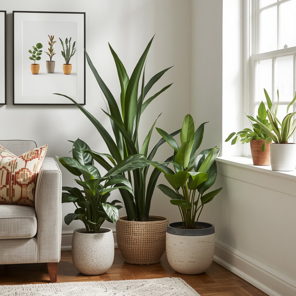
In living rooms, floor planters in the 12–20 inch range make strong style statements next to sofas or in empty corners, and materials like woven rattan, ceramic, or concrete tend to read as intentional decor rather than clutter. In bathrooms, moisture-loving plants pair naturally with glazed ceramic or resin pots that won’t degrade from humidity, while in kitchens, small ceramic or enamel pots on a windowsill add color without competing with countertop clutter.
Bedrooms call for softer, calmer pot choices — matte ceramics or light wood tones in muted colors support a restful atmosphere, whereas home offices can handle more personality, since a single well-chosen colorful or textured pot can double as a conversation-starting desk accessory.
Room-by-Room Cheat Sheet
| Room | Recommended Pot Style | Notes |
|---|---|---|
| Living Room | Large ceramic, concrete, or rattan floor planters | Anchor empty corners, balance sofa scale |
| Bedroom | Matte ceramic, light wood | Keep tones muted for a restful feel |
| Kitchen | Small glazed ceramic, enamel | Windowsill-friendly, easy to wipe clean |
| Bathroom | Glazed ceramic, resin | Moisture-resistant finishes |
| Home Office | Textured or colorful ceramic, brass | Adds personality without overwhelming |
| Entryway | Tall, sculptural concrete or ceramic | First impression piece, should feel intentional |
Don’t Forget Function: Drainage, Liners, and Practical Considerations
A gorgeous pot that kills your plant isn’t a design win. Many decorative pots, especially ceramic and concrete ones, don’t come with drainage holes, so you’ll need either a drill-friendly material, a cache pot approach (nursery pot inside a decorative outer pot), or a pot with a built-in saucer.
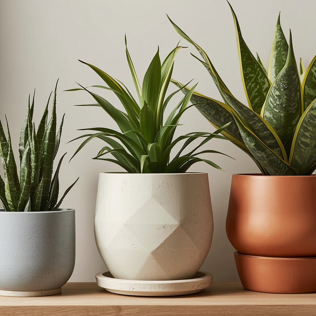
The cache pot method is actually the professional stylist’s secret weapon: keep the plant in its plastic nursery pot with proper drainage, then simply drop that pot inside a decorative outer pot with no drainage needed. This lets you swap decorative pots seasonally or as your style evolves, without repotting the actual plant, and it protects furniture and floors from water damage.
Pro Tip: Always add an inch of pebbles, LECA, or a cork coaster at the bottom of a cache pot before inserting the nursery pot. This lifts the plant above any pooled water and prevents root rot, giving you the design flexibility of a decorative pot with none of the drainage headaches.
Mixing and Layering Pots for a Curated Look
One of the most reliable ways professional decorators create that “collected over time” look is by grouping multiple plants in varied pot heights and materials, unified by a shared color story. Rather than matching every pot exactly, aim for a common thread — the same color family, the same material, or the same general shape — while allowing size and plant variety to differ.
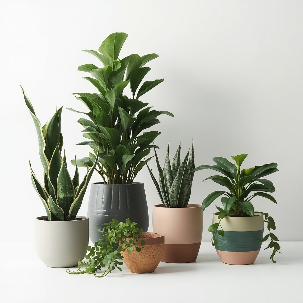
A well-known styling formula many designers rely on is grouping in odd numbers, typically three or five plants of varying heights, which reads as more natural and visually interesting than a symmetrical pair. Layering a tall floor plant, a medium tabletop plant, and a small trailing plant in coordinating pots creates depth and movement that a single specimen simply can’t achieve on its own.
Common Pot-Buying Mistakes to Avoid
- Choosing a pot that’s too small for the plant’s mature size, forcing an awkward repot within months
- Ignoring drainage needs and letting water sit, which leads to root rot
- Matching every single pot in a room exactly, which can look sterile rather than curated
- Picking trendy colors that clash with a home’s undertones (warm vs. cool)
- Overlooking scale — a tiny pot on a large console table gets visually lost
- Forgetting weight and mobility, especially for large floor planters that may need repositioning for cleaning or seasonal light changes
Where to Shop: Budget vs. Splurge
You don’t need to spend a fortune to get designer-level results, but knowing where to allocate your budget helps. Spend more on statement pieces — a large entryway or living room floor planter that will be seen daily and anchors the whole arrangement. Save on smaller, secondary pots, since inexpensive ceramic or terracotta options from home goods retailers, garden centers, or online marketplaces can look just as intentional when styled thoughtfully.
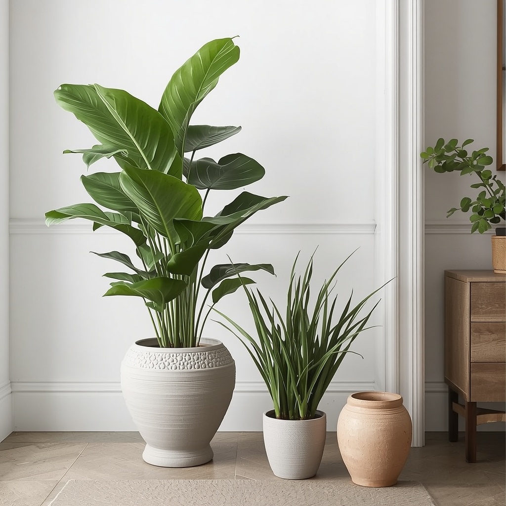
Local pottery studios and artisan markets are also worth checking for one-of-a-kind statement pots that instantly make a space feel personal rather than catalog-bought. Many interior designers source directly from independent ceramicists for exactly this reason — a handmade pot has a texture and imperfection that mass-produced pieces can’t replicate.
Final Thoughts: Let Your Pots Tell a Story
Choosing the right plant pot is really an exercise in intentional design — every material, shape, and color decision either supports your interior style or quietly works against it. Once you start seeing pots as design objects rather than plant containers, you’ll notice how much more polished and cohesive your greenery feels throughout your home.
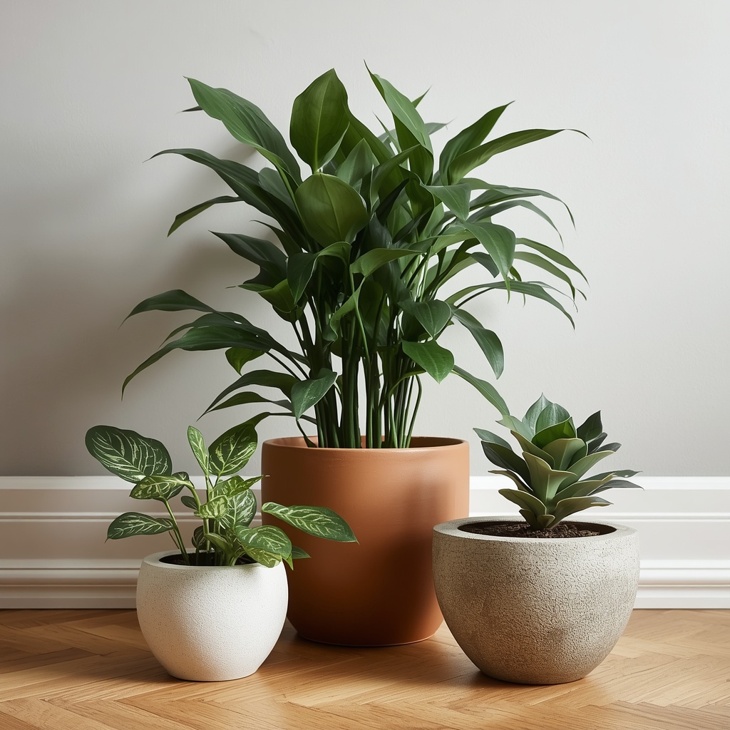
Start small: pick one room, identify its style family from the table above, and choose a single pot that fits. Live with it for a week, notice how it changes the feel of the space, and then apply the same thinking room by room. Before long, your plant collection won’t just be alive — it’ll be genuinely well-designed.