
Walk into any beautifully designed living room and you’ll notice something: the walls are never empty. They’re doing work — telling a story, adding texture, and making the whole space feel intentional. Floating shelves are one of the most versatile tools in an interior designer’s kit for achieving exactly that effect, and the best part is you don’t need a renovation budget to pull it off.
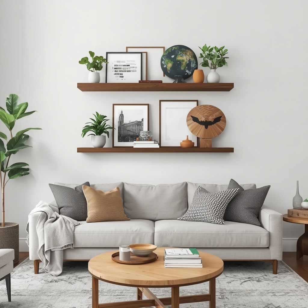
As a home decor specialist working primarily with American homeowners, I get asked constantly: “How do I make my floating shelves look like they belong in a magazine instead of a college dorm?” The answer isn’t about buying more stuff. It’s about understanding composition, balance, and a few tried-and-true styling principles that professional designers use every single day.
This guide walks you through everything — from choosing the right shelf to the exact “rule” that separates cluttered shelves from curated ones.
Why Floating Shelves Are a Living Room Essential
Floating shelves have exploded in popularity for good reason. Unlike bulky bookcases or cabinets, they create storage and display space without eating into your floor plan or blocking natural light. They’re wall-mounted, minimal-looking, and shockingly effective at making a room feel finished.
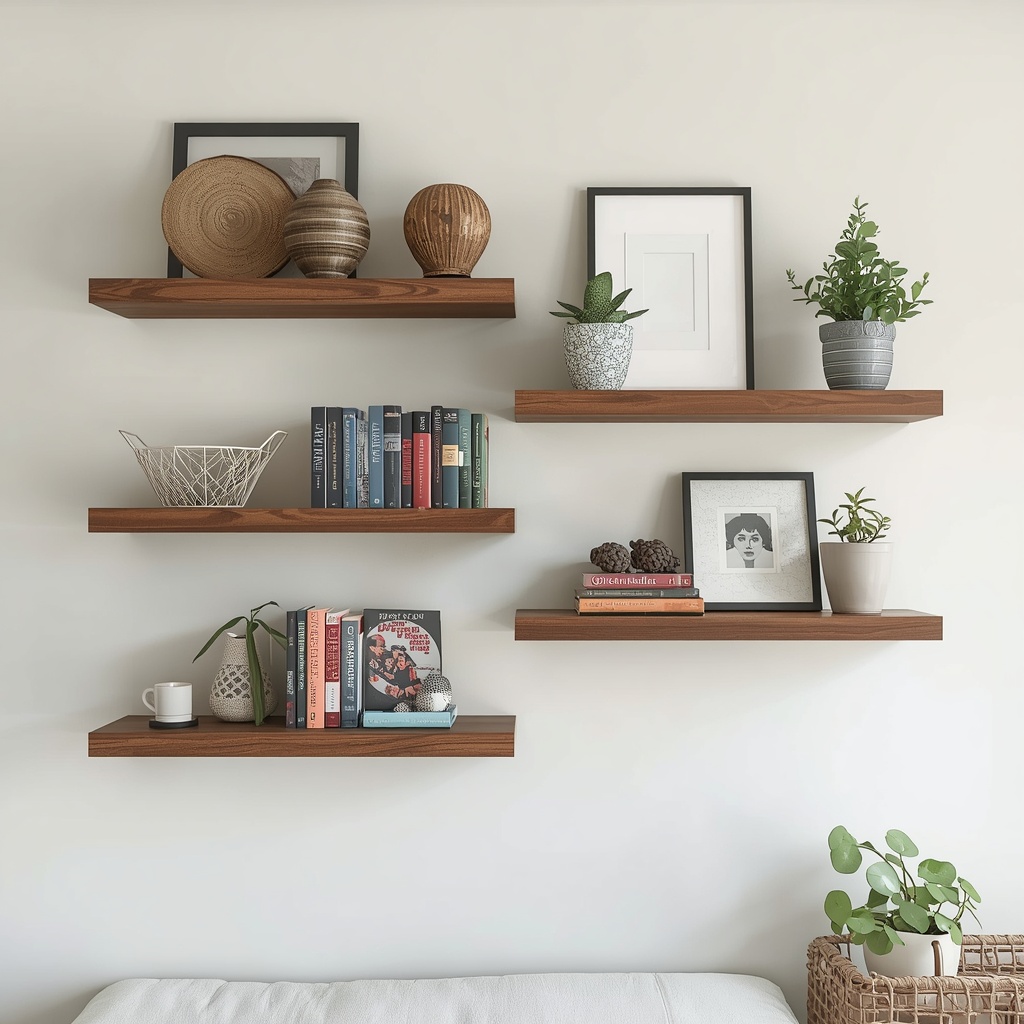
For renters and homeowners alike, floating shelves also solve a real problem: what to do with all that awkward vertical wall space above a sofa, TV console, or in a reading nook. Rather than leaving it blank or hanging a single piece of art, shelves let you build a living, evolving display of books, art, plants, and personal treasures.
They’re also budget-friendly. A well-styled shelf costs a fraction of custom built-ins but delivers a similar visual payoff — depth, texture, and personality on your living room wall.
Choosing the Right Floating Shelves for Your Space
Before you even think about styling, the shelf itself needs to suit your room’s architecture, wall strength, and design style. Not every shelf works for every wall or every look.
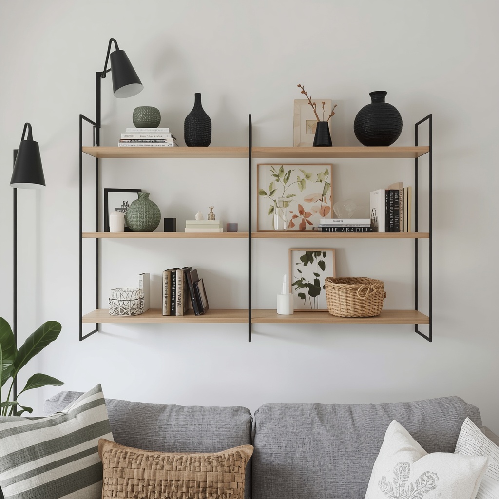
| Shelf Material | Best For | Weight Capacity | Design Style |
|---|---|---|---|
| Solid wood | Farmhouse, rustic, traditional | High (with proper brackets) | Warm, organic interiors |
| Engineered wood/MDF | Budget-friendly projects | Medium | Modern, transitional |
| Metal/wire frame | Industrial, eclectic spaces | Medium-high | Loft-style, urban |
| Glass | Minimalist, contemporary | Low-medium | Sleek, modern |
| Reclaimed wood | Boho, cottagecore, rustic | Medium | Textured, layered looks |
When selecting shelf depth, aim for at least 8–10 inches if you plan to display books or larger decor objects; anything shallower is best reserved for framed art or small accents. Always confirm your wall type (drywall vs. plaster vs. brick) before installation, since that determines whether you need standard anchors or heavy-duty toggle bolts.
The Rule of Three (and Other Styling Principles)
Professional stylists rely on a handful of foundational rules that make shelf arrangements feel curated rather than cluttered. Once you know them, you’ll start seeing them everywhere.
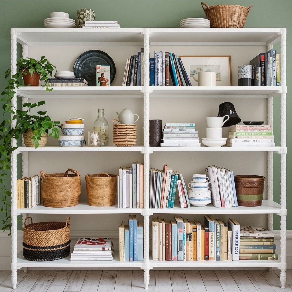
- The Rule of Three: Group objects in odd numbers — three, five, seven. Odd numbers create visual interest because the eye can’t split them into perfectly even pairs.
- Varying Heights: Mix tall and short objects on the same shelf to create a skyline effect rather than a flat row.
- Triangulation: Arrange your tallest, medium, and smallest items so they form an invisible triangle — this is the same principle used in professional tablescaping and gallery wall design.
- Negative Space: Leave breathing room. A shelf packed edge-to-edge reads as cluttered no matter how nice the individual pieces are.
- Color Anchoring: Repeat one or two accent colors across multiple shelves to tie a multi-shelf display together visually.
“Good shelf styling isn’t about how much you can fit — it’s about how much restraint you can show. The empty space is doing just as much work as the objects themselves.” — a principle echoed by design educators at the American Society of Interior Designers (asid.org)
Layering Techniques That Add Depth
Flat, single-layer shelf arrangements are the number one reason shelves look unfinished. Depth is what separates an amateur display from one that looks professionally styled.
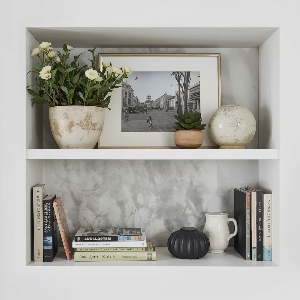
Start by placing your largest item — a stack of books, a vase, or a piece of framed wall art — toward the back of the shelf. Then layer smaller objects in front, slightly overlapping. This creates dimension and prevents that “everything lined up like soldiers” look that reads as stiff and unnatural.
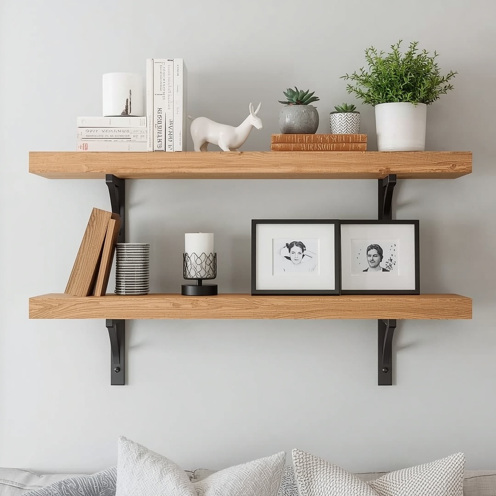
Leaning framed art against the wall instead of hanging it flat is another designer trick that instantly adds depth and a lived-in, editorial feel. It also makes seasonal swaps effortless since you’re not dealing with nail holes.
Pro Tip
💡 Pro Tip: Before you commit to a final arrangement, take a photo of your shelf with your phone. Photos flatten the image the same way a room photo in a magazine would, instantly revealing awkward gaps, uneven weight distribution, or clutter that your eye might miss in person. Adjust until the photo looks balanced — then you know it’ll look great in real life too.
Styling by Design Aesthetic
Your floating shelf decor should reflect the broader design language of your living room. Here’s how to approach some of the most popular American home styles.
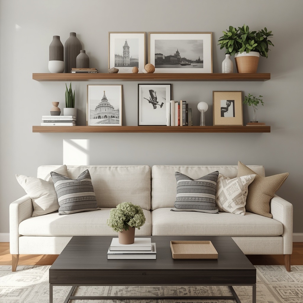
| Style | Color Palette | Key Materials | Signature Accents |
|---|---|---|---|
| Modern Minimalist | White, black, greige | Glass, matte metal | Single sculptural object, one plant |
| Farmhouse | Warm whites, sage, wood tones | Reclaimed wood, ceramic, woven baskets | Vintage crocks, dried florals |
| Boho | Terracotta, mustard, cream | Rattan, macramé, natural fiber | Trailing plants, textured pottery |
| Coastal/Cottage | Blues, whites, sandy neutrals | Driftwood, glass, linen | Woven baskets, coral or shell accents |
| Industrial | Charcoal, rust, exposed wood | Metal brackets, raw wood | Vintage cameras, metal canisters |
| Traditional/Transitional | Navy, cream, brass | Wood, brass, leather | Bookends, framed family photos |
Whatever style you’re working with, semantic consistency matters just as much as color — a rattan basket on an otherwise glass-and-chrome modern shelf will feel out of place unless it’s intentionally used as a contrast accent.
What to Put on Your Floating Shelves
A common styling mistake is treating shelves purely as storage. Instead, think of them as a curated vignette — a mini art installation on your wall. Here’s a well-rounded mix to pull from:
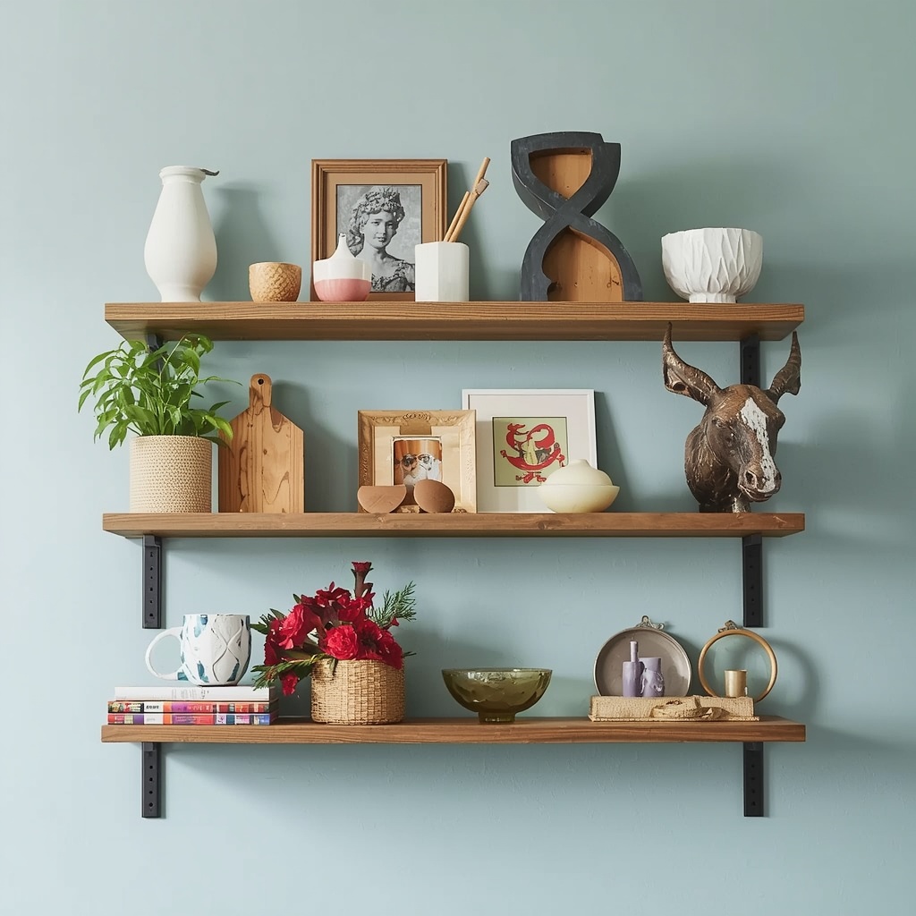
- Books — stacked horizontally, vertically, or both, spine-out or spine-in for a monochrome look
- Plants — trailing pothos, small succulents, or a single statement fiddle leaf fig branch in a vase
- Art and mirrors — small framed prints or a leaning mini mirror to bounce light
- Personal objects — travel souvenirs, pottery, candles, or vintage finds
- Baskets or boxes — for concealed storage that still looks intentional
- Textural elements — a woven object, stone bookend, or ceramic vase to break up hard lines
- Lighting accents — a small battery-powered LED puck light or fairy lights for evening ambiance
Two paragraphs on the “why” behind this variety: mixing categories — books, greenery, art, and personal objects — creates visual and textural contrast that a single-category shelf (all books, all plants) simply can’t achieve. Variety mimics how professional stylists compose vignettes for photo shoots, where every object earns its place by contributing color, shape, or texture.
It’s also worth remembering that floating shelves are one of the few decor elements in your home that can be updated seasonally without any real cost. Swapping out a few objects for the season keeps your living room feeling fresh and prevents “decor blindness,” where a space becomes so familiar you stop really seeing it.
Common Mistakes to Avoid
Even well-intentioned homeowners fall into a few predictable traps when styling floating shelves. Avoid these to instantly elevate your results:
- Overcrowding — cramming too many small objects together reads as cluttered rather than curated
- Uniform height — placing all items at the same height flattens the visual interest
- Ignoring scale — tiny trinkets on an oversized shelf get visually lost
- Mismatched hardware finishes — mixing brushed nickel brackets with brass decor accents without any tying element
- Installing shelves too high or too low — living room shelves generally look best 6–12 inches above furniture like a sofa or console, not centered arbitrarily on the wall
- Forgetting the “why” — styling shelves with random objects instead of ones that reflect your personality or the room’s story
Lighting and Placement Tips
Placement can make or break even a beautifully styled shelf. In most living rooms, floating shelves work best flanking a TV or fireplace, above a console table, or filling an awkward alcove. Keep at least 3–4 inches of clearance between stacked shelves so taller objects like vases or lamps don’t feel cramped.
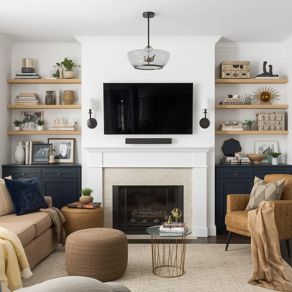
Lighting deserves just as much attention as the objects themselves. Under-shelf LED strip lighting, battery-operated puck lights, or a nearby floor lamp can dramatically change how your display reads at night. Warm white lighting (around 2700K–3000K) tends to flatter wood tones, ceramics, and neutral palettes far better than cool white light, which can make a cozy living room feel clinical.
Seasonal Refresh Ideas
One of the biggest advantages of floating shelf decor is how easy it is to refresh throughout the year without touching your furniture or paint color.
| Season | Color Accents | Quick Swap Ideas |
|---|---|---|
| Spring | Soft green, blush, cream | Fresh florals, pastel ceramics |
| Summer | Ocean blue, sandy neutral | Shells, linen textures, citrus-scented candles |
| Fall | Rust, mustard, deep green | Dried pampas grass, stoneware pumpkins |
| Winter | Deep red, forest green, gold | Pinecones, brass candle holders, faux garland |
Rotating even two or three objects per season is enough to keep the display feeling current, and it’s a far more sustainable approach to home decor than buying entirely new pieces every few months.
Final Thoughts
Floating shelves are deceptively simple pieces of furniture that carry enormous design potential when styled with intention. The goal isn’t perfection — it’s balance: a mix of heights, textures, colors, and personal meaning that makes your living room feel curated rather than staged. Start with the rule of three, layer with purpose, leave room to breathe, and don’t be afraid to rearrange until a photo of your shelf looks as good as the room around it.
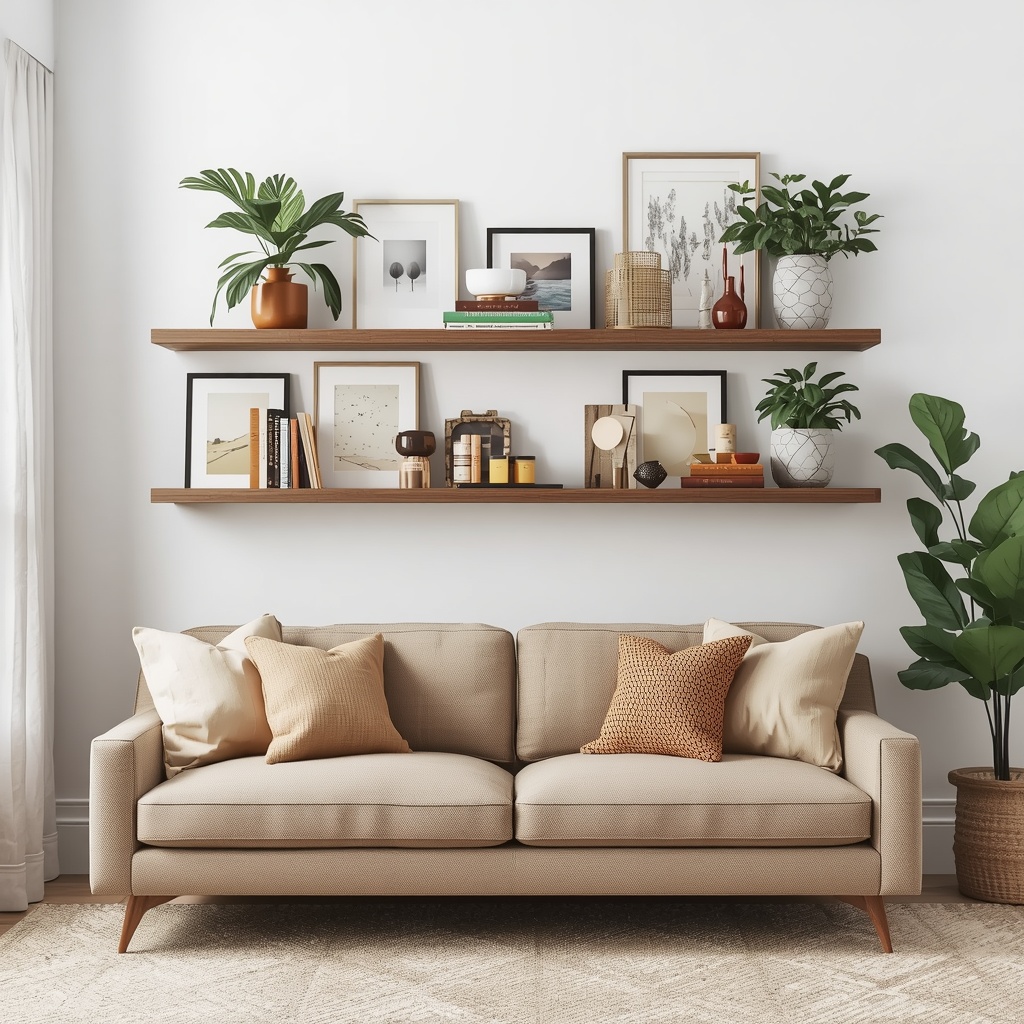
Whether your living room leans modern, farmhouse, boho, or somewhere in between, these principles apply universally. Your shelves should tell a story about who lives in the space — and with a little intentional styling, they absolutely can.