Color is emotion made visible. As an interior designer working with homeowners across the U.S., I’ve seen one powerful shift redefine modern homes: rich, saturated wall colors layered with calming neutrals. This approach delivers drama without overwhelm, personality without chaos, and luxury without excess.
If you’ve been craving a home that feels curated, cozy, and confidently stylish, this design strategy may be exactly what you need.Why Rich Hues Are Dominating American Interiors

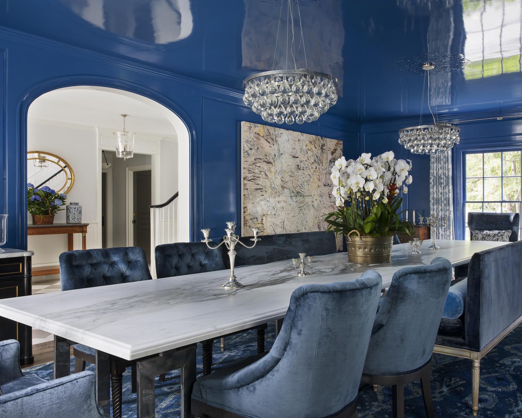

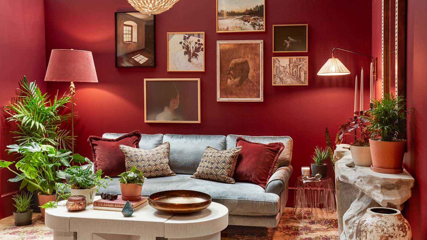
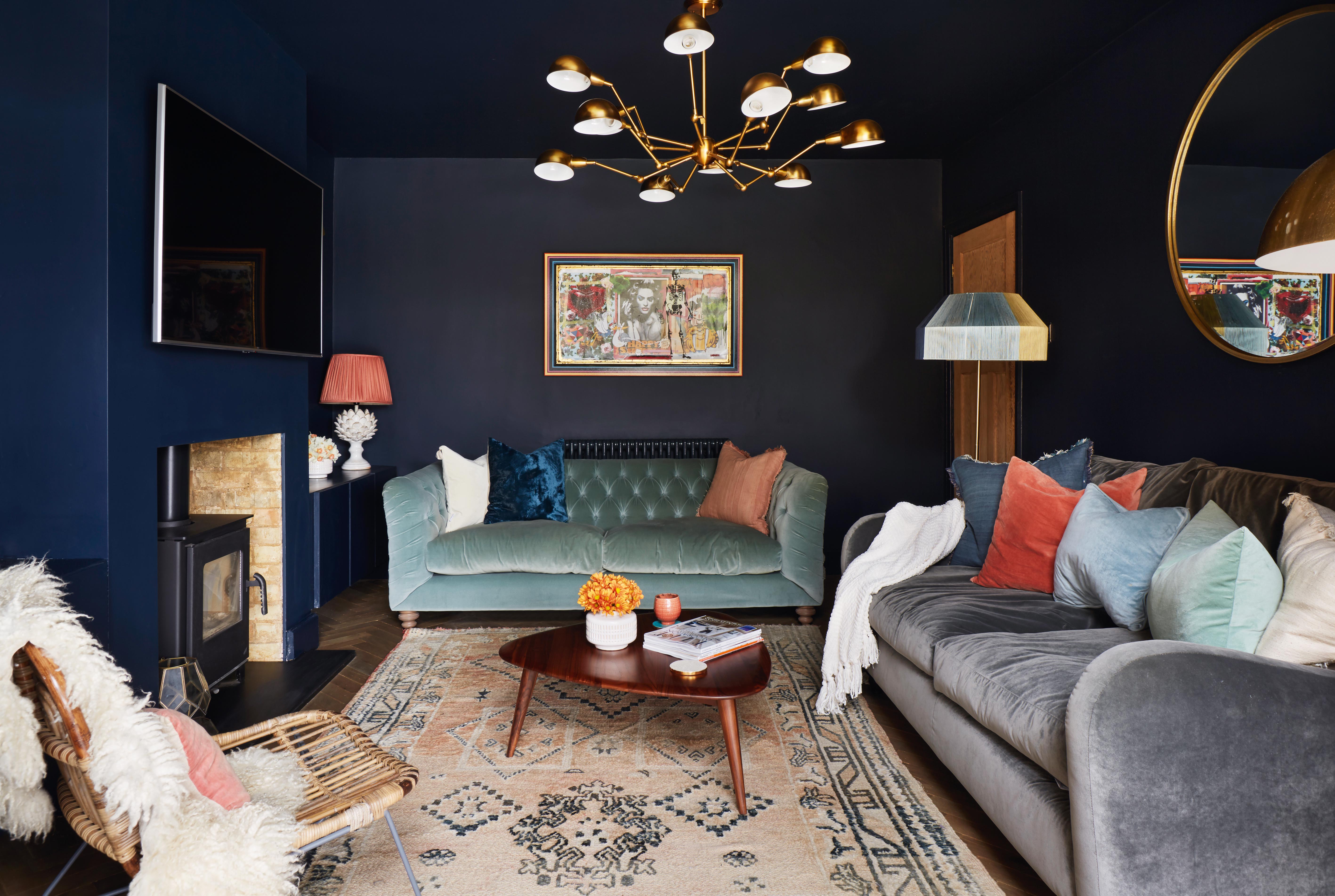
Deep emerald greens, moody navy blues, velvety burgundies, and sophisticated charcoals are replacing flat white and beige as homeowners seek warmth and depth. Rich wall colors create an immersive backdrop that instantly elevates a space.
In U.S. homes—especially open-concept layouts—bold walls help define zones and add architectural presence. The key is not just going dark, but knowing how to balance intensity with softness.
The Psychology Behind Saturated Color
Color psychology plays a major role in how we experience our homes. Rich hues anchor a room and create a sense of intentional design.
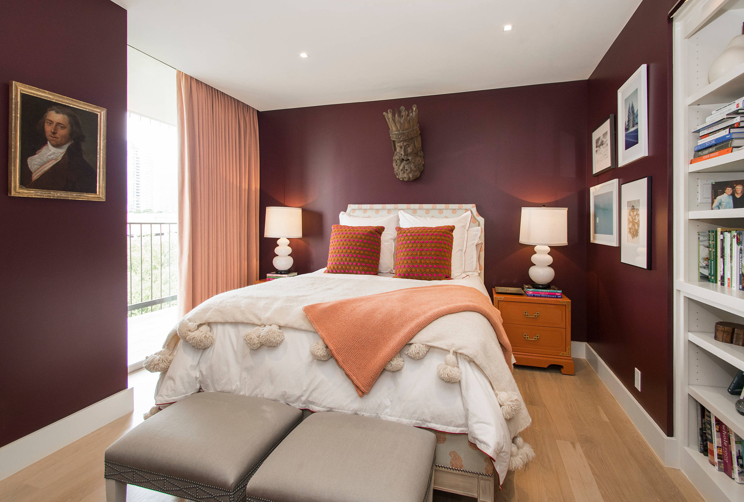
Deep blues promote calm and confidence. Emerald greens feel restorative and grounded. Burgundy and wine tones evoke warmth and sophistication.
When paired with neutral layers—like ivory, taupe, oatmeal, and soft gray—the emotional weight of bold walls feels balanced rather than overpowering.
What Counts as a Rich Hue?
Not all bold colors are created equal. A rich hue is typically:
- Highly saturated
- Deep in tone
- Layered with undertones
- Complex rather than flat
Here are popular rich hues trending in American homes:
| Color Family | Example Shade | Mood Created | Best Rooms |
|---|---|---|---|
| Deep Blue | Navy, Midnight | Calm, refined | Dining rooms, offices |
| Green | Emerald, Forest | Restorative, luxe | Living rooms, bedrooms |
| Red | Burgundy, Wine | Warm, dramatic | Dining rooms |
| Gray | Charcoal | Modern, grounding | Bedrooms, media rooms |
| Brown | Chocolate | Cozy, organic | Libraries, dens |
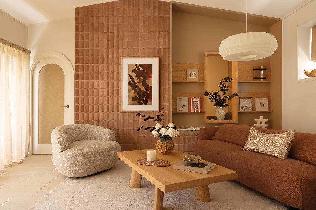
The Power of Neutral Layers


Neutrals act as a visual exhale. They soften bold walls and prevent a room from feeling heavy.
Think of neutrals as supporting actors: textured linen curtains, boucle chairs, jute rugs, warm wood finishes, and creamy upholstery.
Layering different neutral tones—rather than using one flat beige—creates dimension and warmth while maintaining balance.How to Balance Rich Walls with Neutral Decor
The formula is simple but strategic:
1. Follow the 60-30-10 Rule
- 60% dominant color (often the wall color)
- 30% secondary neutral
- 10% accent (metallics, artwork, or bold decor)
This classic interior design principle keeps color intentional and proportional.
2. Use Contrast in Texture
Pair matte walls with:
- Velvet sofas
- Linen drapery
- Wool throws
- Natural wood
Texture prevents dark colors from feeling flat.
3. Bring in Light-Reflective Elements
Mirrors, glass coffee tables, brass hardware, and light-colored rugs help bounce light and keep the space open.
Best Rooms for Rich Hue Walls
Living Rooms


A deep emerald or navy creates a cozy yet refined gathering space. Pair with a cream sectional and layered neutral textiles for a designer look.
Bedrooms
Dark hues cocoon the space, improving relaxation. Charcoal, deep plum, or forest green paired with ivory bedding feels hotel-inspired.
Dining Rooms
Bold walls elevate entertaining. Burgundy or midnight blue enhances candlelight and creates an intimate atmosphere.
Home Offices
Rich hues promote focus and confidence—ideal for remote work spaces.
Pro Tip: Lighting Changes Everything
Ad Pro Tip: Always test large paint swatches on multiple walls before committing. Observe the color morning, afternoon, and evening.
Natural light in California behaves differently than winter light in the Northeast. Undertones can shift dramatically depending on exposure.
Warm LED bulbs (2700K–3000K) complement deep hues best and keep them from feeling cold.
Popular Color & Neutral Pairings That Always Work
Here are foolproof combinations I use for clients:
- Emerald + Cream + Walnut Wood
- Navy + Oatmeal Linen + Brass
- Charcoal + Soft Gray + Black Accents
- Burgundy + Ivory + Gold
- Forest Green + Beige + Cognac Leather
Each pairing balances saturation with softness and texture.
Texture: The Secret Ingredient


Without texture, bold walls can feel heavy. Layering materials introduces warmth and light reflection.
Incorporate:
- Boucle chairs
- Chunky knit throws
- Linen drapery
- Woven baskets
- Natural stone accents
Texture creates visual movement against rich backdrops.Small Spaces & Dark Walls: Myth vs. Reality
Many homeowners fear dark colors shrink a room. In reality, deep hues can blur edges and make walls recede.
In small powder rooms or reading nooks, saturated color actually enhances intimacy and character.
The key is pairing bold walls with:
- Large mirrors
- Adequate lighting
- Light-colored trim or ceilings
Choosing the Right Finish
Paint finish impacts how rich hues appear.
| Finish | Best Use | Why It Works |
|---|---|---|
| Matte | Bedrooms, ceilings | Hides imperfections |
| Eggshell | Living rooms | Soft sheen, subtle depth |
| Satin | Kitchens | Easy to clean |
| Semi-gloss | Trim | Reflects light |
For dramatic spaces, matte finishes create velvety depth that feels luxurious.
Incorporating Metallic & Wood Elements
Metallic accents elevate saturated walls.
- Brass warms navy and green
- Gold enhances burgundy
- Matte black modernizes charcoal
- Warm walnut grounds emerald
Natural wood tones prevent dark colors from feeling sterile.
Layering Neutrals the Right Way
Neutrals should not all match exactly.
Instead, combine:
- Warm ivory
- Greige
- Soft camel
- Light oak
- Creamy whites
Layering multiple shades adds subtle dimension and avoids monotony.
Creating Flow in Open Concept Homes


In open floor plans, use rich hues strategically:
- Accent one main wall
- Carry the neutral palette throughout
- Repeat wood and metallic finishes
This ensures continuity while allowing depth.
Common Mistakes to Avoid
- Using too many bold colors at once
- Forgetting to layer texture
- Ignoring lighting temperature
- Skipping sample testing
- Matching neutrals too precisely
Design is about harmony, not competition.
Budget-Friendly Ways to Try This Trend
You don’t need a full remodel.
Try:
- A single accent wall
- Paint behind built-ins
- Bold powder room walls
- Dark hallway transformation
Paint remains one of the most affordable high-impact upgrades.
Seasonal Adaptability
Rich hues transition beautifully year-round.
In fall and winter, they feel cozy and enveloping. In spring and summer, neutrals and greenery lighten the mood.
Switch throw pillows, artwork, and florals to refresh seasonally.
Sustainability & Timeless Appeal
Deep blues, greens, and charcoals have historical roots in traditional American homes.
They are less trend-dependent than bright statement colors and often increase perceived home value when executed thoughtfully.
Choosing timeless palettes reduces the need for frequent repainting.
Final Thoughts: Designing with Confidence
Rich hue walls balanced with neutral layers offer the perfect blend of drama and comfort.
This approach works in modern lofts, suburban homes, and historic properties alike.
When done thoughtfully—with texture, lighting, and proportion in mind—bold color becomes not risky, but refined.
If you’re ready to elevate your space, start small. Sample boldly. Layer neutrals intentionally. And remember: your home should feel like you, only better styled.
Quick Recap Checklist
✔ Choose a rich, saturated wall color
✔ Layer multiple neutral tones
✔ Incorporate texture
✔ Test paint in different lighting
✔ Use metallic and wood accents
✔ Follow the 60-30-10 rule
Design is about creating spaces that feel intentional, comfortable, and elevated. Rich hues bring personality. Neutral layers bring balance.
Together, they create a home that feels both bold and beautifully livable.