Color Undertones for Perfect Matches
The secret weapon every savvy American homeowner needs to stop second-guessing paint chips, fabric swatches, and furniture finishes — once and for all.
You’ve been standing in the paint aisle for thirty minutes. The chip says “Warm Ivory,” the walls at home are supposedly “White,” and yet every time you bring a sample home, something just feels… off. Sound familiar? The culprit is almost always color undertones — the subtle secondary hues hiding beneath every surface color you own.
As an interior designer who has helped hundreds of American homeowners build cohesive, magazine-worthy spaces, I can tell you that understanding undertones isn’t just a designer trick. It’s the single most important skill for anyone who wants their rooms to feel pulled-together, intentional, and beautiful — without an expensive renovation.
What Are Color Undertones and Why Do They Matter?
Every color you see in your home — whether it’s on your walls, your sofa upholstery, your hardwood floors, or your kitchen cabinets — contains an undertone. An undertone is the underlying hue that a color leans toward under different lighting conditions. It’s the reason a paint that looks creamy beige on the chip can turn oddly pink on your walls, or why your “gray” sofa looks almost lavender next to your white trim.
Undertones exist because paint pigments, fabric dyes, and wood stains are never pure single colors. They are complex mixtures. A white wall might contain traces of yellow, green, or pink. A gray tile might lean blue or purple. These underlying hues interact with natural light, artificial lighting, adjacent surfaces, and the colors in your furnishings — creating either visual harmony or visual tension in your space.
Understanding the color temperature spectrum is essential here. Warm undertones include red, orange, yellow, and peach. Cool undertones include blue, green, purple, and gray. Neutral undertones sit on the fence — they can swing either way depending on surrounding colors and lighting conditions. The goal in any well-decorated room is undertone cohesion — making sure every major element shares compatible secondary hues.
Interior color theory isn’t just about aesthetics — it directly impacts how large or small a room feels, how warm or cold it reads, and even how relaxed or energized you feel inside it. Getting your undertones right is the foundation of every successful home decor decision you’ll ever make.
“Color undertones are the grammar of interior design. You can have beautiful individual words — stunning furniture, gorgeous paint — but if the grammar is wrong, the whole sentence falls apart.”— Sarah Monroe, NCIDQ-Certified Interior Designer
The Three Undertone Families: Warm, Cool, and Neutral
Before you can master color matching in your home, you need to identify which undertone family your existing elements belong to. Let’s break down each category with real-world examples you’ll recognize from popular American home decor brands and paint lines.
Warm Undertones
Leans red, yellow, orange, or peach. Found in golden oak floors, butter-yellow walls, terracotta tiles, and sand-toned linens. Creates cozy, inviting spaces.
Undertone Family 2
Cool Undertones
Leans blue, green, purple, or gray. Found in white marble, slate flooring, navy upholstery, and silver hardware. Creates fresh, airy, sophisticated spaces.
Neutral Undertones
True greige, balanced beige, and versatile taupes. These colors don’t strongly commit to warm or cool — making them the ultimate mixers and the most forgiving shades to work with.
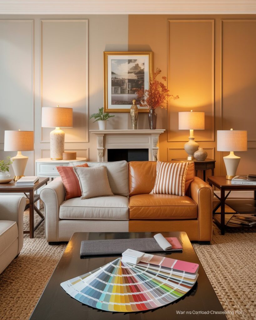
The most common mistake homeowners make is mixing warm and cool undertones without realizing it. You might love a cool silvery-gray sofa and a warm golden-oak coffee table individually, but together they’ll fight each other relentlessly. Neither will look its best. The fix isn’t to replace everything — it’s to bridge them with the right accent colors and textiles that meet in the middle.
★
Pro Tip from the Design Studio
Hold a pure white sheet of paper next to any paint chip or fabric sample you’re evaluating. The undertone will immediately become visible in contrast. If the sample looks yellowish, it’s warm. If it looks pinkish or bluish, it’s cool. This is the single fastest undertone test you can do at home — no special tools required.
How to Identify Undertones in Paint Colors
Paint is where most homeowners run into undertone trouble — largely because paint chips are tiny, viewed under fluorescent store lighting, and evaluated in isolation from everything else in your home. The big paint brands know this, which is why they offer sample pots. But even with samples, many people don’t know what they’re looking for once the color is on the wall.
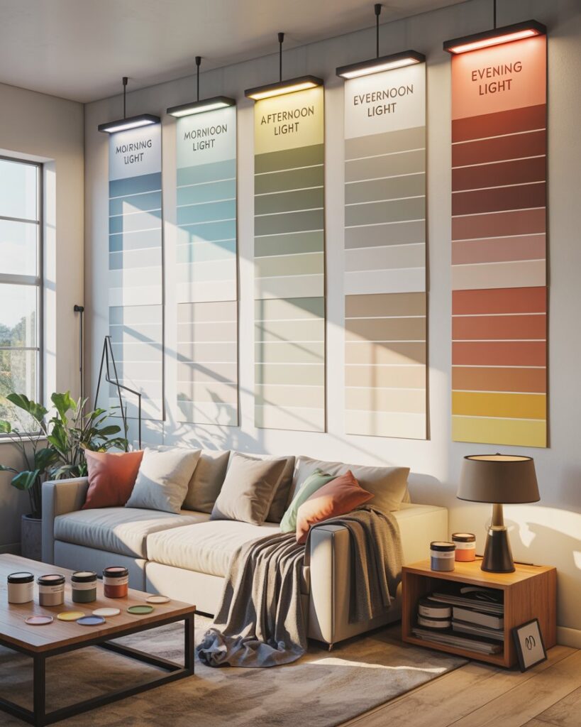
The key is to observe your paint sample at multiple times of day. Natural morning light tends to be cool and blue-toned, which will make warm-undertone paints look more neutral. Afternoon light is golden and warm, which will intensify any yellow or red undertones. Evening artificial lighting — especially incandescent or warm LED bulbs — will amplify warm tones dramatically and mute cool ones.
Popular paint colors and their hidden undertones often surprise people. Benjamin Moore’s “White Dove” (OC-17) — one of the most popular whites in America — has a subtle warm, slightly creamy undertone. Sherwin-Williams’ beloved “Agreeable Gray” (SW 7029) leans warm with beige-pink undertones, not cool as many assume. Meanwhile, “Repose Gray” (SW 7015) is a true cool-leaning gray with faint violet undertones, which is why it looks different in every home depending on its surroundings.
| Paint Color | Brand | Undertone | Best Paired With |
|---|---|---|---|
| White Dove OC-17 | Benjamin Moore | Warm / Creamy Yellow | Warm wood tones, ivory, linen fabrics |
| Agreeable Gray SW 7029 | Sherwin-Williams | Warm / Beige-Pink | Warm whites, oak, taupe, gold accents |
| Repose Gray SW 7015 | Sherwin-Williams | Cool / Violet-Gray | Cool whites, chrome, blue or green accents |
| Classic Gray OC-23 | Benjamin Moore | Neutral / Soft Green | Most wood tones, warm and cool whites |
| Accessible Beige SW 7036 | Sherwin-Williams | Warm / Green-Beige | Natural woods, sage, cream, terracotta |
| Chantilly Lace OC-65 | Benjamin Moore | True Neutral White | Works with warm and cool palettes equally |
For further reading on paint selection, Better Homes & Gardens offers an excellent guide to choosing paint colors that walks you through the process of reading undertones in natural light — a great companion resource to bookmark.
Undertones in Flooring, Wood, and Hard Surfaces
Your flooring is the largest single surface in any room, which makes its undertone the most influential element in your entire color scheme. Get it wrong, and no amount of careful paint selection or beautiful furniture will save the space from feeling disconnected. Get it right, and everything else almost effortlessly falls into place around it.
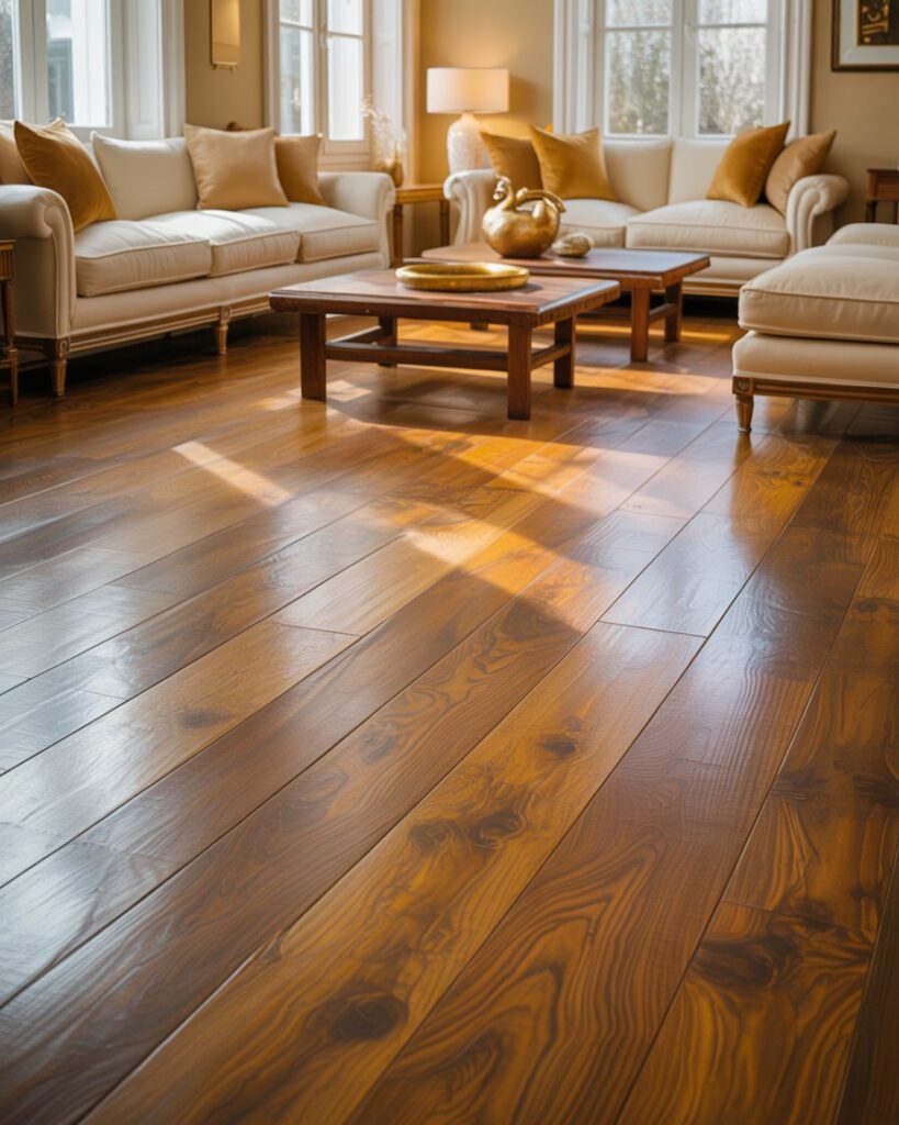
Hardwood floors are particularly complex because wood is a natural material with organic color variation. Most hardwoods fall into warm territory — oak, maple, pine, and hickory all have yellow, orange, or red undertones depending on their stain. However, modern wood finishing techniques have made cool-toned floors possible. Whitewashed oak, gray-stained maple, and wire-brushed ash floors all read cool or neutral — and they require a completely different approach to the rest of your room’s palette.
Tile and stone surfaces also carry strong undertones. Carrara marble has cool blue-gray veining. Travertine is distinctly warm with creamy beige and gold undertones. Slate tiles can range from cool charcoal-blue to warm olive-gray. Understanding your hard surface undertones before you begin any decorating project is non-negotiable — these elements are expensive and permanent, making them the anchors around which everything else must be built.
★
Pro Tip: The Floor-to-Wall Test
Before choosing any wall color, pull a paint chip and lay it flat on your existing floor (not against the wall). The undertones of both surfaces will interact immediately, and you’ll quickly see whether they harmonize or clash. This simple test has saved countless homeowners from an expensive re-paint. Do it in your brightest natural light for the most accurate reading.
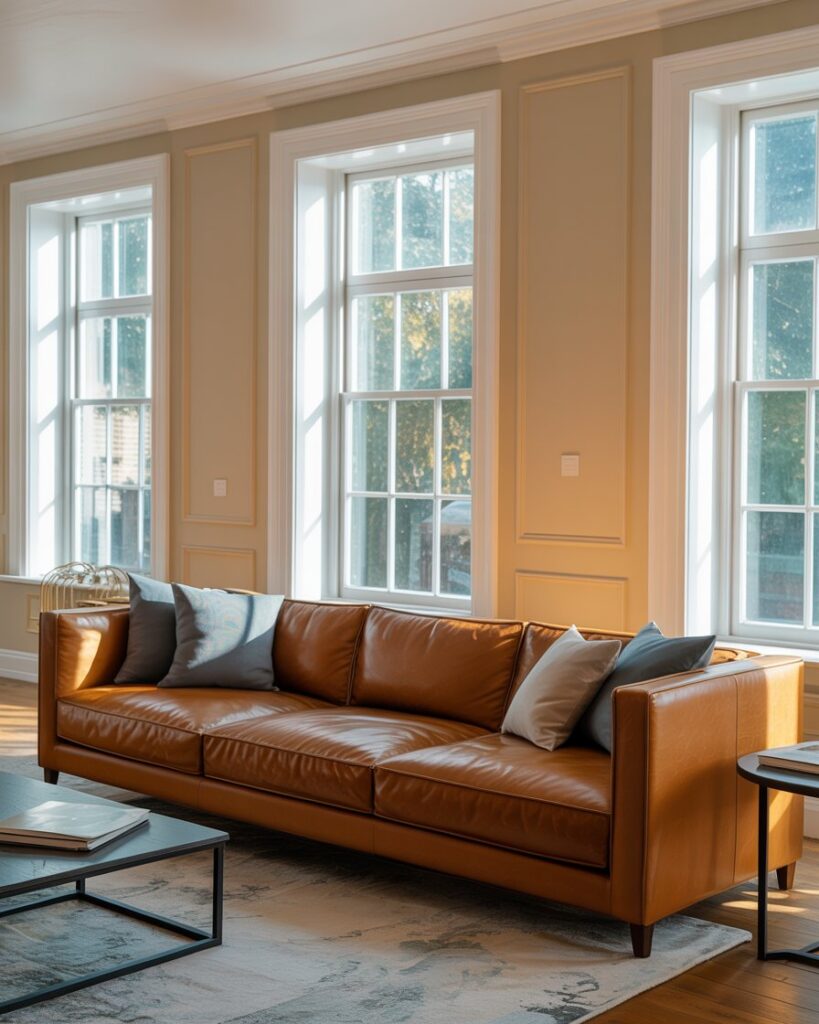
Undertones in Fabrics, Upholstery, and Soft Furnishings
Soft furnishings — your sofas, curtains, area rugs, bed linens, and throw pillows — are where undertones become sneaky. Fabric undertones shift dramatically depending on the weave, sheen, and texture of the material. A matte linen reads differently from a silky velvet, even if both are tagged with the same color name. This is because sheen reflects light, which amplifies undertones, while matte surfaces absorb light and appear more subdued.
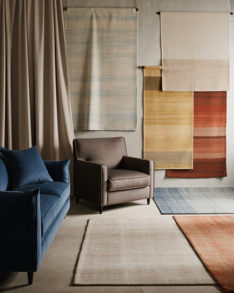
Area rugs deserve special attention because they often contain multiple colors, making their undertone a blend. A rug with cream, taupe, and soft blue threads will read cool overall. A rug combining ivory, gold, and rust will read warm. When in doubt, identify the dominant color in your rug and trace its undertone — that’s the undertone your room will need to honor. The Spruce’s guide on area rug color selection covers this in detail and is worth reading before your next rug purchase.
Curtain fabric is often overlooked, but it covers massive vertical real estate in a room. White or off-white curtains are particularly tricky — a warm ivory curtain against a cool white wall will immediately create visual tension. Always buy curtain fabric samples and test them against your wall color before ordering.
- Linen — Almost always warm; natural fibers have yellow or tan undertones
- Velvet — Sheen amplifies undertones significantly; test in your room’s lighting
- Cotton — Can go either way; bleached cottons lean cool, natural cottons lean warm
- Wool — Generally warm; natural wool has creamy yellow undertones
- Silk and Satin — Cool when bleached white; can lean warm in ivory or champagne shades
- Polyester/Synthetic Blends — Often cooler due to bright white bases used in dyeing
The Lighting Factor: How Light Transforms Undertones
No conversation about color undertones is complete without addressing light — the variable that changes everything. The same color can look entirely different under natural daylight, warm incandescent bulbs, cool LED lighting, and northern versus southern exposure windows. This is why a paint color that looks perfect in your neighbor’s south-facing living room can look completely wrong in your north-facing bedroom.
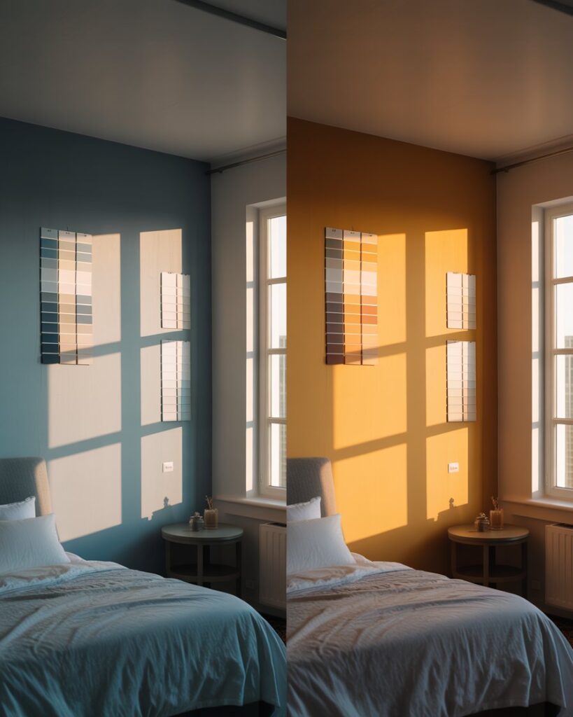
North-facing rooms in the United States receive indirect, cooler light all day. This means cool-undertone colors will appear even cooler and darker, while warm-undertone colors will be balanced and look their most accurate. South-facing rooms get warm golden light throughout much of the day, which will intensify any warm undertones and potentially wash out cool-toned colors. East-facing rooms have warm morning light and cool afternoon light. West-facing rooms do the opposite.
| Room Exposure | Light Quality | Best Undertone Choice | Colors to Avoid |
|---|---|---|---|
| North-Facing | Cool, indirect, blue-toned | Warm undertones to balance | Cool grays, blue-whites |
| South-Facing | Warm, bright, golden | Cool or neutral undertones | Strong warm yellows, oranges |
| East-Facing | Warm AM, cool PM | Neutral undertones work best | Extreme warm or cool tones |
| West-Facing | Cool AM, warm PM | Neutral or slightly cool | Very warm reds or oranges |
Artificial lighting follows the same logic. Warm-white LED bulbs (2700K–3000K) will intensify warm undertones and mute cool ones — ideal for bedrooms and living rooms. Cool-white LEDs (4000K–5000K) simulate natural daylight and reveal undertones more accurately — best for home offices and kitchens. If you have cool-toned walls and warm-toned furniture with conflicting undertones, switching to a neutral daylight bulb (3500K) can sometimes serve as a peace treaty between the two.
Step-by-Step: Building a Perfectly Matched Room from Scratch
Now that you understand the theory, let’s put it into practice. Whether you’re decorating a new room or refreshing an existing space, these steps will guide you toward a cohesive, undertone-consistent result that looks professionally designed — even on a budget.
- Identify your fixed elements first. Start with whatever you cannot change: existing flooring, kitchen cabinetry, large upholstered pieces you’re keeping, and any architectural details like brick fireplaces or wood beams. Determine their undertones using the white paper test.
- Establish your undertone family. Once you know whether your fixed elements are warm, cool, or neutral, commit to that family for all new purchases. This one decision will eliminate 80% of color matching confusion.
- Choose your wall color last — not first. Most homeowners pick paint first and then try to match everything to it. Reverse this. Choose your rug, sofa, and large furniture first; then select a wall color whose undertone harmonizes with those already-chosen elements.
- Test everything together before committing. Order fabric samples, paint large swatch boards (at least 12″ x 12″), and lay everything side by side in your room — in your actual lighting, at different times of day.
- Use the 60-30-10 rule as your undertone roadmap. 60% dominant color (walls + large upholstery), 30% secondary color (rugs, curtains, accent chairs), 10% accent color (pillows, art, accessories). All three tiers should share the same undertone family.
- Bridge undertone conflicts intentionally. If you must mix warm and cool elements, use a true neutral — greige, warm white, or natural wood — as a bridge. This creates visual breathing room between the conflicting undertones.
- Verify under evening light. Do a final check with your artificial lighting on after dark. This is how your room will look most evenings, and it’s often when undertone clashes become most apparent.
The Undertone Cheat Sheet for Common Decor Combinations
Golden oak floors + warm white walls + linen upholstery = warm family harmony. Gray tile + cool white walls + steel hardware = cool family harmony. Ebony floors + greige walls + mixed metals = neutral bridge strategy. Travertine tile + creamy walls + warm wood furniture = warm earth palette. Whitewashed oak + off-white + blue-gray upholstery = transitional neutral approach.
Common Undertone Mistakes (and How to Fix Them)
Even experienced decorators make undertone mistakes. The good news is that most clashes can be fixed without replacing expensive furniture or repainting entire rooms. Understanding the most common errors will help you both avoid them and troubleshoot existing problem spaces in your home.
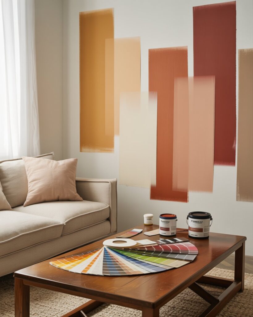
The most frequent mistake is choosing paint by chip alone, without testing it alongside existing room elements. Chips are tiny, photographed under specific studio lighting, and viewed in isolation — they are designed to look their most appealing, not their most accurate. Always buy sample quarts and paint large swatches directly on your wall, living with them for at least 48 hours across multiple lighting conditions before making a final decision.
Another extremely common error is assuming that neutrals are always safe to mix. Beige and gray, for example, are both neutrals — but a warm beige and a cool gray have undertones that directly conflict. Mixing them without a bridge element creates a room that feels confused and unresolved, even if you can’t articulate exactly why. If you’ve ever stood in a room thinking “something is off but I can’t figure out what,” mismatched neutral undertones are frequently the answer.
- Mixing warm and cool metals — Gold and chrome together clash unless deliberately styled as eclectic
- Warm wood floors with cool gray walls — One of the most common mismatches in American homes right now
- Bright white trim against warm-white walls — Makes the walls look dirty rather than cozy
- Cool blue-gray sofa on a warm golden rug — The two elements will compete rather than complement
- Ignoring ceiling undertones — Ceilings occupy 20% of visual field; a pink-undertone white ceiling in a cool room is a constant distraction
★
Pro Tip: The Quick Fix for Warm-Cool Conflicts
If you have a warm-cool undertone conflict in an existing room you can’t fully redo, layer in natural materials — jute, rattan, unfinished linen, raw wood — as accent pieces. Natural materials are inherently neutral and act as visual mediators between conflicting undertones, reducing tension without requiring any major purchases or repainting.
Conclusion: Trust the Undertone, Trust the Result
Color undertones are the invisible architecture of every beautiful room. They work behind the scenes, quietly determining whether your home feels like a curated, intentional sanctuary or a collection of nice things that somehow never quite gel. The homeowners and designers who understand undertones aren’t working harder than everyone else — they’re working smarter, with a framework that turns guesswork into confidence.
Start small. Pick one room in your home and apply the undertone principles you’ve learned here. Identify your fixed elements, establish your undertone family, test your colors in real light, and build outward from there. You don’t need to spend more money — you need to spend it more intentionally, guided by an understanding of the hues hiding beneath every color you choose.
The difference between a room that looks “designed” and one that looks “decorated” almost always comes down to undertone cohesion. Now you have the knowledge — and the eye — to create spaces that feel as good as they look. Your next paint chip won’t be a gamble. It’ll be a decision.
For more room-by-room color guidance, explore resources like Houzz’s Color Magazine and Architectural Digest’s color trend coverage to stay current on how undertones are being used in today’s most-admired American interiors.