If you’ve been living in a cramped apartment or a cozy bungalow and scrolling through endless Pinterest boards wondering why your space never quite looks the way you imagined — I have news for you. The problem isn’t your square footage. The problem is the advice you’ve been following. As an interior designer who has transformed hundreds of small spaces across the US, I’ve watched homeowners and renters unknowingly sabotage their rooms with well-meaning but completely wrong “rules.” Today, we’re busting every last one of them.
Myth Dark Colors Make a Small Room Feel Smaller
This is the single most repeated piece of bad advice in home décor, and it drives me absolutely crazy. The fear of dark paint colors in small rooms has caused an epidemic of beige walls and white ceilings that actually make spaces feel flat, clinical, and — paradoxically — smaller. The truth is that deep, moody hues like navy, forest green, charcoal, and even black can make a small room feel dramatically more intimate, layered, and expansive when applied correctly.
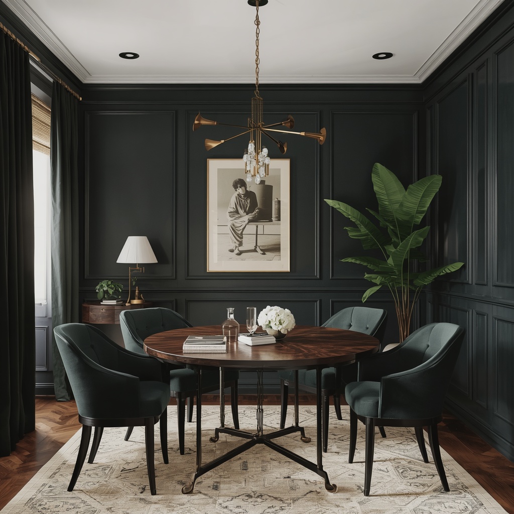
Dark colors absorb light and blur the visual edges of a room. When the walls, ceiling, and trim share a similar deep tone — what designers call a “color drenching” technique — the eye can’t easily detect where one surface ends and another begins. This creates a sense of depth that no amount of white paint can replicate. In fact, some of the most celebrated small-space interiors in design history feature rooms painted entirely in deep jewel tones.
The key isn’t color lightness — it’s finish and contrast. A flat dark paint absorbs too much light; opt for satin or eggshell finishes that bounce light back into the room while still delivering that rich, enveloping color.
🌟 Pro Tip
Try Benjamin Moore’s “Hale Navy” or Sherwin-Williams’ “Tricorn Black” on all four walls and the ceiling of a small bedroom. Pair it with warm brass fixtures and a light-toned rug — the room will feel like a luxurious boutique hotel suite, not a closet.
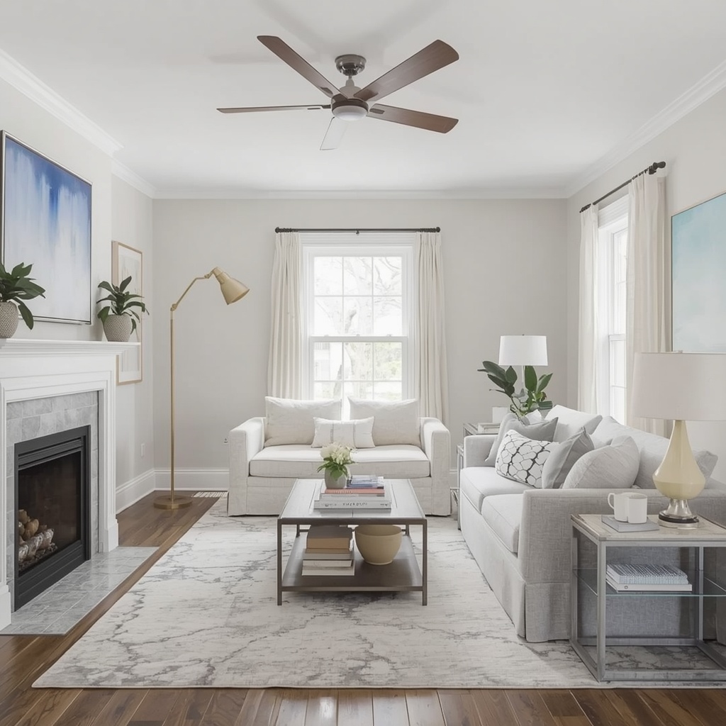
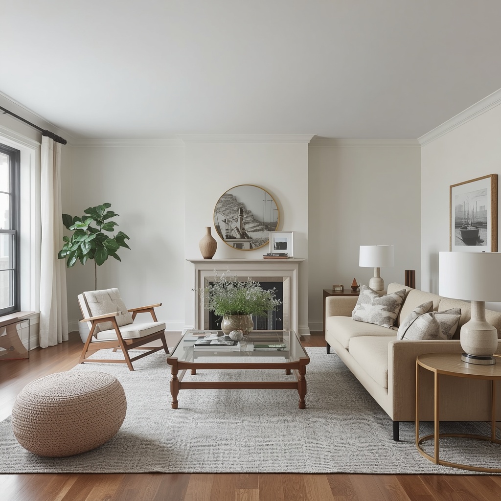
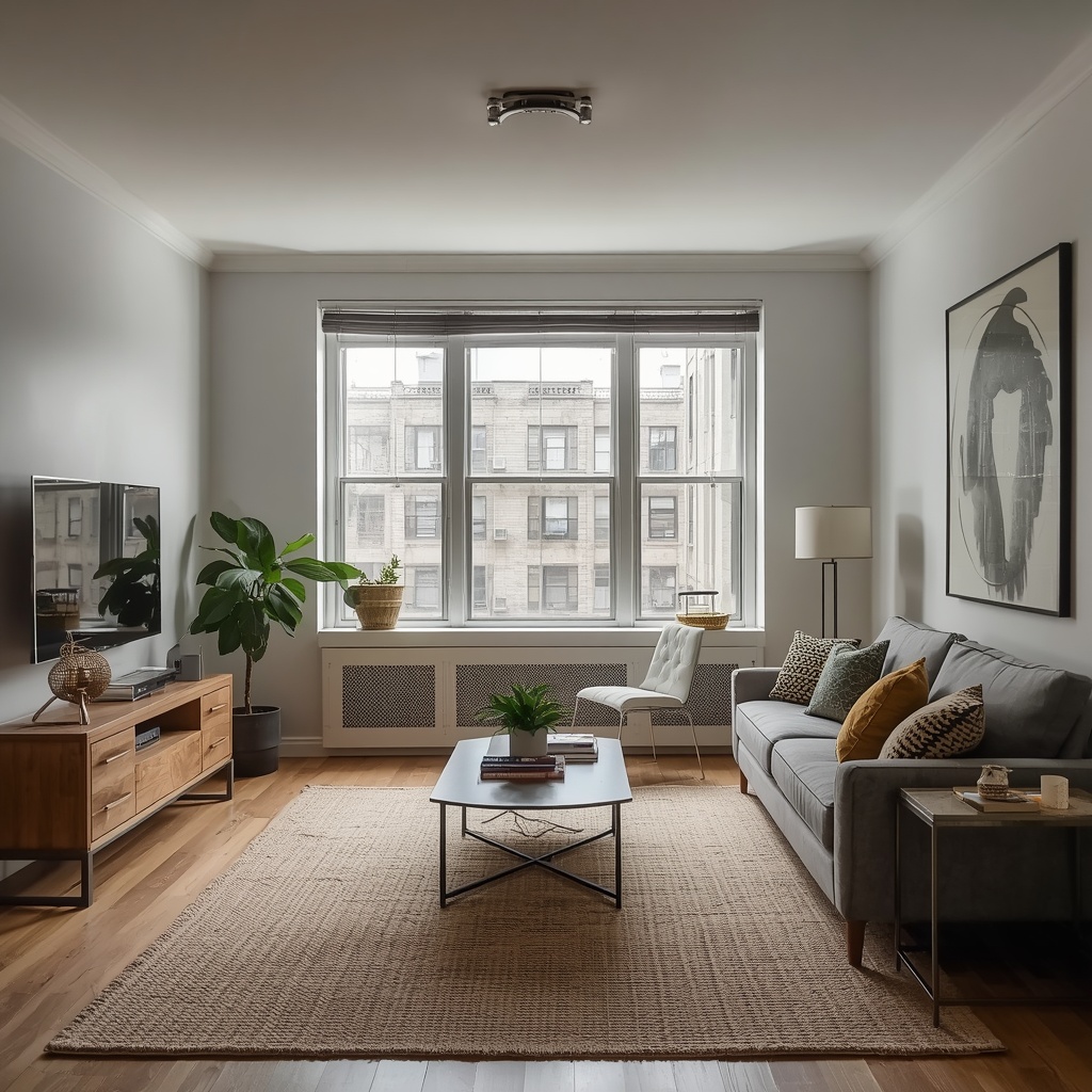
Myth Small Spaces Need Small Furniture
Walk into any big-box furniture store and tell an associate you have a small living room. I guarantee they’ll point you toward the apartment-scale sectional — that shrunken, underpowered sofa that sits on four tiny legs and disappears into the room. This “small furniture for small spaces” logic sounds reasonable but produces the opposite of the desired effect.
When you crowd a small room with lots of little furniture pieces, you create visual clutter and fragment the floor plan. The eye bounces from item to item, making the space feel chaotic and cramped. A far better approach is to choose one or two large, well-scaled anchor pieces — a generous sofa, a substantial dining table, a bold bed frame — and keep everything else minimal. One large piece reads as intentional and architectural; twelve small pieces read as clutter.
“Scale is everything in a small room. One large, confident piece of furniture makes a space look designed. Twenty small ones make it look like a storage unit.”— Interior Design principle, widely attributed in professional design circles
| The Wrong Move | The Right Move | Why It Works |
|---|---|---|
| Multiple small accent chairs | One substantial sofa + one accent chair | Fewer pieces = more negative space = room feels larger |
| Small rug that floats under coffee table | Large area rug that anchors all seating | A large rug unifies the seating area and expands perceived floor space |
| Low-profile furniture on the floor | Furniture with legs, raised off the floor | Visible floor beneath furniture makes ceilings feel higher |
| Narrow, rickety side tables | Solid, generous bedside tables or console | Proper-scaled surfaces feel intentional and grounded |
Myth Mirrors Always Make a Room Look Bigger
Yes, strategically placed mirrors can add perceived depth and bounce natural light around a small room. But the word “strategically” is doing a lot of heavy lifting in that sentence. The myth is that any mirror, anywhere, will automatically make your space feel larger. In reality, a poorly placed mirror — one that reflects a messy corner, a blank wall, or worst of all, the toilet — can make a small space feel disorienting, choppy, and even smaller.
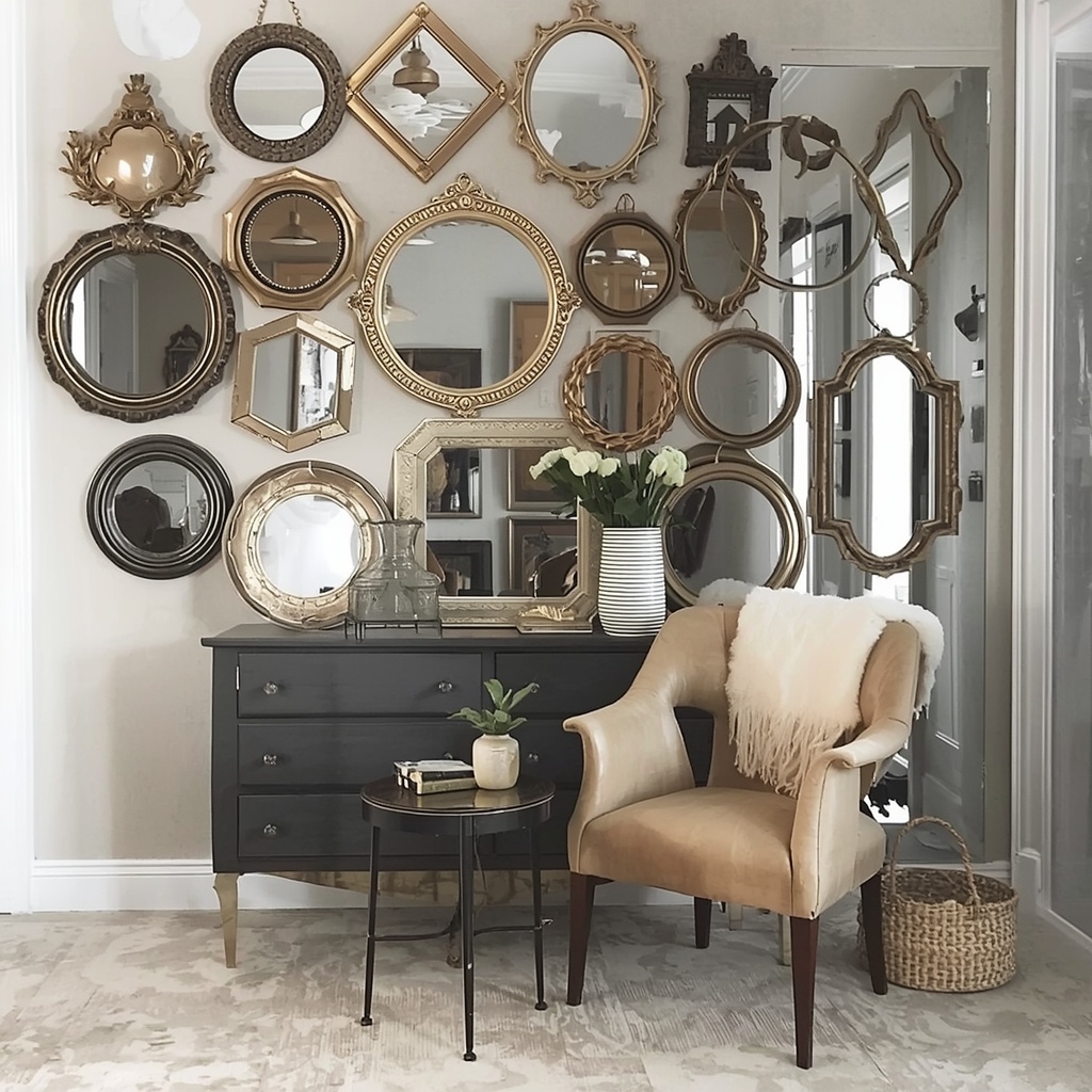
The correct approach is to position mirrors so they reflect something beautiful: a window, a piece of art, or a well-lit vignette. A mirror placed directly across from a window essentially doubles your natural light source, which is the single most effective small-space design move in existence. Conversely, a gallery wall of multiple small decorative mirrors creates visual noise that fragments the eye. One large statement mirror, well-placed, always beats a dozen small ones.
🌟 Pro Tip
In a narrow hallway, lean a large floor mirror at a slight angle rather than hanging it flush. The angled reflection captures more of the space — including ceiling height — and makes the hallway feel both wider and taller. It’s one of the most impactful small-space tricks in my professional toolkit.
Myth Curtains Should Hang at Window Level
Nothing dates a room or makes ceilings feel lower faster than curtains hung at window frame height. This is one of the most visually damaging habits in American home décor, and it’s entirely unnecessary. Hanging curtain rods at window height cuts the wall in half, emphasizes low ceilings, and makes windows look proportionally small — exactly the opposite of what you want in a compact space.
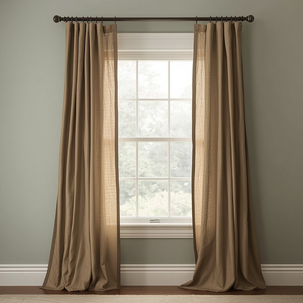
The rule every professional interior designer follows: mount your curtain rod as close to the ceiling — or crown molding — as possible, and let the curtains fall all the way to the floor. This simple change elongates the wall, makes ceilings feel dramatically higher, and makes windows appear up to twice their actual size. It costs zero extra money and takes fifteen minutes to fix. If your curtains aren’t long enough, swap them for floor-length panels — they’re sold everywhere and are extremely affordable.
- Correct rod height: 4–6 inches below the ceiling or crown molding
- Correct curtain length: Floor-length, with a ½ inch break or a slight puddle for drama
- Correct width: Extend the rod 6–12 inches beyond the window frame on each side so curtains stack off the glass
- Correct fabric weight: Linen or light cotton for small rooms — heavy velvet can overwhelm a compact space
- Avoid: Tier curtains, café curtains, or any treatment that cuts the wall horizontally
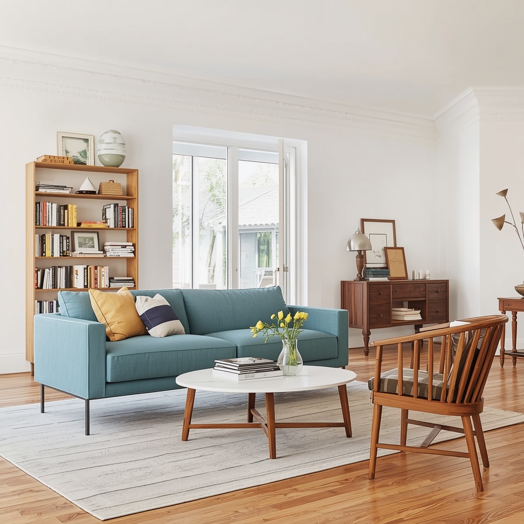
Myth Clutter-Free Means Decoration-Free
The minimalism movement has done wonderful things for interior design — but it’s also produced a generation of small-space owners who are afraid to display anything personal, add layers, or make their space feel lived-in. Blank walls, empty shelves, and sterile surfaces don’t create a sense of space; they create a sense of emptiness. There’s a critical difference between visual clutter and thoughtful layering.
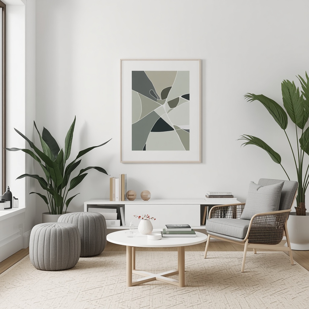
A well-curated small room can — and should — include meaningful objects, books, art, plants, and textiles. The key is intentionality and editing. Group objects in odd numbers. Vary heights. Repeat a color or material across different pieces to create visual rhythm. And please — hang art on your walls. A blank wall in a small room feels like a missed opportunity, not a design choice. One large-scale piece of artwork on the main wall of a small living room instantly transforms it from a rental to a home.
“A small space that tells no story isn’t minimalist — it’s just uninhabited. The goal is to curate, not to empty.”— Common maxim in professional interior styling
Myth Open Floor Plans Are Always Better for Small Homes
Since the early 2000s, American homeowners have been knocking down walls in the belief that open-plan living is the universal solution to small square footage. And while open plans work beautifully in certain contexts — particularly for entertaining — they can actually make small homes feel more chaotic, noisier, and paradoxically smaller when not handled correctly. An undivided rectangular space with no visual anchors can feel like a studio apartment regardless of its square footage.
The real opportunity in small spaces is strategic zoning — using furniture arrangement, rugs, lighting, and even partial dividers like open bookshelves or curtain panels to define distinct areas within a space. A living area, dining zone, and reading nook that each feel intentional and contained will make a small home feel far more spacious than one giant, undefined room. Zoning gives each area purpose, which gives the overall space structure and perceived size.
| Zone | Zoning Method | Cost Level |
|---|---|---|
| Living vs. Dining | Distinct area rugs, back of sofa facing dining table | Low |
| Workspace vs. Bedroom | Curtain panel or open shelving unit as a room divider | Low–Medium |
| Entryway vs. Living Room | Console table + pendant light to mark the transition zone | Medium |
| Kitchen vs. Living Area | Contrasting pendant lights above kitchen island/counter | Medium |
Myth You Should Avoid Patterns and Prints in Small Spaces
The fear of pattern in a small room is understandable — many people worry that a bold wallpaper or a patterned rug will visually overwhelm the space. But the reality is that pattern, when used with intention, is one of the most powerful tools for adding depth, personality, and perceived scale to a compact room. The rooms that feel both small and boring are typically the ones that have been stripped of all pattern out of misguided caution.
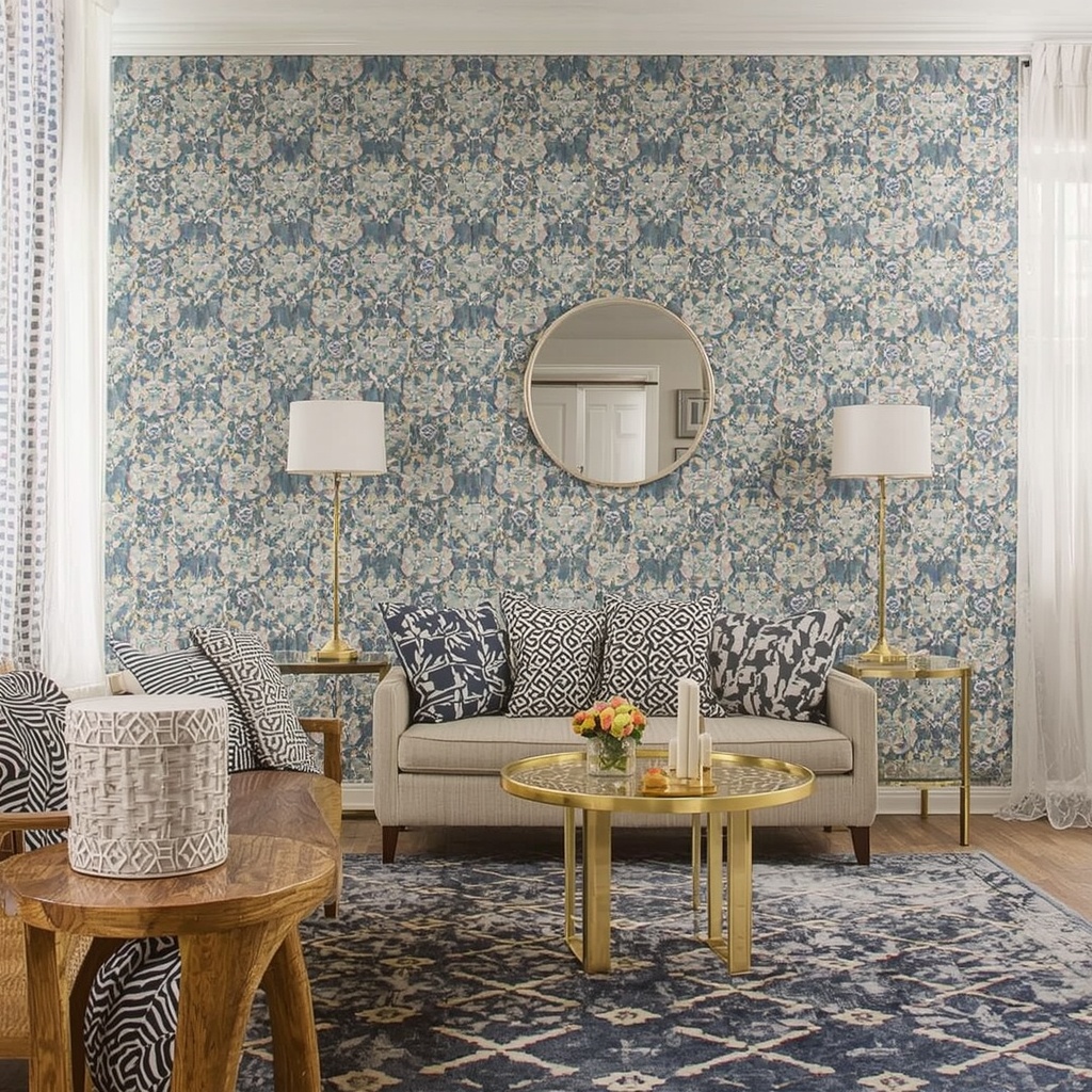
The key distinction is scale and placement. Large-scale patterns used as a single, impactful statement — a wallpapered accent wall, a graphic area rug, patterned throw pillows — create a focal point that pulls the eye and gives the room a sense of depth and designed intention. Where people go wrong is mixing multiple competing patterns at the same scale, which creates the visual chaos they were trying to avoid. Follow the designer’s rule: one dominant pattern, one secondary pattern at a different scale, and solid colors everywhere else. This hierarchy creates interest without overwhelm.
🌟 Pro Tip
Vertical stripes on a single accent wall are the most powerful pattern trick for low-ceilinged rooms. Whether painted on, applied as wallpaper, or achieved with thin trim molding, vertical lines draw the eye upward and can make a standard 8-foot ceiling feel 10 feet tall. Resources like Houzz and Architectural Digest have excellent galleries for small-space wallpaper inspiration.
Myth Overhead Lighting Is Sufficient for a Small Room
A single overhead light — whether a basic ceiling fixture or even a nice flush-mount — is never enough for any room, but it’s especially damaging in a small space. Overhead lighting casts shadows downward, flattens the room visually, and fails to create the layers of warmth and depth that make a space feel large and inviting. This is one of the biggest mistakes I see in small apartment living rooms across the US, and it’s one of the easiest to fix.
The professional standard is called layered lighting: a combination of ambient light (overhead), task lighting (floor lamps, table lamps, under-cabinet strips), and accent lighting (picture lights, LED strips behind furniture, candles). In a small room, three to five light sources at varying heights create warmth, dimension, and a sense that the space extends beyond its actual boundaries. A room lit only from above looks like an office. A room lit from multiple levels at eye height and below looks like a home — a well-designed, generous home.
- Ambient: Dimmable overhead fixture or recessed lights (always on a dimmer switch)
- Task: Floor lamp in a reading corner, table lamp on a console or nightstand
- Accent: LED strip behind a TV unit, picture light above art, candles on a dining table
- Tip: All bulbs in a room should share the same color temperature — warm white (2700K–3000K) for living and dining areas
Quick Reference: Small Space Myths vs. Design Truths
| The Myth | The Truth |
|---|---|
| Dark colors shrink a room | Dark, drenched color adds depth and intimacy |
| Use small furniture in small spaces | One or two large anchor pieces reduce visual clutter |
| Any mirror makes a room bigger | Only mirrors that reflect light sources or beautiful views work |
| Hang curtains at window height | Hang curtains near the ceiling, drop to the floor |
| Keep surfaces bare to feel spacious | Curated layers with rhythm and intention feel designed |
| Open plans always fix small homes | Strategic zoning makes small spaces feel purposeful |
| Avoid patterns in small rooms | One bold, well-scaled pattern creates depth and personality |
| One overhead light is enough | Layered lighting at multiple heights transforms a space |
The Bottom Line: Your Small Space Has More Potential Than You Think
The reason so many small homes and apartments feel cramped, dull, or uninspired isn’t a lack of square footage — it’s a surplus of outdated advice. Every myth we’ve debunked today has a smarter, more effective alternative that will actually make your space work harder, feel larger, and look more beautiful.
Here’s your small-space redesign checklist to get started today:
- Consider a dark, rich paint color on all four walls and the ceiling of one room
- Swap out multiple small furniture pieces for one or two well-scaled anchors
- Rehang your curtains — close to the ceiling, all the way to the floor
- Add two to three floor or table lamps and put your overhead light on a dimmer
- Place your largest mirror directly across from a window
- Choose one bold pattern element and commit to it as a focal point
- Zone your open-plan space with rugs and furniture arrangement
For further inspiration, explore curated small-space galleries on Apartment Therapy, Elle Decor, and Better Homes & Gardens. Your small space isn’t the problem. Your design approach was — and now you have the tools to fix it.