How bold, expressive tile color choices are transforming American kitchens, bathrooms, and living spaces — and exactly how to pull them off with confidence.
Licensed Interior Designer · Specializing in residential tile & color theory · Based in Los Angeles,
For the better part of two decades, American homeowners played it safe with subway tile in white, gray grout, and beige everywhere else. Safe, yes. Memorable? Rarely. Today, a bold revolution is grouting itself into bathrooms, kitchens, mudrooms, and entryways across the country — and its name is color. We are living in the golden age of decorative tile, and if you are still reaching for that same bright-white 3×6 subway, this guide is your permission slip to dream bigger.
Colorful tiles are not just a trend cycle. They are a return to something ancient and deeply human: the instinct to surround ourselves with beauty that reflects who we are. From Mediterranean-inspired encaustic cement tiles to saturated zellige from Morocco, from hand-painted Talavera to modern geometric porcelain in forest green — expressive tile is everywhere, and it is here to stay. Let’s dive into the why, the how, and the specific choices that will transform your home.
Why Neutral Tile Has Dominated — And Why It’s Shifting
The obsession with neutral tile was never purely aesthetic — it was a real estate strategy. Beige, gray, and white palettes were positioned as “universally appealing,” easier to stage and sell. Generations of homeowners were told that bold color choices would turn off buyers. The result was a sea of sameness that drained personality from millions of American homes. Design magazines echoed the sentiment, and entire tile collections were built on the premise that absence of color was sophistication.
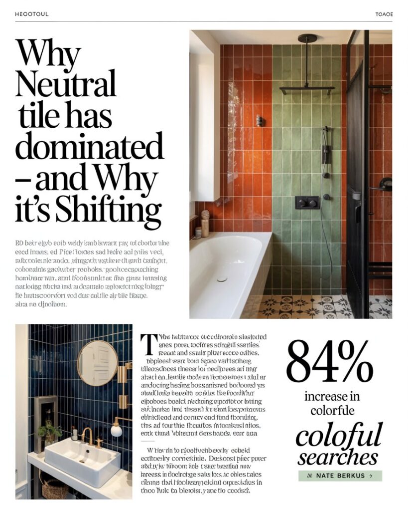
That paradigm is crumbling. Interior designers and real estate experts are now noting that homes with distinctive, well-executed tile choices command more attention, not less. The Houzz 2025 U.S. Bathroom Trends Study confirmed that colorful accent tile searches increased 84% year over year, with deep blues, terracotta, and sage greens leading the charge. Buyers are no longer looking for blank slates — they are looking for character. And character, increasingly, is delivered in color.
“Neutral is not the absence of risk. It is often the absence of reward. Color in tile is permanent, yes — but so is the joy it brings every single morning when you walk into that room.”— Nate Berkus, Interior Designer & Television Host
The Color Families Taking Over American Homes
Not all colorful tile is created equal, and your choice of color family will set the entire emotional temperature of a room. Understanding the leading palettes helps you choose with intention rather than impulse. Below is a look at the tile color families dominating design conversations right now, and what each one delivers in terms of mood, scale, and versatility.
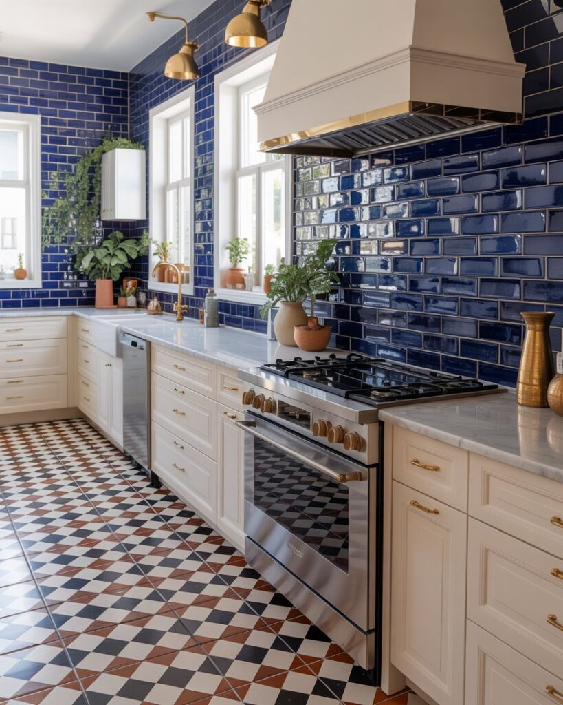
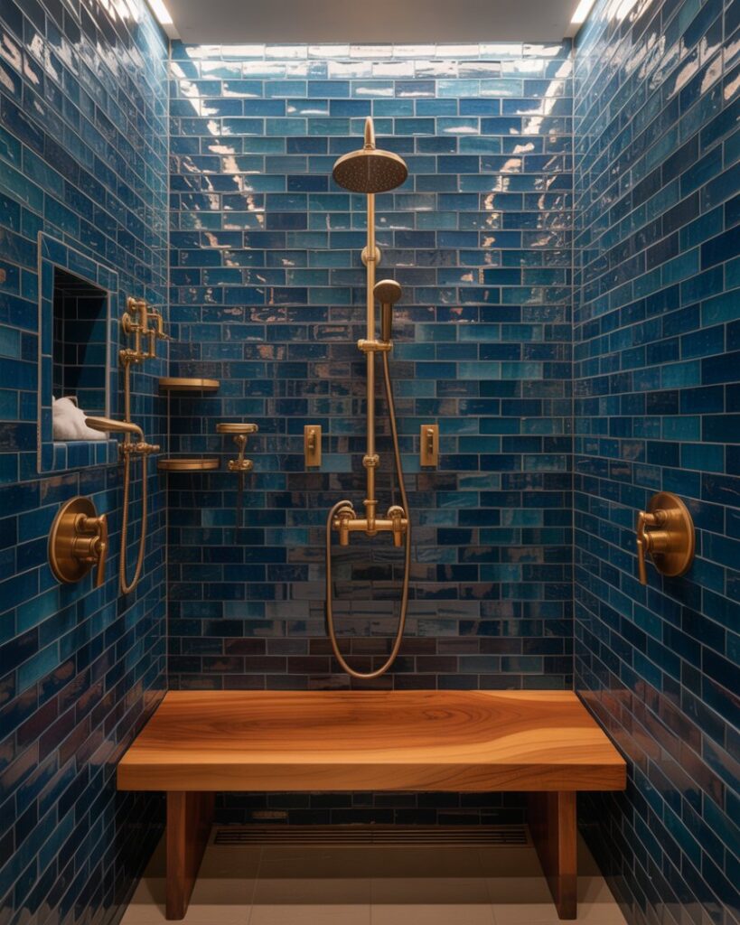
Deep Ocean Blue
Terracotta
Forest Sage
Violet Plum
Saffron Gold
Cranberry
| Color Family | Best Room Application | Mood It Creates | Pairs Well With |
|---|---|---|---|
| Deep Blues & Navy | Primary bathroom, kitchen backsplash | Calm, luxurious, spa-like | Brass fixtures, warm wood vanities |
| Terracotta & Clay | Kitchen floor, entryway, patio | Earthy, grounded, Mediterranean warmth | White walls, wrought iron accents |
| Sage & Forest Green | Kitchen backsplash, powder room | Organic, restful, fresh | Marble countertops, unlacquered brass |
| Mustard & Saffron | Laundry room, mudroom, accent wall | Cheerful, energetic, vintage-inspired | Black hardware, dark grout |
| Plum & Violet | Powder room, butler’s pantry | Dramatic, bold, jewel-box effect | Polished nickel, cream plaster walls |
| Cranberry & Berry | Entryway, dining room floor | Rich, welcoming, maximalist | Natural stone, dark wood furniture |
Room-by-Room Guide to Bold Tile Color
Kitchen: Where Color Lives at the Heart of the Home
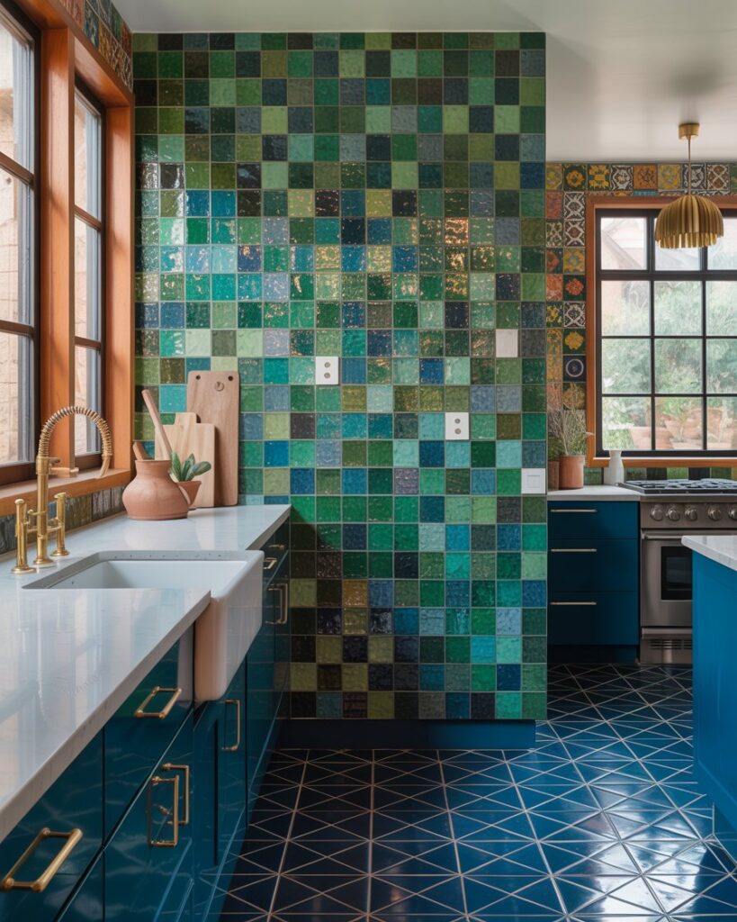
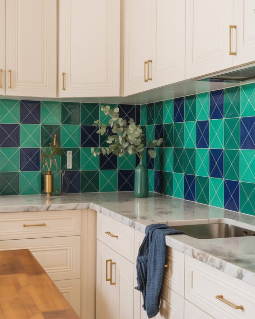
The kitchen backsplash is the single highest-impact tile opportunity in most American homes. It is large enough to read from across the room, framed by cabinetry that anchors it, and experienced dozens of times a day. Choosing a bold color here is not a gamble — it is an investment in daily delight. Handmade zellige tiles in cobalt blue or olive green bring artisanal texture that photographs beautifully and ages even better. If your cabinets are white or cream, almost any color tile works; if your cabinets are darker, lean into contrast with a lighter vivid tile like lemon yellow or turquoise.
Kitchen floor tile is the other major color opportunity most homeowners overlook. Large-format encaustic cement tiles in a geometric pattern — think black and white with a tertiary color like rust or cobalt — can transform a dated kitchen into something that looks curated and intentional. The key is scale: match your tile size to your square footage. Small tiles (2×2 or penny round) read as texture and pattern; large tiles (12×24 or 24×24) read as color plane. Both work, but they create entirely different results in the room.
PRO TIP
Always order a minimum of 15% overage on colorful or handmade tiles. Batch dye lots vary, and you will never get an exact match if you run short mid-installation. Store extras in a labeled bin — if a tile chips years later, you have an exact match ready. For handmade options, check Clé Tile and Tiles of Ezra, two US-based sources for artisan colorful tile with reliable batch management.
Bathroom: The Boldest Room in the House
Bathrooms are the interior designer’s playground for bold tile color, and for good reason: they are small, enclosed spaces where intensity of color feels intimate rather than overwhelming. A powder room tiled floor-to-ceiling in deep plum glossy ceramic is not “too much” — it is a jewel box, a moment, an experience. Primary bathrooms can handle color in more measured doses: a feature wall behind the freestanding tub in handpainted blue-and-white Talavera tile, or a shower niche outlined in saffron gold mosaic, creates focal drama without commitment to total saturation.
Grout color is the secret weapon of bold bathroom tile. Colorful tile paired with matching-tone grout (called “tone-on-tone” grouting) creates a seamless, enveloping effect where the entire surface reads as one wash of color. Colorful tile paired with contrasting grout (white tile, dark charcoal grout, or vice versa) emphasizes the individual tile shape and creates graphic pattern. Neither approach is wrong — but choose intentionally, because the grout decision changes the entire visual result as dramatically as the tile color itself.
Primary Bathroom
Deep navy or sage zellige on the shower wall, paired with warm brass rainfall fixtures and a teak bench.
Powder Room
Full-room plum or cranberry gloss tile with a floating vanity. Small scale = maximum drama is acceptable.
Kids’ Bathroom
Terracotta floor with white subway walls and colored grout in turquoise or mustard for playful energy.
Guest Bathroom
Sage green penny rounds on the floor, white beadboard walls — fresh, personality-driven, easy to style.
Texture and Finish: Color Is Only Half the Story
When we talk about colorful tile beyond neutrals, we are really talking about two variables operating simultaneously: hue and surface quality. A terracotta tile in a matte, unglazed finish reads as rustic and earthy; the same terracotta color in a high-gloss glaze reads as sleek and contemporary. Understanding the finish options available in colorful tile helps you dial in exactly the aesthetic you are after, without being surprised by the result once it’s on the wall.
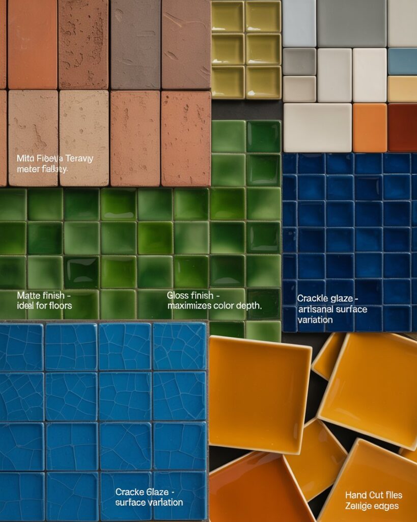
Matte and honed finishes hide water spots and fingerprints, making them practical for family kitchens and high-use bathrooms. Glossy finishes reflect light beautifully, making small spaces feel larger and darker colors feel more luminous — ideal for a jewel-box powder room or a dark kitchen with limited natural light. Crackle glaze and reactive glaze finishes produce slight variation across each tile surface, giving the wall an organic, artisanal quality that cannot be replicated with uniform digital printing. This intentional imperfection is actually a major selling point for design-forward buyers.
- Matte finish — ideal for floors and high-traffic kitchens; hides wear and moisture marks
- Gloss finish — maximizes color depth and light reflection; perfect for dark or small spaces
- Crackle glaze — artisanal surface variation; each tile is unique; excellent for accent walls
- Zellige (hand-cut) — irregular edges and tone variation; the gold standard of handmade tile
- Encaustic cement — matte, patterned, extremely durable; best for floors with proper sealing
- Metallic glaze — gilded or iridescent surface; use sparingly as accent or border tile
- Reactive glaze — two colors interact during firing; no two tiles identical; highly decorative
PRO TIP
Request physical tile samples before committing to any colorful tile — and view them at different times of day and under both natural and artificial light. Colors shift dramatically between morning sunlight and evening LED warm light. Tape full-size samples to your actual wall for at least 48 hours before ordering. This single step prevents the most common and costly tile regrets. Most reputable tile suppliers like TileBar or Bedrosians offer sample programs for $5–$15 per tile.
How to Mix Colorful Tile With the Rest of Your Decor
The biggest fear homeowners express when considering colorful tile is the “what do I do with the rest of the room?” question. The answer is more liberating than you might expect: bold tile works as an anchor, not a cage. When your tile is the visual focal point of the room — which it will be — every other surface becomes a supporting player. White walls, warm wood floors, natural stone countertops, and simple hardware all defer beautifully to colorful tile, letting it sing without competing. You do not need to match; you need to coordinate, which is a much easier lift.
The 60-30-10 color rule is your best friend when integrating bold tile into a larger room. Let the tile be your 10% — the accent color that injects personality. Your 30% is your secondary color, typically furniture, cabinetry, or textiles. Your 60% is your dominant neutral, usually walls and flooring. Pull one color from the tile and echo it lightly throughout the room via a throw pillow, a vase, or a painting. This creates visual cohesion without making the room feel monochromatic or heavy.
“Color in a home is not decoration. It is communication. Every tile you choose tells your guests — and yourself — something true about how you want to feel in this space.”— Kelly Wearstler, American Interior Designer
Budget, Installation, and What to Expect
One of the most persistent myths about colorful tile is that it costs significantly more than white or gray. In reality, the price range for colorful tile is as wide as for neutral tile. Mass-produced colorful porcelain from brands like MSI Surfaces or Daltile runs $2–$6 per square foot — comparable to any standard neutral. Handmade zellige, encaustic cement, and artisan-painted options run $15–$45 per square foot, but these are specialty products regardless of color. The tile’s construction and production method determine price far more than its color.
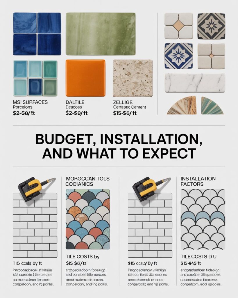
Installation costs for colorful tile are identical to neutral tile of the same format and complexity. A skilled tile installer charges by the difficulty of the pattern and the substrate preparation required, not the hue you’ve chosen. Where projects do go over budget is in pattern complexity — a Moroccan fish-scale mosaic in emerald green requires more labor than a running-bond subway regardless of color. Be transparent with your installer about the pattern you want during the quoting phase, and request a written estimate that breaks out materials separately from labor so you can adjust either without scrapping the whole plan.
| Tile Type | Price Per Sq Ft | Installation Level | Durability |
|---|---|---|---|
| Colored porcelain (mass-produced) | $2 – $6 | Standard | Very high (PEI 4-5 for floors) |
| Glazed ceramic in color | $3 – $9 | Standard | High (wall/light floor use) |
| Zellige (handmade Moroccan) | $18 – $45 | Skilled / specialty | Medium-high with sealing |
| Encaustic cement tile | $12 – $35 | Skilled | High when properly sealed |
| Hand-painted Talavera | $8 – $22 | Standard to moderate | Medium (accent/wall use best) |
| Glass mosaic in color | $10 – $30 | Specialty (sheet installation) | High for wet areas; not for floors |
Caring for Colorful Tile: Keeping It Beautiful for Decades
Colorful tile requires exactly the same basic maintenance as neutral tile — routine cleaning with a pH-neutral cleaner, immediate attention to spills on porous surfaces, and annual resealing for encaustic cement and natural stone tile. The one additional care consideration for deeply pigmented tile is avoiding highly alkaline or acidic cleaners, which can over time dull the glaze surface on ceramic or ceramic-coated porcelain. Stick to cleaners specifically labeled tile-safe, and your colorful tile will look as saturated in fifteen years as it does on day one of installation.
Grout maintenance matters more with colorful tile because contrast between the tile and grout is often intentional and visually prominent. Seal your grout every one to two years depending on traffic, and address any grout staining promptly with a grout-specific cleaner before it sets. If you have used a white or light grout with a dark colorful tile (or vice versa), the contrast is the design — keep that contrast clean and crisp, and the entire tile installation continues to look intentional and well-maintained rather than dated.
PRO TIP
Photograph and document your tile installation details — tile manufacturer, color name, batch lot number, grout brand and color name — and store this information digitally (email it to yourself, save to Google Drive). Fifteen years from now when a tile chips or grout needs matching, you will thank yourself. Insurance claims and resale disclosures also sometimes require this information. A 2-minute step at installation day saves hours of detective work later.
The Bottom Line: Color Is a Gift You Give Your Home
Choosing colorful tile beyond neutrals is not a risk — it is a reclamation. It is the decision to stop designing for a hypothetical future buyer and start designing for the very real person who walks through that bathroom door every morning: you. The homes that endure in memory, that feel truly lived-in and loved, are never the ones that played it safe with subway tile and greige grout.
Start small if you must — a powder room, a laundry room, a mudroom floor. Let yourself experience what it feels like to be surrounded by a color you genuinely love, embedded permanently into the architecture of your home. Then watch how quickly “small” becomes “everywhere.” Color, once you truly let it in, has a way of making everything feel more alive.
For further tile inspiration, browse the National Tile Contractors Association for certified installers near you, and explore Clé Tile for the most extraordinary curated collection of expressive, colorful tile available to US homeowners today.
Semantic keywords: colorful bathroom tile, bold kitchen backsplash tile, decorative floor tiles, encaustic cement tile, zellige tile ideas, terracotta tile decor, tile color trends 2025, beyond neutral home design, interior tile design, expressive tile patterns, grout color tips, handmade tile USA, tile