Geometric patterns are one of the most exciting design tools in a decorator’s toolkit. Bold triangles, hexagons, chevrons, and diamond motifs can transform a flat, forgettable room into a space that feels intentional, layered, and alive. But here’s the truth most homeowners discover the hard way: too much geometry too fast can make a room feel chaotic, dizzying, and visually exhausting.
The good news? You don’t have to choose between bold style and visual comfort. With the right strategy, geometric patterns can add depth, structure, and personality to any room — without tipping into sensory overload. Whether you’re decorating a living room in Austin, a studio apartment in Chicago, or a farmhouse in rural Vermont, this guide will walk you through exactly how to pull it off.
Understanding the Visual Weight of Geometric Patterns
Before you start shopping for geometric throw pillows or patterned wallpaper, it helps to understand how the human eye processes pattern. Geometric designs — especially high-contrast ones — carry significant visual weight. That means they draw the eye immediately and demand attention in a way that solid colors or organic textures don’t.
Visual weight isn’t a bad thing. In fact, it’s what makes a geometric accent wall so striking or a patterned area rug so grounding. The problem arises when too many high-weight elements compete in the same space. Your brain starts working overtime to process the competing patterns, and the room feels restless rather than refined.
The key principle interior designers use is called visual hierarchy — the idea that one element should lead the eye, while everything else plays a supporting role. In a well-styled geometric room, one pattern dominates, and the rest of the décor steps back to let it shine.
“Pattern is like seasoning in cooking — a little enhances the dish, but too much ruins the whole meal.” — Interior design principle rooted in the Bauhaus tradition
Start With One Anchor Pattern (and Build From There)
The single most important rule when working with geometric patterns is this: choose one hero pattern and commit to it. This is your anchor — the piece that sets the tone for the entire room.
Great anchor patterns for American homes include:
- Large-scale hexagon tile in a kitchen or bathroom
- Bold chevron or herringbone area rug in a living room or den
- Statement geometric wallpaper on a single accent wall
- Graphic diamond or trellis upholstery on a sofa or accent chair
Once your anchor is in place, everything else in the room should respond to it — not compete with it. Pull colors from the anchor pattern for your solid accessories. Choose organic textures like wood, linen, or rattan to contrast the precision of the geometry. Let the anchor breathe.
Pro Tip 💡: When selecting your anchor pattern, hold it up against your existing wall color or flooring in natural daylight before purchasing. Colors can shift dramatically between showroom lighting and real-life conditions — what looks like a soft gray geometric in the store might read as stark charcoal at home.
The Rule of Three: Mixing Patterns Like a Pro
Experienced interior designers often follow the Rule of Three when layering patterns in a room. The formula works like this:
| Pattern Role | Scale | Example |
|---|---|---|
| Hero / Anchor | Large | Bold geometric area rug or wallpaper |
| Secondary | Medium | Geometric throw pillow or curtain panels |
| Accent | Small | Subtle diamond weave on a blanket or trim |
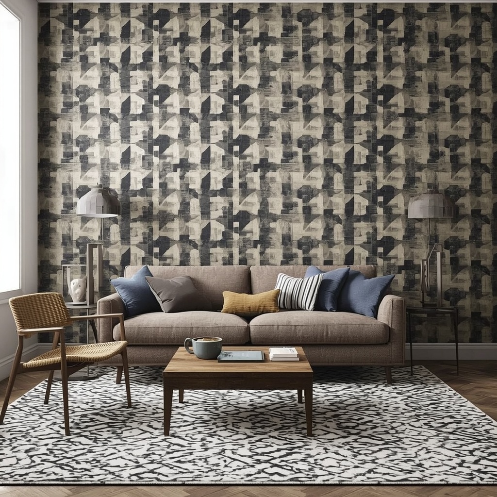
The trick is varying the scale of each pattern. If every geometric element in the room is the same size, your eye has nowhere to rest and the space feels busy. But when you mix a large-scale triangle floor tile with a medium-scale trellis cushion and a small-scale herringbone throw, the room feels layered and sophisticated rather than cluttered.
Color is your secret weapon here. Keeping all three patterns within the same color family — even if the shades vary slightly — creates cohesion. Think: navy, denim, and powder blue geometrics rather than navy, mustard, and coral all at once.
How to Use Geometric Patterns in Specific Rooms
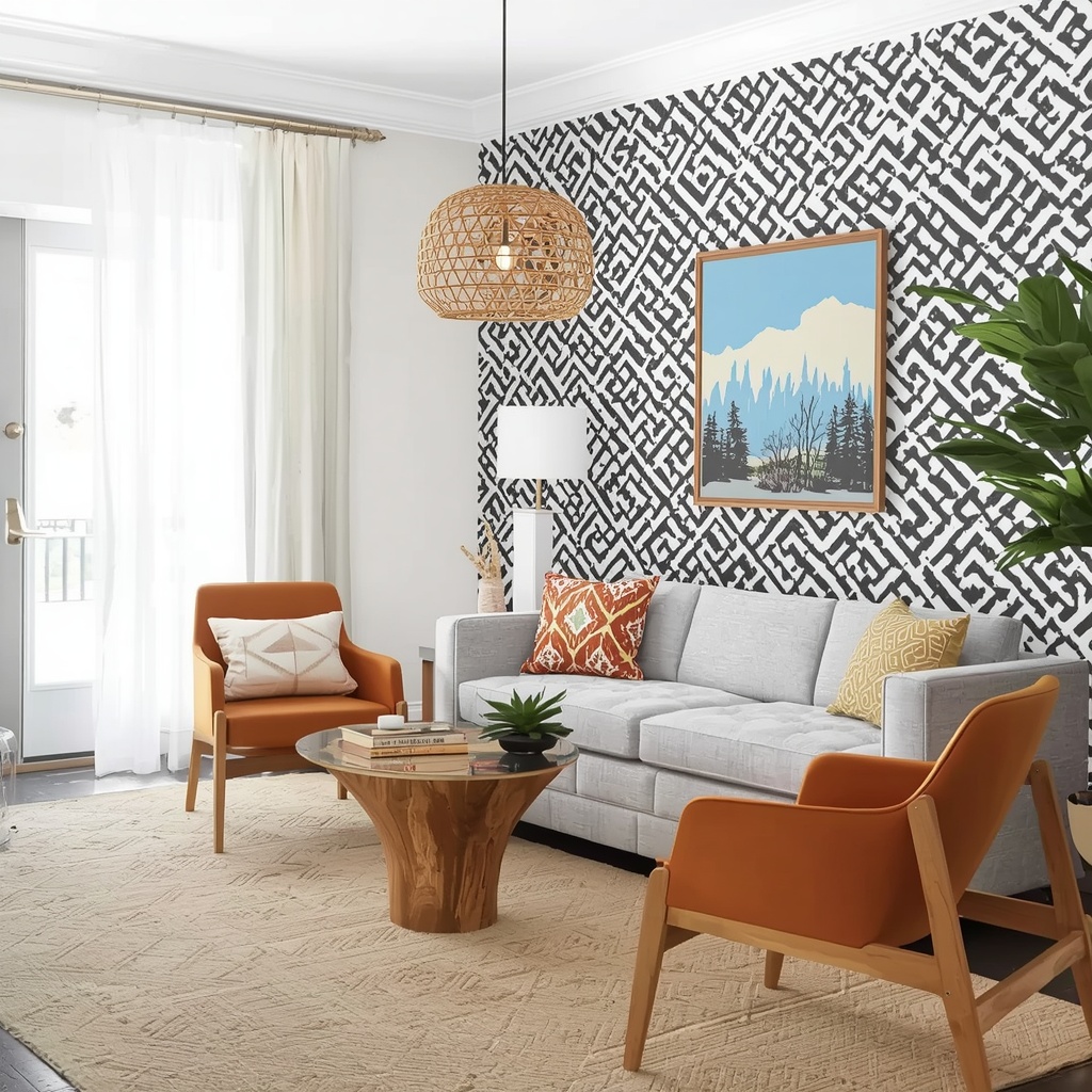
Living Room
The living room is the most forgiving space for geometric experimentation because it’s large and multi-functional. Here, a geometric area rug is your best starting point. It anchors the seating arrangement, adds warmth to hardwood floors, and gives you a clear color palette to build from.
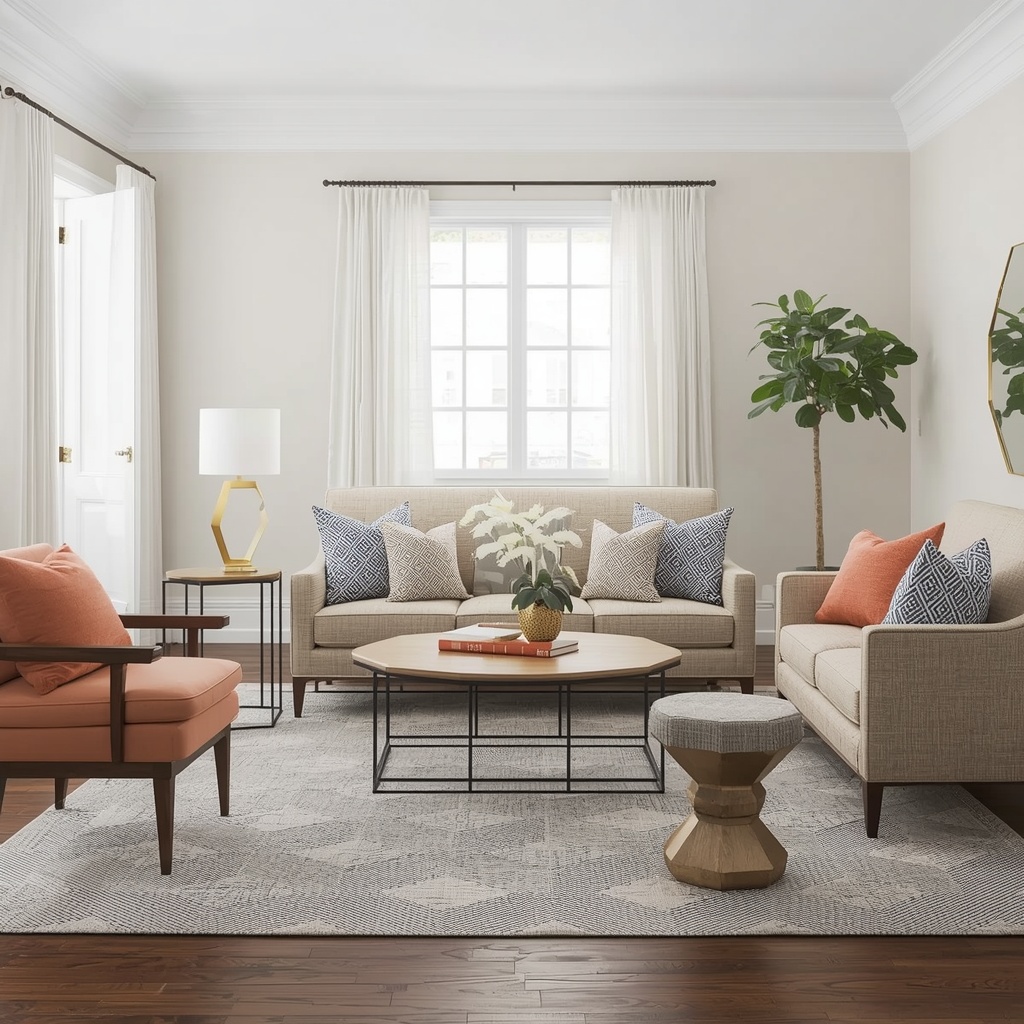
From there, keep the sofa and main chairs in solid, complementary tones. Introduce geometry again through accent pillows (choose two to three with geometric prints) and perhaps a geometric side table or gold hexagon wall mirror. The mix of geometric form (in furniture shape) and geometric print (in textiles) creates visual interest without pattern overload.
Avoid placing a geometric rug, geometric sofa fabric, AND geometric wallpaper in the same living room — that’s the trifecta of too much. Pick two of the three, maximum.
Bedroom
Bedrooms call for a more restrained hand. This is your sanctuary — the place where your nervous system is supposed to wind down. That doesn’t mean geometric patterns are off-limits; it just means they need to be softer and more intentional.
A geometric duvet cover or quilt in muted tones (blush, sage, warm gray) is a beautiful way to bring pattern into a bedroom without overwhelming it. Pair it with solid white or linen shams and keep the walls, flooring, and furniture relatively quiet.
For a bolder look, consider a half-wall geometric wallpaper — often called a board-and-batten effect when done with a geometric lower panel — on just the wall behind your headboard. This creates drama and focus without wrapping the entire room in pattern.
“In bedrooms, geometry should feel like structure, not stimulation. Think of it as the bones of the room — present but not demanding.”
Kitchen and Bathroom
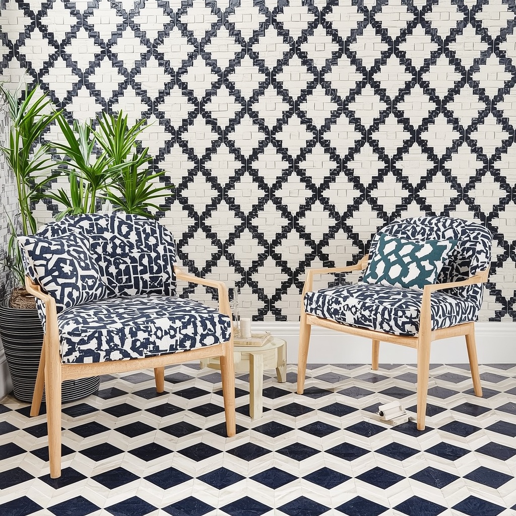
Tile is where geometry truly shines, and both the kitchen and bathroom are perfect canvases. Moroccan encaustic tiles, hexagon penny tiles, and subway tile laid in a herringbone pattern are perennial favorites in American homes and add immense character.
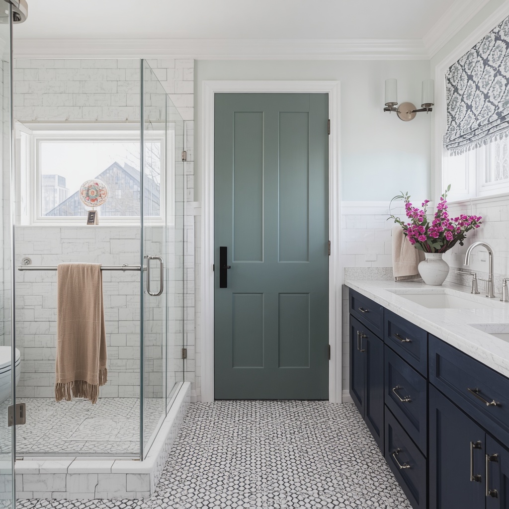
The key in smaller tiled spaces is to let the tile be the only pattern. Keep your cabinet colors solid (white, navy, sage, black), your countertops in a natural stone or plain finish, and your textiles (dish towels, bath mats) in coordinating solids. The geometric tile carries the room — it doesn’t need backup.
Color Strategies That Prevent Pattern Overload
Color and pattern are deeply intertwined, and the wrong color combination can make a geometric pattern feel aggressive even when the scale is appropriate. Here are proven color strategies for geometric styling:
Monochromatic Geometry
Using geometric patterns within a single color family — varying only in shade and tone — is one of the most sophisticated approaches in modern American interior design. A living room in varying shades of terracotta, with a large geometric rug, an abstract triangle print on the wall, and geometric weave pillows, all in different depths of the same hue, feels curated and calm.
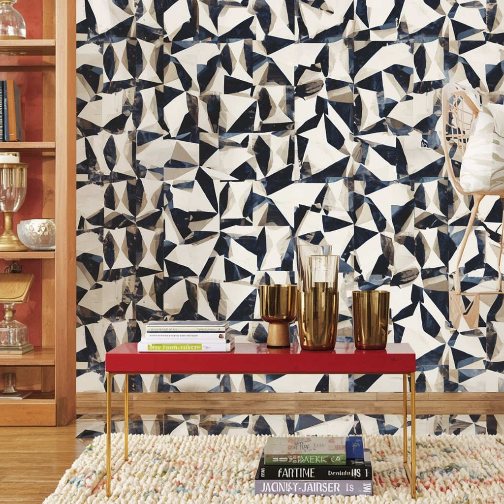
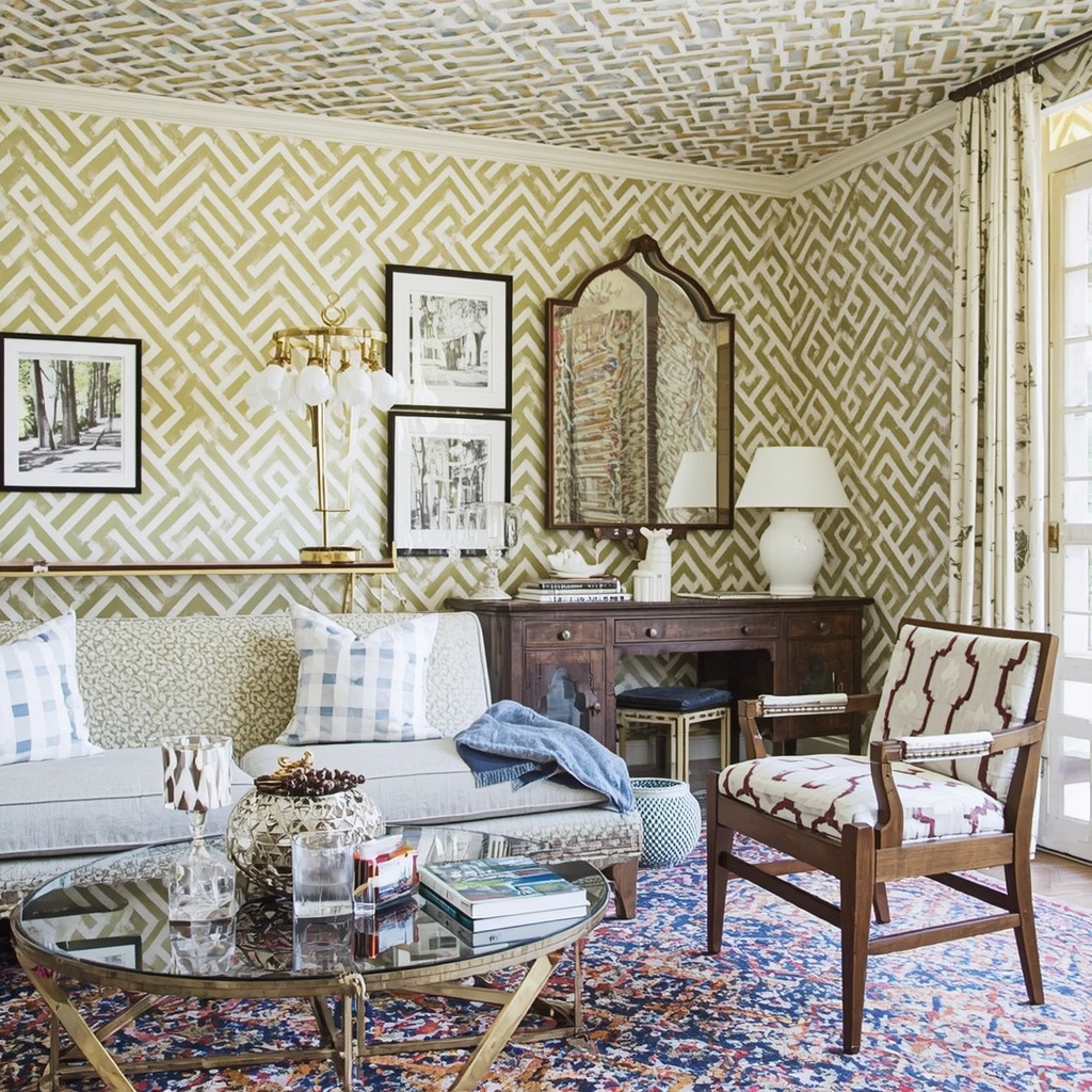
High Contrast as a Feature Wall Only
High-contrast geometrics — think black and white harlequin print or bold navy and white chevron — are stunning but powerful. Limit them to one wall or one large piece and surround them with neutrals. A black-and-white geometric wallpaper on a single dining room wall, flanked by natural wood furniture and white wainscoting, is a showstopper. The same wallpaper on all four walls would be a headache.
Warm Neutrals as the Buffer
Always have a neutral buffer between your geometric elements. Warm whites, cream, greige (gray-beige), and natural wood tones act as visual rest stops that let the eye recover between pattern moments. This is why so many successful geometric rooms feel airy rather than busy — it’s the neutrals doing the heavy lifting in between.Geometric Patterns and Room Size: What to Know
Not all geometric patterns behave the same in different room sizes. Here’s a quick reference:
| Room Size | Best Geometric Approach | Patterns to Avoid |
|---|---|---|
| Small rooms (under 150 sq ft) | Small-scale patterns, light colors, vertical stripes to add height | Large-scale, high-contrast patterns on multiple walls |
| Medium rooms (150–300 sq ft) | One bold anchor, two subtle accents, mix of scales | All-over pattern with no solid relief |
| Large rooms (300+ sq ft) | Multiple geometric zones, bolder scale, layered patterns work well | Too-small patterns that get lost in the space |
In small spaces, vertical geometric stripes (wallpaper or drapery) draw the eye upward and make ceilings feel taller. Diagonal patterns like chevron add energy and movement. Horizontal stripes, however, can visually widen a small room — useful in narrow hallways.
Mixing Geometric Patterns With Organic Textures
One of the most powerful tools for preventing geometric overload is intentional texture contrast. Pairing sharp, precise geometric prints with soft, organic, and natural textures creates a visual conversation that feels balanced and warm.
Try these combinations:
- Geometric tile floor + jute area rug + linen curtains
- Bold diamond-print sofa + raw wood coffee table + woven rattan pendant light
- Chevron wallpaper + velvet solid accent chairs + live-edge wood shelf
The roughness of natural materials — the imperfection of rattan, the softness of linen, the grain of wood — acts as a visual counterweight to the precision of geometric pattern. It tells the room: “I’m designed, but I’m not rigid.”
Pro Tip 💡: Plants are a geometric pattern’s best friend. The natural, flowing curves of indoor plants like fiddle-leaf figs, monstera, or trailing pothos provide a perfect organic contrast to angular geometric décor. A statement plant next to a geometric wallpaper or tile feature instantly softens the look and adds life.
Shopping Guide: Where to Find Quality Geometric Décor in the US
When sourcing geometric pieces for your home, quality of print and construction matters. Cheap geometric textiles often have pattern repeats that don’t align properly at seams, which creates an amateur look that undermines the whole room.
Trusted sources for geometric home décor:
- Anthropologie — Excellent for eclectic, bohemian geometric rugs and bedding
- West Elm — Modern, clean-lined geometric furniture and textiles
- CB2 — Bold, contemporary geometric accent pieces
- Lulu and Georgia — Curated rugs with beautiful geometric options
- Etsy — For handmade, one-of-a-kind geometric tile, art prints, and textile work
For geometric wallpaper specifically, look at Spoonflower (custom printed) or Hygge & West for designer collaborations. Always order samples before committing to full rolls.
Common Geometric Styling Mistakes (and How to Fix Them)
Even experienced decorators stumble with geometric pattern. Here are the most frequent mistakes seen in American homes — and their solutions:
Mistake #1: Too many patterns at the same scale Fix: Vary the scale dramatically. If your rug has 12-inch diamond repeats, your pillow pattern should have 3-inch repeats at most.
Mistake #2: Clashing color temperatures within geometric patterns Fix: Make sure your geometric pieces share either warm or cool undertones. Mixing a warm-yellow-gold chevron with a cool-blue-gray triangle print will feel disjointed even if the colors seem similar.
Mistake #3: Forgetting about pattern on the ceiling Fix: The ceiling is often called the “fifth wall” — a subtle geometric wallpaper or stencil there can add incredible depth without cluttering the room at eye level.
Mistake #4: Using geometric pattern only in accessories Fix: For geometric to feel intentional rather than an afterthought, ground it in at least one large architectural element — a rug, a wallpapered wall, or a tiled surface. Small accessories alone rarely give geometric the presence it deserves.
Final Thoughts: Geometry With Intention
Styling geometric patterns without overwhelming a room is ultimately about restraint with purpose. It’s about understanding that one beautiful, well-chosen geometric element — allowed to breathe in a room of complementary textures and tones — will always outperform a room where every surface is fighting for attention.
Think of yourself as a conductor rather than a musician. Your job isn’t to play every instrument at once; it’s to bring them in at exactly the right moment so the whole piece sounds extraordinary.
Start with one anchor pattern. Layer thoughtfully in scale and color. Trust the neutrals. Bring in organic textures to balance the precision. And above all, let the pattern serve the room — not the other way around.
When you get it right, geometric pattern doesn’t overwhelm a space. It defines it.
Ready to start your geometric transformation? Begin with one room, one anchor piece, and build from there. The best interiors are never finished all at once — they evolve with intention over time.