If you’ve ever stood in your cozy apartment or compact starter home and wondered why it still feels cramped even after decluttering, the answer might be right on your walls. Color — and the palette you choose — is one of the most powerful, budget-friendly ways to visually expand any room. And as an interior designer who has transformed hundreds of small spaces across the U.S., I can tell you: you don’t need to knock down walls to make a room breathe.
The right color palette can create the optical illusion of depth, height, and airiness that no furniture arrangement alone can achieve. In this guide, I’ll walk you through the exact small room color ideas and space-expanding paint strategies that my clients consistently rave about — backed by color psychology and design science.
Why Color Is Your Biggest (Free) Design Tool
Before we dive into specific palettes, let’s talk about why color works so powerfully on our perception of space. Our brains process color before we consciously register anything else in a room. Light, cool, and neutral tones visually recede — they push walls back. Dark, saturated, and warm tones advance — they pull surfaces toward you.
This phenomenon, rooted in atmospheric perspective, is the same reason distant mountains look blue-gray and hazy. When you paint your walls a soft, light hue, your brain subconsciously reads the boundaries of the room as farther away than they really are. The result? A room that feels noticeably more open, even before you move a single piece of furniture.
Color also affects how much natural and artificial light bounces around a room. A wall painted in a high-LRV (Light Reflectance Value) shade can literally brighten a space from within — no extra light fixtures needed. Understanding this concept is step one to using color like a pro.
The good news for budget-conscious homeowners: a gallon of quality paint typically runs $40–$80, making this one of the highest-ROI home improvement moves available. Whether you’re decorating a small bedroom, a studio apartment, a compact living room, or a narrow hallway, the palettes below are your starting point.
“Color does not add a pleasant quality to design — it reinforces it.”— Pierre Bonnard, Post-Impressionist painter and early design influence.
The Science of Light Reflectance Value (LRV)
If you’ve ever felt overwhelmed staring at paint chips, LRV is the number that cuts through the noise. Every paint color has an LRV score from 0 (pure black, absorbs all light) to 100 (pure white, reflects all light). For small spaces, you want colors with an LRV of 60 or higher — these reflect enough light to keep the room feeling open and airy.
| LRV Range | Effect on Space | Best Used For |
|---|---|---|
| 75–100 | Maximum light reflection, very expansive feel | Dark hallways, north-facing rooms, tiny bathrooms |
| 60–74 | Bright and airy, still has color character | Small living rooms, bedrooms, open-plan studios |
| 40–59 | Mid-tone; grounding but not space-expanding | Accent walls only in small rooms |
| Below 40 | Absorbs light; makes spaces feel smaller | Avoid on all four walls of a small room |
Pro Tip
Always check the LRV of a paint before you buy. Most major brands like Benjamin Moore and Sherwin-Williams list it right on their website or app. When testing samples, hold the chip flat against your wall in both natural daylight and your evening lighting — colors shift dramatically between the two.
Proven Color Palettes for Small Spaces
These are the palettes I return to again and again in my design work. Each is built around a primary wall color with coordinating trim, ceiling, and accent suggestions — because a palette is never just one color.
Warm White + Stone
Classic, endlessly versatile, LRV 80+
Soft Sage + Warm Linen
Biophilic, calming, LRV 72–78
Whisper Blue + Cream
Coastal, airy, LRV 74–82
Blush + Greige
Warm feminine softness, LRV 70+
Greige + Amber Accent
Modern organic, LRV 76+
Lavender Mist + Cream
Dreamy and soft, LRV 68–75
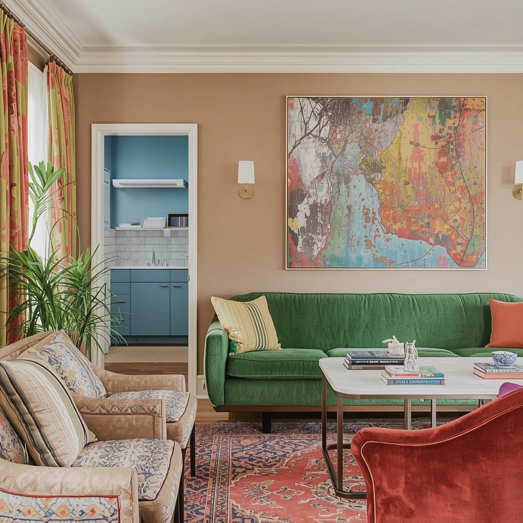
Palette 1: Warm White + Stone Gray — The Space-Maximizing Classic
If there’s one palette that interior designers collectively agree on for small rooms, it’s a warm white paired with soft stone grays. Unlike stark, cold white (which can feel sterile and flat), warm whites have subtle yellow, beige, or pink undertones that make light feel alive on the walls. Think Sherwin-Williams Alabaster (SW 7008, LRV 82) or Benjamin Moore White Dove (OC-17, LRV 85) — these are perennial bestsellers for a reason.
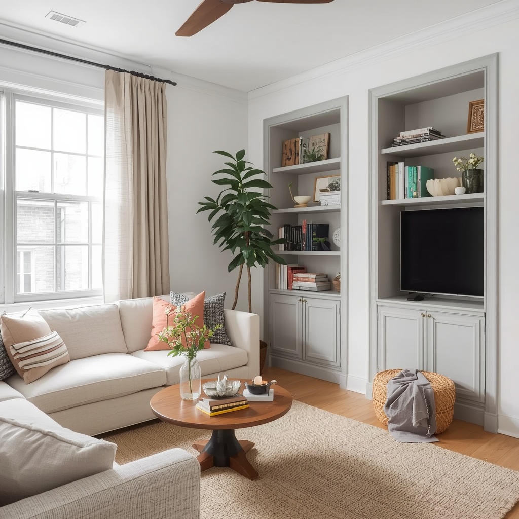
Pair your warm white walls with stone gray trim and a slightly deeper greige on your built-in shelves or alcoves. This tonal layering creates visual interest without breaking the space into competing zones. Add texture through linen curtains, a jute rug, or natural wood accents to keep the room from feeling too one-dimensional. This is the palette I reach for most in small living rooms and studio apartments.
Pro Tip
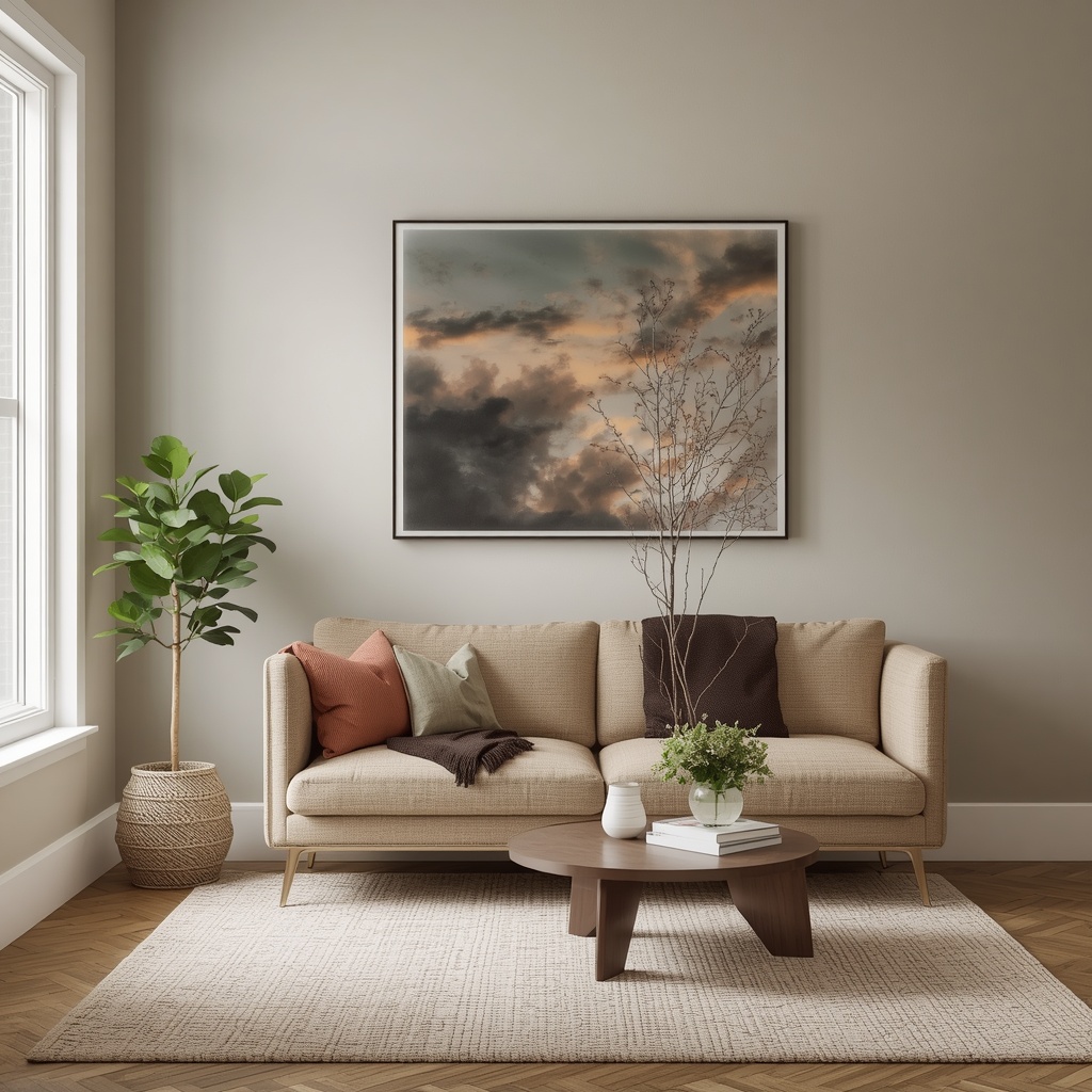
Paint your ceiling the same warm white as your walls — or even one shade lighter. “White ceiling, colored walls” creates a visual lid on the room. A continuous, light color from wall to ceiling erases that boundary and adds perceived height instantly.
Palette 2: Soft Sage Green — The Biophilic Expander
Sage green has had a serious moment in American home design over the past few years, and for good reason — it works beautifully in small spaces when chosen correctly. The key is selecting a muted, gray-leaning sage rather than a bright, saturated green. Colors like Behr’s Aged Sage or Farrow & Ball’s Mizzle have enough gray in them to keep the LRV high while delivering that sought-after organic, nature-connected feel.
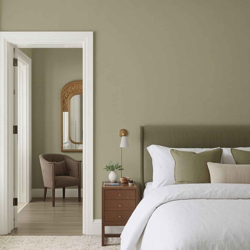
Biophilic design — the practice of bringing the outdoors in — has been shown in multiple studies to reduce stress and improve wellbeing. In small bedrooms especially, a soft sage wall color creates a sense of calm spaciousness reminiscent of a walk through a sunlit garden. Pair it with warm linen, natural wood furniture, and matte brass fixtures for a palette that feels simultaneously cozy and expansive. Avoid pairing sage with bright white trim — opt for a creamy white like Swiss Coffee instead, which bridges the warmth beautifully.
Palette 3: Whisper Blue — The Atmospheric Trick
Here’s where color psychology gets genuinely clever. Cool blues and blue-grays mimic the way our eyes perceive distance in nature — think of a far-off mountain range or a clear sky stretching to the horizon. When used on walls, very soft blue tones create the sensation that the walls are farther away than they are. It’s atmospheric perspective, brought indoors.
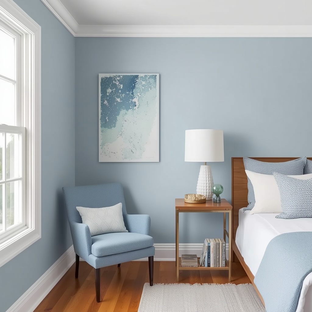
My favorites in this category include Iceberg by Sherwin-Williams and Pale Blue by Farrow & Ball. Both sit comfortably above LRV 70 and pair brilliantly with warm cream trim and natural wood floors. This palette is particularly effective in north-facing rooms that don’t get direct sunlight — the cool wall tone reflects ambient light beautifully rather than fighting it. Add a coastal-inspired texture through grasscloth wallpaper on one wall for depth without darkness.
Color Placement Strategy: Where to Paint What
Choosing the right palette is half the battle. The other half is knowing where to apply each color for maximum space-expanding effect. Here’s a quick strategic breakdown:
| Surface | Recommended Approach | Why It Works |
|---|---|---|
| Walls | Light, high-LRV tone in a matte or eggshell finish | Matte reduces glare; light color recedes visually |
| Ceiling | Same as walls OR one shade lighter | Removes the visual “lid,” adds height |
| Trim & Molding | Crisp white or warm off-white in semi-gloss | Semi-gloss reflects light along edges, creating depth |
| Floor | Medium-toned natural wood or light tile | Dark floors shrink rooms; mid-tones ground without crowding |
| Built-ins / Alcoves | One shade darker than wall color | Creates depth perception, adds dimension |
| Accent wall (if any) | Same palette family, just slightly deeper | Tonal, not contrasting — keeps the space cohesive |
Pro Tip — The Monochromatic Method
One of the most powerful space-expanding techniques is painting everything — walls, trim, ceiling, even built-ins — in the same color family using slightly different shades. This “monochromatic envelope” technique removes every visual interruption that tells your eye “the room ends here,” making the space feel seamlessly larger. It’s especially effective in small bathrooms, hallways, and bedrooms.
Dos and Don’ts for Small Room Color
Use a cohesive color palette of 3 tones max: base, mid, and accent.
Match your window trim color to your wall color in very small rooms.
Use floor-length curtains in the same hue as your walls to heighten rooms.
Choose furniture in the same color family as your walls.
Paint a feature wall a dramatically different color — it chops up the space.
Use dark, saturated colors on all four walls of a small room.
Skip the ceiling — painting it the same color is one of the highest-impact moves.
Rely on a single paint chip — always view samples in both day and night lighting.
Mix cool and warm tones without a bridging neutral — it creates visual tension.
The Role of Finish: Sheen Changes Everything
Even the most perfectly chosen small room paint color can feel wrong if you select the wrong finish. Paint sheen affects how much light is reflected and, therefore, how large or small a room feels. Here’s a simple breakdown tailored specifically to compact spaces:
- Flat/Matte: Best for walls and ceilings in small spaces — absorbs light evenly, hides imperfections, and prevents the “glare tunnel” effect.
- Eggshell: Slightly more reflective than matte; ideal for small living rooms and bedrooms where occasional light scuffs are a concern.
- Satin: Great for trim, doors, and high-traffic areas like small hallways — cleans easily without looking too shiny.
- Semi-gloss: Reserve for trim, baseboards, and window frames — its reflectivity defines architectural edges beautifully.
- Gloss: Avoid on walls in small rooms unless doing a deliberate lacquered effect — it highlights every imperfection and can make a room feel like a box.
Pro Tip — Finish Contrast for Depth
In a small bedroom, try painting walls and ceiling in the same matte warm white, then using a satin finish on just the trim. The subtle sheen difference creates quiet architectural dimension — your eye notices the border of the room without feeling boxed in. It’s a trick straight from the high-end interior design playbook, and it costs zero extra dollars.
Frequently Asked Questions
| Question | Answer |
|---|---|
| Can dark colors ever make a small room look bigger? | Yes — if used strategically. Dark paint on a far wall only (a receding wall) can create an illusion of depth. A dark ceiling can also add drama without making rooms feel cramped if walls stay light. But it’s advanced territory — start with light palettes first. |
| What’s the best color for a small bedroom? | Soft sage green, warm white, or whisper blue. All three promote calm and visually expand without feeling sterile. Pair with warm-toned bedding to prevent the room from feeling cold. |
| Should I use the same color throughout an open-plan apartment? | Yes — a consistent, light color palette throughout connected spaces creates a seamless flow that makes the entire footprint feel larger. Use varying textures, not colors, to define zones. |
| How do I choose between warm white and cool white? | Look at your flooring and fixed finishes first. Warm wood floors pair with warm whites; gray tile or cool-toned floors pair better with cool or greige whites. When in doubt, choose a warm white — it’s universally flattering in most natural lighting conditions across the U.S. |
The Bottom Line
Color is the most affordable square footage you’ll ever buy. Whether you’re working with a 400-square-foot studio in NYC or a snug guest bedroom in a suburban home, the right palette — light, cohesive, and strategically applied — can transform how a space feels to everyone who steps into it.
Start with one of the six palettes above, grab a few sample pots, and test them in your actual space over 48 hours. The room you have is already enough — you just need to see it with fresh color.