By Your Interior Design Expert | Home Décor for the Modern American Home
There’s a reason blue has dominated interior design trends for years — it’s the color of open skies, quiet oceans, and peaceful Sunday mornings. But here’s the secret most homeowners overlook: blue alone can feel cold and sterile. The real magic happens when you pair those calming blue tones with warm accents that breathe life, texture, and soul into a room. Whether you’re redesigning your living room, bedroom, or even a cozy reading nook, mastering this color pairing can completely transform your space into a sanctuary you never want to leave.
In this article, we’ll walk you through every step of building a blue-and-warm-accent palette — from choosing the right shade of blue to layering in terracotta, brass, and natural wood tones. You’ll discover how professional interior designers strike that perfect balance between cool and cozy, and how you can do the same without breaking the bank.Why Calming Blue is the Ultimate Foundation Color for Your Home
Blue is more than just a pretty color — it’s a mood-altering powerhouse. Studies in color psychology consistently show that blue hues lower heart rate, reduce anxiety, and promote a sense of mental clarity. That’s exactly why it’s the go-to choice for bedrooms, living rooms, and home offices where relaxation and focus are priorities.
The spectrum of blue available to homeowners is vast and exciting. From soft, almost-white powder blue to deep, dramatic navy, each shade carries its own personality. Dusty blue walls evoke a sense of timeless elegance, while slate blue adds a sophisticated, contemporary edge. Coastal blue and sky blue bring a breezy, airy quality to open-plan spaces. The key is understanding that not every blue is “calming” — jewel-toned electric blues and ultra-bright teals lean more energizing than soothing. For a truly serene atmosphere, stick with muted, grayed, or soft blue tones that whisper rather than shout.
“The most beautiful rooms tell a story through contrast — when blue meets the warmth of aged wood or burnished brass, the room starts to breathe.” — Nate Berkus, Interior Designer
The Science of Pairing Blues with Warm Accents
Warm accents work as the perfect antidote to blue’s inherent coolness. In color theory, warm and cool colors create complementary contrast — they don’t clash, they complete each other. Think of a misty blue sky at sunset, framed by the golden warmth of the horizon. That visual harmony is exactly what you’re recreating inside your home.

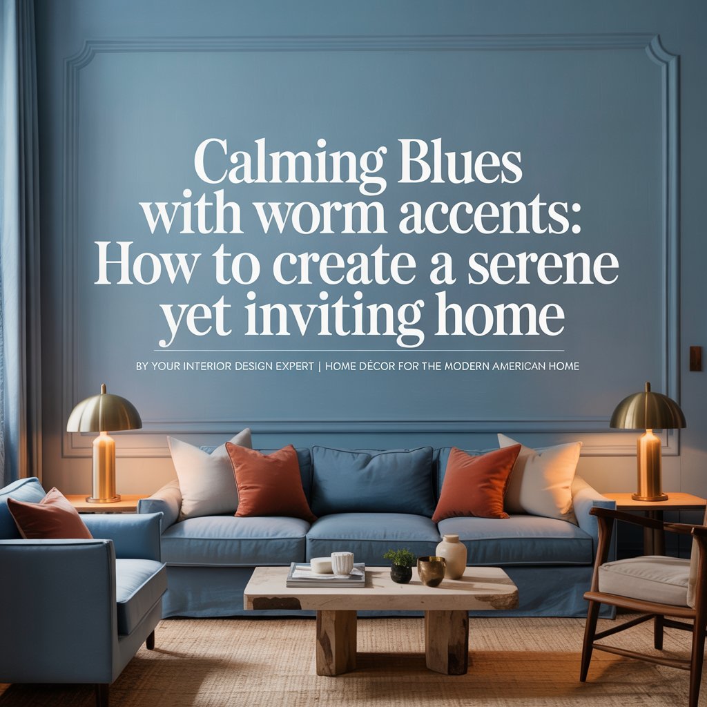
The most effective warm accent colors to pair with calming blues include terracotta, burnt sienna, mustard yellow, blush pink, cognac leather, antique brass, and natural wood tones like walnut and oak. These shades introduce visual warmth and grounding energy that prevents a blue room from feeling like a spa waiting room. When used thoughtfully — through throw pillows, rugs, light fixtures, and furniture legs — these accents transform a cool palette into a layered, livable, and luxurious interior.
Choosing the Right Shade of Blue for Every Room
Not every blue works in every space. Lighting, room size, and function all play a role in which shade will perform best on your walls, upholstery, or cabinetry.
Blue Shade Guide by Room
| Room | Best Blue Shade | Why It Works |
|---|---|---|
| Bedroom | Dusty Blue, Soft Slate | Promotes restful sleep, pairs beautifully with linen and warm wood |
| Living Room | French Blue, Steel Blue | Sophisticated and welcoming without overpowering |
| Kitchen | Powder Blue, Duck Egg Blue | Feels clean, fresh, and timeless |
| Home Office | Muted Navy, Denim Blue | Encourages focus and reduces visual fatigue |
| Bathroom | Seafoam Blue, Pale Blue-Gray | Evokes spa-like serenity, reflects light beautifully |
| Nursery | Baby Blue, Periwinkle | Gentle and calming for little ones |
Pro Tip: Always test your blue paint in both natural daylight and artificial evening light before committing. Blues are notoriously chameleon-like — a shade that looks lavender in a paint chip can read as blue-gray on your wall under warm LED bulbs. Purchase sample pots and paint large swatches (at least 12×12 inches) before making your final decision.
Top Warm Accent Colors That Pair Perfectly with Blue
The beauty of blue is its versatility. It plays well with a surprising range of warm tones, giving you plenty of creative freedom. Here are the best warm accent pairings and how to use them:

Terracotta and Clay This earthy, sun-baked orange is having a major moment in American homes — and for good reason. Terracotta throw pillows on a blue sofa, a clay-colored ceramic vase on a slate blue shelf, or a terracotta-toned area rug anchoring a steel blue living room all create that effortlessly collected, well-traveled aesthetic. The contrast is bold yet balanced, modern yet organic.
Mustard Yellow and Amber Mustard is the secret weapon of blue-based color palettes. A single mustard yellow armchair in a navy blue room is an instant focal point. Amber glass pendant lights over a powder blue kitchen island add warmth without adding clutter. This pairing has a distinctly mid-century modern energy that feels both current and timeless.
Natural Wood Tones (Walnut, Oak, Teak) Wood is the most natural warm accent you can introduce to a blue room. It’s organic, textural, and impossible to get wrong. Walnut-stained floating shelves against a dusty blue wall, an oak coffee table on a blue-gray rug, or exposed wooden ceiling beams over a denim blue accent wall — wood brings a grounding, earthy presence that makes blue rooms feel genuinely lived-in rather than designed.
Antique Brass and Gold Metallic warm accents are the jewelry of interior design. Brass cabinet hardware in a duck egg blue kitchen, a gold-framed mirror above a slate blue fireplace mantel, or burnished bronze light fixtures in a navy bedroom — these details add glamour, dimension, and a sense of curated luxury. Always opt for aged or antique finishes rather than shiny gold, which can veer into tacky territory.
Cognac and Tan Leather Leather in warm, honey-toned shades adds a richness and tactile depth that soft furnishings alone can’t achieve. A cognac leather accent chair in a pale blue living room creates an anchoring warmth. Leather-wrapped ottomans, book bindings, or even a leather-bound photo album styled on a coffee table can subtly introduce this warm tone without overwhelming the space.
How to Layer Warm Accents Without Overwhelming the Blue
One of the most common mistakes homeowners make is going too heavy on the warm accents, which can tip the balance and make the blue feel like an afterthought. The golden rule of blue and warm accent interiors is the 60-30-10 rule:

- 60% of the room should be your calming blue (walls, large upholstered pieces, rugs)
- 30% should be a neutral (white trim, beige linen, light gray — this acts as a buffer)
- 10% is your warm accent (brass fixtures, terracotta ceramics, mustard cushions)
That 10% punch of warmth is where the personality lives. Less is genuinely more. A single terracotta throw draped over a blue velvet sofa will do more for your room than five different warm-toned accessories competing for attention.
Room-by-Room Design Inspiration
The Living Room: French Blue Walls with Walnut and Brass
Imagine a living room painted in French Blue — that sophisticated, grayish-blue beloved by Parisian interiors. A large linen sofa in a warm ivory tone anchors the space. A walnut-stained coffee table grounds the seating area, while a trio of antique brass pendant lights hang overhead, casting a honeyed glow in the evening. Two terracotta linen throw pillows and a chunky woven throw in camel complete the picture. The result is a room that feels deeply calm during the day and warmly intimate at night.

This combination works because it hits every note of the warm blue interior playbook: cool foundation, neutral buffer, and strategic warm punctuation. Add a sisal or jute area rug underfoot and a few potted trailing plants (which act as a natural, organic accent) and you have a magazine-worthy space that’s genuinely comfortable to live in.
The Bedroom: Dusty Blue with Warm Linen and Terracotta
The bedroom is where calming blue truly shines. Paint all four walls in a dusty blue — a muted, grayish-blue that reads soft and sophisticated — and pair it with natural linen bedding in warm oatmeal tones. Layer a terracotta lumbar pillow at the front of the bed arrangement. Choose bedside tables in a light oak or reclaimed wood finish, and add a rattan pendant light above each nightstand for a warm, organic glow.

For the floor, a vintage-style Moroccan rug with warm rose, ivory, and sand tones ties the whole room together and adds that all-important textural contrast underfoot. The result is a bedroom that feels like the world’s most luxurious, calming retreat — the kind of space where you actually unwind the moment you walk through the door.
Must-Have Products for a Blue and Warm Accent Room
Here’s a curated shopping checklist to help you build your palette:
- [ ] Paint: Benjamin Moore’s “Buxton Blue” or Sherwin-Williams “Niebla Azul” for walls
- [ ] Throw Pillows: Terracotta velvet or mustard linen cushions (24×24 inch for sofas)
- [ ] Area Rug: Vintage-inspired Moroccan or Turkish kilim rug in warm sand and clay tones
- [ ] Light Fixtures: Antique brass or warm bronze pendants or sconces
- [ ] Throw Blanket: Chunky knit or woven throw in camel, cognac, or oatmeal
- [ ] Ceramic Vases: Terracotta or amber-glazed vessels in varying heights
- [ ] Wood Accents: Walnut or oak side tables, trays, or floating shelves
- [ ] Candles: Beeswax or amber-toned candles in brass or clay holders
- [ ] Plants: Fiddle leaf fig, pothos, or snake plant in terracotta pots
Common Mistakes to Avoid in Blue and Warm Accent Interiors
Even well-intentioned design choices can go sideways. Watch out for these pitfalls:
Using too many shades of blue at once. Mixing four or five different blues creates visual chaos rather than cohesion. Choose one primary blue and, if needed, one secondary blue shade that’s very close in tone.

Choosing warm accents that are too bright. Neon orange or electric yellow will fight with your blue rather than complement it. Always reach for muted, earthy versions of warm colors — think burnt sienna rather than orange, ochre rather than yellow.
Forgetting about undertones. Some blues lean green, some lean purple. Make sure your chosen blue’s undertone doesn’t clash with your warm accents. A blue with green undertones pairs better with terracotta and wood; a blue with purple undertones works better with dusty rose and antique gold.
Neglecting texture. Color is only half the story. A room that’s all smooth surfaces — painted walls, glossy furniture, flat fabrics — will feel flat and cold regardless of the color palette. Introduce texture through woven rugs, linen throw pillows, rattan furniture, rough ceramic vessels, and nubby knit blankets.
Final Thoughts: Creating a Home That Feels Like a Hug
The pairing of calming blue with warm accents is one of the most enduring and emotionally satisfying combinations in residential interior design. It speaks to something deeply human — the desire to feel both at peace and embraced, cool-headed and warmly held at the same time.
When you walk into a room designed with this palette, something shifts in your nervous system. The blue tells your mind to slow down; the warm wood, brass, and terracotta tell your body it’s safe to relax. That’s not just good design — that’s good living.
Start small if you’re hesitant. Paint one wall, swap your throw pillows, add a brass floor lamp. Let the palette evolve organically. Before long, you’ll have a home that doesn’t just look beautiful in photographs — it feels like you, every single time you walk through the door.
For more home décor inspiration, explore resources like Houzz, Apartment Therapy, and The Spruce — three of the best destinations for room ideas, product reviews, and design tips tailored to American homeowners.
Semantic Keywords Used: calming blue interior, blue home décor, warm accent colors, blue and terracotta, blue and brass, interior color palette, blue living room ideas, dusty blue bedroom, French blue walls, complementary color theory, blue home design, warm blue interior, earthy tones with blue, blue and wood accents, blue accent wall, cozy interior design, color psychology home, serene home design, modern farmhouse blue, transitional interior design.